

If you want one safe pick, I’d start with Brun Prévenance. It handles more papers, works across more nib sizes, and keeps its lines cleaner than the rest. If you want color first, I’d look at Rose Red for daily writing, Violet for purple notes, Orange for headings, Apple Green for markup, and Lavender for a softer page look.
Here’s the core takeaway in plain terms:
- I’m comparing 6 inks: Rose Red, Orange, Lavender, Violet, Apple Green, and Brun Prévenance
- I’m judging them on 6 points: scent, color, shading, flow, paper behavior, and nib match
- On good fountain pen paper, dry times mostly sit around 15 to 60 seconds
- On copy paper, feathering and bleed-through go up fast
- Across the group, water resistance is low
- The easiest starter choices are Brun Prévenance and Rose Red
This means your best pick depends less on scent alone and more on paper type and nib width. Fine to medium nibs are the safer bet for most of these inks, while Orange and Apple Green show more depth in broader nibs.
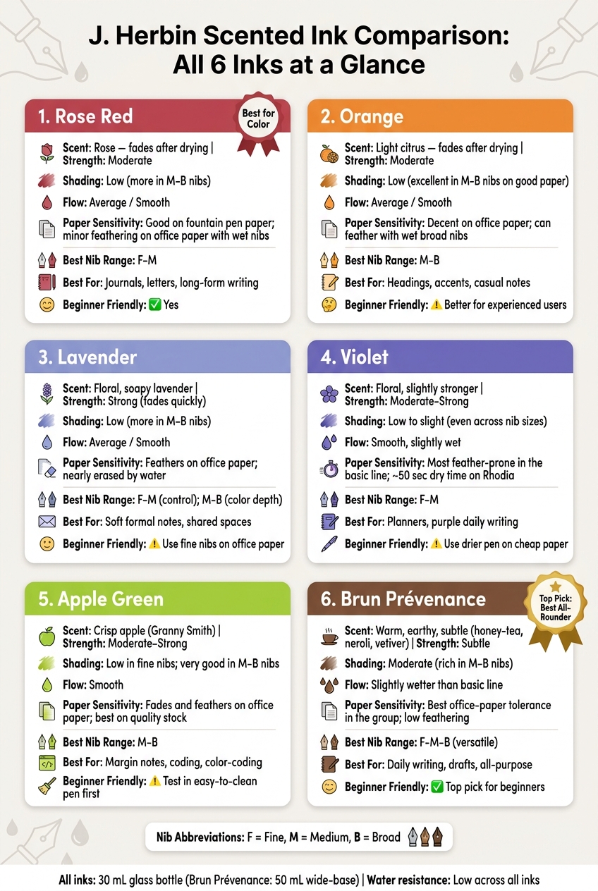
J. Herbin Scented Ink Comparison: All 6 Inks at a Glance
J.Herbin Scented Purple writing sample
sbb-itb-1dd4fe9
Quick Comparison
| Ink | Scent | Color | Paper Use | Best Nib Fit | Best For |
|---|---|---|---|---|---|
| Rose Red | Rose, fades after drying | Pink-red with slight brown tone | Good paper first; okay on copy paper in finer nibs | F–M | Journals, letters |
| Orange | Light citrus | Warm orange | Better on good paper | M–B | Headings, casual notes |
| Lavender | Floral, soapy lavender | Blue-leaning lavender | Weak on copy paper in wet nibs | F–M for control, M–B for color | Soft formal notes |
| Violet | Floral, a bit stronger to some users | Blue-leaning purple | More feather-prone than most | F–M | Planners, purple daily writing |
| Apple Green | Apple, short-lived after drying | Bright green | Okay, but less punch on office paper | M–B | Margin notes, coding |
| Brun Prévenance | Warm, earthy, subtle | Medium-dark brown | Best office-paper control of the group | F–B | Daily writing, drafts |
My bottom line: if you care most about clean writing, go with Brun Prévenance. If you care most about color, pick based on use: Rose Red for long-form writing, Violet for purple pages, and Orange or Apple Green for short bursts of color.
That’s the full picture up front. The rest of the review breaks down where each ink works well - and where it doesn’t.
1. J. Herbin Rose Red
Rose Red is the line’s classic red, so it’s the simplest place to get a feel for the ink’s scent, color, and writing feel.
Scent
You’ll notice the rose scent while writing. Once the ink dries, it fades fast.
Color & Shading
Rose Red shows up as a medium red with slight brown-oxblood undertones. The shading is fairly light, though a medium or broad nib on smooth paper will show more tonal shift.
Flow & Paper Behavior
Flow feels smooth and even. On fountain pen paper like Rhodia or Tomoe River, dry time lands at about 15–60 seconds, with little feathering or bleed-through. On office copy paper, feathering and bleed-through become much more noticeable, especially with broader or wetter nibs.
Water resistance is only medium at best, so this ink makes more sense for daily notes than for anything that might get wet.
Bottle & Pen Match
Rose Red comes in a 30 mL glass bottle with a flat top that also works as a built-in pen rest. It’s compact, steady on a desk, and the clear glass makes it easy to see how much ink is left. The neck is moderately narrow, which makes filling cartridge-converter pens pretty easy. Bigger pens can get a bit annoying to fill once the ink level drops. A syringe helps there.
If you’re new to fountain pens, a fine or medium nib on good paper is the safest pick. It keeps the color looking clean and helps limit feathering on everyday paper. If you’ve used fountain pens for a while, a medium or broad nib on smoother paper will bring out more of that rose-petal tone and the slight undertones.
2. J. Herbin Orange
Scent
Orange has a light citrus scent that you can notice while writing, then it fades once the ink dries. Like the other Herbin scented inks, it leans toward easy day-to-day use instead of big, dramatic shading.
Color & Shading
Orange is a bright, warm orange with light shading. In medium and broad nibs, the color looks fuller and more saturated.
Flow & Paper Behavior
Flow is smooth and steady. It works on office paper better than many scented inks, although broad, wet nibs can still show through. On fountain pen paper like Rhodia, dry time stays under control, and feathering does too.
Bottle & Pen Match
For filling and daily use, Orange comes in the same 30 mL Herbin bottle as the rest of the line. It includes a built-in pen rest that helps steady the pen during filling. Fine and medium nibs are a good fit for everyday writing, though there are other factors for choosing the perfect fountain pen to keep in mind., while broader nibs show more color depth.
3. J. Herbin Lavender
Lavender is the softest and most restrained blue-leaning ink in this lineup.
Scent
Lavender has a clear floral scent. You’ll notice it most in the bottle and during the first few minutes of writing. Once the ink dries, the scent drops off to a faint trace. This smells more like soapy, perfumed lavender than a fresh herb sprig. The floral-water base helps explain why the scent fades so fast. In day-to-day use, that makes it one of the easier scented inks to bring into shared spaces.
Color & Shading
This is a blue-leaning lavender, not a red-leaning one. It looks bluer than J. Herbin's Violette Pensée. Shading is modest, though medium and broad nibs show a bit more depth on the page.
Flow & Paper Behavior
Flow is average and smooth, with no major skipping or dry starts. On Rhodia or Clairefontaine, feathering stays low and bleed-through stays modest. On copy paper, broader or wetter nibs can feather and bleed through, so fine nibs are the safer pick for office writing. Water resistance is low, and water can nearly erase the writing.
Bottle & Pen Match
Lavender comes in J. Herbin's 30 mL bottle, which includes an integrated groove for resting a pen while filling. The 30 mL size is compact and easy to try. Filling is easy when the bottle is full, but once the ink level drops, larger piston or vacuum pens can be harder to fill. If that happens, moving the last bit of ink into a small, shallow container can help. If you're new to fountain pens, a cartridge-converter pen is the easiest place to start.
Next, Violet moves the palette deeper and more saturated.
4. J. Herbin Violet
Violet lands right between Lavender’s softer feel and Apple Green’s brighter look.
Scent
Violet has a clean floral scent. It’s strongest in the bottle and while the ink is still wet, then it fades fast once the writing dries. Most users call it pleasant, though some say it feels a bit strong during longer writing sessions.
Color & Shading
Violet is a medium blue-leaning purple, not the redder tone you get from J. Herbin’s Violette Pensée. It lacks the gold sparkle found in shimmering purple inks, focusing instead on a clean, matte finish. On the page, shading is low to slight across nib sizes, so the color looks pretty even from line to line.
That even look gives Violet a lot of flexibility. Still, the paper you use can change how clean the final result looks.
Flow & Paper Behavior
Flow is smooth and slightly wet. On good paper, Violet generally behaves well. That said, it can feather a little even on smooth stock. Move to office copy paper, and feathering plus bleed-through become more common, especially with medium or broad nibs.
Dry time on Rhodia with a medium nib is about 50 seconds. Water resistance is low, so if water hits the page, the lines often smear or wash away—unlike waterproof fountain pen ink designed for permanence.
Bottle & Pen Match
Violet comes in J. Herbin’s 30 mL glass bottle with the built-in pen rest. It’s a nice touch, but there’s a small catch: larger pens can get harder to fill once the ink level drops.
For standard paper, fine and medium nibs usually give cleaner results.
Apple Green shifts away from this muted purple tone and into something brighter and fresher.
5. J. Herbin Apple Green
Apple Green - sold as Vert / Verte in J. Herbin's scented line - pairs a bright green ink with a crisp apple scent. It feels like the most casual pick in the lineup.
Scent
This scent goes for crisp Granny Smith apple, not candy-like sweetness. You'll notice it most in the bottle and while the ink is still wet. Once it dries, the scent drops off.
Color & Shading
Apple Green shows up as a bright green that stays close to its name instead of leaning hard into yellow or mint. With broader nibs and wetter pens, you get the most shading. On 90 g Clairefontaine, it looks clean and bright.
Flow & Paper Behavior
Flow is smooth, and testing showed no drying or clogging issues. On office paper, the color loses some of its punch, but it still looks clean.
Bottle & Pen Match
The 30 mL bottle is easiest to fill when it's still fairly full. Since the scent can linger in feeds and resin parts, it's smart to test it first in a pen that's easy to clean; properly cleaning and maintaining a beginner-friendly Fountain Pen Revolution pen works well for that.
Brun Prévenance moves the lineup away from bright green and into a warmer brown.
6. J. Herbin Brun Prévenance
Brun Prévenance is a warm, earthy brown with smoked-honey-tea, neroli, and vetiver notes.
Scent
Reviewers describe the scent as warm and atmospheric, with a slightly dusty edge.
Color & Shading
This is a warm, medium-dark brown with an earthy, faintly smoky look. Reviewers also note that it is darker than Private Reserve Copper Burst. On high-quality paper, Brun Prévenance tends to show low-to-moderate shading instead of sharp light-to-dark contrast. That means fine and medium nibs look even and easy to read, while broader nibs add just a small amount of tone change.
Flow & Paper Behavior
Flow is average and dependable, with minimal skipping. On fountain-pen paper, dry time lands at about 15–60 seconds, with low-to-medium feathering and bleed-through. On office paper, both tend to get worse.
Bottle & Pen Match
Brun Prévenance comes in a 50 mL Jacques Herbin perfume-style glass bottle with a sturdy, wide base that helps resist tipping. The wide mouth fits most pens, which makes filling pretty simple. As the ink level drops, though, you may need to angle the pen or use a syringe or fill an eyedropper pen to make filling easier. Fine or medium nibs are a good match if you want to control ink use and keep lines cleaner on weaker paper.
The next section compares all six inks side by side on scent, flow, paper behavior, and nib range.
Performance, Pen Match, and Packaging Compared
After the individual ink profiles, here’s the practical side-by-side view.
Comparison table: scent, color, flow, and nib range
| Ink | Scent Strength | Color Family | Shading | Flow | Paper Sensitivity | Bottle Style | Ideal Nib Range |
|---|---|---|---|---|---|---|---|
| Rose Red | Moderate | Red (light-medium) | Low | Average | Best on office paper in the basic line | 10 mL and 30 mL glass bottle | F–M |
| Orange (Ambre) | Strong | Golden yellow-orange | Low | Average | Decent on office paper; low contrast in fine nibs | 10 mL and 30 mL glass bottle | M–B |
| Lavender (Bleue) | Strong | Soft blue-lavender | Low | Average | Feathers on office paper | 10 mL and 30 mL glass bottle | M–B |
| Violet | Moderate | Light purple | Low | Average | Most prone to feathering in the basic line | 10 mL and 30 mL glass bottle | F–M |
| Apple Green (Vert/Verte) | Moderate-strong | Yellow-green | Low | Average | Fades and feathers on office paper | 10 mL and 30 mL glass bottle | M–B |
| Brun Prévenance | Subtle | Medium brown | Moderate | Slightly wetter than the basic line | Most paper-tolerant; usable on office paper | 50 mL wide-base bottle | F–M–B |
The table gives a quick snapshot. The next sections show where that snapshot holds up and where things get messy.
How each ink performs on fountain pen paper vs. office paper
Side by side, the big difference isn’t flow. It’s paper tolerance.
On fountain-pen-friendly paper - Rhodia, Tomoe River, Clairefontaine, and Leuchtturm - these inks look crisp, with dry times around 15 to 60 seconds depending on nib size. One reviewer found the scented inks wrote smoothly on 90 g Clairefontaine with no flow or drying issues.
Office paper changes the picture fast. A multi-paper test using Walmart "Pen + Gear" copy paper found feathering and bleeding across all nib sizes. Rose Red and Orange do the best here. Violet is the most likely to feather, followed by Lavender and Apple Green. Brun Prévenance, from the premium Jacques Herbin line, acts more like a standard dye ink on office paper, with much better control than the rest of the lineup.
Water resistance is poor across the line. Lavender in testing became largely illegible under running water, leaving only a faint trace. If you need something for records or long-term storage, this isn’t the right group of inks.
Bottle design and filling ease
The 10 mL and 30 mL bottles are small, steady, and easy to store. That’s nice if you like rotating inks instead of parking one bottle on your desk for months. The trade-off is simple: filling gets more annoying as the ink level drops. The 30 mL bottles are easier to work with using standard converters.
Brun Prévenance uses a 50 mL wide-base bottle, which makes it the outlier here in both bottle format and paper behavior. The wide mouth makes filling easy at first. Once the level gets low, though, you’ll still need to tilt the bottle or use a syringe.
In day-to-day use, bottle size matters less than nib choice if you’re trying to control feathering and color strength.
Which pens and nib sizes work best with each ink
Rose Red and Violet work best with fine to medium nibs. Orange and Apple Green show more color depth with medium to broad nibs. If you want to test the same ink across a few nib widths, a beginner-friendly pen with interchangeable nibs makes that much easier. Fountain Pen Revolution carries options that are handy for this kind of comparison.
A dry pen is the safer pick for Lavender and Violet. Brun Prévenance goes the other way - a wetter pen helps bring out more shading.
Pros, Cons, and Which Ink Fits You Best
Pros and cons for all six inks
The results sort themselves into a few clear buying paths. This table turns the testing notes into quick guidance.
| Ink | Scent | Line clarity | Shading | Office Paper | Best nib range |
|---|---|---|---|---|---|
| Rose Red | Medium intensity; noticeable but not overpowering | Strong in fine to medium nibs on white paper | Subtle in fine; good in medium to broad | Usually only minor feathering with wet medium to broad nibs | Works well in most nibs; no broad nib required |
| Orange | Moderate; present while writing | Best for headings and accents; fine nibs can look pale | Excellent in medium, stub, and broad nibs on good paper | Can feather or show through on cheap copy paper, especially with wet nibs | Rewards medium-and-up nibs for the best color depth |
| Lavender | Gentle floral; soft and subtle | Fine nibs can look faint on cream paper | Attractive in medium to broad nibs; weak in extra-fine to fine | Fine to medium nibs are usable; absorbent paper reduces shading | Best in medium to broad nibs; fine nibs are better for short notes |
| Violet | One of the strongest scents in the line | Dark enough for fine to medium daily use | High in medium to broad nibs on good paper | Fine to medium nibs are generally okay; wet broad nibs may feather | Ideal for medium to broad nibs and stubs |
| Apple Green | Light, fresh; refreshing | Good for notes; fine-nib text can look thin over long passages | Very good in medium to broad nibs; subtle in fine | More feathering in medium-and-up nibs on cheap paper | Rewards broader nibs and smooth paper |
| Brun Prévenance | Warm, subtle; office-friendly | High in all common nib sizes on white and cream paper | Rich in medium to broad nibs with complex warm shading | Among the best-behaved; low feathering in fine to medium | Versatile from fine to broad |
From there, your pick comes down to what matters most: reliability, shading, or a stronger scent.
Best inks for beginners
Brun Prévenance and Rose Red are the easiest places to start. Brun Prévenance is especially forgiving. It stays easy to read and feathers less than the brighter colors, similar to Noodler's X-Feather Black. Rose Red is the better pick if you want more color without the paper issues that can show up with Orange or Apple Green. Both make sense as starter inks.
Violet is a solid third pick for beginners who want a bolder color, but it tends to do better in a drier pen if you're writing on cheaper paper.
Best inks for long-time users
Orange is one of the most rewarding choices for broader or wetter pens. Put it in a stub or broad nib on good paper, and you get strong shading from peach to pumpkin. Violet also shines in stubs and italics, where its core-and-halo shading shows up clearly. Brun Prévenance earns a spot here too, especially for its shading depth in wetter pens on good paper.
Final verdict
The buying rule is pretty simple. Brun Prévenance is the best everyday pick. Rose Red and Violet fit journaling and personal notes well. Orange and Apple Green make the most sense for headings, accents, and color-coding.
FAQs
Which J. Herbin scented ink is best for beginners?
The documentation doesn’t point to one specific J. Herbin scented ink as the top pick for beginners.
That said, J. Herbin inks are generally a good starting point. They tend to have gentle saturation, smooth flow, and the kind of polish you’d expect from a brand with a long history behind it.
If you want to try scented or other specialty inks, there are a couple of things to watch for. Some can feather on standard paper. Others may need more upkeep, especially if they contain shimmer. A simple way to test the waters is to start with 2 mL samples before committing to a full bottle.
Which ink works best on regular copy paper?
On regular copy paper, it pays to be picky. Many J. Herbin scented inks can feather on more absorbent sheets, so there aren't many clear picks from this line for standard office paper.
If you want a better shot at clean writing, go with an ink that has a more controlled flow and use a finer nib. That combo puts less ink into the page, which helps cut down on feathering.
What nib size shows the best color and shading?
Broader nibs usually show the best color and shading. Medium, broad, and flex nibs put down more ink, which helps create light-to-dark variation and bring out secondary tones.
Fine nibs tend to give you a more even line, but they often show less shading. If you're testing an ink, a glass dip pen can also show its full depth thanks to a steady, wet line.