

A fine nib can be ground to an italic, but the result is usually subtle, angle-sensitive, and easy to overdo. In most cases, I’d aim for a fine cursive italic, not a sharp italic, because a fine nib only has about 0.3–0.5 mm of tipping to reshape. That small amount limits line variation, makes corner wear happen sooner, and leaves little room for mistakes.
If you want the short answer, here it is:
- Best target: fine cursive italic
- Expected line variation: about 0.6 mm downstrokes and 0.2 mm cross-strokes
- Main risk: scratchiness, skips, and loss of tipping from grinding too far
- Best method: tiny passes, loupe checks, and testing after every change
- Best paper match: smoother paper, not rough office stock
- Better starting point for more contrast: medium or broad nibs
This also means the choice is less about “Can I do it?” and more about “Will the result fit how I write?” If you rotate the pen, write fast, or use rough paper, a fine stub or plain fine nib often makes more sense. Adjusting your handwriting for fountain pens can also help accommodate these specialized grinds. If you write with a steady angle and want cleaner vertical strokes, a fine cursive italic can work well.
Quick Comparison
| Option | Line Variation | Smoothness | Angle Tolerance | Risk Level | Best For |
|---|---|---|---|---|---|
| Unmodified Fine | Low | Smoothest | High | Low | Fast notes, office use, planners |
| Fine Stub | Low to medium | Smoother than italic | Medium | Medium | Daily writing with some character |
| Fine Cursive Italic | Medium, but still subtle | More feedback | Low | High | Slow to medium writing on smoother paper |
| Medium/Broad Italic | Stronger | Usually easier to tune | Medium to high | Lower than fine italic | Stronger thick-thin effect |
So my takeaway is simple: a fine nib italic grind is a narrow-margin job. It can add crispness, but not dramatic calligraphy contrast. If I wanted more line variation with less risk, I’d start one size up.
Grinding a nib by hand to a fine italic (a terrible job LOL)
sbb-itb-1dd4fe9
The Limits of Grinding a Fine Nib into an Italic
Grinding a fine nib into an italic gives you very little margin for error. The reason is simple: there just isn’t much tipping to work with. A typical fine nib has only about 0.3–0.5 mm of usable tipping material from top to bottom. That small amount limits how much flat surface you can shape before you start exposing base metal or thinning the edges so much that wear and chipping become a bigger risk.
How Small Tipping Restricts Width, Edge Shape, and Nib Life
With such a small tipping mass, the flat face you can make has to stay narrow. In plain terms, there’s only so much line variation you can get without pushing the nib too far. A Western fine that normally writes around 0.3–0.4 mm may end up at only about 0.4–0.6 mm on downstrokes after grinding. Japanese fines often begin even narrower, so the change can be even more subtle.
The corners create another problem. On a fine italic, those edges sit close together and stay thin. Rough notebook paper, copy paper, and office pads add drag and wear those corners down faster. If you write with a heavy hand, that wear can happen sooner, though you can improve everyday handwriting by adjusting your pressure.
Why Fine Italics Are Less Forgiving of Writing Angle and Hand Rotation
A fine italic has a small, exact contact patch, so it reacts fast to changes in how you hold the pen. Rotate your grip by even a few degrees, and a different part of the edge starts touching the paper. Instead of gliding on the flat face, the nib can land on a corner. That’s when scratchiness and catching show up. If you tend to twist the pen during quick loops or figure-eight motions, you’ll feel it right away.
Pen angle also changes the feel. A steeper, more upright angle puts more pressure on the front edge of the rectangle. A lower angle lets more of the flat face meet the paper. So if your angle shifts during a sentence, the feedback can change from stroke to stroke. Medium and broad italics react in the same general way, but a fine italic gives you less room to drift. Every small change matters more.
Tine alignment is just as important. If one tine sits even a little higher than the other, one corner leads on each stroke. The result can feel harsh in one direction and smoother in the other.
Comparison Table: Fine Italic vs. Medium Italic vs. Broad Italic
The trade-offs make more sense when you line them up side by side. Approximate downstroke widths are shown below.
| Fine Italic | Medium Italic | Broad Italic | |
|---|---|---|---|
| Smoothness on U.S. notebook paper | More feedback; can catch on rough fibers | Smoother; handles everyday paper well | Generally smoothest; risk of bleed on cheap paper |
| Tolerance to hand rotation | Low; small angle changes affect feel significantly | Moderate; handles normal grip variation | High; larger face masks small angular shifts |
| Expected tipping longevity | Shortest; thin edges wear and round sooner | Moderate; retains character for years of normal use | Longest; more tipping mass supports extended wear |
That’s why fine italic work tends to come down to tiny shaping passes and close inspection at each step.
How to Grind a Fine Nib to a Cursive Italic
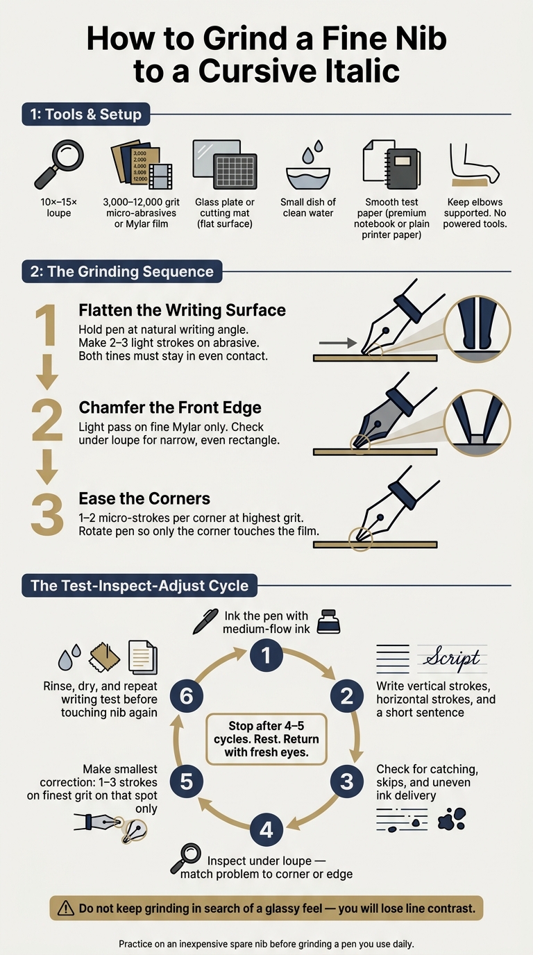
How to Grind a Fine Nib to a Cursive Italic: Step-by-Step Guide
A fine nib usually works better as a cursive italic than as a sharp italic. The reason is simple: rounded corners help cut down on catching while still leaving enough flatness to show line variation.
With a fine nib, the margin for error is small. So the grind needs to stay small, controlled, and checked often.
Tools, Abrasives, and Setup for Controlled Grinding
You’ll need a 10×–15× loupe, smooth test paper, a small dish of clean water for rinsing, and 3,000–12,000 grit micro-abrasives or Mylar film. Premium notebook paper or plain printer paper both work well for testing.
Set the abrasive on a flat surface, such as a glass plate or cutting mat. Sit down, support your elbows, and keep the pen far away from powered tools. Stick to fine abrasives only. A coarse pass can strip off too much tipping in no time.
Once everything is set, work in tiny passes and test after each change.
Shaping the Writing Surface, Front Edge, and Corners in Small Passes
Start with the writing surface, which is the underside of the tipping. Flatten it at your natural writing angle. Hold the pen the way you normally write, then make very short strokes on the abrasive. Use light pressure and make sure both tines stay in even contact.
A simple three-stroke pass works well:
- Make 2–3 light strokes
- Rinse the nib
- Dry it and test
When the writing surface shows a narrow, even rectangle under the loupe, lightly chamfer the front edge on fine Mylar. After that, ease each corner with just one or two micro-strokes at the highest grit. Rotate the pen so only the corner touches the film.
Use your normal grip the whole time. A fine italic makes angle mistakes obvious fast. Grind only for your natural writing angle.
Stop as soon as the nib writes cleanly. The test cycle tells you whether anything else needs work.
How to Test, Inspect, and Adjust Before Removing More Tipping
Stick to a set cycle and don’t rush it:
- Ink the pen with a well-behaved, medium-flow ink.
- Write vertical strokes, horizontal strokes, and a short sentence.
- Check for catching, skipped strokes, and uneven ink delivery.
- Look under the loupe to match the problem stroke with the corner or edge causing it.
- Make the smallest correction possible - 1–3 strokes on the finest grit - on that spot only.
- Rinse, dry, and repeat the writing test before touching the nib again.
Many experienced tuners suggest keeping a short log of each cycle. That makes it easier to spot patterns instead of guessing. It also helps you avoid the classic mistake of taking off a little more... and then a little more again.
Stop after 4–5 cycles and come back to the nib later with fresh eyes.
Practice on an inexpensive spare fine nib before you grind a pen you use all the time. You can find a variety of replacement fountain pen nibs to use for practice.
Balancing Edge Control, Smoothness, and Ink Flow
After grinding, the way a nib feels comes down to three things: edge sharpness, corner rounding, and steady ink flow. On a fine nib, that finish is especially touchy because there isn't much tipping left to shape.
How to Smooth a Fine Italic Without Losing Line Character
Once the grind is set, smoothing should do one job only: remove burrs. Use very fine abrasives, such as 8,000–12,000 grit micromesh or Mylar, plus a drop of water to cut friction. Hold the pen at your normal writing angle and make short strokes or small circles with almost no pressure. Then test it. Every pass matters.
On a fine nib, the tipping is so small that just a few extra passes can quietly turn a crisp italic into something much closer to a plain fine. Stop as soon as normal writing feels clean. If you keep going in search of a glassy feel, you'll rub away the line contrast that gives the grind its character.
Corner beveling works the same way. A tiny diagonal micro-stroke on each corner is enough to knock off the sharpest point. That's it. Test on curves and loops after each pass. If the nib moves through those shapes without snagging, but still lays down thinner horizontals than verticals, you're in the right spot.
How Grinding Changes Ink Flow and Paper Behavior
The same shape that changes line variation also changes how ink reaches the page. Start by checking tine alignment. Uneven tines can feel rough or cause skips, and on a fine nib those small errors show up fast. A flat italic surface can make vertical strokes feel a bit wetter because ink travels across a more even band. But if the grind tightens the slit or leaves the tines uneven, hard starts and skipping can show up just as fast.
After any adjustment, test the nib in actual writing. Check start-up, wetness, and strokes in every direction - left, right, up, and down - to make sure the new shape still supports steady flow.
Paper matters more here than it does with an unmodified fine. Smooth, fountain-pen-friendly paper lets the edge shape come through cleanly and cuts down on corner drag. Rough office copy paper, especially typical 20–24 lb multipurpose stock, pulls ink outward from the stroke edges and makes corner snagging more likely. The result is simple: the same nib can feel scratchier and less steady on cheap paper.
Comparison Table: Fine Cursive Italic vs. Fine Stub vs. Unmodified Fine
| Nib Type | Smoothness | Edge Control & Line Variation | Ink Flow Reliability | Daily Use |
|---|---|---|---|---|
| Fine Cursive Italic | Firm, slightly textured; noticeable feedback on rough paper | Strong thick-thin contrast; precise but angle-sensitive | Reliable when tines are aligned; drier feel, sensitive to rotation | Moderate; needs consistent angle and deliberate pace |
| Fine Stub | Smoother; more forgiving on common paper | Moderate variation; softer edges, less dramatic contrast | Robust; rounded geometry tolerates minor misalignment | High; handles quick notes and varied hand positions well |
| Unmodified Fine | Smoothest | Minimal variation; uniform strokes | Very reliable; consistent flow | Very high; ideal for fast jotting and everyday office use |
If you mostly write on rough office paper or tend to write fast, a fine stub or unmodified fine will usually fit daily use better. If you journal or letter at a slower pace on smoother paper, a fine cursive italic makes more sense. And if this still feels like too narrow a margin for error, a broader nib gives you more tipping and more room to shape.
When a Broader Nib Is the Better Choice
Cases Where Medium or Broad Nibs Are the Better Starting Point
If a fine nib doesn’t have enough tipping for the look you want, it’s usually smarter to begin with a wider nib. Put simply: when a fine nib feels cramped, go up a size.
A medium nib, usually around 0.6–0.75 mm, gives you more space to shape the grind cleanly. That extra tipping makes it easier to cut a wider flat edge and round the corners with less stress, while still keeping clear line variation.
A broad nib, usually 0.9 mm or more, gives you even more room to work. Broad nibs are safer to grind because there’s more tipping to shape, more space to smooth the corners, and less chance of grinding past the usable tipping. If you encounter performance problems during the process, many common nib issues can be resolved with simple tuning. The payoff is stronger contrast and more clearly shaped strokes, which works well for headings, cards, and larger, slower writing.
If you want to keep one pen set aside for italic grinding, Fountain Pen Revolution makes that pretty easy. Its lower-cost pens and interchangeable nibs let you keep one nib for italic work and another for everyday writing.
Decision Table and Key Takeaways
Use the table below to pick the lowest-risk starting size.
| Fine | Medium | Broad | |
|---|---|---|---|
| Target line variation | Subtle; best for small writing and planner entries | Clearly visible; good for journaling and note-taking | Strong; ideal for headings, cards, and decorative writing |
| Risk of over-grinding | High; small tipping, narrow margin for error | Moderate; more forgiving with room to adjust | Low; ample tipping allows shaping and correction |
| Best use cases | Compact notes, margin annotations, planners | Everyday journaling, general note-taking | Headings, invitations, cards, larger deliberate writing |
If you want a stronger italic with less risk, start with a medium nib. Go with a broad nib when you want the most visible contrast.
FAQs
Is a fine cursive italic worth it for everyday writing?
Yes - if you want handwriting with a bit more flair without giving up comfort. A fine cursive italic has slightly rounded corners, so you get clear line variation while the nib still feels smoother and easier to guide than a standard italic.
That makes it a solid pick for everyday writing, from quick notes to personal letters.
How do I know if I’ve ground away too much tipping?
Check your work often with a 10× loupe, and test the nib on paper as you go. Take it slow, especially when you're smoothing the tip or using coarse grits. Those can take off more material than you expect.
If the nib starts feeling overly scratchy, stops flowing, or no longer gives the line variation you were aiming for, you've probably removed too much tipping and damaged the tip.
What paper and ink work best with a fine italic nib?
Use high-quality, fountain pen-friendly paper to cut down on feathering and bleed-through. That matters because fine italic nibs often put more ink on the page than standard round nibs. For calligraphy or more formal work, high-quality parchment paper is a solid pick.
Choose an ink with steady flow. If you use metallic or specialty inks, flush your pen and cartridge on a regular basis to help prevent clogging.