

If I want proportional lettering, I use five guide lines: baseline, waistline, cap line, slant lines, and spacing lines. Together, they control where letters sit, how tall they are, how much they lean, and how far rows stay apart.
Here’s the short answer:
- Baseline: keeps letters sitting on the same level
- Waistline: sets the height of most lowercase letters
- Cap line: sets the top for capitals and ascenders
- Slant lines: keep the letter angle steady
- Spacing lines: keep rows from crowding each other
This matters because even small shifts in height or tilt can make a line look off. For many script styles, a slant of 20° to 30° is common, and heavier paper like 28 lb or 32 lb can help with fountain pen ink control.
If I’m practicing with a fountain pen, these lines give me a simple frame so I can focus on stroke control instead of guessing placement.
Quick comparison
| Guide line | What it controls | Why I use it |
|---|---|---|
| Baseline | Letter position | Stops letters from floating or sinking |
| Waistline | Lowercase body height | Keeps x-height even |
| Cap line | Capital and ascender height | Keeps tall letters level |
| Slant lines | Letter lean | Keeps the angle steady |
| Spacing lines | Distance between rows | Stops overlap and keeps text clear |
So, if I want lettering to look even and readable, I don’t rely on one line alone. I use the full set as one grid.
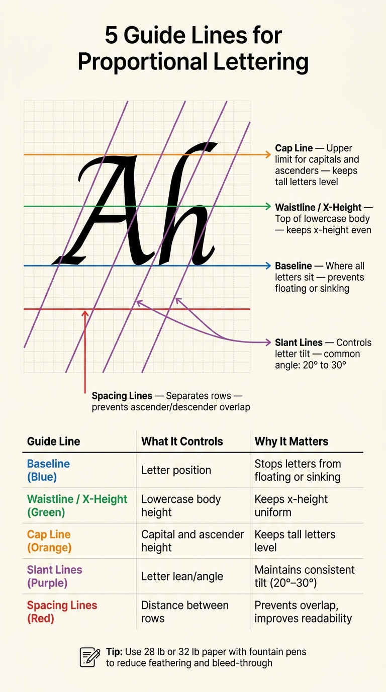
5 Guide Lines for Proportional Lettering: What Each One Does
How to make and use calligraphy guidelines for pointed pen calligraphy #calligraphy
sbb-itb-1dd4fe9
Baseline, Waistline, and Cap Line: The Three Core Height Guides
Start with three simple height guides: baseline, waistline, and cap line. These lines control letter height and help your writing keep the same proportions from start to finish.
Baseline: Where Letters Sit and Stay Aligned
The baseline is the line every letter sits on. If that line stays steady, your letters won’t drift up or dip down as you write. With repetition, your hand starts returning to that level on its own.
Waistline: The Top Boundary of Lowercase Letters
The waistline, also called the x-height, sits above the baseline. It marks the top of the main body of lowercase letters like a, e, n, and o. The space between the baseline and waistline is the x-height, and keeping that space steady makes lowercase letters look even across the whole line. It defines the body of the letter, while ascenders extend above it and descenders fall below it.
Cap Line: The Upper Limit for Capitals and Tall Letters
The cap line marks the top limit for capitals and ascenders. It keeps letters like A, B, H, and L at the same height, so the top of your writing looks even instead of rough or uneven.
| Guide Line | Role | Examples |
|---|---|---|
| Baseline | Foundation where all letters sit | All letters |
| Waistline | Top of the lowercase body (x-height) | a, c, e, m, n, o, r, s, u |
| Cap Line | Maximum height for tall characters | A, B, C; b, d, h, k, l |
Once height is set, slant and spacing lines shape the angle and white space.
Slant Lines and Spacing Lines: Controlling Angle and White Space
After height, the next things to lock in are angle and spacing. Slant lines and spacing lines help you control how letters lean and how much room each row gets.
Slant Lines: Keeping Letter Tilt Consistent
Slant lines are repeated diagonal guides that run across your practice sheet at a fixed angle. Their job is simple: keep each letter leaning the same way.
They matter most in styles like italic and Copperplate, where that lean is part of the look. If one letter tilts too far and the next one sits too straight, the line can feel uneven fast.
That kind of drift is easy to miss while you're writing. But when you step back and look at a full row, it jumps out. A slant angle of 20° to 30° is common for many script styles. So before you put pen to paper, make sure those diagonal guides are perfectly parallel.
Spacing Lines: Separating Rows and Protecting Readability
Spacing lines set the vertical distance between rows of text. They keep ascenders and descenders from crashing into the lines above or below.
When rows are too tight, things get messy fast. Wet ink can blur into the line below. Letters also lose breathing room, which makes the page harder to read.
Good spacing inside letters and between rows helps the whole piece stay clear. Together, these lines turn the page into a clean working grid.
How the Full Guideline Grid Supports Clean Letter Structure
When you use these guides together, they form a clear grid that controls height, angle, and spacing. That takes the guesswork out of the process, so you can put your attention on stroke quality instead of constantly checking where each letter should go. On a blank page, these lines give you a clean framework for lettering.
What Each Guide Line Does at a Glance
| Guide Line | Position on Page | Primary Function | Impact on Proportional Lettering |
|---|---|---|---|
| Baseline | Bottom of the letter body | Provides a horizontal level for all characters to sit on | Ensures all letters sit at the same level, preventing "floating" text |
| Waistline | Top of the x-height | Defines the upper boundary for lowercase letters | Keeps lowercase letters uniform in size and proportion |
| Cap Line | Upper boundary of the lettering area | Sets the upper limit for capitals and tall lowercase letters | Keeps capital letters and ascenders at a consistent height |
| Slant Line | Diagonal across the grid | Dictates the angle of the strokes | Maintains a consistent tilt across all letters on the page |
| Spacing Line | Between rows of text | Separates the descenders of one row from the ascenders of the next | Prevents ascenders and descenders from overlapping, maintaining readability |
Using Printed Practice Sheets with Fountain Pens
Once the grid makes sense, printed practice sheets help you use it the same way every time. They give you fixed boundaries for each part of a letter: height, angle, and row spacing. A good way to work is to start with single strokes, then move to words, until those proportions begin to feel natural.
Paper makes a big difference too. Printing your sheets on 28 lb or 32 lb paper - such as HP Premium 32 lb - can help cut down on feathering and bleed-through.
Conclusion: The Guide Lines That Make Proportional Lettering Work
Once the grid is in place, the last piece is seeing how the lines work as a set. Each guide line handles a different job: the baseline, the letter height, the slant, and the spacing.
That matters because proportional lettering doesn’t rely on just one guide at a time. It works when all of them work together. As a system, these guides help control height, angle, and spacing across the page.
For fountain pens, that setup makes clean lettering easier to build. Instead of getting in the way, the structure helps the writing stay steady and consistent.
FAQs
Which guideline should I focus on first?
Start with the baseline. It’s the line every letter sits on, so it sets the tone for the whole piece and keeps alignment steady.
Once that line feels set, add guides for x-height and for ascenders and descenders. Those extra marks help your letters stay in proportion instead of drifting taller, shorter, or uneven from one word to the next.
Get these basics down, and your lettering will look more polished and well-structured.
Do all lettering styles need slant lines?
No. Not all lettering styles need slant lines. Styles like Copperplate and Spencerian depend on a precise, steady slant. Other styles are vertical by design.
So it comes down to the look you want. Some lettering styles focus on straight, vertical alignment. Others depend on a consistent lean to look right.
How much space should I leave between rows?
Row spacing should match your nib size and letter height. A common rule of thumb is a 1:10 ratio between line weight and the x-height of lowercase letters.
For example, with 7 mm spacing, medium or broad nibs often look balanced. Broader nibs need more room so the writing doesn’t feel cramped, while finer nibs usually work well with tighter spacing.