

The short answer: if I want an inlay that looks good and doesn’t make a wooden fountain pen harder to use, I focus on contrast, workability, weight, and placement first.
A wooden fountain pen usually feels best around 0.5–1.0 oz. (14–28 g). That means inlay choice is not just about looks. Aluminum, resin, and veneer keep weight low. Brass, copper, and nickel silver add more mass. Stone, glass, and shell need more care because they can chip, crack, or wear faster in high-contact spots.
Before I cut anything, I keep these points in mind:
- Brass: warm gold look, heavy, best as narrow accents
- Copper: warm red-orange look, can darken and smear
- Aluminum: cool silver look, light, easy place to start
- Nickel silver: bright silver-white look, harder and heavy
- Colored resin: most color options, light, good for flush fills
- Crushed stone: natural texture, heavier, best in slim bands
- Crushed glass: bright sparkle, brittle, best away from threads
- Veneer and wood strips: low weight, soft wood-on-wood contrast
- Mother of pearl and shell: bold shimmer, brittle, best in low-wear spots
Best beginner picks: aluminum, colored resin, and veneer.
Materials that need more care: crushed glass, shell, and stone.
The Pen Technique I Spent 4 Years Perfecting
Quick Comparison
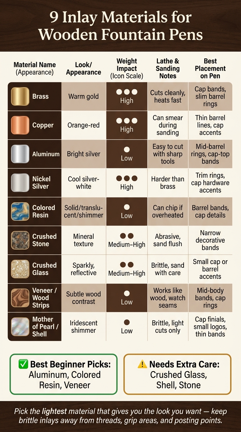
9 Inlay Materials for Wooden Fountain Pens: Quick Comparison Guide
| Material | Look | Weight | Work on the lathe | Best spots |
|---|---|---|---|---|
| Brass | Warm gold | High | Cuts cleanly, heats fast | Cap bands, slim barrel rings |
| Copper | Orange-red | High | Can smear during sanding | Thin barrel lines, cap accents |
| Aluminum | Bright silver | Low | Easy to cut with sharp tools | Mid-barrel rings, cap-top bands |
| Nickel silver | Cool silver-white | High | Harder than brass | Trim rings, cap hardware accents |
| Colored resin | Solid, translucent, or shimmer color | Low | Can chip if overheated | Barrel bands, cap details |
| Crushed stone | Mineral texture | Medium to high | Abrasive, sand flush | Narrow decorative bands |
| Crushed glass | Sparkly, reflective | Medium to high | Brittle, sand with care | Small cap or barrel accents |
| Veneer / wood strips | Subtle wood contrast | Low | Works like wood, watch seams | Mid-body bands, cap rings |
| Mother of pearl / shell | Iridescent shimmer | Low | Brittle, light cuts only | Cap finials, small logos, thin bands |
If I had to boil the whole topic down to one line, it would be this: pick the lightest material that gives you the look you want, and keep brittle inlays away from threads, grip areas, and posting points.
What To Think About Before Picking an Inlay Material
Before you pick a material, run it through four checks: contrast, workability, weight, and placement. That simple filter makes the list much easier to narrow down.
Wood Color and Grain Contrast
Decide early if you want the inlay to stand out or blend in.
On walnut, warm metals like brass and copper usually look right at home. Nickel silver or aluminum feel cooler and more modern. On maple, which is pale and often lightly figured, dark inlays like black resin or ebonized wood strips give you strong contrast. On ebonized or near-black wood, bright metals can look almost jewel-like, and mother of pearl has a nice glow against the dark surface.
Highly figured blanks like burls, spalted maple, and zebrawood already do a lot visually. In those cases, simpler and narrower inlays tend to work better. A thin metal ring or a translucent resin fill can frame the figure instead of fighting with it. A large solid inlay block on a burl blank often ends up looking cluttered.
Turning, Sanding, and Finishing Behavior
Different inlay materials behave very differently on the lathe, and that matters more than many people expect.
Metals cut cleanly with sharp tools, but they build heat fast. Slow the lathe down and take light passes so you don't discolor the wood or soften nearby glue lines. Also, polish metal with its own abrasive sequence. Wood-finishing grits won't take out fine scratches.
Resins can chip at the edges of a channel if your tools are even a little dull. A final pass with a sharp skew or scraper, followed by careful sanding with fresh abrasive, helps keep those edges crisp. Crushed stone and glass inlays are brittle, so heavy cuts are a bad idea. Bring them flush with progressive sanding instead. Veneer strips act more like wood, but cross-grain cuts can cause tear-out at the seams, so keep tools sharp and line the grain up with care.
Across all materials, a thin coat of CA glue or sanding sealer before the final grits can help steady the edges and cut down on smearing between the inlay and the surrounding wood.
Once a material cuts cleanly, move on to weight and placement.
Weight, Balance, and Pen Feel
Most wooden fountain pens feel best in the 0.5–1.0 oz (roughly 14–28 g) range. That range tends to feel right in the hand without making the pen too light or too heavy.
Light inlays like thin resin fills, veneer strips, and aluminum bands add almost nothing, which makes them a good fit for slim, delicate barrels. Heavier materials like brass and copper can shift the center of gravity in a noticeable way, especially on narrower designs. A heavy cap band can make a pen feel top-heavy when posted. A dense barrel inlay near the tail pushes the balance backward.
Weigh each component before final assembly. If the dry-assembled pen feels nose-heavy or tail-heavy, switch to a lighter inlay or make the channel narrower.
Placement Near Threads and Posting Areas
Placement can make or break the pen. Three areas need extra care: threads, grip transitions, and cap-post contact points.
Near cap or barrel threads, brittle inlays like stone, glass, and shell can crack when you cut the threads or when the cap gets tightened over and over. It's usually safer to place decorative inlays just above or below the threaded area and leave solid wood there to take the twisting force.
At grip transitions, even a small ridge or sharp inlay edge gets uncomfortable fast. Flush, tapered inlays that blend into the wood feel much better in use and are less likely to lift later.
At cap-post contact points, where the cap meets the end of the barrel again and again, tougher materials like metals and dense resin hold up better. Crushed glass or brittle stone are better kept away from that area.
Sketch the pen cross-section before you cut any channels. It's a simple step, but it helps you place the inlays without weakening the threads or posting points.
1. Brass
Brass is a practical, low-cost inlay that gives wooden fountain pens a warm metallic touch. It’s a solid starting point for builders who want clear contrast without a lot of prep.
Visual Effect
Brass adds a warm, golden accent that pops against darker woods like walnut, cocobolo, and ebony. On lighter woods like maple or ash, the contrast is softer.
A thin brass line can make straight grain look sharper. Small bands or simple motifs can give plain blanks a bit more life. In most cases, brass looks best as a narrow accent instead of a large block. On figured woods, it can outline the grain with a crisp, reflective edge.
One thing to plan for: brass darkens over time unless you seal it. So you’re choosing between a bright finish and a more aged look.
Workability on Wood Pen Blanks
Brass cuts cleanly, but it heats up fast. Keep your lathe speed on the lower side and take light passes.
When sanding, use a firm backing block behind the paper. That helps keep the brass and the wood level with each other instead of ending up with a slight dip or ridge.
Weight and Balance Impact
Brass is heavy. Even a small band can pull the balance forward.
Best Use on Barrel vs. Cap
Brass usually works better as a wider accent on the cap. On the barrel, keep inlays narrow and place them away from the threads.
If you load too much brass into the cap, a posted pen can start to feel back-weighted.
2. Copper
Copper is softer and easier to shape than brass, but it darkens sooner. It keeps that warm metal look, just with more of an orange-red cast instead of brass’s yellow-gold feel.
Visual Effect
Copper’s orange-red tone looks especially good next to dark and mid-tone woods like walnut, rosewood, and mahogany. When it’s polished, you get a sharp contrast that stands out fast.
Leave copper unsealed, though, and it will darken to brown over time. In humid conditions, it can also pick up a green patina. If you want to hold onto that bright polished look, seal it after final polishing with CA or lacquer.
Workability on Wood Pen Blanks
Copper can be a little fussy on pen blanks. It can smear during sanding, and those smears may stain lighter woods. That’s why it helps to use fresh abrasive, sand in stages, and clean the surface often as you go.
Masking tape along the inlay can help protect the wood around it. Go easy with sanding pressure too. Copper heats up fast, and once that happens, smearing gets much more likely.
For glue-up, slow-set epoxy or high-strength CA glue is a better fit than wood glue.
Weight and Balance Impact
Copper is heavier than wood and resin, but lighter than brass. In small amounts, like thin lines, dots, or narrow bands, the effect on balance is usually minor. In fact, that little bit of extra mass can make a pen feel steadier in your hand.
Go bigger with copper, though, and you’ll notice it. Wide inlays or thick rings can shift the balance in a more obvious way.
Best Use on Barrel vs. Cap
With pens, where you place copper matters just as much as how it looks. Thin copper lines or small decorative dots usually work well on the barrel without changing the feel too much.
For larger accents, the cap is often the better spot. That’s where the visual effect tends to hit hardest, especially when the pen is capped or posted. One more thing: keep copper out of threaded areas. Put it where the barrel or cap can handle the wear.
3. Aluminum
If brass and copper feel a bit too heavy, aluminum gives you that same metal contrast with much less mass. It’s the lightest metal inlay in this group, so it makes sense when you want metal detail without adding much weight.
Visual Effect
Aluminum gives you a clean, bright silver line that leans modern. Against dark woods like walnut, wenge, ebony, and rosewood, the contrast is sharp, so even a thin band looks crisp and exact. On lighter woods like maple or birch, the look is more subtle. Think of it as a soft shimmer instead of a bold stripe.
It also works well with cool-toned dyed blanks in blue, gray, or teal, along with blanks that use black resin segments.
Polished aluminum looks bright. Brushed aluminum feels softer and more muted. A light texture can also help hide wear, which makes aluminum a smart pick when you want a crisp accent without making the pen look visually heavy.
Workability on Wood Pen Blanks
Aluminum cuts cleanly when your tools are sharp, but dull cutters can smear the edge. Its dust can settle into open wood grain and leave gray streaks, so it helps to dry sand and clean the blank often between grits. After that, deburr the metal before finishing.
Before bonding, wipe the aluminum clean with isopropyl alcohol or acetone.
Weight and Balance Impact
Even fairly wide aluminum inlays have little effect on balance.
Best Use on Barrel vs. Cap
Aluminum is a good fit for lower-stress spots away from threads, such as:
- Mid-barrel rings
- Cap-top bands
- Segmented spacers
On pens made to be posted, using aluminum in the cap instead of a heavier metal can help keep the posted pen from feeling back-heavy.
4. Nickel Silver
Nickel silver, also called German silver, is a copper–nickel–zinc alloy with a silver-white color. Despite the name, it contains no actual silver. It sits in a nice middle ground between aluminum and brass: brighter and tougher than aluminum, but less warm in tone than brass. That mix makes it a smart pick for thin bands, logos, and trim.
Visual Effect
Nickel silver has a cool, pale tone. On dark woods, it creates sharp contrast. On light woods, it adds a quieter, more understated accent.
Workability on Wood Pen Blanks
Nickel silver is harder than brass, so it takes a bit more care at the lathe. Use sharp tools, keep the speed moderate, and make light passes. It also helps to roughen the metal before bonding it with epoxy. Save polishing for the end.
Weight and Balance Impact
Nickel silver is heavy - close to brass and much heavier than aluminum. Small inlays like dots, logos, and thin bands usually won’t change the feel much. But wider trim rings can add noticeable heft. In most cases, it works best as an accent rather than a large inlay section.
Best Use on Barrel vs. Cap
On the barrel, nickel silver works well as a narrow grip ring, a mid-barrel accent band, or a small logo plate. Those areas get handled all the time, so its wear resistance and easy re-polishing come in handy.
On the cap, it’s a natural fit for cap bands, finial rings, or clip bases. These spots take wear from posting, pocket carry, and desk contact, so the metal can help protect the wood edges. If the pen is meant to be posted, larger nickel silver parts are usually best placed toward the cap end to help keep the pen balanced when posted.
sbb-itb-1dd4fe9
5. Colored Resin
If you want color instead of metal, resin gives you the biggest range. Colored resin - whether epoxy, polyester, or urethane casting resin - can be tinted, swirled, layered, or mixed with mica powder to create accents that run from subtle to bold.
Visual Effect
The look can shift a lot depending on the resin and color choice. Opaque pigmented resins create solid, graphic bands that stand out against the wood grain. Translucent resins let light pass through, which gives the blank a glassy, wet depth. That look works especially well with highly figured woods like maple burl or spalted blanks. Pearlescent and mica-filled resins add a shimmer that feels a bit like celluloid.
Color pairing matters more than people think. On black walnut, turquoise or teal creates a cool, crisp contrast. On curly or birdseye maple, navy or deep burgundy feels classic and restrained. On cocobolo, a dark resin line can define the shape without competing with the figure. Bold color usually works best when it doesn't fight the grain or throw off the pen's visual balance.
That range only pays off if the resin turns cleanly and stays flush.
Workability on Wood Pen Blanks
Resin brings its own set of shop issues. The main ones are chip-out at the resin–wood boundary and heat buildup during cutting. On softer woods like maple or cherry, the wood can cut faster than the resin. When that happens, light shear scraping and moving to abrasives a bit earlier can help keep the surface even.
Full cure time also matters. Most resins need at least 24 hours before turning, and some need several days. In thin sections, a less brittle, slower-curing resin often machines more cleanly.
Weight and Balance Impact
Resin adds very little weight when it's used in small bands, logo fills, or narrow accent lines. Larger fills or hybrid sections can shift the balance a bit, especially when they sit closer to the rear of the barrel.
Best Use on Barrel vs. Cap
Placement matters just as much as color. On the barrel, keep resin flush in the grip area so the pen stays comfortable in hand. Narrow bands or subtle wave patterns set a little farther back can show off the design without changing how the pen feels at the fingertips.
On the cap, you have more room to go bold. The finial, clip anchor, and cap lip are good spots for more elaborate inlay work because they see less wear. If the pen is posted often, don't load too much resin at the very end of the cap. That can make the pen feel top-heavy. Spreading resin accents along the cap helps keep the balance more even.
6. Crushed Stone
After smooth resin, crushed stone brings in a more natural mineral texture. It can create strong contrast, but it also asks for a careful hand. Placement matters, and so does finishing. Common options include turquoise, malachite, lapis lazuli, jasper, and amethyst.
Visual Effect
Crushed stone has an organic, dimensional look. You get texture, depth, and uneven color shifts that feel less polished and more like raw material put to work.
It tends to look best against dark, understated woods such as walnut, ebony, rosewood, or dyed blanks. The darker background helps the stone stand out without much effort. On figured woods, the better move is to pick a stone color that supports the grain instead of fighting for attention. In most cases, that contrast looks best when the inlay stays narrow.
Workability on Wood Pen Blanks
Crushed stone is usually packed into a channel with epoxy or thin CA glue. One common approach is to rout or carve a shallow groove, place the largest chips first, then add smaller chips and powder to fill the gaps, and lock everything in with thin CA glue. Use accelerator lightly. Too much can lead to clouding or bubbles.
This is the part where patience pays off. Stone is hard and abrasive, so sanding can take time. The stone and the surrounding wood need to be leveled with care so the surface feels smooth and even. If you rush in with coarse grits, you can chip the inlay edges or dig into softer grain lines nearby.
Once the surface is level, switch to sharp tools and fine abrasives for the final cleanup. Softer stones in the 3–4 range on the Mohs scale are usually easier to shape and finish than harder minerals.
Weight and Balance Impact
Stone is heavier than wood, and it’s often heavier than resin-only inlays too. A thin accent band adds only a modest amount of mass, but larger stone sections can pull the balance toward the inlaid area.
That shift can change how the pen feels in the hand. Keeping the inlay narrow and placing it with care helps avoid a top-heavy feel.
Best Use on Barrel vs. Cap
Crushed stone usually works best as a narrow accent. A slim decorative band on the barrel, or a small accent ring near the cap lip or section transition, is often enough to make a strong visual impact without taking over the design.
On the cap, less is more. Too much stone adds weight and can make posting feel awkward. It’s also smart to keep stone away from threads and other wear points.
7. Crushed Glass
Crushed glass gives you the same inlay depth as stone, but it looks brighter and more reflective. Stone tends to feel earthy. Glass leans crisp and sparkly. On a finished wooden fountain pen, that means a clean, high-contrast accent that stands out fast.
Visual Effect
Fine glass chips, around 0–2 mm, create a smoother, tighter sparkle. Bigger pieces look more like a mosaic, with each chip throwing off its own reflection. Clear or mirrored glass can look a bit like cracked ice when you set it in transparent CA or epoxy.
Colored glass is bolder and more saturated. Cool shades like clear, aqua, or blue work nicely with warm woods such as walnut or cherry. Amber or gold can stand out against pale woods like maple or ash.
Workability on Wood Pen Blanks
Cut a shallow 0.06–0.12 in. channel first. Then seal the surrounding wood with sanding sealer or shellac so the CA doesn’t stain the surface. Fill the recess slightly proud with crushed glass and soak it with thin CA glue. After it cures fully, sand it flush.
Pre-tumbled decorative glass is the better pick here. It has softer edges, packs more evenly, and bonds more predictably than raw broken glass.
Go easy when sanding. Heavy cuts can pull chips loose. Start around 220–320 grit to reduce that risk. If pinholes show up, spot-fill them with thin CA and fine glass powder, then sand again.
Wear eye protection and a respirator. Glass dust can irritate your eyes and lungs.
Weight and Balance Impact
In narrow bands, crushed glass adds very little weight. Most people won’t notice much change from a thin ring. Wider inlay areas, especially ones built up with thicker epoxy fills, can add more noticeable heft.
Best Use on Barrel vs. Cap
Keep glass away from threads. It can chip thread surfaces more easily than resin or metal. On the cap, a band near the clip or cap top makes a strong visual statement without putting extra stress on high-contact spots. Use the bolder accent on the cap, and keep the barrel ring thin. Crushed glass works best as a bright accent rather than the main visual field.
8. Veneer and Wood Strips
Veneer and wood strips are the most understated inlay option. They add very little weight, pair easily with the base wood, and give you a natural contrast without a harsh visual break. If you want a softer transition, this is usually the best fit. The result is a quiet wood-on-wood contrast that brings out grain, figure, and color.
Visual Effect
The direction of the strip changes the whole look. Cross-grain rings create clean breaks between the grip, barrel, and finial, so they fit well with segmented or stacked designs. Long strips that run from one section to the finial can make the pen feel longer and slimmer, especially when dark strips frame a lighter center area. You can also make chevron and knot patterns with angled veneer inlays.
Species selection also plays a big role. Makers often use thin hardwood veneers, dyed veneers, and woods like maple burl, walnut, padauk, wenge, and zebrawood. Dyed veneer in black, red, or blue can add bold lines while still letting some wood texture show through. If the blank already has strong figure, it usually looks better to keep the pattern simple.
Workability on Wood Pen Blanks
Veneer is very thin, so prep matters even more than it does with solid inlay materials. Bonding surfaces should be flat and freshly sanded before gluing. Many makers use slow-set epoxy or a good PVA wood glue with even clamping pressure to prevent lift or joint failure. During turning, thin CA glue can be wicked into a fragile seam to help stabilize it. Sharp tools, light cuts, and a hard finish also help protect those thin edges.
Weight and Balance Impact
Veneer adds almost no weight. That makes it a smart choice when you want more visual detail without changing the pen’s balance.
Best Use on Barrel vs. Cap
Veneer works on both the barrel and the cap, but it should stay away from threaded areas and cap-contact points. On the barrel, decorative bands or segmented patterns around the mid-body are usually the safest spots. On the cap, accent rings near the finial or above the clip can give the pen a clean, finished look without adding extra stress.
If veneer sits near the barrel tail where a posted cap makes contact, a hard finish can help guard the edge from wear and chipping. In practice, veneer works best as a decorative accent, not for structural cuts.
9. Mother of Pearl and Shell
If veneer is subtle, mother of pearl and shell are the boldest choice here. Nothing else on this list creates as much contrast. As the light shifts, the iridescence can move from white to green, blue, pink, or cream. The result feels less like a plain wood pen and more like a piece of fine jewelry.
Visual Effect
On dark woods like walnut, ebony, or rosewood, even a small dot or thin band can pull the eye right away. On lighter woods like maple or ash, the shimmer feels more like a quiet accent than the main event. Abalone or paua usually pairs best with straight-grain woods, since busy shell patterns can clash with figured blanks. Simple motifs, like dots, bands, and small geometric shapes, tend to work best because they let the iridescence stand on its own.
That bright look only pays off when the shell is cut well and backed well.
Workability on Wood Pen Blanks
Shell is brittle, so it can chip or crack if you get rough with it. Most makers cut it with fine-tooth or jeweler's saws at low speed and with solid backing. Since shell is non-porous, epoxy or high-quality CA adhesive is a better pick than wood glue. It also helps to degrease and lightly scuff the bonding surface before gluing. On the lathe, sharp tools and very light cuts help prevent chipping or cracking. Shell dust can irritate the respiratory system, so dust extraction and a mask are recommended when cutting or sanding.
Weight and Balance Impact
In most pen inlays, shell adds very little weight. Larger panels or heavy banding on the cap can make the cap feel a bit heavier when posted. But with small dots, thin bands, or crushed-shell fills, the effect on balance is minimal.
Best Use on Barrel vs. Cap
Since shell is brittle, it makes sense to place it where it sees the least wear. The cap finial is a good spot for a shell dot or logo. Thin bands near the clip or around the cap body can echo luxury pen styling without getting in the way of grip or posting. On the barrel, mid-body panels set away from the grip zone give the shell space to show without taking constant finger contact. Avoid putting shell near threads, on sharp edges, or anywhere the cap posts with force. High-contact areas are a bad bet for shell because daily use can chip it.
Quick Comparison Table
Use this chart to compare look, weight, handling, and placement at a glance.
| Material | Appearance | Relative Weight Impact | Turning/Sanding Notes | Best Placement | Beginner-Friendliness |
|---|---|---|---|---|---|
| Brass | Warm gold tone with strong contrast against dark wood | High | Turns cleanly; polish it separately from the wood | Cap bands and barrel end rings | Intermediate |
| Copper | Orange-red tone that develops patina over time | High | Cuts cleanly but can smear more easily; use light passes | Accent bands and finial inlays | Intermediate |
| Aluminum | Cool silver tone with a modern look | Low | Cuts easily; can smear if tools are dull | Cap lip and mid-barrel bands | Beginner to intermediate |
| Nickel Silver | Silver-white tone with a refined shine | High | Harder than brass; use sharp tools and slow feeds | Trim rings, clip bases, section accents | Intermediate to advanced |
| Colored Resin | Wide color range - opaque, translucent, or shimmering | Low | Can chip if it overheats; use sharp cutters and fine passes | Grip sections and mid-barrel panels | Beginner |
| Crushed Stone | Speckled or mosaic effect in blues, greens, or earth tones | Medium to high | Abrasive on tools; use light cuts and sand in stages to a smooth finish | Decorative bands away from threads | Intermediate to advanced |
| Crushed Glass | Sparkling, light-reflective lines | Medium to high | Avoid aggressive cuts; sand slowly | Small accent grooves away from threads and posting areas | Advanced |
| Veneer and Wood Strips | Tone-on-tone or high-contrast bands depending on species | Low | Watch grain direction; make sure the bond is strong before mounting | Decorative bands and contrast rings | Beginner to intermediate |
| Mother of Pearl and Shell | Iridescent shifting colors - white, green, blue, or pink | Low | Hard and brittle; use minimal cutting and always wear respiratory protection | Small cap logos or accent bands away from wear points | Advanced |
Resin, veneer, and aluminum are the easiest places to start. Crushed glass and shell need the most care.
Conclusion
Once you compare looks, ease of use, weight, and placement, the choice comes down to one thing: how you want the pen to feel in your hand and wear over time. The best inlay isn’t always the flashiest one. It’s the one that matches the look you want, the weight you’re comfortable with, and the level of clean work you can pull off.
Let the blank lead the way. Pick contrast that supports the wood instead of stealing the whole show. Warm metals tend to pair well with warm-toned blanks, while cool metals and resin often suit lighter woods or blanks with heavy figure.
If this is your first build, keep it simple. Start with lower-mass materials like aluminum, resin, or veneer. If you want a richer look, go with brass, copper, or nickel silver. Save stone, glass, or shell for builds where you can slow down and pay close attention during shaping and finishing.
Weight matters just as much as appearance. Check the balance before you commit, and keep brittle materials away from threads and posting points. It also helps to test a few lower-cost pens first so you can get a feel for what weight and balance sit best in your hand.
Pick the material that suits your wood, your tools, and the way the pen will be used. Before you make the final call, test a few combinations on scrap blanks first.
FAQs
Which inlay material is best for beginners?
For beginners, brass and similar metals are a smart place to start. They hold up well, have a clean, polished look, and you can tailor them with different finishes.
How do I keep an inlay from affecting pen balance?
Keep the pen’s total weight in the 20 to 30 gram range. Also, arrange the materials so the balance point lands about 1 to 1.5 inches from the nib tip.
Here’s a simple way to check it: hold the pen horizontally at the grip, between your thumb and forefinger. If it feels uneven, your hand will often make up for it with extra muscle tension. Over time, that can lead to writing fatigue.
Where should I avoid placing brittle inlays?
Avoid brittle inlays in spots that take repeated stress, vibration, or flexing. That matters even more near caps or tight, threaded sections, where over-tightening can lead to stress cracks.
It’s also smart to skip delicate inlays on pens where the cap will be posted often. And during bonding or fitting, don’t force a misaligned fit or press unevenly. That kind of pressure can crack brittle materials fast.