

If I want my handwritten letters to look better, I don’t need antique gear or hard rules. I just need a clear format, a script that fits my pen, paper that handles ink well, and a steady practice routine. This guide boils historic letter writing down to a few usable parts: layout, tone, script, tools, and repetition.
I can take the main ideas from older U.S. letters and use them right now:
- Format the page with care: date, place, salutation, body, closing, and signature
- Match tone to the reader: formal for business, warmer for friends and family
- Pick the right script: Spencerian for flowing letters, Palmer for clear daily writing, Copperplate for names or short formal lines
- Use simple materials: 90–100 gsm paper, matching envelopes, and black, blue-black, or dark blue ink
- Practice in short sessions: 10–15 minutes for drills or 20–30 minutes once a week for full letters
One fact stood out to me: a 2024 study found that handwriting showed broader theta/alpha connectivity than typing. That fits what many pen users already feel on the page: when I slow down, I pay more attention to spacing, pressure, rhythm, and word choice.
Here’s the short version:
| Area | What I’d do |
|---|---|
| Letter layout | Write the full date, add a place if I want, then use a clear salutation, body, closing, and signature |
| Best script for most people | Spencerian or Palmer |
| Best ink colors | Black, blue-black, or dark blue |
| Best paper range | 90–100 gsm fountain-pen-friendly paper |
| Best practice plan | One era, one goal, one letter at a time |
The main point: keep it simple, keep it readable, and keep writing.
Historic Letter Formats and Social Etiquette
Standard Layout for a Historically Styled Letter
Older American letters usually follow a simple pattern: date, optional location, salutation, body, closing, signature, and sometimes a postscript. For modern U.S. writers, it helps to write the date in full, like September 20, 2026. Put it at the top right for personal letters or the top left for formal correspondence.
If you want the page to feel closer to the Civil War or Colonial period, add a location line above the salutation or pair it with the date. For example: Boston, Massachusetts or Camp near Richmond, Va., September 20, 1863. After the heading, leave one blank line, then start the salutation flush left. Leave another blank line before the body.
For the body itself, you have two solid options. You can indent each paragraph about 0.5 inches, or you can use block paragraphs with a blank line between them. Both look right on the page. The main thing is to keep the letter open and easy to read, not cramped. A postscript works best only when you have a real afterthought, not as part of the main message.
Etiquette Rules for Paper, Ink, and Tone
Paper and ink do more than change the look of a letter. They affect how the nib moves and how formal the page feels. Older guides leaned toward white or cream paper and pushed people away from red ink. Plain white or cream paper with some weight tends to work well because it helps prevent bleed-through and gives the handwriting a cleaner look. Black or blue-black ink also fits older practice and stays easy to read.
Tone matters just as much. In formal letters, write out words fully and keep grammar tight. Business-style letters often used closings like Yours faithfully or Respectfully yours. Letters to family or close friends sounded warmer, with openings and endings such as My dearest Mother, Ever yours, or Your affectionate son.
The trick is simple: match the salutation and closing to the person you’re writing to. That small choice does a lot of the work in making the letter feel right for the period.
Format Rules Across Major Eras: A Side-by-Side Look
| Era | Date Placement | Location Line | Salutation Style | Paragraph Style | Closing Convention |
|---|---|---|---|---|---|
| Colonial | Top left or integrated with location | Often combined with the date | Sir, Madam, Honored Sir | Long paragraphs, fewer breaks | Your obedient servant, Your humble servant |
| Victorian | At the top, often with the location | Usually paired with the date | My dear Sir, My dearest Friend, Dear Mrs. [Name] | Indented paragraphs, clearer breaks | Yours sincerely, Yours very truly, With best regards |
| Civil War-era | Upper right, often with precise location | Location and date on the same line | Dear Wife, My dear Brother | Practical, shorter paragraphs | Your loving son, Your obedient servant, Yours truly |
| Modern historic-inspired | Upper right for personal letters or upper left for block style | Optional city and state | Dear [Name], My dear Friend, kinship titles as preferred | Block or indented paragraphs, blank line between | Yours sincerely, Your affectionate friend, Respectfully yours |
A Civil War-era layout is one of the easiest styles to borrow because the location-and-date heading gives the letter a strong sense of place and time. Victorian forms, by contrast, lean more ornate in the salutation and usually look a bit neater in paragraph spacing. Once you settle on a layout, the next move is to pair it with a script that fits your nib and writing speed. For more on technique, see our guide to handwriting with fountain pens.
sbb-itb-1dd4fe9
How To: 19th Century Letter Etiquette and Penmanship
Handwriting Styles That Work Well With Fountain Pens
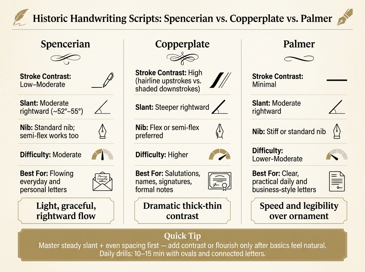
Historic Handwriting Scripts Compared: Spencerian vs. Copperplate vs. Palmer
Spencerian, Copperplate, and Palmer: A Plain-Language Overview
Once your page layout is set, the next step is picking a script that fits both the tone of the letter and the pen in your hand. For American correspondence, three historic styles come up again and again: Spencerian, Copperplate, and Palmer.
Spencerian is light, flowing, and slants to the right at about 52°–55°. It has grace without feeling stiff, which makes it a good fit for personal letters. Copperplate is much more formal. It uses thin hairline upstrokes and dark shaded downstrokes, so the contrast is part of the look. That makes it a natural choice for invitations, certificates, and high-status letters, but not usually for an everyday note. Palmer Method took Spencerian and pared it down into a faster business hand. It puts speed and legibility ahead of ornament.
In practice, Copperplate often works best in small doses. A salutation, a name, or a signature can look striking in that style. Writing an entire letter that way, though, can slow you down fast.
How Nib Choice and Posture Shape Your Script
A fine or medium nib suits Spencerian and Palmer well. Those styles depend more on steady shape, slant, and movement than on heavy contrast between thick and thin lines. If you want Copperplate-style shading, a semi-flex or full flex nib gives you the line variation you need on downstrokes. Keep the pressure light. Push too hard, and you can damage a flex nib.
Posture matters more than many people expect. Sit upright with your forearm resting on the desk, then tilt the paper 30°–45° - left tilt for right-handers, right tilt for left-handers. Hold the pen in a relaxed tripod grip, about 1–1.5 inches from the tip, and try to move from your arm instead of only from your fingers. Spencerian and Palmer both respond well to this whole-arm motion. Over a full page, writing that way usually looks more even and feels less tiring. (Fountain Pen Revolution offers affordable pens, nibs, ink, stands, and cases for experimenting with script and nib feel.)
Once your hand position feels steady, paper and ink start to matter just as much.
Comparing Historic Scripts for Daily Practice
Use the chart below to match a script to your pen and writing pace.
| Script | Stroke Contrast | Slant | Nib Needs | Difficulty | Best Use in Correspondence |
|---|---|---|---|---|---|
| Spencerian | Low–moderate | Moderate rightward (~52°–55°) | Standard nib; semi-flex works too | Moderate | Flowing everyday and personal letters |
| Copperplate | High (hairline vs. shaded) | Steeper rightward | Flex or semi-flex preferred | Higher | Salutations, names, signatures, formal notes |
| Palmer | Minimal | Moderate rightward | Stiff or standard nib | Lower–moderate | Clear, practical daily and business-style letters |
One of the most common beginner errors with Copperplate is trying to force heavy shading into every downstroke. That can lead to ink pooling or broken shading, and it can put stress on softer nibs. Spencerian has its own trap: ornate capitals. They look tempting, but too much flourish can drag down your pace and make the writing harder to read.
A better path is to lock in the basics first:
- steady slant
- even spacing
- clean letterforms
After that, add contrast or decoration only when those habits start to feel easy. A short daily session - 10–15 minutes with ovals and connected letters - does more good than jumping straight into full pages of text.
Paper, Ink, and Tools for Recreating the Historic Letter Experience
Choosing Paper and Ink for Historic-Style Letters
Once you've picked a script, paper and ink do a lot of the heavy lifting. They shape how the page looks, how the pen moves, and how close the finished letter feels to an older piece of correspondence.
Historic letters were often written on rag paper made from linen and cotton fibers, which held liquid inks well. You don’t have to hunt down antique paper to get close, though. Modern fountain-pen-friendly paper in the 90–100 gsm range usually works well with wetter inks and broader nibs without much feathering or bleed-through.
Cream paper often feels warmer and more in step with late 19th- or early 20th-century letters. It softens the contrast between page and ink, which tends to flatter black and dark blue inks. White paper gives a cleaner, more formal look, and it makes blue-black ink appear crisp and exact. After that, it helps to keep the rest of the setup simple: one pen, one paper, and envelopes that match.
For ink, start with black, blue-black, or dark blue. Those shades come closest to old iron-gall inks, which laid down dark blue or blue-black lines and deepened over time. High-shading or shimmering inks can look nice, but they usually don’t feel as period-true. They can also be a bit fussier in day-to-day use.
Before you buy a full pack of stationery, test a few sheets with your pen and ink. Write a short paragraph, then check:
- smoothness
- drying time
- line crispness
- show-through on the back
The same ink can look clean on one sheet and muddy on another. A quick test first can save both money and annoyance.
Building a Simple Correspondence Kit
A good kit is one you’ll keep using, not one that sits in a drawer. Start small:
- one dependable fountain pen with a fine or medium nib
- one bottle of dark ink, such as blue-black or dark blue
- one paper stock made for fountain pens
- matching envelopes
- a small storage case to keep it all together
Match the paper and envelopes, and test the envelopes before buying in bulk. A wax seal can add some period style, but for everyday mailing, a gummed flap is the easier pick. Fountain Pen Revolution sells low-cost pens, nibs, ink, pen stands, and cases, which makes it a handy place to put together a starter kit. Keep everything ready to go so writing a letter feels easy, not like a whole production.
Turning Historic Correspondence Into a Regular Writing Project
Lesson and Workshop Ideas for History-Based Writing
Once the layout, script, and materials are ready, put them to work in short exercises that build page control, steady lines, and range in tone.
One of the most useful drills is a rewrite in modern language. Take a historic letter and translate it into present-day English while keeping the same message. Or flip it around: turn a casual email into a formal letter with the usual date line, salutation, body, closing, and signature. It sounds simple, but it pushes writers to think about structure and tone at the same time.
Another strong exercise is the historical character letter. Writers pick a person or role, such as a Civil War soldier or a railway pioneer, note the date, setting, and audience, and then write a fictional letter in a period-appropriate voice to a family member, employer, or other relevant recipient. That small shift in perspective can change everything. Suddenly, word choice, pace, and even sentence shape start to matter more.
A more structured version uses two letters built around one historical event: one before it and one after it. Each letter should include weather, food, and emotional state. That detail gives the writing texture and helps writers think more carefully about era, audience, and purpose.
A Simple Weekly or Monthly Letter Routine
For steady practice, keep the plan small: pick one era, one goal, and one letter, then save each finished page.
A weekly session of 20 to 30 minutes works well. If you prefer slower, cleaner pages, a monthly rhythm can work too. The main thing is consistency, not volume. A short session done every week beats a burst of effort that disappears after a month.
It also helps to pair the era with one handwriting goal. For example:
- steadier baselines in Spencerian
- even margins in Palmer
Over time, a dated folder of finished letters becomes a plain record of progress. You can see gains in legibility, spacing, and tone on the page, which is often more motivating than trying to judge improvement from memory.
Conclusion: Keep the Format Simple and the Practice Consistent
Keep the practice simple and repeatable. Historic letter writing works best when it becomes a regular habit. Choose one historical model, follow a clear page layout, use a legible script, and work with materials your fountain pen handles well.
Keep the format simple. What matters is writing on a regular basis and letting the practice build page by page.
FAQs
Which script should I start with?
Start with the script that fits your goals, but put consistency first. Print works well for clear, everyday writing. Cursive feels smoother and more rhythmic on the page.
If you're just starting out, begin with simple stroke drills like parallel lines and ovals before moving on to letterforms. In the long run, regular practice matters more than the script you pick.
Can I use regular stationery paper?
It’s usually best to skip regular stationery or standard copy paper when you’re using a fountain pen. Most of it just doesn’t deal with liquid ink very well.
Lower-grade paper can lead to feathering, bleed-through, or ink pooling. If you want cleaner writing, go with fountain-pen-friendly paper - ideally 80 gsm or more - so your lines stay crisp and your letters look neat.
How do I make a letter feel historically accurate?
Focus on materials and technique. Use black ink on sturdy cream or white paper. Fading ink was seen as disrespectful, so the paper and ink should look clean and lasting.
A flexible-nib fountain pen can help you copy the thick and thin strokes found in classical scripts. As you write, aim for a smooth, steady flow and hold the nib at a 45-degree angle.
For a period touch, seal envelopes with red wax. Skip black wax, since it was traditionally used for mourning.