
You can get clean fountain pen gradients with just four things: wetter nibs, low-absorbency paper, controlled water, and notes you can repeat. In most cases, the result comes down to ink flow and timing: use a medium, broad, stub, italic, or flex nib, work on papers like Tomoe River, Clairefontaine, or Rhodia, and blend while the ink is still wet.
Here’s the short version:
- Single-ink gradients work best when I start with a light wash and add full-strength ink for the dark end.
- Two-color gradients are easier to control on paper than inside a converter.
- Shading inks are the simplest place to start.
- Sheen inks need more ink on the page and smooth paper.
- Shimmer inks need more cleaning because particles settle and build up.
- Dual-shading inks show the second color best with broad or stub nibs.
- If blends turn muddy, I adjust the mix by 2 drops at a time.
- If edges go hard, I add the next layer while the surface is still damp.
- If paper feathers, I switch to a less absorbent sheet.
- For repeat results, I log ink names, nib size, drop count, and paper after each test.
A few useful facts stand out. JetPens notes that lighter inks tend to shade more than darker, highly saturated inks. Goldspot points out that shading shows best when the nib puts down a generous amount of ink. And for paper, the article ranks Tomoe River as the top pick for strong shading and sheen because it keeps ink near the surface longer.
Quick comparison
| Area | Best choice | Main issue to watch |
|---|---|---|
| Nib | Medium, broad, stub, italic, flex | Too much ink can flatten the effect |
| Paper | Tomoe River, Clairefontaine, Rhodia, Cosmo Air Light, Iroful | Absorbent paper kills shading |
| Easiest method | Single-ink wash + layering | Oversaturating the page |
| Best blend control | On-paper blending | Hard edges if ink dries too soon |
| Lowest cleanup | Shading inks | Less dramatic surface effects |
| Highest cleanup | Shimmer inks | Particle buildup in feed and nib |
Bottom line: if I want gradients that look clean instead of muddy, I focus less on fancy gear and more on wet timing, paper choice, and small test changes.
sbb-itb-1dd4fe9
Tools, Inks, and Paper to Prepare Before You Start
Before you mix even one drop of ink, set up your workspace. It saves hassle later and gives you more control once you start.
Keep a protected work surface, paper towels, a small cup of clean water, a pipette or dropper for exact transfers, and a brush nearby if you want to blend on paper. To get started, you only need a converter, pipette, water cup, and brush. For pens, converters, piston fillers, and eyedropper-filled pens all work well because they hold enough ink for smooth transitions. That matters because the next steps depend on steady ink flow and paper that keeps the ink sitting on the surface instead of soaking in too fast.
Which Nibs and Ink Types Show Gradients Best
Nib size has a big effect on how much gradient you’ll see. As Goldspot Pens puts it:
"To show fountain pen shading, the nib needs to lay down a generous amount of ink."
Medium, broad, stub, italic, and flex nibs usually put down enough ink for shading you can actually notice. The point isn’t just a wetter line. You also want enough ink to stay visible on the page long enough to produce a controlled fade.
Different ink types behave in different ways:
- Shading inks create light-to-dark shifts
- Sheening inks add surface color shifts
- Shimmer inks add sparkle from suspended particles
One thing to watch: an overly wet flex nib can dump too much ink onto the page and flatten the effect.
Paper That Shows Shading Without Feathering
Paper can make or break a gradient. If the sheet is absorbent, the ink gets pulled into the fibers right away. The result is a flat, even color with very little tonal change. Absorbent copy paper flattens shading and sheen, and does not allow the color to pool in the stroke to create shading. Low-absorbency paper gives you more time to layer, blend, and keep your edges clean.
Smooth, fountain-pen-friendly papers tend to perform best. Rhodia shows more shading; Clairefontaine shows more; Tomoe River shows the most, which makes it one of the best picks for extreme shading and sheen because of its low absorbency. Cosmo Air Light and SAKAE TP Iroful are also strong options, especially for dual-shading and sheen effects.
Test on a scrap sheet first. A quick swatch tells you a lot: dry time, how much sheen appears, and whether the edges stay crisp or start to feather. With the right nib and paper picked out, the next section walks through how to build gradients step by step.
Step-by-Step Methods for Creating Gradients
Now it’s time to put those tools to work. Start simple with one ink, then move into two-color blends and brush work.
Single-Ink Light-to-Dark Gradients with Water and Layering
If your swatch test came out clean, begin with a single-ink gradient. Mix a pale wash in a small palette, then keep full-strength ink ready for the dark end. Work from light to dark, and watch the paper closely so it doesn’t get oversaturated. A broad nib or a brush usually works best because it lays down enough ink to show pooling and shifts in value.
"Light-colored inks tend to have more shading than dark inks. Vivid, highly saturated inks usually don't shade." - JetPens
Once you can control a single ink, you’re ready to try two-color blends.
Two-Color Gradients in Converters and on Paper
Two-color gradients need a little more setup, but they can look striking. If you want to blend inside a converter, stick with compatible inks and flush the pen completely before refilling. This is a key part of fountain pen maintenance when experimenting with different ink types. As you write, the colors can shift bit by bit.
Blending on paper gives you more control and keeps cleanup simpler. Put down a stroke with Ink A on low-absorbency paper, then place Ink B at the other end while the first color is still wet. Use a slightly damp brush to pull each color inward until they meet. If either side starts to dry, the blend will form a hard edge instead of a smooth fade.
| Blending Method | Control | Repeatability | Appearance | Pen Maintenance |
|---|---|---|---|---|
| In-Converter Mixing | Low | Difficult | Gradual transition while writing | High; requires a thorough flush between inks |
| On-Paper Blending | High | Moderate | Soft blended edges | Low; standard cleaning |
Use the brush method when the pen alone can’t give you the soft transition you want.
Brush-Assisted Blends for Lettering and Simple Ink Art
This approach works best for large capital letters, block lettering, and broad calligraphy strokes. In short, it helps when there’s enough wet ink on the page to move around. Lay down Ink A with your pen or brush across the full stroke. While it’s still wet, take a slightly damp brush and pull the color outward from one edge. Then place Ink B at the other end and drag it toward the center until both colors meet.
Keep the brush barely damp. You want it to move ink, not flood the page. Too much water thins both colors and can cause feathering, especially on paper with even a little absorbency. A fine-tipped brush helps with tighter letterforms, and larger shapes are easier when you’re just getting started.
Using Specialty Inks for Stronger Gradient Effects
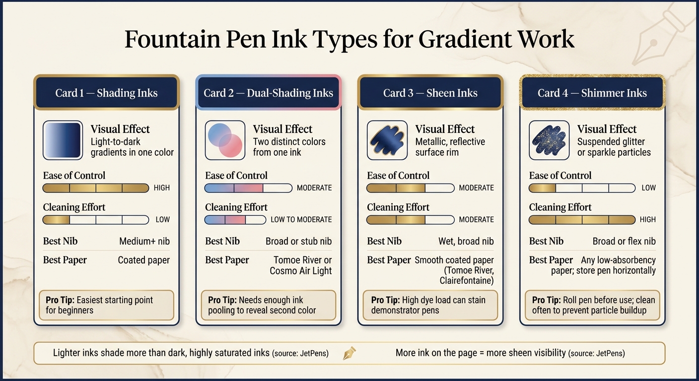
Fountain Pen Ink Types for Gradients: Visual Effect, Control & Cleanup
Specialty inks can change the look of a gradient in a big way. But they’re not plug-and-play. Each type asks for its own setup, from ink flow and paper choice to how often you clean the pen.
How to Get More from Shading, Sheen, and Shimmer Inks
Shading inks usually look best with a medium flow or a pen that runs a bit dry. Move a little more slowly so ink collects at the start and end of strokes, and where lines cross.
"Shading is the contrast of ink saturations that pool within handwritten letters." - Goldspot Pens
Sheen inks work the other way. That metallic edge on a dried stroke comes from a high dye load sitting on the paper surface. To show it off, use a wetter pen and smooth, fountain-pen-friendly paper such as Tomoe River or Clairefontaine.
"More ink on the page tends to contribute to higher amounts of sheen. If you want your inks to sheen as much as possible, use a wetter pen." - JetPens
Keep blotting paper close by. That surface layer can smudge easily. Highly saturated sheening inks can also stain light-colored demonstrator pens if they sit in the pen for too long.
Shimmer inks need to be mixed before use. Gently roll the pen between your palms to spread the mica particles back through the ink, and store shimmer-filled pens horizontally. If the flow starts to fade during a writing session, advance the converter a bit to move fresh ink forward. Clean the pen often so particles don’t build up.
Dual-shading inks show a second color where ink pools. To make that shift show up, you need enough ink on the page. A broad or stub nib on low-absorbency paper usually gives the best shot.
Use the table below to match each ink type with the right nib and paper.
Choosing Affordable Pens and Nibs for Practice
Specialty inks get better with practice, so it helps to keep a pen just for this kind of work - something you don’t mind flushing often. Fountain Pen Revolution sells budget-friendly pens with interchangeable nibs, including broad and ultra-flex options, that fit the heavier flow many specialty inks need. A second pen filled with shimmer or sheen ink also makes testing easier without messing with your daily writer.
Specialty Ink Comparison for Gradient Work
Each ink type gives you a different mix of visual payoff, control, and cleanup.
| Ink Type | Visual Effect | Ease of Control | Cleaning Effort | Best Nib & Paper Pairing |
|---|---|---|---|---|
| Shading | Light-to-dark gradients in one color | High | Low | Medium+ nib; coated paper |
| Dual-Shading | Two distinct colors from one ink | Moderate | Low to moderate | Broad or stub nib; Tomoe River or Cosmo Air |
| Sheen | Metallic, reflective surface rim | Moderate | Moderate (high dye load) | Wet, broad nib; smooth coated paper |
| Shimmer | Suspended glitter or sparkle | Low (particles settle) | High (particle buildup) | Broad or flex nib; horizontal storage required |
Once you can control each ink type, the next challenge is fixing muddy color, hard edges, and feathering.
Troubleshooting and Conclusion
Fixing Muddy Colors, Hard Edges, and Feathering
If a test blend looks flat, blooms too much, or dries with a hard edge, the fix is often pretty simple.
Muddy blends usually happen when one ink is much stronger than the other. Start with a 1:1 mix, then adjust by two drops at a time until the transition looks cleaner. First, get the saturation level close. After that, tweak the hue.
Hard edges tend to show up when the paper is too dry before the next layer goes down. Add that next layer while the surface is still damp, and the edge should soften. If the issue is feathering, switch to a less absorbent paper.
Small changes help here. Change one variable per test so you can tell what made the difference. And for cleaner results, use one jar for rinsing and one for clean water.
"By saturating an area of heavy rough textured watercolour paper... and then adding a drop of ink into the wetted area, the ink blends with the water and reduces in concentration as it spreads away from the point of entry." - Nick Stewart, Artist and Tutor
Key Steps for Repeatable Gradient Results
When a blend works, write the formula down right away. That one step makes it much easier to get the same gradient again later.
For each successful blend, log:
- Ink names
- Nib size
- Drop count
- Paper
It also helps to use dropper bottles. They make the drops more even, which makes your notes easier to trust when you come back to the mix later.
"Because I mix inks so often, it's easier for me to have individual droppers for each color. Plus the droppers allow for more uniform drops which allow me to document my mixes for future reference." - Thien-Kim Lam
After each session, flush heavily sheening and shimmer inks well. Sheening inks usually need more flushing than standard dye-based inks. Store shimmer pens on their side, and expect some glitter to stick around even after cleaning.
FAQs
What’s the easiest gradient method for beginners?
The most beginner-friendly place to start is ink shading.
Use a broader nib and write with slow, deliberate strokes. That gives the ink a little time to pool on the page, which lets it shift from light to dark within a single stroke.
This tends to work best on smooth paper, where the gradient shows up more clearly. You can also push the effect a bit with a wetter pen or heavier ink flow, but start gently so you don’t end up with smudges.
Can I create gradients with fine nibs?
Yes, but fine nibs usually work less well because they put down less ink. That gives you less tonal range and more even, uniform lines.
You can still make gradient effects with methods like wet-on-wet chromatography or by diluting inks for lighter shades. For the best results, broader nibs or glass dip pens usually work better.
How do I keep fountain pen ink blends from turning muddy?
To keep ink blends from turning muddy, stick with inks from the same brand or product line. They’re more likely to play nicely together. It also helps to skip mixing pigment-based, shimmer, or permanent inks with standard dye-based inks.
Before you commit, test a small batch in a vial. Then let it sit for at least 24 hours and watch for cloudiness or floating particles. Use precise measurements and write down your ratios so you can get the same bright result again later.