

If you want better line control, start with nib history. I can trace most modern dip nib choices back to three stages: quills, early metal points, and machine-made steel nibs.
Here’s the short version:
- Quills gave writers soft flex and a built-in ink space, but they wore down fast.
- Early metal nibs lasted longer, but many felt stiff and uneven on paper.
- Steel nibs in the 1800s changed writing by making nibs cheaper, more consistent, and easier to match to specific scripts.
- Modern dip nibs still follow those older shapes: pointed flex for pressure-based scripts, broad-edge for angle-based scripts, and stub nibs for smoother everyday writing.
A few facts stand out:
- Metal writing points date back to at least 79 AD.
- In 1822, John Mitchell began large-scale steel nib production in Birmingham.
- By 1842, Joseph Gillott’s factory was making more than 70 million nibs per year.
- In the U.S., Richard Esterbrook opened a major steel pen factory in 1858.
If I strip the topic down to what matters for you today, it comes to this:
- Soft nib feel comes from design choices that tried to bring back quill-like flex.
- Nib parts like the slit, vent hole, tines, and shoulders change ink flow and spring.
- Vintage nib testing starts with the slit, rust, coating, and tine snap-back.
- Script match matters: pointed flex for Copperplate and Spencerian, broad-edge for Italic and Blackletter, stub for cursive and note-taking.
- Setup matters too: use a flex fountain pen or the right holder, dip only to the vent hole, and dry steel nibs well after use.
The Fascinating World of the Dip Pen
sbb-itb-1dd4fe9
Quick Comparison
| Stage | Main Material | Feel on Paper | Main Tradeoff | Best Known Use |
|---|---|---|---|---|
| Quill | Feather | Soft, flexible | Wears down fast | Early writing and formal hands |
| Early metal point | Bronze, copper, silver, iron | Firm, often scratchy | Less flex, uneven flow | Longer-lasting writing point |
| Steel nib | Sheet steel | Range from firm to flexible | Can rust; each shape behaves differently | Mass-use writing, calligraphy, drawing |
| Modern specialty nib | Modern steel and alloys | Built for specific styles | Must match nib to task | Calligraphy, manga, illustration |
So when I look at dip pen nib history, I don’t just see old tools. I see why one nib feels soft, another feels rigid, and why the right nib shape and size can make a script much easier to write.
How Early Dip Nibs Worked: Quills and Pre-Industrial Metal Points
Quill Pens: Writing Qualities and What They Offered
Quills ruled Western writing for nearly 1,000 years because they were flexible, simple to shape, and easy to find.
The way they worked was pretty clever. A quill held ink inside the hollow feather shaft, called the calamus, which served as a natural reservoir. Ink moved from the calamus through a cut slit by capillary action. If the tip was cut into a broad chisel shape, line width changed based on the direction of the stroke. If it had a pointed cut, the tines could spread under pressure, giving thicker downstrokes.
Goose feathers were the usual choice, while crow feathers were better for finer detail. The tradeoff was wear. Quills dulled fast and had to be retrimmed often with a penknife to keep a sharp edge. After enough use, a quill became too short to hold and was thrown away.
If you want that quill-like feel now, look for flex nibs rated moderate flex or soft. That bit of give feels much closer to a bird feather than a stiff nib.
Early Metal Nibs Before Standardized Steel Production
Metal points fixed the wear problem, but they didn’t match the flex of quills. Metal writing points existed by at least 79 AD. Over time, bronze, copper, silver, and wrought iron versions appeared, but they stayed rare and expensive because each one had to be made by hand by a skilled artisan.
In use, they were rigid, scratchy, and missing the springy response people were used to with feather quills. Many early metal points also had no slit at all. That made ink flow unevenly or splatter, since the pen had to rely on surface tension alone instead of a built-in reservoir. In plain terms, you got less writing time between dips and less control on the page.
Even with those flaws, early metal points had one clear edge: durability. A copper or bronze nib kept its edge much longer than a feather and didn’t need constant retrimming. That set the stage for the industrial jump to steel nibs in the 1800s. These limits made room for machine-made steel nibs in the 1800s.
| Feature | Quill Pen | Early Metal Point (Pre-1800s) |
|---|---|---|
| Material | Goose or crow feather | Copper, bronze, silver, or wrought iron |
| Flexibility | High - natural elasticity | Low - rigid and often scratchy |
| Ink Storage | Hollow calamus shaft | Reliance on surface tension alone |
| Line Variation | Directional (broad) or pressure-based (pointed) | Directional; little pressure variation |
| Maintenance | Frequent trimming with a penknife | Cleaning and rust prevention |
How Industrial Steel Nibs Changed Writing in the 1800s
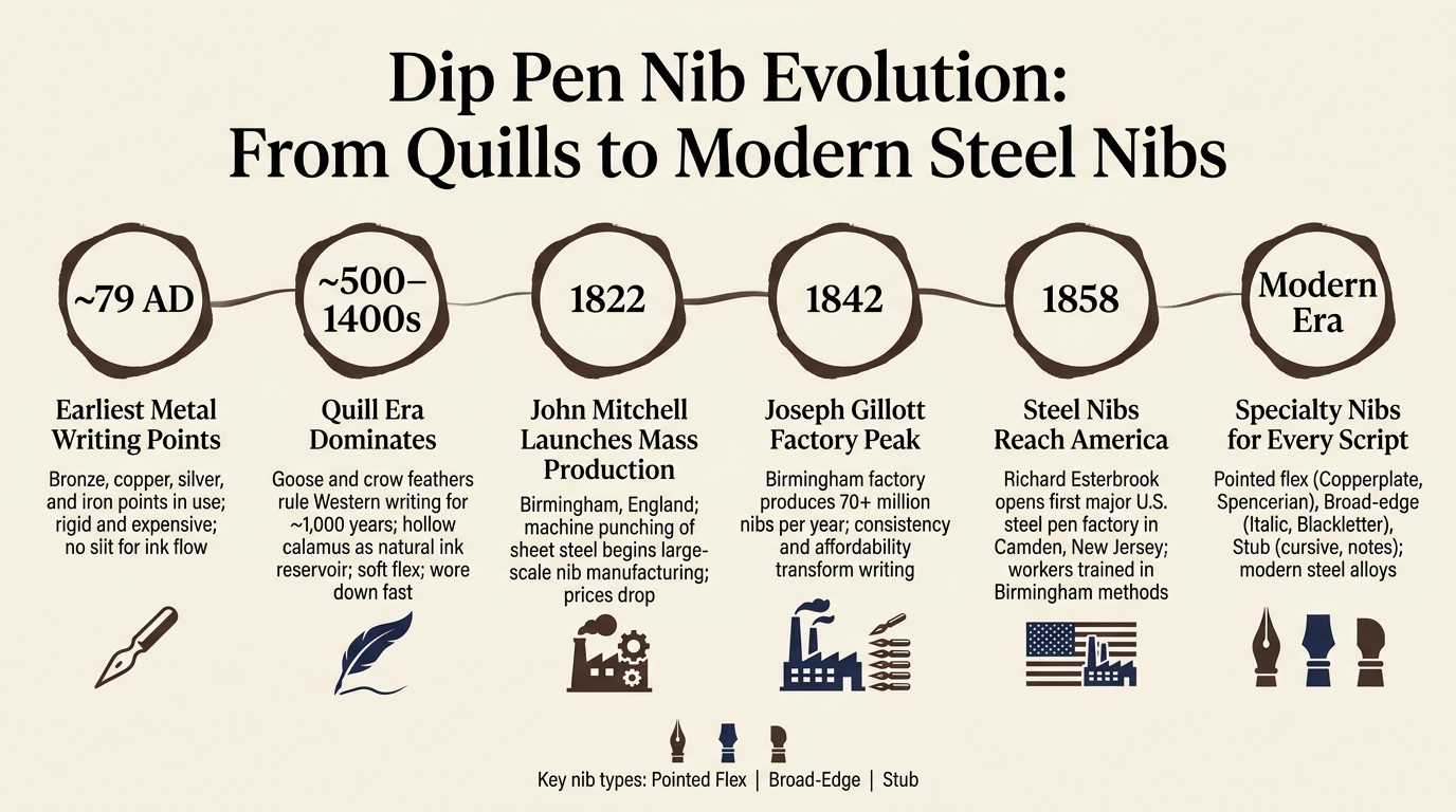
Dip Pen Nib Evolution: From Quills to Modern Steel Nibs
The Rise of Machine-Made Steel Nibs
Machine punching changed the pen trade from handwork into factory output. In 1822, John Mitchell of Birmingham helped lead that shift by using the process to mass-produce steel nibs from sheet steel, which kicked off a huge production boom. By 1842, Joseph Gillott's Birmingham factory alone was turning out more than 70 million nibs per year.
That kind of scale pushed prices down. Steel nibs were no longer just for specialists or people with money to spare. Ordinary writers could buy them too. And once factories started making nibs in large batches, consistency became part of the story. Nib material still mattered, of course, but nib shape now mattered just as much.
In the U.S., the same shift arrived a bit later. In 1858, Richard Esterbrook opened the first major American steel pen factory in Camden, New Jersey, with workers trained in Birmingham methods.
Because factory nibs were made to match one pattern, writers often had to adjust their hand to the nib, not the other way around. Makers could turn out pointed, broad-edge, and stub nibs at scale, each built for different scripts.
Parts of a Steel Nib and What Each Part Changed
You can see those changes most clearly when you look at the nib itself. Each part affects how the pen feels on paper, how the ink moves, and how much line variation you can get. These 1800s design changes weren't just for looks - each one fixed a specific writing problem.
| Nib Part | Function and Impact on Writing |
|---|---|
| Slit | Channel that carries ink to the tip. |
| Vent (Breather) Hole | Relieves stress and steadies flow. |
| Tines | The two halves of the nib separated by the slit; longer, thinner tines spread more under pressure, producing greater line variation. |
| Shoulders | Cuts that add spring. |
| Curvature | A deeper convex curve or multiple facets make a nib stiffer; a flatter profile produces more flex. |
One small detail can change the whole feel of a nib: the vent hole. A heart-shaped vent hole placed farther from the tip gives the nib more elasticity and more line variation, which works well for expressive scripts. A small round hole set close to the tip keeps the nib firmer, which fits fast, monoline writing better.
Makers also used shoulder slits as an early way to bring back some of the spring people knew from quills. Some nibs went even further and added broad cuts across the body, a style sometimes called a Double Spring. That let the body flex too, not just the tines.
Put all of that together, and you get the feel of the nib on paper: firm, lively, or very flexible. While vintage nibs offer unique history, you can find similar performance in modern writing tools designed for today's enthusiasts.
How to Identify and Test Vintage Steel Nibs
Once you know the parts, old nibs get much easier to judge. Some are still great writers. Others look nice in a box and little else. A few simple checks can help you tell the difference before ink hits the page.
Start with a visual inspection. Look at the slit first. It should run straight down the center of the point. If it's off-center, the nib can feel scratchy and the ink flow can turn uneven. Then check the slit, tip, and vent hole for rust or pitting.
If the nib looks blackened or rough, it may still have its original protective varnish. This was usually a shellac coating put on by makers to stop rust during storage and shipping. If that coating is still there, the nib won't take ink well until you remove it.
To check flexibility, try the thumbnail test. Press the tip lightly against your thumbnail. The tines should spread a little, then snap back into place. If they stay apart or feel uneven, the temper is off. When you move to paper, use scrap paper first and keep the pressure light. Early 19th-century nibs were often thick, hard, and much less elastic than later factory-made versions, so it's smart not to force flex that just isn't there.
An arched or faceted body usually means the nib will be stiff. That's not damage or bad quality. It was done on purpose for business writing and carbon-paper use. If you're after flex for Copperplate or Spencerian practice, a flatter profile with a heart-shaped vent hole and longer tines is usually the better bet.
How to Match Nib Types to Historical Writing Styles
Once you know how nibs changed over time, the next step is simple: match the nib to the script you want to write.
Pointed Flex Nibs for Copperplate and Spencerian Scripts
Pointed flex nibs work best for scripts that rely on pressure contrast, especially Copperplate and Spencerian. You press on the downstrokes and ease up on the upstrokes. That’s what keeps those fine hairlines clean and sharp.
What matters most here is spring back. A nib that snaps back fast helps you keep Spencerian looking light and controlled. If you're new to this, a stiffer nib like the Nikko G is usually easier to handle. If you want more contrast, a more flexible nib like the Gillott 303 can give you that, but it also wears out faster. Try not to railroad or over-flex the nib. Keep pressure on downstrokes only, and use an oblique holder to cut drag on the return stroke.
Broad-edge nibs come from a different branch of penmanship. They don’t depend on pressure for contrast. They depend on angle.
Broad-Edge Nibs for Italic, Blackletter, and Formal Hands
Broad-edge nibs fit scripts built on fixed stroke contrast, including Italic and Blackletter. The goal is to hold the nib at a steady angle so the stroke width stays even. For Italic, that angle is usually about 45°.
If a true italic nib feels a bit sharp, stub nibs give you a smoother and faster option. You still get some thick-thin contrast, just without as much edge.
Nib Type Comparison Table: Historical Use, Line Variation, and Script Match
This quick comparison shows which nib type fits which historical hand.
| Nib Type | Historical Use | Line Behavior | Best Fit |
|---|---|---|---|
| Pointed Flex | 17th–19th Century; formal correspondence | Pressure-based (tines splay on downstrokes) | Copperplate, Spencerian, English Round Hand |
| Broad-Edge | Medieval to Renaissance; manuscripts | Angle-based (fixed chisel-edge width) | Italic, Blackletter, Uncial, Foundational |
| Stub | Late 19th Century to Modern; rapid records | Directional (rounded edges for smoothness) | Cursive, legal writing, rapid notes |
How to Use Modern Dip Nibs for Historical Writing Practice
Choosing Modern Nibs and Holders for a Historical Feel
Once you’ve picked the nib, setup is the next piece: holder, ink, and paper. Choose the holder that fits the script you want to practice. A straight holder is the right fit for most hands.
For Copperplate or Spencerian, use an oblique holder. It places the nib at about a 55° angle, which helps keep the right tine from dragging.
How to Prepare, Ink, and Clean a Dip Nib
Clean the nib before you start so you remove factory oil and any dried ink. When it’s time to ink up, don’t dip too far. Dip only to the vent hole, or apply ink to the nib with a small brush if you want more control.
A leather writing pad under hard paper can also help. It cuts down on drag and makes the writing feel smoother.
After each session, clean the nib well and dry it all the way. Steel nibs can corrode fast, especially with iron gall ink, so store them dry and swap out any nib as soon as you see clear corrosion.
Conclusion: Key Stages of Nib Evolution and What to Try Next
Match the nib’s shape and flex to the script you want to write. Use the holder that gives you the angle you need, and adjust pressure to get the line variation you’re after.
If you’re just getting started, keep it simple: one script, one nib, and one holder.
FAQs
Why did quills last so long before steel nibs took over?
Quills stayed standard for centuries for a simple reason: early metal nibs just weren’t good enough. They didn’t have the flexibility, spring, or rust resistance needed to replace quills in a practical, low-cost way.
Later on, metal nibs showed clear advantages. They lasted longer and gave more consistent results. Even so, quills remained common in schools well into the 20th century because dip pens and ink cost far less than the fountain pens available at the time.
How do I know if a nib is soft or stiff?
Check the nib’s elasticity - basically, how the tines react when you press down as you write. A soft nib bends more easily and gives you line variation with just a light touch. A stiff nib, on the other hand, needs a lot more pressure before it starts to flex.
Nib ratings are usually based on normal hand pressure. So it’s worth paying attention to how hard you naturally press and testing a few different nibs to see what feels right for your writing style.
Which nib should I start with for my script?
First, identify your script style: pointed nibs work best for Copperplate, Spencerian, and modern scripts, while broad-edge nibs fit Italic, Gothic, and foundational hands.
If you're new to pointed script, the Nikko G is a common place to start. It’s durable, forgiving, and steady in the hand. As your control gets better, you might switch to a Zebra G, which gives you more responsive line variation and smoother ink flow.