

If I want line variation, the short answer is simple: pick a stub for daily writing, a cursive italic for more edge without too much drag, or a crisp italic for the sharpest thick-and-thin strokes.
Here’s the whole article in plain English:
- A nib grind changes the tip shape, not the pen body
- Stub nibs have rounded corners, so they feel smoother and are easier for most people
- Italic nibs have sharper edges, so they give the strongest contrast but can catch on paper
- Cursive italic nibs sit between the two
- Common stub sizes run from 0.6 mm to 2.3 mm
- A 1.1 mm stub is often a solid first step
- The more crisp the grind, the more your writing angle and paper quality matter
If I boil it down even more, it looks like this: more sharpness = more line variation, but also more control needed from my hand.
Quick Comparison
| Grind | Line Variation | Feel on Paper | Best For | Learning Curve |
|---|---|---|---|---|
| Stub | Low to medium | Smooth | Notes, journaling, daily use | Low |
| Cursive italic | Medium | Smoother than italic, more feedback than stub | Daily writing with more character | Medium |
| Italic | High | Sharp, can catch | Calligraphy, headings, slow writing | High |
One more thing: these nibs often put down more ink than a standard rounded nib, so paper matters. On cheap paper, you may see feathering or bleed-through.
If I’m choosing fast, I’d use this rule: stub first, cursive italic next, crisp italic last.
Which nib grinds might be right for you?
sbb-itb-1dd4fe9
Stub Nibs: Easy Line Variation for Everyday Writing
Stub nibs are the simplest way to get line variation without giving up day-to-day comfort. The tip is rectangular with rounded corners. That shape gives you broad downstrokes when the wide edge meets the page, and narrower cross-strokes when the slimmer part of the tipping makes contact. The rounded corners also help the nib glide instead of catching or digging into the paper, so the writing feel stays smooth even when you're jotting notes in a hurry.
How a Stub Nib Writes
A stub nib has a broad sweet spot, so it’s fairly forgiving at normal writing angles, even if the pen turns a little in your hand. Stub widths usually range from 0.6 mm to 2.3 mm, and that number refers to the width of the downstroke.
For most people, a 1.1 mm stub is a smart first pick. It’s wide enough to show the thick-thin contrast without feeling too bold for daily use. A 1.5 mm stub gives you a stronger, more noticeable effect. In practice, stubs work well for journaling, personal letters, planners, and quick notes.
One small trade-off: stub nibs put more ink on the page. So if your paper tends to soak ink up like a sponge, you may see feathering or bleed-through. Fountain pen paper helps with that.
If you want sharper contrast and cleaner stroke edges, the next step is italic.
Italic and Cursive Italic Nibs: Sharp Definition vs. Daily Comfort
Italic and cursive italic both give you more line variation than a stub. The main difference comes down to feel: italic is sharper and more exact, while cursive italic is easier to live with day to day.
Italic Nibs: Sharp Edges and Strong Calligraphic Contrast
If a stub is the easygoing option, an italic pushes things further. An italic nib has flat edges and sharp corners. That shape creates the strongest line variation in this group: bold downstrokes and very thin cross-strokes. The result is dramatic thick-thin contrast that works well for calligraphy, headings, and formal printing.
The trade-off is comfort. Those sharp corners don’t forgive much. Even a small bit of rotation can make the nib catch or dig into the paper. As Richard Binder of RichardsPens.com puts it:
"Formal, or 'crisp,' italics and oblique italics are ideally suited to calligraphy, but most people find them difficult to use rapidly because the nibs' sharp corners tend to dig into the paper."
That’s why italic nibs tend to reward a slow, controlled hand and careful pen angle. For fast notes or casual journaling, a crisp italic often feels less practical and more demanding.
Cursive italic takes that same basic idea and smooths out the rough edges for daily use.
Cursive Italic Nibs: A Middle Ground Between Stub and Italic
A cursive italic is ground with slightly rounded edges and softened corners. You still get much of the contrast of an italic, but with some of the ease of a stub. On paper, it feels smoother, and it’s less likely to punish slight rotation.
"Cursive italic is, for most nibmeisters, the midway between the stub and the italic... a practical way to add character without losing comfort." - Rachel de la Fuente
For many writers, that middle-ground feel is the sweet spot. Cursive italics are usually narrow enough for daily writing, but they still show clear contrast on the page. Put stub, italic, and cursive italic side by side, and those differences stand out fast.
Stub vs. Italic vs. Cursive Italic: A Direct Comparison
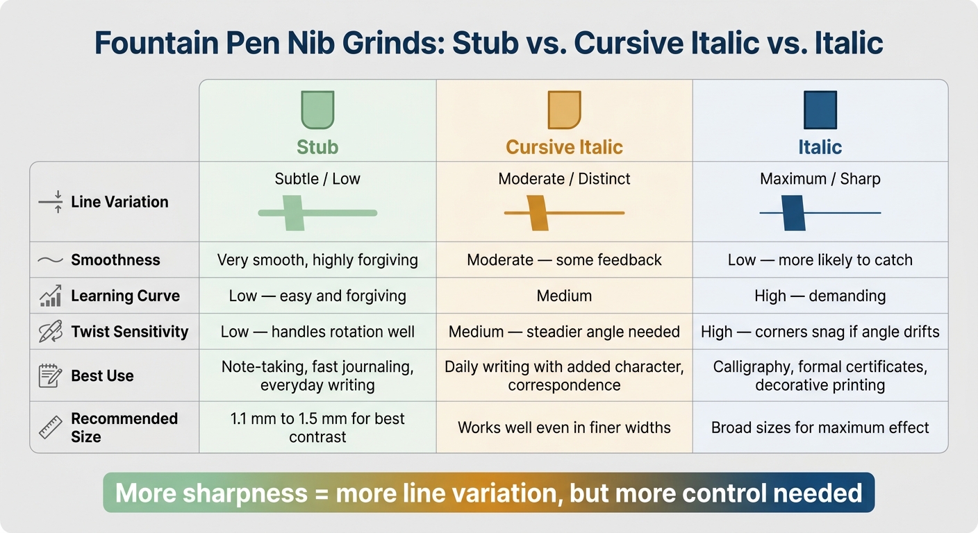
Fountain Pen Nib Grinds Compared: Stub vs. Cursive Italic vs. Italic
To make the differences easier to see, here’s a quick side-by-side look.
| Grind | Line Variation | Smoothness | Learning Curve | Best Use |
|---|---|---|---|---|
| Stub | Subtle / low | Very smooth, highly forgiving | Low - easy and forgiving | Note-taking, fast journaling, everyday writing |
| Cursive Italic | Moderate / distinct | Moderate - some feedback | Medium | Daily writing with added character, correspondence |
| Italic | Maximum / sharp | Low - more likely to catch | High - demanding | Calligraphy, formal certificates, decorative printing |
The table covers the basics, but one detail matters a lot in daily use: twist sensitivity. This is how much the nib reacts when you rotate the pen as you write. Stub nibs are easygoing here and handle rotation well. Cursive italics ask for a steadier angle. Italics are the strictest of the three, and if your angle drifts, the corners can snag on the paper.
As Rachel de la Fuente puts it: "The 'crisper' the grind, the more line variation. However, it also means more feedback and more chance for the edge to catch on paper."
Choosing the right nib width plays a big part too. Stubs tend to show their line contrast best in Broad and larger sizes, while a Medium stub may show only a small amount. Cursive italics, on the other hand, can still give you noticeable contrast even in finer widths.
That connection is pretty simple: the sharper the grind, the more character you get on the page, but the more control the nib asks from your hand.
How to Pick the Right Nib Grind
Pick your grind based on three simple things: how fast you write, how smooth your paper is, and how much you rotate the pen (see our fountain pen buying checklist for more factors).
Match the Grind to How You Write
With the main differences in mind, these three factors can help narrow it down.
If you write fast - say, for work notes or quick journal entries - a stub is usually the safest starting point. It gives your writing some flair without making the pen feel fussy.
For journaling or correspondence, a cursive italic gives you more line variation than a stub, but it doesn't have the harsher feel of a crisp italic. It sits in that middle ground: more character, still comfortable.
For formal calligraphy or signature work, a crisp italic gives the sharpest contrast. But there's a catch. It works best when you write slowly and keep your hand position steady.
Paper matters just as much as writing speed. A crisp italic tends to do best on smooth, high-quality paper. On rougher paper, those sharp edges are more likely to catch or snag.
If you're still torn, try one grind before you commit. Fountain Pen Revolution sells affordable pens and replacement nibs.
Key Takeaways
- Stub: easiest for everyday writing
- Cursive italic: a middle ground of character and comfort
- Crisp italic: most line contrast for slow, controlled writing
FAQs
Which nib grind is best for beginners?
A stub nib is usually the best pick for beginners. It has a squared-off shape with rounded edges, so it feels smooth on the page and gives you a bit of room for small shifts in grip or pen angle without snagging the paper.
A 1.0 mm or 1.1 mm stub is a common place to start. It gives you clear line variation without making everyday writing feel awkward, which makes it a solid fit for journaling or note-taking.
How does nib width affect line variation?
Nib width plays a big role in how much line variation you’ll see. Broader nibs, like Broad or Double-Broad, have more tipping material. That usually means a stronger contrast between thick vertical strokes and thin horizontal strokes.
With narrower nibs, grinds like a stub tend to give you subtler variation. A crisper grind, such as a cursive italic, can still show clear variation even on a finer nib. But if you want the effect to stand out more, a medium or broader nib usually delivers the best results.
Can I use these grinds on regular paper?
Yes, but you need to be a bit careful.
Many custom grinds lay down more ink than standard nibs. That means they can feather or bleed on low-quality paper.
For everyday writing on standard office paper, stub and cursive italic nibs are usually the best picks. Using a drier ink can help too.
Sharper grinds, like crisp italic, are more sensitive to paper texture and may snag on rough fibers.