
Decorative letter writing transforms simple handwriting into an art form, combining unique shapes, textures, and colors to create visually appealing letters. This guide covers everything you need to get started, from tools like fountain pens and brush pens to techniques like flourishes, shading, and layouts. Whether you're designing stationery, addressing envelopes, or mastering calligraphy basics with a dedicated set, this article provides practical steps to elevate your personal correspondence. Key takeaways include:
- Tools to Use: Fountain pens, brush pens, fine-liners, and quality paper like Rhodia or Tomoe River.
- Basic Techniques: Stroke exercises, faux calligraphy, and letter anatomy.
- Advanced Skills: Drop shadows, inline highlights, 3D effects, and texture layering.
- Stationery Tips: Personalize with rubber stamps, embossing, and envelope liners.
- Envelope Design: Use decorative papers, clear addressing, and wax seals for a polished finish.
With practice and the right materials, you can create stunning, heartfelt letters that leave a lasting impression.
How to turn your handwriting into decorative letters | Step by Step | Capital Letter | Floral deco
sbb-itb-1dd4fe9
Tools and Materials You'll Need
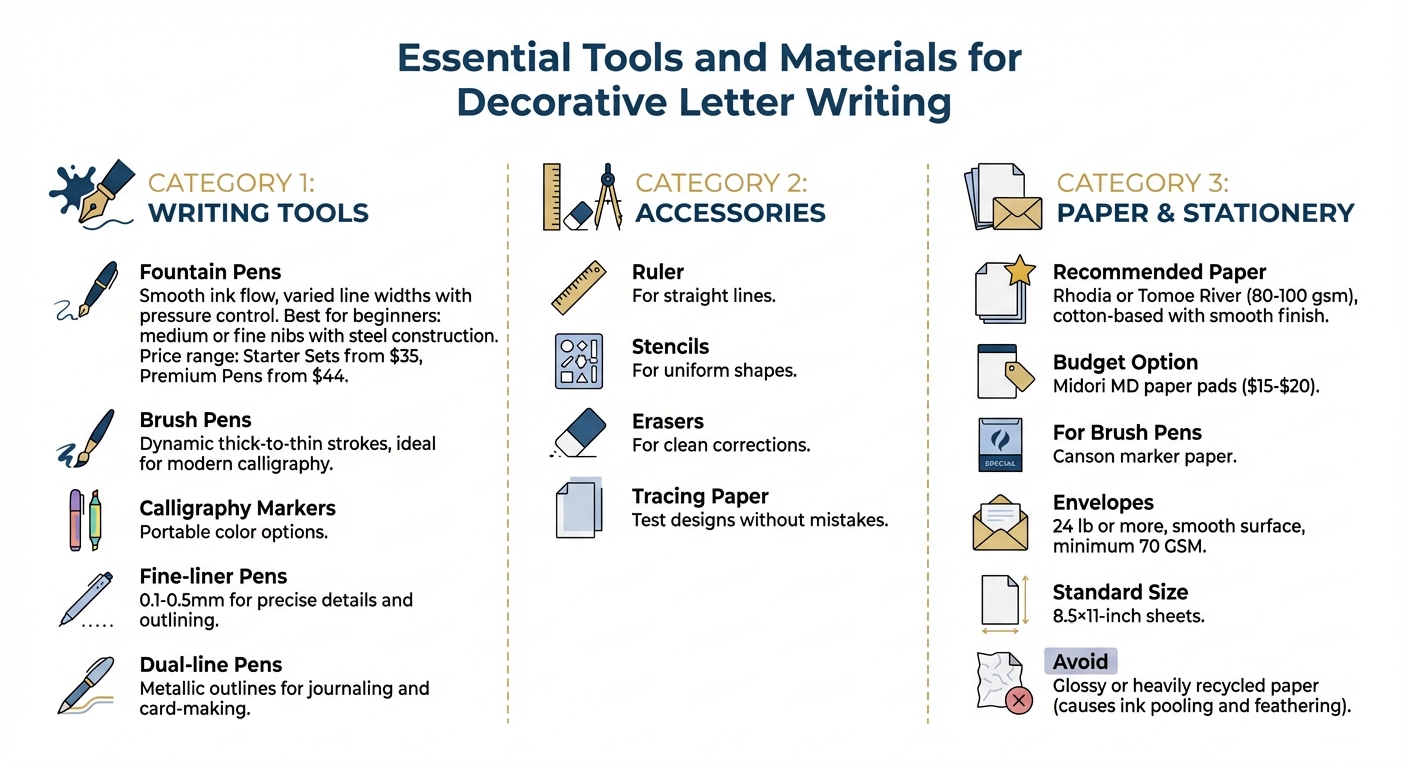
Essential Tools and Materials for Decorative Letter Writing
Decorative letter writing doesn’t require a massive investment - just a few well-chosen tools can get you started. Picking the right materials is key to ensuring your letters are as stunning as they are long-lasting.
Fountain Pens for Letter Writing
Fountain pens are a fantastic choice for decorative writing thanks to their smooth ink flow and precision. They let you create varied line widths simply by adjusting pressure - press harder for bold downstrokes and lighten up for delicate upstrokes. This makes it easy to achieve calligraphy-like effects without the mess of dip pens.
If you’re new to fountain pens, start with medium or fine nibs for versatility. Steel nibs are a great option for consistent performance, and beginner-friendly kits with ink cartridges or converters make maintenance straightforward. Fountain Pen Revolution offers a variety of affordable options, including Starter Sets starting at $35 and handmade Premium Pens from $44. These provide an accessible way to explore decorative letter writing without breaking the bank.
Pair your fountain pen with other tools to unlock more creative possibilities.
Additional Writing Tools and Accessories
To expand your techniques, consider adding other writing tools to your collection. Brush pens are perfect for creating dynamic thick-to-thin strokes, ideal for modern calligraphy. Calligraphy markers, on the other hand, offer portable color options. Fine-liner pens (ranging from 0.1 to 0.5 mm) are great for precise details and outlining, especially for faux calligraphy, where you write normally and then thicken your downstrokes by adding a second line. Dual-line pens, which produce metallic outlines, are excellent for journaling and card-making.
Don’t forget the basics: a ruler for straight lines, stencils for uniform shapes, and erasers for clean corrections. These simple tools can help you add layers and textures to your designs, even if you’re just starting out.
Once you’ve got your pens and accessories, the next step is choosing paper that works well with your tools.
Selecting Paper and Stationery
The right paper can make or break your decorative lettering. Low-quality paper can cause ink to feather or bleed, ruining your hard work. Look for fountain-pen-friendly paper with a smooth finish - cotton-based options like Rhodia or Tomoe River (80–100 gsm) are excellent for preventing bleed-through while keeping your lines sharp. Avoid glossy or heavily recycled paper, as these can cause ink pooling.
For envelopes, choose ones with a weight of 24 lb or more and a smooth surface to avoid smudging. Affordable options like Midori MD paper pads (around $15–$20) offer minimal bleed-through, while Canson marker paper pairs well with brush pens. Stick to US standard sizes, like 8.5×11-inch sheets, for convenience and compatibility with your tools.
With the right tools, accessories, and paper, you’ll be well on your way to creating beautiful decorative letters.
Basic Hand Lettering Techniques
With your tools in hand, it’s time to dive into the basics of creating beautiful letters. By understanding letter structure and practicing simple techniques, you’ll build a solid foundation for more intricate and decorative designs down the road.
Letter Structure and Anatomy
Before diving into decorative styles, it’s crucial to understand how letters are built. A key principle in decorative writing is stroke weight - press harder on downward strokes to create thicker lines, and apply lighter pressure on upward strokes for thinner, more delicate lines. This contrast is what gives lettering its elegant appeal. If you’re just starting, try faux calligraphy: write a word as you normally would, then add a second line next to each downward stroke and fill it in.
Consistency is another essential factor. Keep your letters aligned on a steady baseline and maintain a uniform slant - whether vertical, leaning left, or leaning right. Even spacing between letters also contributes to a polished look.
For practice, grab a carpenter’s pencil with a wide, flat lead. Holding it at a steady slant allows you to see how stroke width naturally changes as you form letters. It’s a great way to build muscle memory before transitioning to more advanced tools like pens or brushes.
Once you’ve got these basics down, you’ll be ready to explore more deliberate calligraphic techniques to refine your style.
Getting Started with Calligraphy
Calligraphy isn’t about speed - it’s about creating something visually pleasing. As Loveleigh Loops puts it:
"The aim of cursive writing is speed [while] the aim of calligraphy is beauty."
Take your time. Construct each letter stroke-by-stroke, focusing on precision over quickness.
Start by mastering the eight fundamental strokes: entrance, underturn, overturn, oval, compound curve, reverse oval, ascending loop, and descending loop. These building blocks help you create consistent letterforms. Use guidelines with a baseline, header line (for x-height), and ascender/descender lines to keep your proportions in check.
To improve control, practice drills like rows of ovals or compound curves. These exercises help you develop muscle memory and smooth out transitions between thick and thin strokes. When you’re ready to write, hold your dip pen at a 45-degree angle to the paper to ensure a steady ink flow.
Once you’ve nailed the traditional forms, you can experiment with modern styles like bounce lettering. This playful technique lets letters dip above and below the baseline, adding a whimsical touch to your work.
With these foundational strokes under your belt, you’ll be ready to explore ways to make your lettering truly stand out.
Adding Flourishes and Embellishments
Flourishes can elevate your lettering, turning simple designs into eye-catching works of art - but it’s important not to overdo it. Calligrapher Naselle Anderson offers this advice:
"Flourishing is all about having fun and turning something that may be a little plain into a more elaborate and eye-catching piece. You want to avoid overcrowding your calligraphy words or calligraphy letters."
The key is strategic placement. Add flourishes at the start or end of a word, on the crossbar of a “t,” or in the loops of ascenders (like h, l, or k) and descenders (like y, g, or j). When designing loops and curves, imagine fitting an oval inside them to ensure they’re proportional. Follow the stroke weight rule: avoid crossing two thick lines; if lines must intersect, at least one should be thin.
Sketch your flourishes lightly with a pencil first. Tracing paper can also be a lifesaver - lay it over your original work to test different designs without risking mistakes. For smoother curves, use your entire arm rather than just your wrist, and maintain a steady speed to avoid jagged lines.
Start small by adding flourishes to individual letters, then gradually work up to embellishing entire words. This step-by-step approach helps you understand how flourishes interact with letter anatomy, keeping your designs balanced and visually pleasing.
Advanced Decoration Techniques
Building on your basic skills, these advanced techniques bring depth and dimension to your decorative lettering. With a solid grasp of foundational strokes, you're ready to explore these enhancements to elevate your designs.
Working with Color and Shading
Color and shading are powerful tools to create depth and establish visual hierarchy. One popular technique is adding drop shadows, which are drawn slightly offset from your letterforms to make them appear raised. As designer Annie Dailey puts it:
"The drop shadow and drop line effect add dimension and contrast by bringing the letter to the forefront of the composition".
For a polished effect, try the inline technique - adding a narrow stroke inside your letterforms to create an internal highlight. This works particularly well with high-contrast colors or metallic inks, giving your letters a striking finish.
To create visual hierarchy, experiment with variations in color, size, shape, weight, and style across different words or phrases. Using layout grids can help you map out your design before committing to colors, ensuring curves, angles, and scales align harmoniously. Start with classic letterforms, like serif or script styles, and build on them.
When applying color, treat it as a finishing touch. Use tracing paper to refine your pencil sketches first, allowing you to experiment with colors and avoid mistakes. Once you're confident, you can also incorporate illustrations to further enhance your design.
Adding Illustrations and Borders
Illustrations and borders can add flair, but they should always complement the text rather than overpower it. A great example is the cadel letter technique, where the first letter of a paragraph is decorated with elaborate designs and flourishes, while the rest of the text remains clean and legible.
You can also integrate decoration directly into the letters themselves. For instance, a dip pen naturally creates thick downstrokes and thin upstrokes, which can double as part of the illustration. To add dimension, draw letters as 3D prisms and shade their edges for a realistic effect.
If you're adding external decorative elements, like borders, make sure they align with the perspective of your lettering. For watercolor borders or backgrounds, start by outlining your letters with plain water before adding color - this prevents unwanted bleeding.
Flourishes work best when they flow naturally from the letter strokes, rather than looking like separate add-ons. For a modern approach, try interconnected "graffiti" style lettering, where the letters flow together into a unified design. These elements set the stage for exploring textures and layering.
Creating Textures and Layers
Textures and layers bring both physical and visual depth to your work. Hand-drawn textures like stippling (dots), cross-hatching (intersecting lines), or stripes can fill negative spaces within block or outline letters, adding intricate detail.
For dramatic effects, experiment with shadow layering. Floating shadows - those separated from the letterforms - can make your letters appear to hover. You can amplify this effect by layering multiple shadows with varying thicknesses, distances, and colors. Alternatively, connect shadows directly to the letters for a solid 3D block effect.
To ensure consistency, establish a single light source for your shadows and highlights. Another fun technique is offset layering: create several copies of a letterform, each slightly larger than the last, and stack them with shadows to create a stair-step, raised appearance.
Different mediums can also introduce unique textures. Watercolors, inks, acrylics, or even glitter can add physical depth to your designs. For repeating patterns, you can carve DIY stamps from erasers or foam to apply consistent textures.
Finally, pay attention to the negative space around and between your letters. Thoughtful use of negative space can bring balance and visual interest to your overall composition, making your designs feel complete and intentional.
Decorating Stationery and Envelopes
Once you've nailed down decorative lettering, it’s time to bring those skills to life by designing your stationery and envelopes. This step sets the stage for your letter, creating an impression before it’s even opened.
Personalizing Your Stationery
Turning plain stationery into a memorable piece is easier than you think. Rubber stamping is a great way to add flair - try floral, geometric, or seasonal designs. The type of ink matters too: pigment inks provide bold, vibrant colors, while archival inks ensure your designs are fade-resistant and waterproof, perfect for letters meant to last.
For extra texture, try embossing. Sprinkle embossing powder over your stamped design, then use a heat tool to create an elegant, raised effect. Faux layering is another trick - stamp overlapping designs to give depth without adding bulk. And don’t forget envelope liners! These colorful or patterned inserts create a delightful surprise when the envelope is opened.
Other embellishments can take your stationery to the next level. Use washi tape for borders, or add stickers and die-cuts for a pop of personality. Ribbons or twine tied around the stationery give it a gift-like feel. When combining multiple elements, test your materials first - stamp on scrap paper to check ink coverage, and make sure your fountain pen ink works well with your chosen paper to avoid smudging or bleed-through.
Envelope Design and Addressing
The envelope is your first chance to impress. As The Paper Mouse puts it:
"The envelope is the first thing your addressee sees when they receive your letter, so a cheerful or humorous or elegant envelope is the first hint to the joy they're about to experience from reading your letter."
Consider crafting envelopes from unique materials like decorative papers, old maps, or even pages from books or calendars. Want to add a professional detail? Create envelope liners by tracing the envelope flap onto liner paper, cutting it slightly smaller, and gluing it in place - leave about 1/4 inch on the sides and 1/2 to 1 inch at the top for a clean fit.
When addressing, let your lettering style shine. Calligraphy, bubble letters, or block fonts can tie the envelope design to the tone of your letter. If the envelope’s background is busy, use a colorful label or draw a border around the address for clarity. Stick to paper with a thickness of at least 70GSM to prevent ink bleed and tearing during transit. Always test your pen and ink on scrap paper first to ensure smooth writing.
Remember to keep the address and postage areas clear to meet postal guidelines. If you’re using intricate lettering, stencils can help keep the address readable for postal workers.
Sealing and Final Touches
The finishing touches can turn a simple envelope into something extraordinary. Wax sealing is a timeless way to add elegance. You’ll need a wax seal stamp, wax beads or sticks, a heating tool, and a non-stick surface like a silicone mat. Preheat your stamp slightly before pressing it into the wax to prevent sticking, and let the wax cool for a few seconds before stamping to get a crisp design.
Keep in mind, though, that wax seals or bulky decorations might make your envelope nonmachinable, requiring additional postage. Some mail artists recommend adding an extra 15¢ in stamps to ensure these envelopes are handled properly by the postal service. Washi tape and stickers are great for decoration, but make sure the primary seal is secure. If you’re using decorative “stamp-style” washi tape, place it away from real postage to avoid confusing postal workers.
For heavier decorative clips, a small dab of adhesive can help keep them in place during mailing. And if your envelope is particularly bulky, consider slipping it into a protective outer envelope to prevent damage during transit.
Using Fountain Pens for Decorative Writing
Building on basic calligraphy skills, fountain pens provide an elegant tool for enhancing decorative letter writing. Their smooth ink flow and ability to create varied line weights make them ideal for adding flourishes, shading, and expressive details to your writing.
Selecting a Fountain Pen
The first step in choosing a fountain pen is understanding nib flexibility. Flexible nibs let you apply pressure on downstrokes for thicker lines and ease up on upward strokes for finer ones. This pressure-sensitive technique creates stunning contrasts in your lettering. For beginners, #5 or #6 JoWo nibs strike a good balance, offering control for Spencerian-style flourishes without being too challenging.
If you're just starting, Fountain Pen Revolution offers affordable options. Their starter pens are priced under $20 and come with medium or flexible nibs perfect for decorative writing. For a more comprehensive setup, their Starter Sets begin at $35 and include everything you need - pen, ink, and accessories. For those seeking a step up, their Premium Pens start at $44, featuring handcrafted designs and higher-quality materials. If you're after exceptional smoothness and responsiveness, the Gold Nib Collection with 14k gold nibs is worth exploring.
Don't overlook grip comfort, especially if you plan on long writing sessions. A comfortable grip can make all the difference. Medium nibs are great for shading techniques, while broad nibs are better suited for bold, dramatic outlines.
Fountain Pen Writing Techniques
Practicing pressure control on grid paper is a great way to build muscle memory for achieving smooth thick-thin strokes. Fountain pens allow for subtle pressure adjustments that create beautiful shading without needing extra layers . For a striking effect, try outlining letters with thin metallic ink lines and filling them in with broader strokes to create a 3D prism-like appearance.
Start with a pencil sketch to plan your design and refine it before committing to paper. This method helps you map out flourishes without wasting expensive stationery. A tip from seasoned calligraphers: keep embellishments to about 20% of your composition to maintain readability . The goal is to enhance your message, not overshadow it.
If you notice railroading or dry skips, it could be due to low ink flow or rough paper. Try priming your pen with a wet stroke on scrap paper or switch to smoother stationery. Blobbing, or ink pooling, often happens when too much pressure is applied on downstrokes. Ease up and let the nib do the work.
Fountain Pen Maintenance
Regular maintenance is key to keeping your fountain pen in top condition. Flush it weekly with water using a bulb syringe, and use soap only for stubborn clogs. Every three months, take apart the nib and feed for a deeper clean to prevent ink buildup that can affect your lines.
Store your pen nib-up in a case or stand to prevent ink from clogging the feed. Fountain Pen Revolution pens come with stands designed for upright storage, making this simple. For flexible nibs, ensure all parts are completely dry before reassembly to maintain the nib's bounce and responsiveness.
Using high-quality inks helps reduce clogs and buildup. Fountain Pen Revolution offers inks specifically designed for their pens, creating shading effects that enhance decorative writing. When cleaning, distilled water is best as it avoids mineral deposits that could disrupt ink flow. With consistent care, your pen will perform beautifully, supporting your growth in decorative writing.
Getting Started with Decorative Letters
Main Points to Remember
Decorative letter writing combines pressure control, thoughtful planning, and creative embellishments to turn simple letters into works of art. It’s all about adding shapes, textures, and flourishes that reflect your personal style while keeping the letters readable.
Start by sketching your designs to fine-tune them before committing to ink. Use your entire arm for smooth, balanced flourishes, and limit embellishments to about 20% of the composition. This approach ensures your message stays clear and remains the focal point.
With these basics in mind, you’re ready to dive into projects that make your correspondence uniquely yours.
Ideas for Your Next Letter
Once you’ve mastered the fundamentals, try these creative ideas to bring your decorative letters to life:
- Practice perfecting the loops and flourishes of your favorite letter in both uppercase and lowercase before moving on to full words.
- Create framed quotes, wedding invitations, or custom greeting cards with elegant embellishments.
- Share your art with others by joining communities like Geek Girls Pen Pals or Postcrossing, where each letter becomes a personal masterpiece.
- Add meaning to your practice by volunteering to write uplifting letters for organizations like MoreLoveLetters or Love For The Elderly.
Try experimenting with effects like 3D designs or inline highlights. Use lined paper during practice to keep your letters evenly spaced and aligned. Add a touch of personality with small accents like dots, dashes, or tiny floral sketches in the margins - what some call “dingbats and doodads”.
Explore Fountain Pen Revolution
To bring these ideas to life, having the right tools is key. Fountain Pen Revolution offers Starter Sets starting at $35, which include a pen, ink, and accessories. These pens provide smooth ink flow, perfect for practicing cursive and decorative scripts. If you’re looking for something more refined, their Premium Pens start at $44 and feature handmade designs and high-quality materials. For intricate flourishes, the Gold Nib Collection with 14k gold nibs offers exceptional precision and responsiveness.
Browse their full collection at https://fprevolutionusa.com. You’ll find pens, inks designed for special shading effects, and storage stands to keep your tools in great condition. With consistent practice and the right fountain pen, you can develop a decorative writing style that makes every letter unforgettable.
FAQs
What’s the easiest lettering style to start with?
The easiest lettering style to start with is simple print or block lettering. These styles are direct, easy to execute, and don't demand advanced techniques, making them ideal for beginners. Practicing with these basics allows you to focus on decorative elements while building confidence and control. Once you've mastered these, you'll be better prepared to explore more complex styles like cursive or calligraphy.
How do I stop ink from bleeding or feathering?
To avoid issues like ink bleeding or feathering, pay attention to the combination of paper, ink, and nib you’re using. Choose high-quality, fountain pen-friendly paper that's designed to be less absorbent. Pair this with drier inks, which help prevent oversaturation. Additionally, consider using finer nibs, as they release less ink onto the page. Regular cleaning of your pen and testing inks on appropriate paper can also go a long way in achieving smoother, cleaner writing results.
How do I mail wax-sealed or bulky envelopes safely?
To safely mail envelopes with wax seals or those that are bulky, make sure the envelope is completely sealed before adding the wax. Remember, wax seals are decorative and not designed to secure the envelope shut. Use the correct postage for irregular or non-standard mail, and if you're unsure, consult your local postal service for guidance. Keep in mind that wax seals can interfere with automated sorting machines, so double-check the size and thickness requirements to help your envelope reach its destination without any problems.