
Fountain pen nib size plays a big role in how your handwriting looks and feels. The right nib size can improve legibility, comfort, and even how your ink interacts with paper. Here’s what you need to know:
- Finer nibs (Extra Fine, Fine): Great for small handwriting, quick drying, and detailed work. Ideal for left-handed writers or standard paper.
- Broader nibs (Medium, Broad): Better for large handwriting, smoother strokes, and showcasing ink shading and sheen. Works best on high-quality paper.
- Specialty nibs (Stub, Italic): Add flair with line variation, perfect for decorative writing like invitations or cards.
Paper type matters too - coated paper enhances ink effects, while absorbent paper may cause feathering. Matching your nib size to your handwriting style and paper ensures the best writing experience. Start with Fine or Medium nibs if you're unsure, then explore options like Stub or Broad for artistic touches.
In-Depth Comparison of Different Fountain Pen Nibs
Fountain Pen Nib Sizes Explained
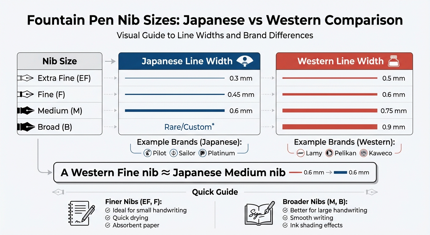
Fountain Pen Nib Sizes: Japanese vs Western Line Width Comparison Chart
Choosing the right fountain pen nib size and tip shape can make a big difference in how your handwriting looks and feels.
Standard Nib Sizes and Line Widths
Most fountain pen brands offer four main nib sizes: Extra Fine (EF), Fine (F), Medium (M), and Broad (B). Some even go beyond, with options like Double Broad (BB) or decorative Stub/Italic nibs.
The line width of these nibs varies between Western and Japanese manufacturers. Western nibs (like Lamy, Pelikan, and Kaweco) are generally wider than their Japanese counterparts (such as Pilot, Sailor, and Platinum). For example, a Japanese Medium nib is roughly equivalent to a Western Fine.
| Nib Size | Japanese Line Width | Western Line Width |
|---|---|---|
| Extra Fine (EF) | 0.3 mm | 0.5 mm |
| Fine (F) | 0.45 mm | 0.6 mm |
| Medium (M) | 0.6 mm | 0.75 mm |
| Broad (B) | Rare/Custom | 0.9 mm |
"A Western fine nib is approximately the same size as a Japanese medium nib." – JetPens
Finer nibs are ideal for absorbent paper, as they use less ink and dry quickly. Broader nibs, on the other hand, glide more smoothly and enhance ink shading, making them a favorite for those who enjoy a more fluid writing experience.
Once you’ve got the size down, the shape of the nib tip is the next factor to consider.
How Tip Shape Changes Your Writing
The shape of a fountain pen nib tip plays a key role in how it interacts with the paper and the kind of lines it creates. Round nibs are the most common and have a rounded ball of tipping material. This design produces consistent, uniform lines regardless of the direction you're writing.
Stub and Italic nibs, on the other hand, are flat across the bottom instead of rounded. This flat edge creates thick vertical strokes and thin horizontal strokes, giving your writing a calligraphic flair. The difference between the two lies in their edges: Stub nibs have slightly rounded corners for smoother everyday use, while Italic nibs have sharper edges for more dramatic line contrast and precision.
For those looking to experiment, specialty nibs provide even more variety:
- Fude: Produces brush-like strokes.
- Zoom: Varies line width depending on the pen angle.
- Oblique: Designed for rotated writing styles.
- Flex: Adjusts line width based on writing pressure.
"The tipping material... is the most crucial part of the nib. The tip is welded on and ground down to a specific 'nib grind or nib size' that will determine the line width you end up with as you write." – Brian Goulet, Founder, The Goulet Pen Company
Round nibs are forgiving if your pen rotates slightly while writing, making them great for beginners. Stub and Italic nibs, while a bit more sensitive to hand angle, reward careful writers with beautiful line variations. These tip shapes open up endless possibilities for customizing your pen to match your handwriting style.
Matching Nib Size to Your Handwriting
The balance between ink and white space - known as handwriting density - plays a big role in choosing the right nib. For instance, pairing a broad nib with small handwriting can blur lines and fill in letter loops, making your writing harder to read. A good rule of thumb is to aim for a 1:10 ratio of line weight to x-height (the height of lowercase letters). If you’re writing on 5 mm grid paper, a nib that produces a 0.5 mm line often creates a clean, balanced look. Your writing style matters too: cursive, with its tight, connected strokes, usually works better with finer nibs, while printing, which naturally has more spacing, can handle broader nibs. This balance is key when deciding between fine and broad nibs.
Fine Nibs for Small Handwriting
Extra-Fine (EF) and Fine (F) nibs are ideal for small handwriting, offering the precision needed to keep your letters clear and free from excess ink. These nibs also use less ink, which means quicker drying times - a major plus for left-handed writers who want to avoid smudging.
"In general, the smaller your handwriting, the finer the nib you'll want to use. A finer nib will usually give smaller handwriting a more attractive density." – Fountain Pen Love
On the other hand, if your handwriting is larger, a finer nib might make your writing look too sparse.
Broad Nibs for Large Handwriting
For larger handwriting, Medium (M) and Broad (B) nibs are better suited, as they create fuller, more consistent lines.
"Broad nibs produce wider lines of ink. The increased ink flow lubricates the nib for a smoother, more effortless writing experience." – Stephanie, JetPens
When using wider-ruled paper (around 7 mm spacing), Medium or Broad nibs help maintain a visually balanced appearance. However, broader nibs lay down more ink, so it’s important to use fountain-pen-friendly paper to prevent feathering and bleed-through. Choosing the right nib ensures your writing looks its best while complementing your style, setting the stage for exploring the overall feel of writing in the next section.
How Nib Size Affects Line Quality and Writing Feel
Line Width and Ink Flow
The size of a nib's tip plays a big role in how ink flows onto the page. For instance, extra-fine nibs create lines as thin as 0.3–0.4 mm, while broad nibs produce thicker lines, ranging from 0.8–1.0 mm. This difference not only impacts the appearance of the lines but also highlights the ink's characteristics.
Broader nibs release more ink, creating a "wetter" writing experience. This results in deeper color saturation and brings out unique ink qualities like shading and sheen. Hanna Struk from Scriveiner captures this perfectly:
"A broad nib is where an ink's special properties, like shading and sheen, truly come alive, turning every word into a small piece of art".
On the other hand, finer nibs distribute less ink, which means lines dry quickly. This also influences how the pen feels as it interacts with the paper, adding a tactile element to the writing experience.
Writing Feedback and Pen Smoothness
Nib size doesn't just affect the ink flow - it also changes how the pen feels while writing. Finer nibs, with their smaller tips, provide more feedback, giving a sensation similar to using a pencil. In contrast, broader nibs glide more smoothly, thanks to the extra ink acting as a lubricant between the nib and the paper .
As Brian Goulet, founder of The Goulet Pen Company, explains:
"The smaller the nib size, the thinner the line it puts down... finer nibs won't feel as smooth as you write, since they have a smaller surface area on the tip."
To maintain smoothness, extra-fine nibs require a gentler touch - too much pressure can cause them to scratch or dig into the paper. Broad nibs, however, move effortlessly with minimal effort. Stephanie from JetPens highlights this advantage:
"the increased ink flow lubricates the nib for a smoother, more effortless writing experience".
Ultimately, your choice of nib size should reflect your preference for either a more textured, feedback-heavy feel or a smoother, gliding experience.
sbb-itb-1dd4fe9
Paper Type and Writing Purpose Matter
Beyond the nib size, the type of paper you use and the purpose of your writing play a big role in how your pen performs.
How Paper Affects Nib Performance
The paper's absorbency can make or break your writing experience. Absorbent paper pulls ink in quickly, which often leads to feathering and bleed-through - issues that become more pronounced with broader nibs. As Rachel de la Fuente explains:
"A lower absorbance means that the ink will pool, rather than soak in, and dry slowly, improving desirable ink properties."
On the other hand, coated or smooth paper keeps the ink on the surface longer. This enhances effects like shading and sheen, which are especially noticeable with medium and broad nibs. However, fine nibs can snag on rough, textured paper, while broader nibs tend to glide over imperfections. If the paper is too slick, it may cause skipping, and heavily textured paper can shed fibers, clogging the nib and disrupting ink flow. For everyday use, smooth, moderately absorbent paper strikes the right balance by drying quickly and supporting consistent ink flow.
Choosing Nibs for Different Writing Tasks
Your nib choice should align with your writing needs, complementing the paper you’re using. For journaling on 5 mm dot grid paper, extra-fine or fine nibs work best to keep your writing neat and legible. If you're taking notes quickly on 7 mm ruled paper, medium or broad nibs can provide smoother, faster strokes. This pairing ensures clarity for daily tasks while setting the stage for more formal writing.
When working with lower-quality paper, like standard printer stock, extra-fine or fine nibs are ideal for minimizing feathering and bleed-through. Hanna Struk from Scriveiner points out:
"When using more absorbent paper, a fine nib is also an excellent choice to minimise ink feathering or bleed-through."
For formal correspondence or artistic touches on greeting cards, broad and stub nibs truly shine. They bring out the full personality of your ink - its shading, sheen, and shimmer - when paired with high-quality coated paper. Using a broad nib on premium brands like Tomoe River or Rhodia paper allows you to fully appreciate an ink's color depth and unique properties.
Stub and Italic Nibs for Decorative Writing
If you’re looking to give your handwriting a touch of artistic flair without diving into complex calligraphy techniques, stub and italic nibs might be just what you need. These nibs can turn everyday writing into something that feels polished and decorative, perfect for projects like invitations, greeting cards, or anything that calls for a bit of extra elegance. Let’s explore how these nibs work their magic and when to use them.
What Makes Stub and Italic Nibs Different?
Stub and italic nibs stand out from standard rounded nibs because of their flat-ground tips. This unique design naturally creates line variation as you write, producing thick vertical strokes and thinner horizontal ones - all without requiring extra effort. As Ferris Wheel Press puts it:
"These nibs have a flat edge instead of a rounded tip, which creates thick downstrokes and thin sidestrokes - perfect for calligraphy-style writing."
The main difference between the two lies in their edges. Stub nibs have slightly rounded corners, making them smoother and easier to use, especially for beginners. They’re great for adding subtle character to everyday writing. Italic nibs, on the other hand, have sharper, squared-off corners. This design delivers more dramatic line variation and crisp contrast but requires a steady hand and consistent writing angle (around 45 degrees) to avoid scratching the paper. The Online Pen Company explains:
"A calligraphy nib tends to have sharper corners which gives a crisper line and more variation in line width."
Stub and italic nibs come in various sizes, typically measured in millimeters. Common options include 1.1 mm, 1.5 mm, and 1.9 mm, though specialized nibs like the Pilot Parallel can go up to 6.0 mm. For beginners, a 1.1 mm stub is a solid choice - it’s easy to control while still offering noticeable line variation.
When to Use Stub and Italic Nibs
Stub nibs are perfect for everyday writing that feels a little more special. Whether you’re journaling, writing a thoughtful note, or creating greeting cards, they add personality without slowing you down.
For more formal projects, such as wedding invitations, certificates, or artistic lettering, italic nibs shine. Their sharper edges create maximum contrast and clean, defined lines. However, they do require you to write more slowly and maintain a consistent angle. Nibs.com highlights the difference:
"A stub nib provides broad down-strokes and narrow cross-strokes while writing, and is less position-sensitive on the paper than the crisper and slightly more demanding cursive italic."
Because these nibs lay down more ink than standard round nibs, it’s essential to use high-quality paper. Smooth paper prevents feathering and bleed-through, while also enhancing the appearance of ink shading and sheen. This ensures your decorative writing looks as stunning as possible.
Conclusion
Choosing the right nib size isn’t just about personal preference - it’s about matching your handwriting style, paper type, and intended use. As Fountain Pen Love wisely notes:
"It doesn't do much good to write something if it can't be read".
The goal is to strike a balance between ink flow and negative space, ensuring your writing is both clear and visually appealing.
If you have smaller handwriting, Extra Fine (EF) or Fine (F) nibs are excellent choices. For larger, more expressive script, Medium (M) or Broad (B) nibs might be more suitable. Don’t overlook the importance of pairing the nib style with the right paper - paper quality can significantly impact how your fountain pen performs.
Experimenting with different nib sizes doesn’t have to be expensive. Brands like Fountain Pen Revolution make it easy to explore, offering a range of nib options from standard EF nibs to specialty stubs and flex nibs. With starter sets priced around $35 and individual nibs at affordable rates, you can try out various styles without stretching your budget.
For those new to fountain pens, starting with a Fine or Medium nib is a safe and versatile choice for everyday writing. Once you understand how nibs influence your writing experience, you can branch out - choosing broader nibs to showcase ink qualities or stub nibs for a touch of artistry. The right nib can transform writing from a task into a source of enjoyment.
FAQs
What nib size should I choose for my handwriting style?
Choosing the right nib size comes down to your handwriting style, the kind of writing you do, and what feels comfortable to you. If your handwriting is on the smaller side or you prefer crisp, precise lines, Extra Fine (EF) or Fine (F) nibs are a great fit. These nibs create thinner lines that dry quickly, making them perfect for detailed work. On the other hand, if your handwriting is larger, you're signing bold signatures, or you enjoy a more expressive writing style, Medium (M) or Broad (B) nibs might be more your speed, as they produce thicker, more saturated lines.
For those new to fountain pens, a Medium nib is often a safe starting point. It strikes a nice balance between precision and smoothness. If you're more experienced or looking to experiment, specialty nibs like stub or italic can add flair with unique line variations and artistic effects. Ultimately, the best nib size for you depends on how you write, the paper you use, and how bold or fine you like your lines to be.
What kind of paper works best with different nib sizes?
The type of paper you choose plays a big role in how your writing turns out, especially when using different nib sizes. Broader nibs, which release more ink, work best with fountain pen-friendly paper. This kind of paper helps avoid common problems like feathering (when ink spreads out) and bleed-through. Plus, its smooth surface makes your handwriting look cleaner and improves the ink flow.
On the other hand, finer nibs - like extra-fine or fine - can handle standard paper reasonably well. But even with these nibs, premium paper can elevate the writing experience, making it smoother and more enjoyable. To get the most out of any nib size, stick with paper made specifically for fountain pens. It balances smoothness and ink absorption perfectly, ensuring your lines stay sharp and neat.
What makes stub and italic nibs great for decorative handwriting?
Stub and italic nibs are fantastic choices for decorative handwriting, thanks to the striking line variations they produce. A stub nib has a flat tip that creates bold downstrokes and fine cross-strokes, giving your writing a dynamic and expressive feel. On the other hand, italic nibs, with their sharper edges, are perfect for formal scripts like Gothic or cursive. They deliver clean, consistent lines that bring a refined elegance to your lettering.
These nibs are particularly favored in calligraphy and creative writing projects because they offer greater control and allow for more stylistic expression. Whether you're crafting bold flourishes or intricate designs, stub and italic nibs can transform your handwriting into a true work of art.