
In calligraphy, nib size directly impacts the thickness, flow, and style of your strokes. Here's what you need to know:
- Extra Fine (0.2–0.3mm): Ideal for precise, detailed scripts like Spencerian and Copperplate.
- Fine (0.4–0.5mm): Great for small cursive writing with reduced ink bleed-through.
- Medium (0.6–0.7mm): A balanced option for everyday lettering and casual handwriting.
- Broad (0.8–1.0mm): Perfect for bold, expressive styles like Gothic and Blackletter.
- Stub/Italic (1.1–2.0mm): Produces dramatic line variations for formal scripts.
- Flex Nibs: Adjust line width with pressure, suited for flourishing and dynamic styles.
Choosing the right nib ensures your calligraphy matches your artistic goals, whether you're focusing on fine details or bold, striking designs. Test different nibs to find the perfect fit for your style and paper type.
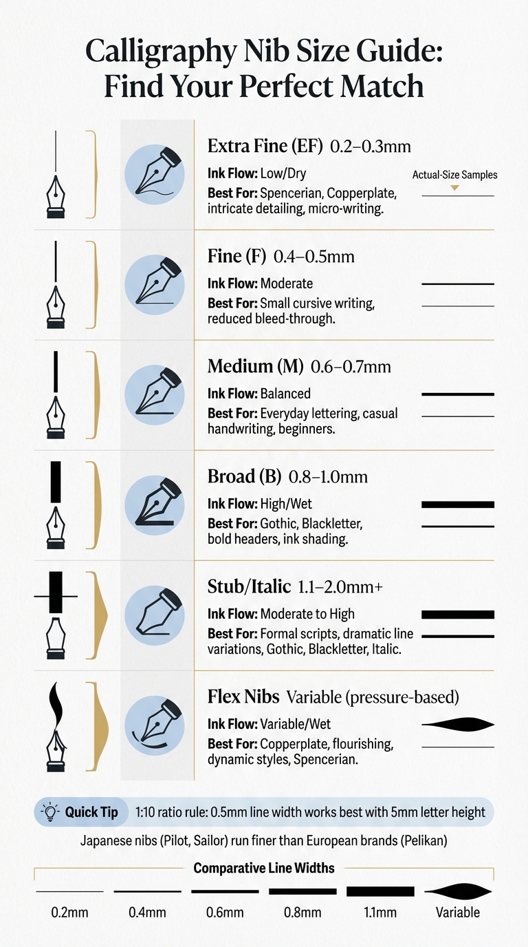
Calligraphy Nib Size Comparison Chart: Line Widths and Best Uses
Different Nib Sizes and Their Features
Extra Fine and Fine Nibs: Precision and Detail
Extra Fine (EF) nibs produce incredibly thin lines, typically between 0.2mm and 0.3mm. These are perfect for tasks requiring meticulous precision, like micro-writing or intricate details in scripts. If you're working on Copperplate or Spencerian calligraphy, an EF nib ensures every stroke stays sharp and defined, preventing letters from blending together. This makes them a go-to choice for styles that demand fine, delicate details.
Fine (F) nibs create slightly thicker lines, around 0.4mm to 0.5mm, making them ideal for everyday cursive writing. They maintain clarity in loops and connections, such as the rounded shapes in letters like 'e' or 'n,' without the risk of ink pooling. Additionally, fine nibs are great for avoiding bleed-through on thinner paper, making them practical for regular use.
For a more versatile option, medium nibs strike a balance between precision and boldness.
Medium Nibs: All-Purpose Lettering
Medium (M) nibs offer a line width of 0.6mm to 0.7mm, making them a versatile choice for a variety of writing styles. They provide a smooth ink flow, avoiding the scratchy feel that finer nibs can sometimes have on textured paper. Whether you're signing your name, jotting down notes, or practicing casual print handwriting, medium nibs deliver consistent performance. They’re also forgiving for beginners while offering enough control for more experienced users.
When you're ready to make a statement with bold, expressive strokes, broad nibs are the way to go.
Broad Nibs: Bold and Expressive Strokes
Broad (B) nibs create thick, striking lines ranging from 0.8mm to 1.0mm, perfect for making your writing stand out. These nibs glide effortlessly over rougher paper and excel at showcasing ink shading and shimmer effects that finer nibs can't achieve. Broad nibs are particularly suited for Gothic and Blackletter calligraphy, where bold, sweeping strokes are essential to the style. Keep in mind, though, that broad nibs require larger letter sizes and more spacing to maintain readability and avoid a cramped appearance.
sbb-itb-1dd4fe9
Specialty Nibs: Stub and Italic
Creating Chiseled Effects with Stub Nibs
Stub nibs are designed with a flat tip instead of a rounded one, which creates a distinctive "ribbon" effect when writing. This design produces broad downstrokes and narrow cross strokes effortlessly, without requiring added pressure. The result is a semi-calligraphic style that's both elegant and easy to achieve.
One standout feature of stub nibs is their rounded corners. These allow for smooth writing, making them suitable for everyday use as well as decorative scripts. Stub nib widths typically range from 0.6mm to 2.3mm, with wider nibs providing more dramatic line variations.
"With the right pen, nib, ink, and paper combination you will soon be getting that satisfying 'ribbon' effect which is reminiscent of calligraphy but without the time and effort required to learn that specific skill." – Brian Goulet, Founder, Goulet Pens
If you're new to stub nibs, starting with a 1.0mm or 1.1mm size is a good idea. These sizes are easier to control. As you gain confidence, you can experiment with larger widths like 1.5mm or beyond. Just remember to keep the nib flat while writing - any twisting can lead to skipping or an unpleasant scratchy feel.
Now, let’s take a closer look at italic nibs and how they elevate calligraphic techniques.
Italic Nibs for Formal Calligraphy Styles
Italic nibs take the flat design of stub nibs to the next level with sharp, squared-off edges. These edges create a striking contrast between thick and thin strokes, giving your writing a "chiseled" appearance that's perfect for formal scripts like Gothic, Blackletter, and Uncial. This sharp contrast enhances the overall visual appeal, making italic nibs a favorite for formal calligraphy. However, they do demand precision, as maintaining a 45-degree angle to the baseline is key, along with a slower, more deliberate writing pace.
For those who want a middle ground, cursive italic nibs are an excellent choice. These nibs feature slightly rounded edges, combining the smoothness of stub nibs with the pronounced line variation of traditional italics. They're ideal for formal correspondence and decorative writing. Italic nibs are available in sizes ranging from 1.1mm to 2.0mm or larger.
"True calligraphy nibs are often even squarer than italics; the intent is to give a very crisp and controllable line width." – Richard Binder, Pen Specialist
While italic nibs can create stunning results, their sharp corners require careful handling to avoid snagging on the paper. On the upside, they excel at showcasing ink properties like shading and sheen by laying down broader lines on downstrokes.
Fountain Pen Nib Sizes Explained || Extra-Fine, Fine, Medium, Broad, 1.1 Stub, Pilot Soft Flex
Nib Size Comparison Table
Here's a detailed comparison of nib sizes to help you understand their characteristics. The table below outlines typical line widths, ink flow patterns, and the calligraphy styles best suited for each nib size.
It's important to note that nib sizes can vary depending on the manufacturer. For instance, Japanese brands like Pilot and Sailor tend to produce finer nibs compared to European brands like Pelikan. A Japanese Medium nib (0.4mm–0.5mm) often matches the line width of a European Fine nib (approximately 0.5mm). This difference makes it essential to consider the nib's origin when making your selection.
| Nib Size | Typical Line Width | Ink Flow | Best Calligraphy Styles |
|---|---|---|---|
| Extra Fine (EF) | 0.2mm – 0.3mm | Low / Dry | Intricate detailing, micro-writing |
| Fine (F) | 0.3mm – 0.5mm | Moderate | Spencerian, small-scale Copperplate |
| Medium (M) | 0.5mm – 0.7mm | Balanced | General lettering, everyday cursive |
| Broad (B) | 0.8mm – 1.0mm | High / Wet | Bold headers, signatures, ink shading |
| Double Broad (BB) | 1.2mm+ | Very High | Artistic use, large-scale signatures |
| Stub / Italic | 1.1mm – 2.0mm+ | Moderate to High | Gothic, Blackletter, Italic scripts |
| Flex Nibs | Varied (Pressure-based) | Variable / Wet | Copperplate, Flourishing, Spencerian |
| Music Nib | 1.0mm – 1.9mm | Very Wet | Expressive, bold writing |
Fountain pen nibs are generally narrower than calligraphy nibs. For example, as highlighted by Nibs-USA.com, "A fountain pen fine, for instance, is much less than half the width of a calligraphy fine". Calligraphy nibs, particularly broad-edge ones used for scripts like Gothic or Blackletter, can range from 1.5mm to a striking 5.0mm in width.
Ink flow also plays a big role in how a nib performs. Finer nibs use less ink, which helps prevent bleed-through and allows for quicker drying. On the other hand, broader nibs lay down more ink, which enhances effects like shading and sheen.
Choosing the Right Nib Size for Your Calligraphy Style
Matching Nib Sizes to Calligraphy Styles
The nib size you choose should align with your calligraphy style. For scripts like Copperplate, Spencerian, and Modern Calligraphy, pointed pen nibs are a must. These styles rely on pressure variations to create those elegant changes in line width.
If you're working with Italic, Blackletter, or Uncial scripts, broad-edge nibs (also called chisel-edged nibs) are the way to go. Their flat edge helps produce the characteristic thick and thin strokes at specific angles. For instance, a 1.1mm italic nib is great for formal scripts, while nibs larger than 2.0mm are perfect for bold headers and larger designs.
Smaller handwriting generally benefits from finer nibs, as they keep the details crisp and prevent ink from bleeding into the next line. On the other hand, larger block letters shine with medium or broad nibs, which provide better coverage and enhance ink shading. For tight cursive, extra-fine or fine nibs work wonders, while larger block print thrives with broader nibs that fill the space beautifully.
Ultimately, the best way to find your perfect nib is through hands-on testing, keeping your style and preferences in mind.
Tips for Testing and Selecting Nibs
One helpful guideline is the 1:10 ratio of line weight to x-height. For example, if you're writing on 5mm (approximately 0.20 in) grid or dotted paper, a nib that creates a 0.5mm line width usually strikes a good balance between clarity and legibility.
When testing, try writing a series of cursive letters. If the loops feel cramped or overly dense, the nib might be too broad. As a general rule:
"A finer nib will usually give smaller handwriting a more attractive density. Using a nib that is too broad will smash all of your lines together, creating a high-density handwriting that will probably be hard to read."
Always test your nib on the paper you’ll actually use. Thinner papers often pair better with finer nibs to avoid bleed-through, while thicker or coated papers can handle the wetter ink flow of broader nibs. If you're looking to highlight ink properties like shading or sheen, medium, broad, or music nibs tend to bring out these effects far better than fine or extra-fine nibs.
Finally, don’t hesitate to adjust your letter size to suit the nib instead of sticking rigidly to your current writing habits. Writing larger with a broad nib or smaller with a fine nib might reveal a combination that feels more natural and produces stunning results.
Fountain Pen Revolution: Affordable Nibs for Every Style
Why Choose Fountain Pen Revolution for Nibs
If you've been exploring how nib sizes influence calligraphy styles, Fountain Pen Revolution makes it easy to find affordable options tailored to your needs. Their #6 steel nibs for calligraphy start at just $5.00 for classic sizes like Extra Fine, Fine, and Medium. For those looking to experiment with specialty nibs, options such as the 1mm Stub, Architect, and Fine Flex nibs are available starting at $9.00. For maximum line variation in scripts like Copperplate or Spencerian, the EF Ultra Flex nib is a standout choice at $19.00. These prices make it simple to try out different styles without breaking the bank.
For those who want to refine their formal scripts, Fountain Pen Revolution pairs the Ultra Flex nib with a 6.3mm ebonite flex feed, ensuring smooth ink flow even during heavy pressure swells. Meanwhile, 1mm Stub nibs and Architect nibs offer distinct line variations perfect for Italic or Blackletter styles.
Not sure which nib suits you best? Try the 5-nib Sampler Pack for $28.00 (about 15% off) or the 8-nib Sampler Pack for $56.00 (around 20% off). These packs let you explore multiple sizes and specialty grinds before committing to a single option. You can purchase nibs individually or opt for complete Nib Units (starting at $12.00), which include the housing and feed for easy installation.
With such a wide range of affordable options, it's simple to experiment and find the perfect nib for your calligraphy journey.
Getting Started with Fountain Pen Revolution
Ready to elevate your calligraphy? Fountain Pen Revolution offers a budget-friendly way to enhance your practice. Start by browsing their selection at Fountain Pen Revolution and filtering for nibs that match your preferred style. For scripts like Copperplate that demand significant line variation, the EF Ultra Flex nib paired with an ebonite feed combo ($20.00) ensures smooth, consistent ink flow during pressure shifts. If you're working on formal styles like Italic or Blackletter, the 1mm Stub nib produces the bold, contrasting strokes these scripts require.
Take advantage of free shipping on US orders over $65.00, or enjoy free international shipping on orders of $149.00 or more. To keep your nibs in top condition, consider adding brass flossing sheets to your order - these help maintain clean nib slits and ensure smooth ink flow. With both Chrome and Two-tone finishes available, you can even match your nib to your pen's design.
These tools make it easier than ever to bring precision and creativity to your calligraphy practice.
Conclusion
The nib size you choose plays a key role in shaping your calligraphy by influencing ink flow and the character of your strokes. Whether you're drawn to the precision of an Extra Fine nib (0.2mm–0.3mm) for intricate cursive scripts or the bold impact of a Broad nib (0.8mm–1.0mm) for dramatic lettering, selecting the right tool can elevate your work.
A good rule of thumb is to aim for a 1:10 ratio of line weight to x-height - like a 0.5mm line paired with 5mm tall letters. Fine nibs are ideal for tighter line spacing, while broader nibs shine on wider-ruled paper, highlighting ink effects like shading and sheen or shimmer.
With this understanding, you can confidently explore nib options. Companies like Fountain Pen Revolution make it easy to experiment with different nibs without breaking the bank, opening the door to endless creative possibilities.
FAQs
How do I pick a nib size for my letter size?
When selecting a nib, consider your handwriting style and how you plan to use your pen. A fine or medium nib works well for small, precise handwriting or when you need ink to dry quickly. On the other hand, a broad nib is ideal for larger, more expressive writing and showcasing the unique characteristics of your ink. To get the best experience, match the nib size not only to your writing style but also to the type of paper you’ll be using.
What nib works best on thin paper without bleeding?
Fine nibs, like Extra Fine or Fine, work perfectly with thin paper. They produce crisp, precise lines that dry quickly, reducing the chance of ink bleeding through. This makes them a great choice for writing on delicate paper types.
Stub, italic, or flex - how do I choose?
Choosing the right nib - stub, italic, or flex - really comes down to your calligraphy style and experience level.
- Stub nibs are a fantastic starting point. They're smooth to write with, forgiving, and make it easy to achieve consistent line variation. Perfect for beginners looking to experiment with calligraphy.
- Italic nibs deliver sharper, more defined lines, creating a dramatic effect. However, they require a steady hand and more precision, so they might be better suited for someone with a bit of practice.
- Flex nibs are all about expressive strokes and are often used for ornate scripts like Copperplate. While they can create stunning results, they do take time and effort to master.
If you're unsure where to begin, a stub nib is a safe and beginner-friendly choice.