
Fountain pen inks offer unique effects like shading (light-to-dark color transitions) and sheening (metallic secondary colors). These effects depend on the ink, pen, nib size, and paper. To evaluate inks effectively:
- Start with a sample vial: Test multiple inks affordably before buying full bottles.
- Use different paper types: Smooth, non-absorbent papers like Tomoe River highlight sheen, while absorbent papers can impact shading.
- Experiment with nib sizes: Broader nibs and glass dip pens enhance both shading and sheen.
- Test ink flow: Write at normal and heavy flow to see how pooling affects results.
- Keep detailed records: Track paper, nib, and flow to understand ink behavior over time.
Testing inks systematically helps you find the perfect match for your writing style. Your tools and techniques can make the same ink look completely different. Ready to dive in? Start experimenting with these tips!
The Difference Between Shading, Sheening & Shimmer Inks | & a Little Swatching Party
sbb-itb-1dd4fe9
1. Start With a Sample Vial
Before committing to a full bottle of ink priced between $18.00 and $25.60, it’s smart to start with a small sample vial. This gives you the chance to see if the ink meets your expectations for shading and sheen without taking on financial risk. As Goldspot Pens explains:
"Choosing a shading ink alone will not give you the desired dramatic effect. A good, shading ink is one variable of a three-part equation."
Samples are incredibly useful for side-by-side comparisons. With a few vials, you can test 5–10 different inks in one session, directly comparing their shading depth or sheen intensity. This is especially helpful when deciding between similar shades - like a handful of aqua or teal inks - where subtle differences in saturation and sheen can make all the difference. For example, highly saturated inks tend to sheen more but shade less, so seeing them in action helps you find the perfect match for your writing style.
Before using your sample to fill a pen or create a swatch, give the vial a quick shake. Over time, dyes and particles can settle, and a little agitation ensures you’re testing the ink at its true consistency.
"A well curated collection does not need to be large. It needs to be intentional." - Ferris Wheel Press
This philosophy fits perfectly here. Samples allow you to curate a collection that’s tailored to your preferences. Instead of buying full bottles on a whim, you can focus on inks that truly deserve a spot in your lineup. Plus, your sample findings will come in handy when testing on different paper types, as discussed in Tip 2.
2. Swatch on Multiple Paper Types
After testing your ink with sample vials, the next step is to see how it performs on different types of paper. The paper you choose plays a big role in how shading and sheening appear.
Sheen happens when dye pools on the surface of the paper. On absorbent paper, the ink soaks into the fibers quickly, which eliminates the sheen. On smoother, less absorbent paper, the ink stays on the surface longer, allowing the sheen to develop.
"Sheen is most visible on smooth, non-absorbent paper (like Tomoe River or Graphilo) using a wet pen. On absorbent paper, the dye is pulled into the fibers before enough accumulates on the surface to produce the effect." - InkPalette
To get a full picture of an ink's performance, it helps to test on at least three types of paper. Tomoe River paper is ideal for highlighting sheen. Rhodia is a dependable choice that reflects how the ink behaves for most users. If you're interested in testing shading with bold, wet lettering, MD Cotton is another good option. Fountain pen collector and professor Susan M. Pigott shares: "I also test inks with a Tomoe River notebook (because this is such a popular paper) and the MD Cotton A4 plain for large lettering."
Absorbent papers are more likely to show feathering (blurry ink edges) and bleed-through (ink soaking through to the other side), which can interfere with shading and sheen results. To keep your tests clean and accurate, stick to fountain-pen-friendly papers like Rhodia or Clairefontaine.
3. Test With Different Nib Sizes
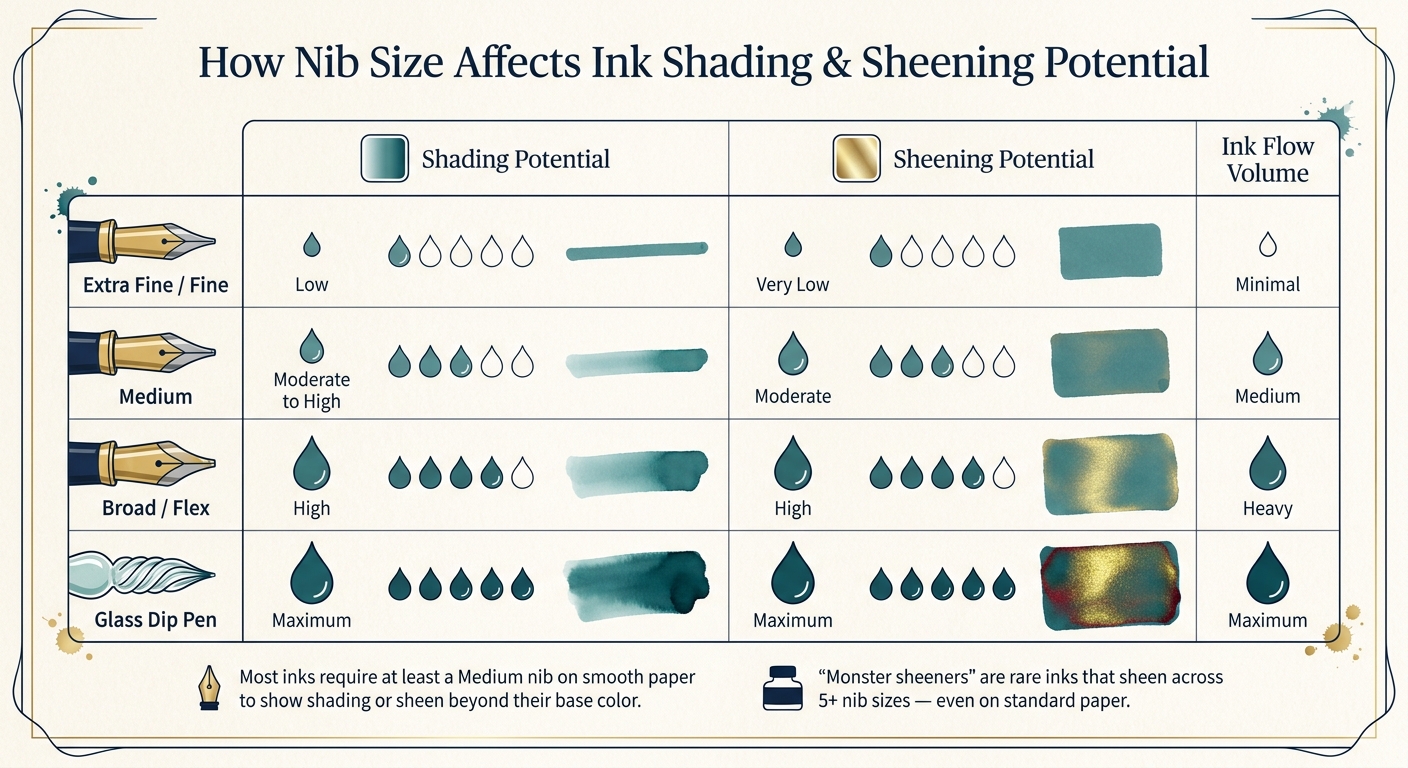
Nib Size vs. Ink Shading & Sheening Potential Chart
Once you've tested how your ink behaves on various paper types, it's time to see how nib size plays a role. The size of your nib determines how much ink flows onto the page, which directly impacts shading and sheening. This is where things get really interesting.
Broader nibs lay down more ink, which enhances both shading and sheening. The extra ink creates shading - a beautiful gradient from light to dark within a single stroke - and allows metallic sheens to appear as the ink dries. On the other hand, fine nibs produce thinner, more uniform lines with less opportunity for these effects to shine.
"Shading can be showcased the best in medium, broad, and flex nibs." - Kelli McCown, Mountain of Ink
A great way to test this is by using the same ink in two different pens: one with a Japanese Fine nib and another with a Western Medium or Broad nib. You'll notice that the fine nib offers a consistent color, while the broader nib reveals more tonal variation and sheen.
| Nib Type | Shading Potential | Sheening Potential |
|---|---|---|
| Extra Fine / Fine | Low | Very Low |
| Medium | Moderate to High | Moderate |
| Broad / Flex | High | High |
| Glass Dip Pen | Maximum | Maximum |
If you want to push an ink to its limits, try using a glass dip pen. These pens create a wetter line than typical fountain pens, making them perfect for revealing the full potential of shading and sheen. This makes them especially handy during the initial testing phase when you're deciding on the best pen and nib combination.
Some inks are even labeled based on how many nib sizes can reveal their unique properties. For example, "Monster sheeners" are rare inks that show a sheen across five or more nib sizes - even on standard paper. However, most inks require at least a medium nib on smooth paper to display anything beyond their basic color.
4. Write With Both Normal and Heavy Ink Flow
When testing ink, it’s not just about the nib size - ink flow plays a huge role in how shading and sheening appear. Under normal flow, inks typically behave as expected: you’ll see the base color, maybe with a touch of shading. But when you increase the ink flow - by writing slower, pressing harder, or using a wetter pen - you’ll notice a dramatic change. The extra ink pooling on the paper often brings out the sheen. This sheen happens because of thin-film interference, much like the rainbow effect on an oil slick. When a thick layer of ink dries on smooth, low-absorption paper, light reflecting off the surface creates a bold metallic secondary color.
Brian Goulet, Founder of Goulet Pens, explains it perfectly:
"The more ink you lay down, the more dramatic the sheen becomes."
Some inks undergo a complete transformation with heavy flow. Take Wearingeul Valley of Fear, for instance - it shades beautifully under normal flow but develops a striking red sheen with heavier ink application. Similarly, Organics Studio Nitrogen can produce such a vivid red sheen under heavy flow that it almost overtakes its base blue color.
| Property | Normal Flow | Heavy Flow |
|---|---|---|
| Shading | Subtle, light-to-dark transitions | High contrast; reveals multi-tonal colors |
| Sheening | Minimal to none; base color dominates | Metallic luster; secondary color appears at edges |
| Dry Time | Fast; practical for everyday use | Slow; requires patience to avoid smudging |
Want to test both conditions? Here’s a simple method: write the same word or phrase twice on the same paper. First, write at your usual speed; then, slow down, letting the ink build up. This side-by-side comparison helps you see how the ink performs under different flows. Keep track of your results - you’ll start to notice patterns that make understanding your inks much easier.
5. Keep Consistent Records of Your Results
When testing ink flow and nib size, keeping organized records is essential. Skipping this step can make it hard to replicate results or spot patterns. By logging each test - paper type, nib size, and flow conditions - you’ll create a reliable reference for future comparisons.
Susan M. Pigott, a well-known fountain pen enthusiast, shares this insight:
"I decided to standardize how I do ink reviews so each one is more consistent."
Tracking the same variables every time, like paper type and nib size, helps explain why the same ink can behave so differently on two swatches. Over time, your records will uncover patterns - like which papers consistently highlight sheen or which nib sizes enhance shading.
To stay organized, consider using tools like swatch cards or pre-printed logs. For instance, Col-o-ring cards are perfect for comparing inks side by side, while notebooks like The PenThing Ink Swatch Plot Log include pre-printed categories and even a 1–10 rating scale for properties like shading, sheen, dry time, feathering, and bleeding. Numerical ratings make it easier to compare inks at a glance without relying solely on written notes.
Another tip: photograph your swatches in natural light with a macro lens to capture subtle details like sheen. Be sure to label every swatch with the full ink name to avoid confusion later.
| Detail to Log | Why It Matters |
|---|---|
| Paper Type | Absorbency impacts sheen and shading |
| Nib Size | Line width affects how much ink is applied |
| Flow/Application | Differentiates light versus heavy ink behavior |
| 1–10 Property Ratings | Provides quick, objective comparisons |
Conclusion
Testing ink for shading and sheening takes time and a bit of experimentation, but the results are worth it. Let’s quickly revisit the five tips discussed in this article:
- Start with a sample vial to avoid committing to a full bottle before you're sure.
- Try different paper types to see how absorbency changes the ink’s behavior.
- Experiment with nib sizes, from extra fine to broad or stub, to find the sweet spot for shading and sheen.
- Test varying ink flows, from normal to heavy, to observe how pooling impacts the color and sheen.
- Keep detailed records to make your comparisons consistent and helpful over time.
The overarching message? Personalized testing is essential. As Kelli from Mountain of Ink puts it:
"The best way to see how an ink handles is to try it yourself."
Your pen, paper, and writing style all influence how an ink behaves, so hands-on testing is the only way to truly understand its potential. For instance, the same ink can appear entirely different when used with a fine nib on standard copy paper versus a broad stub on Tomoe River paper.
If you’re new to this, Fountain Pen Revolution offers a great starting point. Their beginner-friendly fountain pens, starting at just $35, give you the chance to experiment with nib sizes and ink flow without breaking the bank. Pair a broad or stub nib with a quality ink, and you’ll immediately notice the dramatic effects of shading and sheening.
FAQs
What’s the quickest way to test an ink before buying a bottle?
The quickest way to try out an ink is by using a dip pen or a calligraphy nib on fountain-pen-friendly paper. This approach allows you to immediately observe the ink's shading, sheen, flow, and overall behavior - without the hassle of filling a pen. It’s a simple and practical way to test the ink before deciding to invest in a full bottle.
Which paper should I use to see the most sheen?
To get the best sheen from your ink, opt for coated papers like Clairefontaine or Tomoe River. These papers are designed to slow down ink absorption, which keeps the ink on the surface longer. This delay allows the ink to fully develop its shiny, metallic effect. Coated papers are perfect for highlighting sheen because they prevent the ink from soaking in too quickly, giving it time to crystallize and show off its full range of visual properties.
How can I tell if poor sheen is my ink, pen, or paper?
Sheen largely depends on how ink, pen, and paper interact. For instance, absorbent paper like standard copy paper tends to diminish sheen, while coated paper can make it more pronounced. Other factors include the ink's composition and the nib type - broader nibs and wetter ink flows generally bring out more sheen. If you're looking to boost sheen, consider using coated paper, a wetter ink, or a broader nib.