
Stub and italic nibs are perfect for adding style and personality to your writing. These nibs create thick vertical lines and thin horizontal ones, giving your handwriting a distinct look without requiring advanced calligraphy skills. Here's what you need to know:
- Stub nibs are smooth with rounded edges, great for everyday writing.
- Italic nibs have sharp edges, ideal for formal scripts but require more precision.
- Hold the pen at a 45-degree angle to maintain consistent ink flow and line variation.
- Start with a 1.1mm stub nib for easy control, then explore sharper italic nibs for more dramatic effects.
- Use fountain pen-friendly paper to avoid ink smudges or bleed-through.
Practice drills like vertical, horizontal, and diagonal strokes to master the basics. Over time, you'll achieve smooth, elegant writing with these nibs.
What Are Stub and Italic Nibs?
Defining Stub and Italic Nibs
Stub and italic nibs stand out because of their broad, flat tips, a departure from the rounded tips typical of standard fountain pen nibs. The main distinction between the two lies in the edges. Stub nibs have rounded corners, making them smoother and easier to use, perfect for everyday tasks like writing, journaling, or signing documents. Italic nibs, on the other hand, feature sharper, chisel-like edges that create more defined, high-contrast strokes, making them a go-to for formal calligraphy and traditional scripts.
"The difference between a stub and an italic is how sharp the corners of the nib are. Think of it like a crisp corner edge like the edge of a sheet of paper is an italic nib. A softer rounded edge on a nib is a stub." - Ana, Author, The Well-Appointed Desk
Stub nibs glide effortlessly across the page, thanks to their rounded edges, minimizing the chances of catching on the paper. Italic nibs, however, require a bit more care and precision; if the angle isn't just right, they can snag the surface. Now, let’s dive deeper into their structural differences.
Nib Structure and Sizes
The unique design of stub and italic nibs sets them apart from standard round nibs. Both feature flat tips and straight-cut tines, which result in thick vertical downstrokes and thin horizontal cross-strokes. Stub nibs are characterized by short, stubby tines with shallow shoulders, offering the stability needed for consistent line variation. Italic nibs maintain the flat tip but have sharper, more pronounced edges, enhancing the contrast in strokes.
These nibs come in various widths, commonly 1.1 mm, 1.5 mm, and 1.9 mm, which refer to the width of the downstroke. For beginners, a 1.0 mm or 1.1 mm stub nib is a popular choice, as it provides noticeable line variation without feeling overwhelming. For those who prefer finer lines, options like 0.5 mm and 0.6 mm are available. Because these nibs lay down more ink than standard ones, using high-quality, fountain pen–friendly paper is essential to avoid issues like feathering or bleed-through.
Stubs, Cursive Italics, Italics & Obliques Differences & Characteristics
Stub vs. Italic Nibs: How They Compare
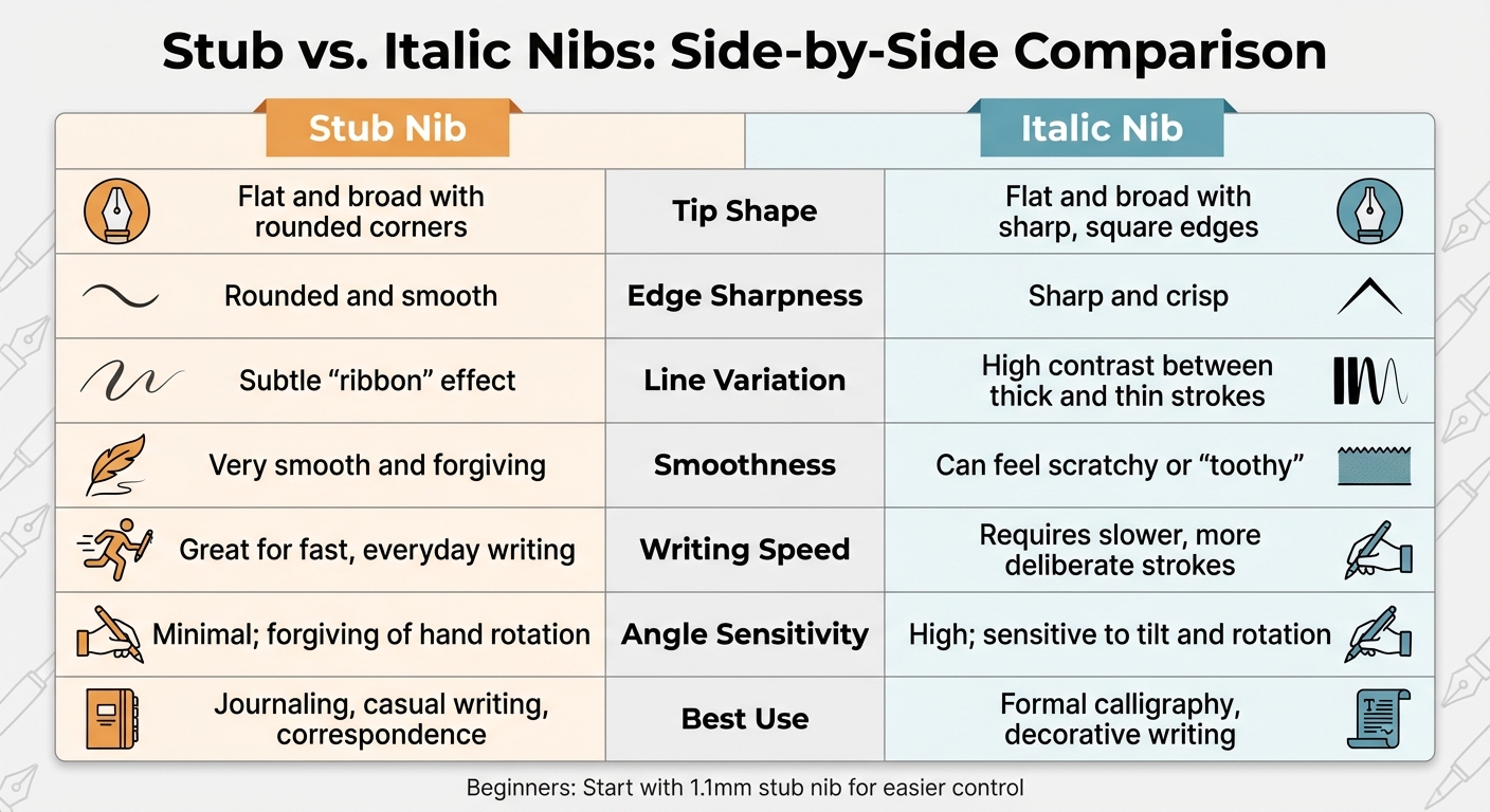
Stub vs Italic Fountain Pen Nibs Comparison Chart
Side-by-Side Comparison
Knowing the key differences between stub and italic nibs can help you decide which one fits your writing style and purpose.
| Feature | Stub Nib | Italic Nib |
|---|---|---|
| Tip Shape | Flat and broad with rounded corners | Flat and broad with sharp, square edges |
| Edge Sharpness | Rounded and smooth | Sharp and crisp |
| Line Variation | Subtle "ribbon" effect | High contrast between thick and thin strokes |
| Smoothness | Very smooth and forgiving | Can feel scratchy or "toothy" |
| Writing Speed | Great for fast, everyday writing | Requires slower, more deliberate strokes |
| Angle Sensitivity | Minimal; forgiving of hand rotation | High; sensitive to tilt and rotation |
| Best Use | Journaling, casual writing, correspondence | Formal calligraphy, decorative writing |
Stub nibs are smoother and more forgiving, making them ideal for everyday use. Italic nibs, on the other hand, can feel scratchy if misaligned but deliver striking line contrast when used correctly. As Brian Goulet, Founder of The Goulet Pen Company, explains:
"Stub – rounded edges, smooth but you sacrifice more line variation, more forgiving with regard to the angle at which the pen is held".
These distinctions make it easier to determine which nib type aligns with your writing needs.
Selecting the Right Nib Type
Your choice of nib depends on your writing goals and experience level.
Begin with a stub nib if you're new to broad-edged writing. A 1.0mm or 1.1mm stub is a great starting point, offering noticeable line variation without requiring precise angle control. It's perfect for journaling, note-taking, and general correspondence.
Opt for an italic nib for formal calligraphy or dramatic line contrast. Italic nibs demand precision and slower, deliberate strokes. As pen expert Richard Binder points out:
"Writing too rapidly with an italic tends to produce scratchiness and skips... You are forced to write more slowly in order to retain control of your writing".
The sharp edges of an italic nib create striking differences between thick downstrokes and thin cross-strokes, but they require careful handling and angle control.
Explore a cursive italic for a balanced approach. This grind offers edges that are more rounded than a true italic but sharper than a stub. It delivers strong line variation while remaining smooth enough for everyday use. If you've mastered stub nibs and want more dramatic effects, a cursive italic could be a great next step.
Basic Writing Techniques
Pen Angle and Hand Position
To get the most out of your nib, start by holding your pen at a 45-degree angle to the paper. This ensures the flat edge of the nib stays fully in contact with the surface, creating the desired line variation. Your grip should feel natural - relaxed yet steady - with the pen's own weight or light pressure doing the work. Applying extra pressure isn’t necessary and can even hinder performance. As you write, keep the nib flat against the paper without rotating the pen barrel. Both tines need to stay in contact with the surface to maintain a smooth and consistent ink flow. Even a slight twist can lead to issues like skipping, scratchiness, or the ink flow stopping altogether.
"Keeping the nib flat on the paper at all times will ensure a consistent flow of ink" - Brian Goulet, Founder of The Goulet Pen Company.
Controlling Line Width
Once you’ve nailed the pen angle, the next step is to focus on stroke direction. Line variation doesn’t come from pressure but from how you move the pen. When making vertical strokes (downstrokes), the nib’s full width touches the paper, creating thick lines. On horizontal strokes, only the nib’s edge makes contact, resulting in thinner lines. Practicing these strokes will help you achieve consistent line variation - broad verticals and fine horizontals - all while maintaining the correct pen angle.
If you’re using an italic nib, slow down your writing speed. Italic nibs are especially sensitive to the writing angle, and moving too quickly can lead to scratchy lines or skipping.
"The italic nib... is particularly sensitive to the writing angle, making them highly susceptible to cutting paper" - Danny Watts, Author of Chronicles of a Fountain Pen.
sbb-itb-1dd4fe9
Practice Exercises for Beginners
Line and Stroke Drills
Begin with straightforward vertical lines - draw parallel downstrokes across the page. These strokes create your widest lines because the nib's full width touches the paper. The key here is consistency. Keep each stroke the same thickness by holding the nib at a steady, flat angle. Next, practice horizontal strokes to achieve your thinnest lines. This contrast between thick vertical strokes and thin horizontal ones is what gives stub and italic nibs their distinct "ribbon" effect.
Once you're comfortable with vertical and horizontal strokes, move on to diagonals. For right-handed writers, strokes from the upper-left to the lower-right often appear thicker, while those from the upper-right to the lower-left look thinner. This exercise helps you understand how the nib's orientation impacts the weight of your strokes. Work slowly to avoid the nib's sharp edges catching on the paper.
When you feel confident with these basic strokes, try combining them into continuous curves and simple letterforms.
Letter Shapes and Loops
Now that you've practiced controlled strokes, it's time to shape letters and curves. Start with continuous "O" shapes and figure-eights to develop muscle memory. These exercises will help you keep the nib flat while smoothly changing directions. Maintaining consistent contact with the paper is crucial here to ensure even ink flow. If the pen skips or feels scratchy, check your grip - make sure the nib stays aligned straight ahead.
After loops, move on to individual letters. Begin with letters that emphasize vertical strokes, such as "l", "h", and "t", to reinforce your broad downstrokes. Then, practice letters with horizontal elements like "e" and "z" to refine your thin lines. The objective is to transition seamlessly between thick and thin strokes without adding unnecessary pressure.
Fixing Common Problems
Once you've got stroke techniques down, it's time to tackle some common pen-related issues to make your writing experience even smoother.
Dealing with Scratchiness
Scratchiness happens when one side of the nib catches on the paper while the other side lifts slightly. This is often caused by a slight rotation of the pen along its long axis. To fix this, hold the nib up to the light and check if both tines are perfectly level. Writing slowly can also help prevent a misaligned tine from catching. Additionally, inspect the nib slit for any trapped paper fibers that might be causing the problem. If the issue persists, consider trying a cursive italic grind, which can provide a smoother glide.
Improving Ink Flow
If your pen isn't delivering ink smoothly, the problem might be that the nib isn't maintaining full contact with the paper. Make sure the nib stays flat against the surface to ensure steady ink transfer. Sometimes, the underside of the tines can be too smooth - especially with gold nibs - creating a gap that disrupts ink flow. This can lead to hard starts or skipping. If alignment isn't the issue but skipping continues, try using a wetter ink or switching to a more textured, absorbent paper to help bridge the gap. For new pens, flushing the nib and feed with water can remove manufacturing oils that might block ink flow. Another common issue to watch out for is railroading.
Preventing Railroading
Railroading happens when the ink splits into two parallel lines instead of forming a single, smooth stroke. This occurs when both tines don't make contact with the paper at the same time, breaking the ink bridge. Pay close attention to your grip and ensure both tines touch the paper evenly - just a slight twist can disrupt the flow. Use a light touch and let the nib's natural design create line variation. If railroading persists, examine the nib under a magnifying loupe (5× to 10×) to see if one tine is higher than the other. If needed, you can gently adjust the misaligned tine with your fingernail. Also, make sure the feed is thoroughly cleaned, as leftover manufacturing residue can interfere with ink flow.
Conclusion
To master stub and italic nibs, focus on keeping the nib flat, maintaining a steady angle, and resisting the urge to apply extra pressure. As Brian Goulet, Founder of The Goulet Pen Company, explains:
"Writing with a stub nib can take some practice and some getting used to... but once you get the hang of it, it can be very rewarding".
The unique shape of these nibs naturally creates striking line variation, setting them apart from standard options. With consistent practice, these techniques can become second nature, making your writing flow with ease. Starting with a 1.1mm stub nib is a great way to strike a balance between noticeable line variation and ease of use. As your skills grow, you can gradually experiment with sharper italic nibs for even more dramatic effects.
For those just starting, Fountain Pen Revolution offers beginner-friendly stub and italic nib sets starting at about $35. Their selection caters to both newcomers and seasoned writers. By practicing the techniques and drills mentioned earlier, you’ll refine your style and add a touch of calligraphic elegance to your everyday writing - whether it’s journaling or simple note-taking.
It’s important to give yourself time to adapt, as the feedback and feel of these nibs differ from standard ones. Stick with it, keep tweaking your technique, and soon your writing will showcase the effortless sophistication these nibs are known for.
FAQs
Which nib width should I start with for daily writing?
For those new to fountain pens, starting with a Fine or Medium nib is a smart choice for everyday use. A Fine nib is ideal if you have smaller handwriting or prefer ink that dries quickly. On the other hand, a Medium nib provides a slightly thicker line, offering a balance of comfort and flexibility. These nibs are great for honing your writing style before diving into more specialized options like stub or italic nibs.
How do I keep a consistent angle while writing?
To achieve smooth ink flow and consistent lines, hold the pen at an angle between 40° and 55° relative to the paper. Keep your grip light and guide the pen using your entire arm rather than just your fingers. Stay relaxed, adjust your hand position as needed, and avoid applying too much pressure - this helps maintain the right angle and ensures your writing stays steady.
What ink and paper work best with stub or italic nibs?
For stub or italic nibs, it's best to go with inks that highlight their natural line variation. Think deep blacks or vibrant blues - colors that make your writing pop. Just as important is using high-quality, fountain pen-friendly paper. These nibs tend to release more ink, so the right paper helps avoid issues like bleeding or feathering. Opt for absorbent paper that promotes smooth ink flow and keeps your lines sharp and clean.