

Choosing the right ink for greeting card calligraphy can make or break your design. The best inks ensure smooth flow, vibrant colors, and durability against smudging or fading. Here's what you need to know:
- Key Ink Properties: Focus on ink flow, drying time, and pigmentation to achieve clean, bold strokes without smudges.
- Paper Compatibility: Match your ink to the paper type - smooth cardstock works well with dye-based inks, while textured or watercolor papers pair better with pigmented inks.
- Special Effects: Metallic and shimmer inks add flair, with options like gold or white for standout designs.
- Nib Compatibility: Thicker, pigmented inks suit pointed pens, while low-viscosity inks flow better in fountain pens.
- Product Recommendations: Affordable, high-quality options from brands like Fountain Pen Revolution include beginner-friendly inks and specialty shimmer varieties.
Whether you're creating festive cards or elegant invitations, choosing the right ink ensures your calligraphy looks polished and lasts over time.
Calligraphy Handmade Halloween Cards | Metallic Ink & Watercolor
sbb-itb-1dd4fe9
Key Ink Properties for Greeting Card Calligraphy
Crafting stunning greeting cards with calligraphy starts with understanding the essential properties of ink. These characteristics help you avoid common pitfalls like skipping, feathering, or smudging. The three key factors to focus on are ink flow, drying time, and boldness on paper.
Ink Flow and Consistency
Ink flow refers to how easily it moves from the nib to the paper, while consistency relates to its thickness or viscosity. If the ink is too thick, it can cause skipping and uneven strokes. On the flip side, overly thin ink might bleed into the paper fibers or create unsightly pools. The right balance ensures clean, consistent lines every time.
For example, sumi ink is known for its smooth flow and can be diluted slightly with water to achieve the perfect consistency without compromising intricate details. If your ink feels too thick, adding a few drops of water can often solve the problem.
Drying Time and Smudge Resistance
Greeting cards are frequently handled during writing, assembly, and mailing, making smudge resistance a must. Slow-drying inks are prone to smearing, whether from finger pressure or accidental contact with an eraser.
Dr. Ph. Martin's Bleed Proof White is a standout option for its quick-drying qualities and smudge resistance, even when used for corrections. For black inks, beginners often turn to affordable fountain pens or Higgins Eternal, which reliably dries well on card surfaces without leaving smudges.
Pigmentation and Opacity
Pigmentation determines the richness and vibrancy of the ink, while opacity measures how well the ink covers the surface without letting the background show through. Highly pigmented inks like Ziller Soot Black deliver bold, lightfast results that look professional and vibrant.
When working on dark cardstock or creating layered designs, opacity becomes crucial. Products like Finetec Gold watercolors and Dr. Ph. Martin's white offer excellent coverage, ensuring your lettering stands out with a striking visual presence. Thin, low-opacity inks might feather or appear washed out, so selecting the right formulation ensures your calligraphy remains sharp and eye-catching.
Next, we’ll look at how these ink properties interact with different paper types to elevate your greeting card designs.
Choosing Inks for Different Paper Types
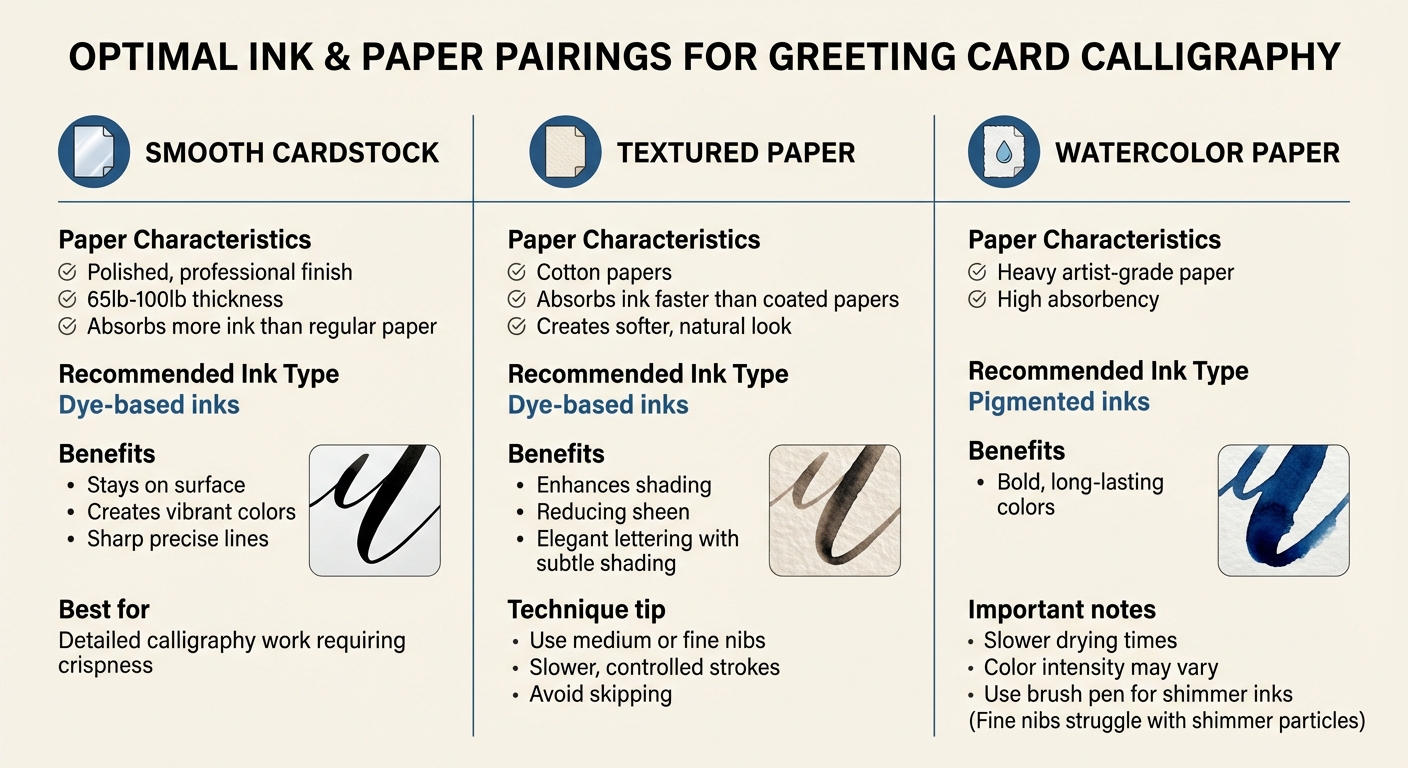
Ink and Paper Pairing Guide for Greeting Card Calligraphy
The type of paper you use has a big impact on how your ink performs. It can make the difference between clean, crisp results and issues like feathering, bleeding, or uneven coverage. Let’s look at how smooth cardstock, textured paper, and watercolor paper each call for specific ink choices.
Smooth Cardstock
Smooth cardstock is a go-to for projects like greeting cards because it delivers a polished, professional look. Its surface finish and thickness, typically ranging from 65lb to 100lb, mean it absorbs more ink than regular paper. For this type of paper, dye-based inks are a great match. They stay on the surface, creating vibrant colors and sharp, precise lines. This makes smooth cardstock a favorite for detailed work, like calligraphy, where crispness is key.
Textured Paper
Textured and cotton papers bring a unique challenge. They absorb ink much faster than coated papers, resulting in a softer, more natural look. This characteristic enhances shading while reducing sheen.
For textured paper, dye-based inks work well when you’re aiming for elegant lettering with subtle shading. To avoid skipping and maintain smooth lines, use medium or fine nibs and slower, more controlled strokes. Adjusting your technique is essential to get consistent results on these uneven surfaces.
Watercolor Paper
Watercolor paper and other heavy artist-grade papers require a completely different approach. Their high absorbency makes pigmented inks the best choice, as they produce bold, long-lasting colors. However, drying times will be slower, and color intensity may vary depending on the paper.
If you’re using shimmer inks on watercolor paper, it’s better to use a brush pen or a flex fountain pen. Fine nibs can struggle with shimmer particles, which may settle into the paper rather than creating the desired effect.
Color Vibrancy and Special Effects
The ink finish and color you choose can completely transform your greeting card calligraphy, shifting its tone from subtle and refined to bold and eye-catching.
Matte vs. Metallic Inks
Matte inks, like Dr. Ph. Martin's Black Star, dry with a completely non-reflective finish, giving your work a sleek, modern look. Unlike standard inks that retain a slight sheen, matte inks stand out for their flat, understated aesthetic. Calligrapher and author Molly Suber Thorpe highlights their practicality:
the matte finish's non-reflective quality is ideal for scanned or photographed work.
This makes them a great choice for cards you plan to digitize for online sharing or printing.
Metallic inks, by contrast, are packed with pigment or mica, creating a bold, reflective finish that pops on both light and dark paper. These inks are perfect for celebratory or festive designs where you want your calligraphy to shine - literally. While matte inks exude sophistication, metallic inks bring drama and flair to your creations.
Some inks even go a step further by incorporating shimmer effects, adding another layer of visual interest.
Shimmer and Sheen Effects
Shimmer effects add a sparkling polish to your work that catches the light beautifully, even after drying. Many metallic inks, like Dr. Ph. Martin's Copper Plate Gold, use shimmer particles as a defining feature, giving your greeting cards a luxurious, professional touch.
To get the most out of shimmer inks, remember to shake the bottle regularly or use one with a shaker ball to keep the pigment evenly distributed. Heavily absorbent papers can cause shimmer particles to settle unevenly, so testing your ink and paper combination beforehand is a smart move.
Gold and Specialty Colors
Gold and white inks are especially popular for greeting card calligraphy. Opaque formulations, such as Kuretake Brilliant Gold Mica or Bleed Proof White, ensure your lettering stands out sharply - perfect for formal invitations or holiday cards.
The vibrancy of these specialty inks comes down to their opacity. As Molly Suber Thorpe explains:
a true test of opacity is whether fine hairlines match the color intensity of bold strokes.
Inks with high pigmentation, like sumi or acrylics, deliver rich, consistent color that holds up across different stroke widths. On the other hand, watery inks create a softer, more translucent effect. For a custom touch, you can mix concentrated white inks like Bleed Proof White with other colors to create opaque pastel shades, ideal for use on colored cardstock.
These vibrant and dynamic inks pair beautifully with the right fountain pen nib, which we’ll explore in the next section.
Ink Flow and Nib Compatibility
Matching the right ink viscosity to your nib is key to achieving smooth, consistent writing. Thicker inks give you precise control, while thinner inks help avoid clogging and feathering. But there’s another layer to consider: how nib design influences your ink choice. If the ink is too thick, your fountain pen might skip or stop writing entirely. Too thin, and your pointed pen strokes could bleed into the paper fibers, ruining those fine details. Let’s dive into how these dynamics play out for fountain pen nibs and pointed pen tools.
Fountain Pen Nibs
Fountain pen nibs - whether fine, medium, or broad - work best with smooth, low-viscosity inks that won’t clog their feed systems. For fine nibs, thinner inks like Ziller Soot Black are a great choice. They flow effortlessly through the narrow channels, making them perfect for detailed lettering on smooth cardstock. These inks are also highly pigmented and lightfast, so your work pops without the annoyance of skipping.
For medium and broad nibs, inks with a velvety consistency like Moon Palace Sumi are ideal. These inks provide a smooth flow and rich pigmentation, ensuring even strokes without pooling on the page. Some calligraphers tweak sumi inks by diluting them slightly with water, which helps fine-tune the flow for a specific nib size. This adjustment ensures consistent lettering while maintaining the ink’s vibrant opacity.
Pointed Pen Tools
Unlike fountain pens, pointed pens thrive with thicker, more pigmented inks. These flexible nibs can handle inks that would clog a fountain pen instantly. Popular choices for dip pens include sumi inks or iron gall formulations like Higgins Eternal and Scribbler's Walker's Copperplate. These inks sit well on the nib’s tines without dripping, giving you the control needed for those striking thick-thin lines that make your lettering stand out.
However, achieving the right consistency often requires dilution. For instance, thick white inks like Dr. Ph. Martin’s Bleed Proof White need to be thinned with water or Gum Arabic for smoother flow. The process is simple: mix in small amounts, test on scrap paper that matches your final surface, and adjust gradually. This method ensures the ink remains opaque while providing the flexibility needed for sharp hairlines and bold strokes without smudging.
Inks from Fountain Pen Revolution
Fountain Pen Revolution (FPR) offers a range of affordable, high-quality inks that are perfect for greeting card calligraphy. With prices starting as low as $1.00 for samples and going up to $12.50 for premium 30ml bottles, these inks deliver excellent performance. FPR's house-brand inks are known for their smooth flow, rich pigmentation, and beautiful finishes, making them a great choice for enhancing your card designs. Whether you're a beginner, a seasoned calligrapher, or someone looking for bundle deals, FPR has options to suit your needs.
Beginner-Friendly Inks
If you're just starting out with calligraphy, FPR's "New User Inks" are a great place to begin. Their Classic Black and Classic Blue-Black inks, priced at around $4.00 per 30ml bottle, provide consistent flow through fountain pen nibs and resist drying out mid-stroke. These sumi-style inks have a velvety texture and can be diluted with water to adjust flow, making them ideal for practicing basic scripts on smooth cardstock without worrying about feathering.
For those who want more color variety, Green with Envy and Painted Desert are excellent choices. These inks offer high saturation and quick drying times, ensuring steady, clean strokes - an essential feature when you're learning to control nib pressure on fountain pens or pointed nibs.
Premium and Specialty Inks
When you're ready to take your card designs to the next level, FPR's premium inks are the way to go. These specialty inks include shimmer and sheen effects that add a touch of elegance to your projects. For example:
- Royal Flush Shimmer ($12.50 per 30ml) features a blue-turquoise base with silver shimmer and red sheen, perfect for dazzling holiday cards.
- Gilded Ivy Shimmer combines a dark green base with gold sparkles, making it great for festive or nature-inspired designs.
- Cosmic Pink Shimmer transitions beautifully from pink to a green-gold sheen with silver shimmer, ideal for springtime or wedding-themed cards.
These premium inks maintain strong pigmentation and opacity, even on textured papers, ensuring your colors remain vibrant. Just remember to shake the bottle before use to evenly distribute the metallic particles.
Ink Bundles and Sets
For those working on multiple projects or looking to experiment with different effects, FPR's curated bundles provide excellent value.
- The Variety Pack ($36.00, regularly $42.50) includes five 1oz bottles - Green with Envy, Royal Flush Blue, Painted Desert, Neptune Blue, and Cinnamon - offering a range of vibrant colors to inspire your creativity.
- The Shimmer/Sheen Bundle ($43.00, regularly $50.50) includes five specialty inks, such as Galaxy Blue Shimmer and Mardi Gras, giving you plenty of options for creating unique metallic and sheening effects on your cards.
- The Ink Mixing Kit ($49.00) is perfect for those who want to create custom colors or add shimmer to their inks, making it a versatile tool for hobbyists tackling bulk card-making projects.
These bundles are a smart choice for anyone looking to explore different styles or produce a variety of greeting cards with stunning finishes.
Conclusion
The right ink combines smooth flow, quick drying, and rich pigmentation to deliver vibrant, clean strokes. Pairing your ink with the appropriate paper - whether it's smooth cardstock, textured sheets, or watercolor paper - helps achieve sharp and polished results. For a touch of flair, special effects like shimmer, sheen, or metallic finishes can elevate your designs, making them ideal for occasions like weddings or holidays.
Your choice of nib is equally important. Fountain pen inks need to maintain a consistent viscosity for effortless writing, while pointed pen tools often work better with slightly thicker ink formulations. It's always a good idea to test your ink on scrap paper before committing to your final project.
Fountain Pen Revolution offers a great starting point for both beginners and seasoned calligraphers. Their affordable range of inks includes beginner-friendly options as well as specialty inks with shimmer and sheen for professional-level results. Plus, with free shipping on US orders over $65.00, it's easy and convenient to stock up on ink bundles.
Whether you're perfecting your strokes with their Classic Black ink or experimenting with shimmering and sheening varieties, Fountain Pen Revolution's ink collection gives you the tools to create stunning greeting cards. Combine these inks with their budget-friendly fountain pens and nibs to build a complete calligraphy setup that suits your needs and budget.
FAQs
How do I keep my ink from bleeding or feathering on cardstock?
To prevent ink from bleeding or feathering on cardstock, opt for high-quality, coated, or heavier-weight paper - ideally, paper that’s at least 80 GSM. This type of paper is less absorbent, which helps keep your ink lines crisp. Pair this with finer nibs and drier inks, as they’re less likely to spread or soak into the paper. Always test your ink and paper combination beforehand to ensure they work well together and avoid any surprises while working on your calligraphy projects.
Which inks work best on dark or colored paper?
Metallic inks work brilliantly on dark or colored paper, thanks to their reflective metal particles that produce a shimmering effect. Their high opacity allows for vibrant designs and lettering that stand out clearly against darker backgrounds.
How can I thin thick inks without losing opacity?
To thin thick inks while keeping their opacity intact, use distilled water for the process. Start by transferring a small amount of ink into a separate container. Gradually add distilled water, mixing thoroughly until you achieve the consistency you want. Steer clear of tap water, as its impurities can interfere with the ink's quality. This approach helps maintain smooth ink flow on paper while preserving both color vibrancy and opacity.