
Calligraphy ink can make or break your lettering experience. The right ink ensures smooth flow, crisp lines, and lasting quality, while the wrong one can lead to issues like clogging, bleeding, or faded results. Here's what you need to know:
- Viscosity: Thick inks work well for dip pens, while thinner, dye-based inks are better for fountain pens.
- Durability: Pigment-based inks are waterproof and long-lasting, ideal for archival projects. Dye-based inks offer vibrant colors but may fade over time.
- Paper Compatibility: Use smooth, high-quality paper to avoid issues like feathering or bleeding.
- Special Effects: Sheen, shimmer, and metallic inks add decorative flair but require careful handling and proper tools.
Quick Tip: Always test your ink with your pen and paper before starting a project to ensure the best results. For beginners, Sumi ink is a reliable choice due to its smooth flow and ease of use.
Explore the full guide for detailed insights on ink properties, tool compatibility, and recommendations for every skill level.
Tutorial 14 - Learn More About Calligraphy Inks
sbb-itb-1dd4fe9
Key Ink Properties to Consider
When choosing ink for calligraphy, three main factors shape both your writing experience and the final look of your work: color, flow, and sheen.
Color Selection for Letter Writing
The color of your ink does more than just enhance your writing - it sets the mood and communicates a message. Lucy Williams, Editor at The Pen Company, explains:
"Colour goes beyond mere visual aesthetics - it holds the power to convey messages and trigger assumptions in the eyes of the reader".
Black is the go-to for formal documents and sympathy cards, as it conveys elegance and authority. Blue is a favorite for personal letters and journaling, offering a sense of calm and sincerity. Red, full of energy and passion, is great for love letters or creative work but can feel harsh in apologies or critiques. Green, on the other hand, provides a softer tone for constructive feedback or marking.
Traditional calligraphy often leans on rich blacks like Sumi ink or warm browns like Walnut ink. Modern calligraphy, however, embraces a wider range of hues. For instance, Pilot’s Iroshizuku line includes 24 colors inspired by Japanese landscapes, and metallic inks like gold are now trendy for wedding invitations and decorative touches.
Beyond aesthetics, readability is crucial. High-contrast combinations, such as white ink on dark paper, ensure clarity. High-opacity inks dry evenly and maintain vibrant colors, while low-opacity inks can create a more artistic, unpredictable effect but might sacrifice legibility. Always test your ink on your paper first to check for issues like bleeding or feathering.
Flow and Consistency
Once you've chosen a color, focus on the ink's flow, which should match your tools and writing style.
A smooth flow is key for precision, allowing the ink to follow your hand movements seamlessly. As calligrapher Richard Wideman puts it:
"Ink is the lifeblood of calligraphy, it flows within every stroke and into every letterform".
Thicker inks can clog nibs and cause railroading, where only the edges of a stroke appear. On the other hand, thin inks may flood the paper and blur your lines.
The ideal consistency is often compared to the thickness of half-and-half. For dip pens, the ink should be thick enough to cling to the nib, while fountain pens for beginners require thinner, dye-based inks that flow easily through their internal channels. If your ink is too thick, thin it with a few drops of distilled water. If it’s too thin, add a small amount of gum arabic to thicken it.
Charlotte Andrews from Mirabelle Makery offers this advice:
"What may be too thin for one person will be just right for another so be patient with finding out what works for you".
Before starting your final piece, test the ink flow on scrap paper to ensure it’s working smoothly.
Sheen Effects
Sheen adds an extra layer of visual interest to your writing, creating a metallic-like rim or secondary color that appears when the ink catches the light. For example, a blue ink might show a red metallic edge when viewed at an angle.
This effect happens when the ink’s dyes or pigments stay on the paper’s surface rather than being fully absorbed. Highly saturated inks with strong opacity often produce the most striking sheen. Metallic inks, like gold or silver, are particularly popular for formal or decorative projects.
To maximize sheen, use smooth, low-absorbency papers like Tomoe River or Cosmo Air Light, which allow the ink to pool on the surface. Broader nibs, such as 1.1mm stubs, deposit more ink and enhance the sheen effect. Keep in mind that sheening inks can smudge even after drying, so use blotting paper and avoid touching the finished work.
For a custom sheen effect, you can mix powdered mica (like Pearl Ex) into ink, using a 2:1 ratio with a small amount of gum arabic.
Types of Calligraphy Ink
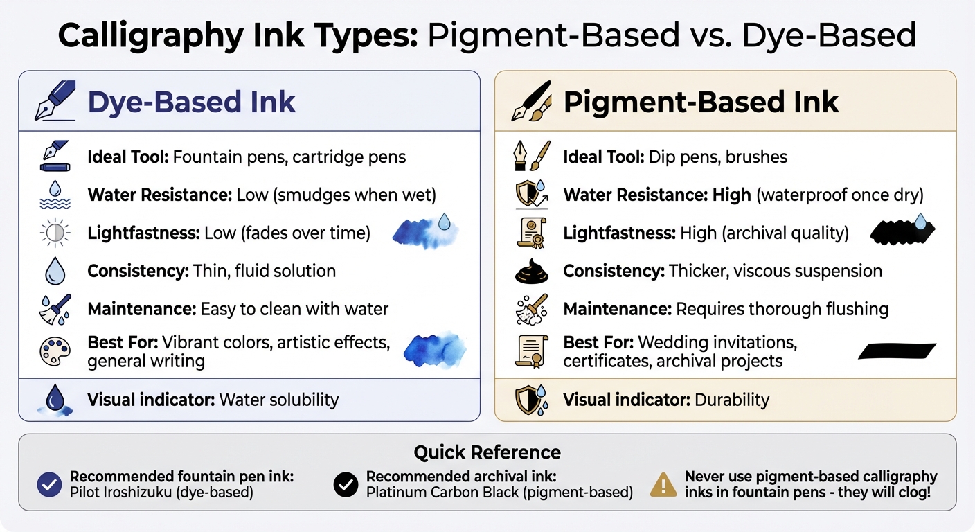
Calligraphy Ink Types Comparison: Pigment vs Dye-Based Properties
When selecting the perfect ink for your calligraphy, factors like color, flow, and sheen are just the beginning. The ink's composition plays a big role in shaping the final result. Calligraphy inks generally fall into three main types: pigment-based or dye-based, waterproof or non-waterproof, and specialty decorative inks.
Pigment-Based vs. Dye-Based Inks
The key difference between pigment-based and dye-based inks lies in their makeup. Dye-based inks are solutions where color molecules are fully dissolved in water. On the other hand, pigment-based inks are suspensions, with tiny solid particles floating in liquid. This distinction impacts their behavior: pigment inks are known for being waterproof, fade-resistant, and archival, making them a go-to for wedding invitations, certificates, or anything that needs to withstand time or weather. Dye-based inks, while offering vibrant colors and stunning gradients, are prone to smudging when wet and fading under prolonged exposure to light.
According to Wideman, pigment-based inks with gum arabic are best suited for dip pens rather than fountain pens, as the thicker consistency can clog fountain pen mechanisms. For archival projects, pigment-based inks like Platinum Carbon Black are a reliable choice. If you're looking for dynamic color blending and artistic effects, dye-based inks such as Pilot Iroshizuku are a fantastic option. Choosing the right ink depends heavily on your calligraphy tool and the intended purpose of your project.
| Feature | Dye-Based Ink | Pigment-Based Ink |
|---|---|---|
| Ideal Tool | Fountain pens, calligraphy cartridge pen sets | Dip pens, brushes |
| Water Resistance | Low (smudges when wet) | High (waterproof once dry) |
| Lightfastness | Low (fades over time) | High (archival quality) |
| Consistency | Thin, fluid solution | Thicker, viscous suspension |
| Maintenance | Easy to clean with water | Requires thorough flushing |
Waterproof and Non-Waterproof Inks
Waterproof inks are a must for projects like addressing envelopes, signing legal documents, or creating archival journals. These inks bond permanently with paper fibers, ensuring durability. Kevin Waters highlights their importance:
"Waterproof fountain pen ink is essential for a signature or handwritten note to be permanent for legal and archival reasons".
Non-waterproof, dye-based inks are better suited for general writing or artistic work, where vibrant colors and shading effects are more important than permanence. They’re also easier to clean from pens. Water-resistant inks offer a middle ground, holding up against minor moisture while still bleeding slightly. True waterproof inks, however, become completely impervious once dry, though they may require a curing time of several minutes to an hour. Keep in mind that thick calligraphy or India inks should never be used in fountain pens - they can cause irreversible clogs. Instead, opt for high-capacity fountain pens paired with fountain-pen-safe waterproof inks like Sailor Kiwa-Guro or Platinum Carbon Black.
Specialty Inks for Decorative Effects
If you're looking to add a touch of flair, specialty inks bring unique visual elements to your calligraphy. These include shimmer, sheen, metallic, and opaque white inks. Shimmer inks are infused with mica or metallic powders (gold, silver, copper, etc.) to create a sparkling effect. Sheen inks, typically high-saturation dye-based formulations, dry with a metallic luster that contrasts beautifully with the base color - imagine blue ink drying with a subtle purple sheen.
Metallic inks, with their bold reflective finish, are perfect for formal projects like wedding invitations. Opaque inks, such as white or pastel shades, are essential for writing on dark or colored papers where standard inks would be invisible. To get the most out of shimmer and metallic inks, always shake the bottle before use, as the particles tend to settle quickly. Smooth, non-absorbent paper like Tomoe River or Clairefontaine can enhance sheen and shading effects, while overly absorbent paper can dull the finish. For thicker metallic or opaque inks, consider loading the nib with a brush instead of dipping directly. This technique helps prevent uneven flow and messy blobs.
Matching Ink to Your Calligraphy Tools
Picking the right ink for your calligraphy tools goes beyond just choosing a color or finish - it’s about ensuring compatibility. Using the wrong ink can lead to clogged pens, damaged nibs, or uneven ink flow. The secret lies in understanding how different inks interact with your tools.
Fountain Pens
Fountain pens are delicate instruments that require water-based dye inks. These inks are thin enough to flow smoothly through the pen's feed system without causing clogs. Avoid using calligraphy inks, India inks, or drawing inks in fountain pens. These contain binders like gum arabic or shellac, which can dry permanently and ruin the pen's internal mechanisms.
Scott Humphries offers an important tip:
"One of the most common and costly mistakes is for fountain pen users to buy dedicated calligraphy or India ink. While these are among the best inks for calligraphy, they can be too thick for the nib and inner workings of fountain pens".
Similarly, Richard Wideman explains:
"Calligraphy ink is pigment-based ink that contains a compound called 'gum arabic' and is made for dip pens only. 'Gum arabic' can make your fountain pens and pilot parallels unusable if put into them".
When choosing fountain pen ink, pay attention to its flow properties and nib size. "Wet" inks flow quickly and absorb into paper faster, making them ideal for high-quality, dense paper. On the other hand, "dry" inks are slightly thicker, reducing the risk of bleeding or feathering on standard printer paper. For example, Waterman inks are a great "dry" option for everyday use.
Most fountain pen inks are non-waterproof, making them easier to clean since dried residue can be dissolved with water. However, pigment-based inks like Platinum Carbon Black offer greater permanence but require more frequent cleaning to avoid build-up.
Dip Pens and Nibs
Dip pens are far more forgiving when it comes to ink selection. They can handle a wide variety of options, including pigment-based calligraphy inks, India inks, sumi ink, walnut ink, acrylic inks, and even iron gall ink. These thicker inks work well with dip pens because their viscosity helps the ink adhere to the nib’s reservoir, allowing for controlled flow rather than dripping or smearing.
Before using a new dip pen nib, it’s important to remove the protective wax or oil coating applied during manufacturing. While this coating prevents tarnishing, it repels ink and can cause poor flow or "railroading." To clean the nib, use warm soapy water or briefly pass it through a flame.
When loading ink onto a dip pen, technique matters. For pointed nibs, dip the nib just beyond the breather hole. For broad-edge nibs, use a brush to apply ink directly to the reservoir - this prevents overloading and reduces the risk of messy blobs. You can also adjust the ink’s viscosity by adding distilled water to thin it or gum arabic to thicken it.
Regular cleaning is essential for dip pen nibs. Use warm, soapy water and an old toothbrush to remove dried ink, then dry the nib thoroughly to prevent rust. Proper care ensures your tools stay in excellent condition and ready for your next project.
Recommended Calligraphy Inks
When it comes to calligraphy, selecting the right ink can make all the difference. The ink you choose should align with your skill level and the artistic effects you’re aiming to achieve. For beginners, smooth-flowing inks that are easy to work with are ideal. Advanced calligraphers, on the other hand, might look for inks that offer precision and durability for detailed or archival work. Below are some standout recommendations to suit a variety of needs.
Beginner-Friendly Options
If you're just starting out, Sumi ink is a fantastic choice. As Lindsey Bugbee, a seasoned calligrapher, puts it:
"I recommend sumi ink for all of my Beginner's Modern Calligraphy Online Course students. I love it for learners because it's smooth, velvety, and dilutes well".
Brands like Moonpalace and Kuretake are particularly reliable, offering resistance to feathering on most papers and maintaining excellent opacity, even on delicate hairlines. A single 16-ounce bottle can last through months of daily practice.
Another strong contender is Walnut ink, a favorite among educators like Maria Montes, who says:
"Walnut ink offers the ideal calligraphy learning experience because it's forgiving, slightly translucent (so you can see your stroke mechanics), and flows beautifully without being too thin or thick".
This ink is available in crystal form, which you mix with water at home, making it both economical and customizable.
For those seeking bold colors and waterproof performance, Speedball Super Black India Ink is a solid option. Its 100% carbon black pigment ensures intense color and quick drying. If you prefer fountain pen inks for dip pens, a touch of gum arabic can help adjust the viscosity and reduce unwanted blobbing.
Ready to elevate your craft? Let’s dive into inks designed for more advanced work.
Inks for Advanced Work
For intricate scripts like Copperplate or Spencerian, Iron gall ink is a go-to for experienced calligraphers. Maria Montes highlights its standout qualities:
"Iron gall ink has incredible flow properties that glide smoothly across the paper, allowing for the thinnest hairlines and richest downstrokes".
This ink develops a deeper, richer tone as it oxidizes over time, adding a timeless quality to your work. However, it’s acidic, so be sure to clean your nibs thoroughly after use to prevent corrosion. Popular options include Rohrer & Klingner Iron Gall (Salix or Scabiosa) at around $12.50 for a 50-ml bottle and the Platinum Classic Series, which retails for about $32.00 for 60 ml.
For professional, archival-quality pieces, Platinum Carbon Black is a dependable choice. Its pigment-based formula ensures permanence and lightfastness. If you’re experimenting with custom colors, gouache is another option - diluted to a light cream consistency, it flows beautifully through both pointed and broad-edged nibs.
For those who enjoy adding vibrant or decorative elements, there are plenty of colorful options to explore.
Color Variety Options
Diamine Calligraphy and Drawing Inks are perfect if you’re after a broad spectrum of colors, including metallics like gold and silver. For more intense hues, Dr. Ph. Martin's offers several lines, such as Radiant Concentrated for vivid dyes, Hydrus Fine Art for pigment-based watercolors, and India Calligraphy Inks.
If you’re interested in creating gradients or soft transitions, Ecoline Liquid Watercolors are a wonderful choice. However, as they are dye-based, they may fade over time with prolonged exposure to light. For fountain pen enthusiasts, Pilot Iroshizuku inks offer a sophisticated palette of 24 shades inspired by Japanese landscapes. Adding a small amount of gum arabic can make these inks suitable for dip pens.
For dark surfaces, white ink is essential for contrast and detail work.
White Ink for Highlights
When it comes to white ink, Dr. Ph. Martin's Bleed Proof White is a favorite among professionals. It delivers a true white color without turning chalky, making it ideal for highlights and fine details. Since it comes as a thick paste, you’ll need to dilute it with distilled water - mixing it to a half-and-half consistency ensures smooth, opaque flow. Using distilled water also helps prevent mold growth, extending the ink’s shelf life.
For better control when using white ink, apply it to the back of the nib with a brush instead of dipping directly. This technique reduces pooling and improves flow. Another option is KWZ White, though it tends to be pricier.
Whether you’re practicing basic strokes or working on intricate designs, the right ink can elevate your calligraphy to the next level.
Calligraphy Ink Comparison
Choosing the right ink for your calligraphy projects can feel overwhelming with so many options out there. To make things easier, here's a side-by-side comparison of popular inks designed for dip pens. Whether you're practicing your strokes or creating archival-quality work, understanding each ink's properties can help you make an informed decision and avoid unnecessary frustration.
Ink Comparison Table
| Ink Type | Flow | Lightfastness | Waterproofing (when dry) | Beginner Suitability | Fountain Pen Compatible |
|---|---|---|---|---|---|
| Sumi Ink | Smooth & velvety | High | Water-resistant | High | No |
| Walnut Ink | Thin & watery | High/Moderate | No | Challenging | No |
| Iron Gall Ink | Excellent for detail | High (archival) | Water-resistant (cured) | Advanced (acidic) | No |
| Bombay India Ink | Smooth | High | Waterproof | Good | No |
| Bleed Proof White | Thick (dilution needed) | High (opaque) | No | Moderate | No |
Key Features of Each Ink
Sumi Ink is a favorite for beginners, thanks to its smooth flow and high lightfastness. It’s perfect for daily practice and versatile enough for various writing styles.
Walnut Ink has a beautiful vintage tone but requires more skill due to its thin consistency. It’s better suited for those with steady control over their strokes.
Iron Gall Ink is ideal for advanced calligraphers, particularly for intricate styles like Copperplate. It delivers sharp, precise lines but needs careful handling because its acidic formula can damage nibs if not cleaned thoroughly.
Bombay India Ink is a reliable waterproof option, making it great for addressing envelopes or combining with mixed media. Its smooth flow ensures consistent results.
Bleed Proof White is a thick, opaque ink designed for dark surfaces. To achieve the right consistency, dilute it with distilled water before use. It’s a solid choice for intermediate calligraphers looking to add contrast to their work.
This breakdown should help you pick the ink that best suits your skill level and project needs.
Testing Inks with Your Setup
Picking the right ink for your calligraphy project isn't just about the brand or color - it’s about how it works with your pen and paper. Even premium inks can act unpredictably depending on your setup, so testing is a smart way to avoid wasted materials and frustrating results.
Start with your nib. New nibs, like those in a J. Herbin Calligraphy Practice Set, often have a protective oil coating that can interfere with ink flow. To prep the nib, spray it with Windex and wipe it down with a lint-free cloth. When dipping the nib into the ink, make sure the ink covers the vent hole but doesn’t submerge the flange where the nib attaches to the holder.
Next, perform a simple stroke test. Hold the flat edge of the nib against scratch paper and move it side to side in a straight line. This helps the ink flow properly into the nib. As Jim Bennett, a calligraphy instructor, explains:
"The side-to-side stroke will help draw the ink down into the nib. This side-to-side technique is helpful for testing all pens. It not only helps get the ink to flow, but allows you to gauge the flow of the ink and get the 'feel' of the pen."
If you notice railroading - two parallel lines instead of a smooth stroke - it means the nib needs more ink. Dip it a little deeper to load it properly. Once the nib is functioning well, move on to testing the ink on your chosen paper.
Paper matters. Ink can behave differently depending on the paper's absorbency. For example, an ink that looks crisp and vibrant on smooth Rhodia paper might feather and bleed on standard copy paper. If you’re testing fountain pen inks, try using a budget-friendly pen like a Platinum Preppy or Twsbi Go to avoid risking your pricier pens.
If the ink forms blobs or feels overly thick, you can adjust it. Add distilled water drop by drop to thin it out, or if it’s too watery, mix in a pinch of gum Arabic or let some of the excess water evaporate.
Finally, keep track of your findings. Use swatch cards or a dedicated notebook to record how each ink performs. Be sure to note the bottle and batch number, not just the color. This detailed record will be a valuable resource as your ink collection grows and your technique improves.
Finding Affordable Calligraphy Inks
Finding quality calligraphy ink doesn’t have to break the bank. Fountain Pen Revolution (FPR) offers a wide selection of inks that work seamlessly for both fountain pens and calligraphy. Their pricing is approachable, with classic professional colors starting at just $1.00, sheening inks at $1.25, and shimmering inks from $1.75 each. These budget-friendly prices make it easy for beginners to experiment with a variety of colors without a hefty investment.
For those looking to stretch their dollar further, FPR also has bundle deals that deliver great value. The FPR Variety Pack includes five bottles for $36.00 - about 15% less than buying them individually. Meanwhile, the Shimmering Bundle offers six bottles for $60.00, saving up to 20%. These bundles provide a rich assortment of colors, ideal for everything from formal invitations to creative projects.
FPR doesn’t stop at basic inks; they also offer specialty products to refine your craft. Their Railroad X lubricating additive, priced at $6.50, reduces railroading issues during expressive strokes. If your pen still struggles, there are several quick fixes for pens not writing to get the ink flowing again. For those who enjoy customization, the Ink Mixing Kit at $49.00 lets you create your own shades and tweak sheen levels. As FPR explains:
"Every FPR premium ink is a mixture of some combination of the colors and shimmer included in the FPR Ink Mixing Kit".
This flexibility allows you to tailor your inks to your artistic needs.
Another perk? FPR offers free U.S. shipping on orders over $65 and free international shipping on orders above $149. Plus, their inks are specially formulated without thick binders, ensuring they won’t clog the delicate feeds of fountain pens or dip pens. Whether you’re a beginner or a seasoned calligrapher, these inks provide an affordable and effective way to elevate your projects.
Conclusion
This guide has covered essential aspects of ink properties, tool compatibility, and practical testing. Now it's time to tie it all together. When choosing an ink, focus on how its characteristics - like water resistance or vibrant hues - align with your tools and project goals. For instance, pigment-based inks are known for their durability and water resistance, making them perfect for professional work. On the other hand, dye-based inks deliver bright, bold colors and are ideal for fountain pens. It's also crucial to consider ink viscosity: thicker inks work well with dip pens but can clog fountain pens.
The interplay between your ink, pen, and paper significantly affects the outcome of your work. Paper quality, for example, directly impacts how the ink behaves. Understanding elements like sheen, shading, and flow can help you achieve your desired visual effects, whether you're crafting formal invitations or experimenting with artistic designs. Testing your tools and materials before starting a project is a step you shouldn't skip.
Calligrapher Louise from Cult Pens offers this practical advice:
"The best advice I can really give, though, is to just get stuck in and have a play! ... There are no rules that must be followed really (other than don't put calligraphy inks in fountain pens!), just guidelines."
In essence, the key to success lies in experimentation. Test your ink–pen–paper combinations on scrap materials and keep your nibs clean to ensure they perform at their best. Start with budget-friendly inks to explore a variety of colors and effects without breaking the bank. You can tweak ink consistency with gum arabic or distilled water and try specialty inks for decorative flourishes. Through trial and error, you'll discover the perfect ink for your calligraphy projects.
For more advice and a range of affordable calligraphy supplies, check out Fountain Pen Revolution (https://fprevolutionusa.com).
FAQs
How do I know if an ink is fountain-pen safe?
To make sure an ink is safe for your fountain pen, look for ones that are specifically made for fountain pens. Stay away from inks like India ink or pigmented inks, as these can clog or harm the pen. Instead, choose water-soluble inks that are clearly marked as fountain-pen safe. Always check the product label or description to ensure it’s compatible with your pen.
What ink should I use for waterproof envelope addressing?
When addressing envelopes, opt for waterproof fountain pen ink to ensure your writing resists moisture once it dries. Pigment-based inks work well because they adhere to the paper, making them impervious to water. Another option is carbon or particle inks, such as Platinum Carbon Ink, which are also waterproof but can occasionally clog fountain pens. Using reliable waterproof ink keeps your addresses clear and safe from water damage.
How can I fix ink that’s too thick or too runny?
If your ink feels too thick, you can thin it out by mixing in a bit of distilled water. This helps improve its flow and reduces the chances of skipping. On the other hand, if the ink is too runny, adding a small amount of gum arabic can make it thicker and easier to control. Keeping your ink at the right consistency is key to smoother writing and helps avoid problems like uneven flow or skipping.