
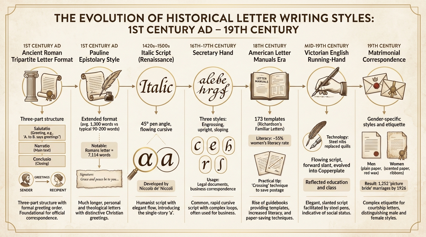
Letter writing has always been more than just communication - it reflects history, culture, and personal expression. From ancient Roman formats to 19th-century matrimonial letters, these styles reveal societal values, technological shifts, and individual creativity. Here's a quick overview of the seven key styles covered:
- Victorian English Running-Hand: Flowing, slanted script popular in the 19th century, influenced by steel-nib pens.
- Ancient Roman Tripartite Letter Format: A structured approach dividing letters into greeting, body, and closing.
- Secretary Hand: A looped, angular script used in legal and professional documents during the 16th–17th centuries.
- Italic Script: A Renaissance-era style known for its slanted, flowing letters, ideal for personal and scholarly writing.
- 18th-Century American Letter Manuals: Guides that taught the middle class letter-writing etiquette and techniques.
- First-Century Pauline Epistolary Style: Paul's theological letters, blending personal touches with structured formats.
- 19th-Century Matrimonial Correspondence: Romantic letters balancing societal norms with personal expression.
Each style reflects its era's tools, values, and communication needs, offering a glimpse into the past through the art of handwriting.
Evolution of Historical Letter Writing Styles from Ancient Rome to 19th Century
Victorian Letter-Writing Etiquette Rules
sbb-itb-1dd4fe9
1. Victorian English Running-Hand
Victorian English Running-Hand, which developed from English Round Hand, became the standard script across English-speaking countries by the mid-19th century. This style was recognized for its open, flowing design, featuring subtle contrasts in stroke weight, long sweeping ascenders, gracefully curved letters, and a consistent forward slant. Over time, it transitioned into Copperplate, a more refined version distinguished by sharp precision, carefully controlled curves, bold shaded strokes, and delicate hairlines - a hallmark of 19th-century correspondence.
This evolution wasn't just about aesthetics; it also reshaped how handwriting was used in Victorian society. For formal documents like legal records, deeds, and business ledgers, the smooth and regular strokes of Running-Hand provided a professional and standardized appearance. In personal correspondence, the script carried social significance. Writing with precision and elegance was often seen as a reflection of education and social standing. Businesspeople typically used a straightforward and legible style, while those with leisure time - especially women and gentlemen - sometimes added decorative flourishes, including the delicate "ladies' hand".
Technological advancements also played a key role in shaping this handwriting style. The introduction of steel-nib pens during the 19th century revolutionized writing techniques. Unlike quills, steel nibs produced finer, more consistent lines with less effort. This innovation made the flowing, slanted style of Running-Hand more practical, as it allowed for quicker writing compared to more elaborate scripts. To save time, Victorians often abbreviated names, such as "Jas." for James or "Wm" for William. These changes reflected the demands of an industrializing society, which required writing to be both efficient and functional.
Interestingly, the push for speed and individuality led to greater variation in handwriting styles as the century progressed. Although literacy rates were climbing, letters from the late 19th century were often harder to read than those from earlier decades. This tension between elegance and practicality defined Victorian Running-Hand, making it an essential blend of artistry and utility during a time of rapid social and industrial transformation.
2. Ancient Roman Tripartite Letter Format
Long before the flourish of Victorian scripts, ancient Rome introduced a structured approach to letter writing that continues to shape modern correspondence. This format, rooted in rhetorical principles like dispositio, divided letters into three parts: the greeting (salutatio), the body (narratio), and the closing (conclusio).
Roman letters typically opened with a formal greeting. The sender's name came first, followed by the recipient's, and a salutation like "greetings" (chairein in Greek). The body often began with a wish for the recipient’s health - “I pray that you are well” - and ended with farewells such as errōso (be strong) or vale (farewell). This wasn’t just about structure; it was a way to project power and reinforce social ties.
During the height of the Roman Empire (350s–390s AD), a sophisticated communication network emerged. Writing letters in this polished, standardized format became a way for elites to emphasize their Roman identity and maintain political influence, even as the Western Empire began to fracture. A Roman writer once remarked:
I recognized your letter the way you recognize friends' children by their resemblance to their parents.
The Roman letter format didn’t fade with the empire. Medieval scholars adapted these principles into dictamen, the formal art of letter writing, blending classical rhetoric with emerging traditions. Even today, its influence is evident in professional communication. Formal greetings, structured bodies, and clear sign-offs in emails and letters trace their roots back to this ancient system.
Cicero, a Roman rhetorician, advised placing the strongest points at the beginning and end of a message - a timeless strategy. Whether drafting a business proposal or penning a personal note, this approach remains a cornerstone of effective communication.
3. Secretary Hand
Secretary Hand developed in the early 16th century as a response to the need for a quicker, more legible script for professional correspondence. It replaced the slower medieval scripts and became the go-to style for copyists. This looped and angular script gained popularity across English, German, Welsh, and Gaelic-speaking regions, remaining dominant until the mid-17th century.
The hallmark of Secretary Hand lies in its loops, flourishes, and angular strokes. As a Script Tutorial from BYU observes:
Secretary Hand, at first glance, initially appears foreign.
Scribes refined the script into three main styles - engrossing, upright, and sloping. In 1618, Martin Billingsley documented these variations in The Pen's Excellency.
A well-known example of Secretary Hand is William Shakespeare's 1616 will. For over 150 years, this script was the standard for legal documents, official records, and business correspondence in England. In early modern drama, a unique convention emerged: dialogue was often written in Secretary Hand, while stage directions and character names were penned in Italic script. This practice influenced the modern use of italics in typography.
For modern researchers, deciphering Secretary Hand can be tricky. Letters like c, e, h, r, s, u/v, w, and x differ significantly from their modern counterparts. Additionally, scribes often grouped words together, such as writing "thone" instead of "the one".
Over time, Secretary Hand began to merge with Italic script, leading to the development of "Round Hand." This evolution paved the way for modern English handwriting styles, including the Copperplate script that dominated the 19th century.
Interestingly, during the Tudor era, handwriting styles also reflected social roles. Men typically learned Secretary Hand for professional use, while women were often taught the "Italian hand" (Italic script). This style was considered easier to read but also easier to forge, adding an intriguing layer to its history.
4. Italic Script in 16th-Century Letters
While Secretary Hand ruled formal business correspondence in England, Italic script became a stylish and practical choice in Europe. Often called chancery cursive or the "Italian hand", this script gained prominence during the Italian Renaissance as the go-to style for personal and scholarly communication. It was developed in the 1420s by Niccolò de' Niccoli, who found the formal Humanist minuscule too cumbersome for everyday writing tasks. This new style didn’t just look elegant - it also made writing faster and more efficient.
Italic script is easily recognized by its slanted, flowing letters. Scribes achieved this effect by holding their pens at a 45° angle, creating smooth, rhythmic strokes that improved both speed and readability. Modern enthusiasts often recreate these strokes using specialized calligraphy sets. One notable change was the simplification of the letter "a", shifting from a two-story form to the single-story ⟨ɑ⟩ that remains in use today. Ligatures, or connected letters, further reduced the number of strokes needed, making the script even more practical.
The printing press played a major role in popularizing Italic script. As printing began to replace handwritten manuscripts around 1500, handwriting took on a new role - producing personal letters, documents, and other individual papers. Ludovico Vicentino degli Arrighi's 1522 manual, La Operina, was the first book dedicated to teaching the italic hand, spreading its use across Europe. Around the same time, Aldus Manutius introduced the first italic typeface in Venice in 1501, directly inspired by the chancery cursive style.
Renaissance humanists gravitated toward Italic script for its combination of elegance and practicality. As Martin Davies explained:
A humanist manuscript was intended to suggest its contents by its look... old wine in new bottles, or the very latest vintage in stylish new dress.
The Vatican's Papal Curia later standardized Italic script as cancelleresca corsiva, using it for official correspondence and less formal documents. Like many scripts before it, Italic script represents the timeless balance between aesthetics and functionality in the art of letter writing.
5. 18th-Century American Letter Manuals
As commerce and land ownership expanded America's middle class, letter-writing manuals became essential for those seeking upward mobility. These guides played a crucial role in bridging educational gaps, teaching shopkeepers, artisans, and women - groups often lacking formal education - how to craft letters that conveyed refinement and social grace. In a time when only about half of those who could read also knew how to write, these manuals opened doors to a skill previously reserved for the elite.
These guides went beyond teaching grammar and penmanship. They offered templates for various types of correspondence. For instance, Richardson's Familiar Letters for Important Occasions included 173 examples, covering everything from business matters to marriage proposals, while also providing moral and stylistic advice. As Richardson himself noted, his templates aimed to teach:
not only the requisite style and forms... but how to think and act justly and prudently.
This moral instruction was particularly important for women, whose literacy rate in the late 18th century hovered around 55%.
The manuals also introduced the "familiar letter", turning correspondence into a more personal and nuanced form of communication. Writers learned to weave together business updates, personal news, and social commentary, a style that helped families scattered across Britain, North America, and the Caribbean maintain close ties. These guides emphasized etiquette, advising, for example, that condolence letters should avoid humor or gossip. This mix of practical advice and social norms gradually shaped regional variations in letter-writing expectations, including distinct roles for male and female correspondents.
Practical tips extended to the technical aspects of letter writing. Manuals taught readers how to prepare quills, mix ink, and fold paper for sealing with a wax seal kit. Because postage costs were based on the number of sheets and paid by the recipient, writers learned to save space by using small handwriting or "crossing", a technique where text was written vertically over existing horizontal lines. With the average colonist receiving just one letter per year before the mid-19th century, every word counted.
Gender-specific advice often reflected societal expectations. For example, Daniel Defoe recommended a straightforward style for tradesmen, stating:
An easy and free way of writing is the best style for a tradesman.
6. First-Century Pauline Epistolary Style
Paul reshaped the art of first-century letter writing by transforming the brief, functional notes of the time - usually 90 to 200 words - into expansive theological treatises. His letters averaged 1,300 words, with some, like Romans, reaching an impressive 7,114 words, while Philemon was a more concise 335 words. This extended format allowed him to dive deeply into doctrine while introducing fresh approaches to greetings and structure.
While Paul adhered to the basic Hellenistic letter format, he reworked its elements to suit his purpose. For example, he began his letters by merging the Greek "charis" (grace) with the Jewish "shalom" (peace), crafting the distinctive salutation, “Grace and peace.” This shift highlighted spiritual well-being over physical concerns. Classicist Steve Reece even noted:
Paul follows many of the normal epistolary conventions.
However, Paul's letters were anything but rigid. His personal touches and inventive greetings reflected a more flexible and context-aware style of communication.
The structure of Paul’s letters typically moved from exhortation to theological reflection, and then to ethical guidance. Instead of the conventional practice of expressing gratitude for physical health, Paul gave thanks for the faith, hope, and love of his readers. As Felix Just, S.J., Ph.D., pointed out:
Paul almost always gives thanks to God for something about the recipients (their faith, hope, and love, or the good example they give for other Christians).
Interestingly, Galatians stands out as the only letter among his undisputed works where he skips thanksgiving entirely, replacing it with astonishment at the recipients' behavior.
Paul often collaborated with co-authors like Timothy, Silvanus, and Sosthenes, and he dictated his letters to scribes, or amanuenses. For example, Tertius is identified as the scribe for Romans. To ensure authenticity, Paul frequently added a personal postscript in his own handwriting. His letters were addressed to small groups of believers, often meeting in "house churches", and were designed for communal reading and circulation.
Paul's approach left a lasting legacy. His style influenced the Apostolic Fathers and later shaped medieval ars dictaminis - the formal art of letter writing that became essential for discussing religious doctrine. Notably, each of his 13 attributed letters opens and closes with a reference to "grace", a tradition that continues to echo in Christian liturgy today. His innovations in letter writing not only transformed early Christian communication but also set the stage for future developments in religious and formal correspondence.
7. 19th-Century Matrimonial Correspondence
During the 19th century, matrimonial correspondence blended personal feelings with the expectations of the time. Manuals like the 1847 Guide to Good Manners provided templates for expressing affection while adhering to societal norms. These guides encouraged an "easy and natural" tone that balanced emotional sincerity with proper decorum, shaping not just the content but also the visual presentation of these letters. Achieving such a look today often involves mastering handwriting with fountain pens.
The appearance of these letters carried as much weight as their words. Men were advised to keep things simple, using plain paper, bold black ink, and sealing their letters with red wax. Women, on the other hand, often added personal touches like scented paper, ribbons, or small decorative drawings. Over the decades, stationery styles evolved - ornamental ribbons were popular in the early 1800s, giving way to thicker cream-colored paper in the 1880s and monogrammed letterheads by the 1890s. Black sealing wax, however, was strictly associated with mourning. Much like earlier forms of letter writing, these matrimonial letters balanced personal expression with an adherence to societal expectations.
Gender roles heavily influenced how emotions were expressed in these letters. Men were expected to adopt a humble tone, portraying themselves as "supplicants" seeking the "alms" of a woman’s affection. Instead of focusing on physical attributes, they were encouraged to praise a woman’s virtue and moral character. Women, in turn, were advised to remain reserved, emphasizing a suitor’s moral qualities rather than indulging in overt sentimentality. Many women avoided directly using the word "love", often signing off letters with the phrase "ever your friend".
For long-distance couples, the "picture bride" practice became a practical solution. Photographs and brief letters were exchanged to ensure recognition at train stations or ports, blending the practicality of strategic partnerships with a growing belief in romantic love. By 1926, the Travelers' Aid Society documented 1,252 marriages resulting from these exchanges.
Conclusion
From the precise angles of Secretary Hand to the graceful curves of Spencerian script, these seven historical letter-writing styles offer more than just aesthetic appeal. Each one serves as a window into the values, challenges, and social dynamics of its time. For example, Victorian letters balanced heartfelt emotion with strict propriety, Roman correspondence adhered to rigid structures, and 18th-century writers famously “crossed” their pages to save on postage costs, avoiding charges that could leap from 6d to 8d for an additional sheet.
Writing in these historical styles isn’t just an artistic endeavor; it’s a way to immerse yourself in the past. Experts describe it as a “total immersion in living history”, offering insight into how every pen stroke once carried deep social meaning. Master calligrapher Denis Brown aptly remarked:
the tool chooses the style as much as the scribe does
For instance, broad-edged pens are ideal for the angular forms of Blackletter, while flexible nibs bring out the fine contrast of Copperplate. This deep connection between tools and technique remains as relevant today as it was centuries ago.
If you’re inspired to try your hand at these styles, start with the right materials. Quality tools can make all the difference. Use black ink on sturdy cream or white paper, as fading ink was historically seen as disrespectful to the recipient. A flexible nib fountain pen is especially useful for creating the thick and thin strokes that define many classical scripts. For beginners, Fountain Pen Revolution offers starter sets starting at $35, as well as premium options with 14k gold nibs for those seeking a more authentic experience.
Whether you’re captivated by the rigid structure of Roman letters or the romantic flourishes of 19th-century correspondence, practicing these styles offers more than just artistic skill. It builds discipline, strengthens muscle memory, and connects you to centuries of tradition. In fact, handwriting is making a comeback; by 2023, several U.S. states reinstated cursive writing requirements after its removal from Common Core Standards in 2010. So, pick up a pen, choose a style, and let history shape your writing journey.
FAQs
Which historical letter style is easiest to learn today?
The 18th-century British Royal Navy letter style is one of the simplest historical styles to pick up today. Its formal, graceful handwriting is typically done on plain paper and draws inspiration from actual letters of the era. Since many examples of this style are readily available, it’s an approachable choice for beginners.
What pens and paper work best for recreating these styles?
To bring historical letter-writing styles to life, try using a quill or fountain pen to replicate the smooth ink flow and distinctive handwriting of the time. Pair this with high-quality, textured paper - laid or wove paper works well for Victorian-inspired letters, while thicker, parchment-like paper is ideal for recreating correspondence from earlier eras, such as the 1775 Royal Navy. These choices help evoke the charm and sophistication of period-specific writing.
How can I read and transcribe old scripts like Secretary Hand?
To get comfortable with reading and transcribing Secretary Hand, start by familiarizing yourself with its unique characteristics. Pay close attention to alphabet charts and sample texts to identify the specific letter forms, loops, and decorative flourishes commonly used. Regular practice is essential - compare your transcriptions to the original documents to refine your accuracy. Specialized guides can also provide valuable insights. Remember, patience and steady effort are crucial when working with this historical style of handwriting.