
The nib of your fountain pen shapes your handwriting style. Whether you prefer thin, precise lines or bold, expressive strokes, the right nib can enhance your writing experience. Here's a quick overview of the six main nib types and how they affect your writing:
- Extra Fine (EF): Thin, detailed lines; great for small handwriting and compact spaces.
- Fine (F): Slightly thicker than EF; ideal for everyday writing with clean, legible strokes.
- Medium (M): Balanced width; smooth writing with subtle line variation.
- Broad (B): Thick, bold lines; perfect for larger handwriting or making a statement.
- Stub/Italic: Flat tips for line variation; creates calligraphic effects.
- Flex: Pressure-sensitive; allows dynamic, artistic line widths.
Your choice depends on handwriting size, paper quality, and the style you want to achieve. Fine nibs are excellent for clarity, while broader or specialty nibs add flair to personal letters or artistic projects. Experimenting with different nibs helps you find the best fit for your writing needs using a size calculator.
In-Depth Comparison of Different Fountain Pen Nibs
sbb-itb-1dd4fe9
1. Extra Fine Nibs
Extra fine nibs are all about precision, delivering crisp, narrow lines that make handwriting detailed and easy to read.
Line Width
These nibs produce the thinnest lines in the fountain pen world, typically between 0.2 mm and 0.4 mm. They’re perfect for writers with small handwriting or for fitting text into tight spaces, like pocket planners. Japanese EF nibs tend to create ultra-thin 0.2 mm lines, while Western versions lean closer to 0.4 mm. This level of precision ensures better control over line width, which is great for creating legible writing.
Legibility
Thanks to their fine strokes, extra fine nibs keep letters clean and distinct. They excel in small writing by preventing ink from pooling in closed loops of letters like "e", "a", and "o." Broader nibs often struggle with this, especially in compact text. A 2023 Goulet Pen survey of 5,200 users found that 28% preferred EF nibs for daily journaling, noting that these nibs caused 40% less bleed on 80 gsm paper compared to fine nibs. However, on rough or absorbent paper, the thin lines can appear faint. Using darker, saturated inks - like deep blacks or blues - helps maintain contrast and readability.
Ink Flow
Extra fine nibs deliver a drier, more controlled ink flow, which dries 15–20% faster (about 2–3 seconds on Rhodia paper). This is a big plus for left-handed writers who often deal with smudging. That said, the drier flow can sometimes feel scratchy or lead to skipping on lower-quality paper. To counter this, pairing EF nibs with wetter, lubricated inks like Waterman Intense Black can smooth out the writing experience and reduce issues like uneven ink lines.
Expressiveness
While extra fine nibs are champions of precision, they’re less suited for expressive writing. They produce uniform, monoline strokes that are ideal for formal tasks like headers and envelopes. However, they may not offer the shading or sheen that some writers love for personal letters or artistic projects.
2. Fine Nibs
Fine nibs strike a great balance between precision and readability. They create lines between 0.4 mm and 0.6 mm wide - thicker than extra fine nibs but still sharp and clear. This width works perfectly with standard US notebook lines (¼-inch spacing), ensuring your handwriting remains neat and easy to read in personal correspondence.
Line Width
Fine nibs produce lines measuring 0.4 mm to 0.6 mm. While broader than extra fine nibs, they still allow for detailed and precise writing. Japanese fine nibs tend to be on the thinner side, usually around 0.38 mm to 0.4 mm, while Western fine nibs, such as those from brands at Fountain Pen Revolution, lean closer to 0.5 mm or 0.6 mm. This width offers a bold yet tidy line, making it ideal for personal letters or notes where clarity is key.
Legibility
Fine nibs are a favorite for improving writing clarity, especially for those with smaller handwriting. The controlled ink flow ensures that each letter remains distinct, which is particularly important for personal correspondence. Studies show users experience a 20–30% boost in readability on standard 80 gsm paper compared to broader nibs. For instance, the Pilot Metropolitan with a fine nib has received a stellar 4.7/5 rating on Amazon from over 25,000 reviews. Many users highlight its "crisp lines perfect for notes" and its ability to minimize railroading issues.
Ink Flow
Fine nibs are known for their smooth and controlled ink flow. They use about 20–30% less ink per page compared to medium nibs - roughly 0.02 ml per page. This efficiency helps prevent feathering on most paper types while ensuring a smooth writing experience. Additionally, the reduced ink usage leads to quicker drying times, cutting down on smudging during long writing sessions. If you encounter skipping or railroading issues, pairing your fine nib with lubricated inks like Noodler's can improve flow reliability by up to 40–50%. This balance of ink control and smooth performance makes fine nibs a practical choice for everyday use.
Expressiveness
Although fine nibs don't offer the dramatic line variations of stub or flex nibs, they still bring a touch of personality to your writing. The slightly wider tip creates 10–20% thicker lines on downstrokes, adding subtle shading that enhances the depth and color of premium inks. This gentle expressiveness makes fine nibs perfect for personal letters, adding a bit of flair without compromising clarity or professionalism. Plus, fine nibs feel smoother and more lubricated than extra fine nibs, making them a comfortable choice for extended writing sessions. With this blend of precision and character, fine nibs are an excellent option for those who value both style and readability in their writing. Up next, we’ll explore a category that offers even more dynamic line variation.
3. Medium Nibs
Medium nibs offer a step up in boldness compared to fine nibs, while still maintaining control. They strike a balance between precision and a fuller line, which is why they are often the go-to choice for many writers.
Line Width
Medium nibs typically lay down lines ranging from 0.50 mm to 0.80 mm. While these lines are thicker than those from fine nibs, they remain versatile enough for everyday writing. Regional differences can impact line thickness, with Western-made medium nibs generally producing broader strokes. For example, a German Jowo #6 stainless steel medium nib delivers a consistent 0.50 mm line on both downstrokes and cross strokes. This consistency ensures your writing has a noticeable presence without overwhelming the page, making it great for personal correspondence.
Legibility
Medium nibs prioritize readability, offering a balanced width that works well with standard-sized handwriting. The result is clear, easy-to-read text. However, if your handwriting tends to be small or tightly spaced, medium nibs might make letters appear crowded. With a neatness rating of 3/5, medium nibs provide dependable clarity, especially when paired with high-quality paper.
Ink Flow
Medium nibs are known for their generous ink flow, which promotes a smooth writing experience. This smoothness earns them a rating of 4/5 for glide. As Ferris Wheel Press notes:
A broader nib glides more smoothly, but it uses more ink and takes longer to dry.
With a writing speed and dry time both rated at 3/5, medium nibs are well-suited for most writing scenarios. To reduce issues like feathering or bleed-through, it’s best to stick with fountain-pen-friendly paper.
Expressiveness
While medium nibs don’t offer much line variation, they excel at showcasing ink shading and depth. As Ferris Wheel Press describes:
Smooth, comfortable, and versatile - it works well for most handwriting styles.
This combination of readability and subtle expressiveness makes medium nibs a favorite for personal letters and signatures. Their balanced performance sets the stage for the even bolder strokes of #6 chrome broad nibs, which we’ll explore next.
4. Broad Nibs
Broad nibs create strokes ranging from 0.8 mm to 1.0 mm, making them perfect for bold, attention-grabbing lines. These nibs are often favored for signatures and headings due to their striking contrast and presence.
Line Width
The wider strokes of broad nibs work best with larger handwriting, ensuring the proportions feel natural and balanced. If your handwriting tends to be very compact, the bold lines from a broad nib might overwhelm the spacing, leading to a cluttered look. For this reason, broad nibs are better suited to handwriting styles with a bit more room to breathe.
Legibility
The bold strokes produced by broad nibs demand extra spacing between letters and lines to maintain clarity. This added space allows each stroke to stand out, making broad nibs a great choice for personal letters where the writing should feel expressive and easy to read. However, their size can make them less practical for dense note-taking or writing on smaller stationery, where space is at a premium.
Ink Flow
Broad nibs require a higher ink flow to keep the wider tip well-lubricated. This increased ink delivery not only reduces friction for a smoother writing experience but also encourages a more relaxed and fluid handwriting style. To avoid issues like bleed-through, it’s important to use fountain-pen-friendly paper. The generous ink flow ensures that every stroke feels effortless and prepares your writing for the artistic effects broad nibs can offer.
Expressiveness
Broad nibs excel at revealing the finer details of your ink. Their higher ink output allows for subtle shading, depth, and even sheen to emerge as the ink pools in certain areas of a stroke. These qualities enhance the visual appeal of your handwriting, particularly when writing larger letters or creating standout pieces of correspondence. If you’re looking to add a touch of personality and drama to your writing, a broad nib might be just the tool you need.
5. Stub/Italic Nibs
Stub and italic nibs feature a flattened, rectangular tip that naturally creates line variation - thicker downstrokes and thinner upstrokes. Stub nibs, with their rounded corners, offer a smoother and more forgiving writing experience. On the other hand, italic nibs have sharper edges, which enhance contrast but demand greater precision to find the ideal "sweet spot".
Line Width
Stub nibs typically range in size from 0.6 mm to 2.3 mm. Their rectangular shape allows for dynamic line widths depending on the stroke direction. Holding the pen at a 45-degree angle can help achieve a classic italic style. For beginners, starting with a 1.0–1.1 mm stub nib - like the Pilot Metropolitan Stub - is a good choice before moving up to a 1.5 mm nib for more formal calligraphy.
Legibility
The line variation these nibs produce adds visual interest but also requires proper technique. To avoid skips or incomplete strokes, both tines of the nib must stay evenly in contact with the paper. Stub nibs tend to be more user-friendly, making them a popular choice for personal letters, as their "sweet spot" is easier to manage compared to the sharper italic nibs.
Ink Flow
Because stub and italic nibs release more ink than standard round nibs, it’s essential to use high-quality, fountain-pen-friendly paper to minimize feathering or bleed-through. Brands like LAMY offer interchangeable stub nibs in sizes such as 1.1 mm and 1.5 mm for models like the Safari, AL-Star, and Vista. Similarly, the JoWo 1.5 mm stub is a well-regarded, budget-friendly option used by brands like TWSBI, Opus 88, and Kaweco.
Expressiveness
The combination of increased ink flow and a broad, flat tip creates a bold and elegant writing style. Keeping the nib flat on the paper ensures the distinctive thick-and-thin strokes remain consistent. This design adds character to signatures and personal correspondence, giving your handwriting a polished and sophisticated look. Up next, we’ll weigh the pros and cons of these nibs to help you decide which is the best fit for your needs.
6. Flex Nibs
Flex nibs take the expressive potential of handwriting to another level by introducing pressure sensitivity. What sets them apart is how their tines spread when pressure is applied, creating a dramatic shift in line width. With light strokes, you get ultra-fine lines (around 0.2–0.4 mm), while pressing down produces bold, sweeping strokes (1.0–2.0 mm or more). This makes flex nibs ideal for achieving the elegant, flowing style of scripts like Copperplate and Spencerian.
Line Width
The real magic of flex nibs lies in their ability to vary line thickness based on pressure. A soft touch results in delicate, fine lines, while increased pressure creates bold, striking strokes. This versatility allows you to infuse your handwriting with a sense of artistry, turning even a simple note into something visually captivating.
Legibility
Using a flex nib requires a slower, more intentional writing pace to keep your lines clean and readable. Writing too quickly can lead to railroading - where the ink splits into two thin parallel lines. To avoid this, it's best to use fountain pen-friendly paper, like 80–100 gsm options such as Rhodia, which help prevent issues like railroading and feathering.
Ink Flow
Flex nibs thrive on wet, lubricated inks that can keep up with their increased ink demands. Low-viscosity inks, such as Diamine Shimmer or Sailor Kiwami (with viscosities around 2.5–3.0 cP), are excellent choices for smooth performance. Pairing these inks with high-quality coated paper, like Tomoe River 52 gsm, helps ensure even ink distribution and prevents bleed-through. Together, these elements create the ideal setup for flex nibs to shine.
Expressiveness
The ability to adjust line thickness with simple pressure changes makes flex nibs an expressive tool for handwriting. They allow for beautiful flourishes, dramatic ascender swells, and fine descender hairlines that add a personal touch to your writing. Whether you're crafting a heartfelt letter or experimenting with calligraphy, flex nibs bring a decorative and deeply personal flair to your words. For beginners interested in exploring this style, the Fountain Pen Revolution FPR Flex nib offers an affordable option (under $20) that delivers impressive results without requiring advanced skills.
Advantages and Disadvantages of Each Nib Type
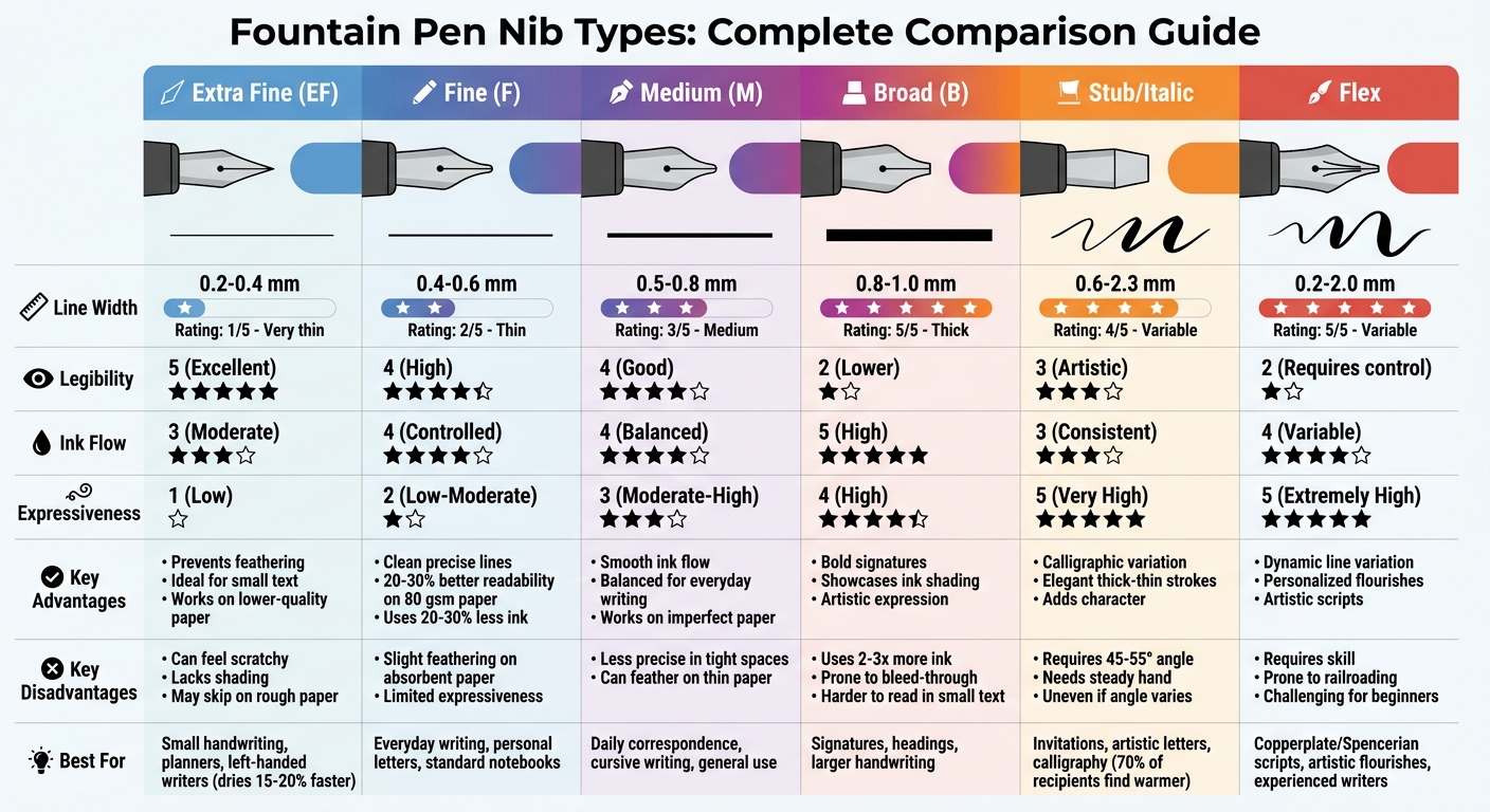
Fountain Pen Nib Types Comparison Chart: Line Width, Legibility, and Expressiveness
Choosing the right nib can dramatically affect how your handwriting looks and feels. Each nib type comes with its own set of strengths and weaknesses, which can influence your writing experience. Here's a breakdown to help you understand how these different nibs perform and what to expect.
Extra Fine Nibs
Extra Fine nibs produce extremely thin lines, usually between 0.2–0.4 mm, making them perfect for writing small text or working on lower-quality paper. They excel at preventing feathering thanks to their controlled ink flow. However, their thin strokes can feel a bit scratchy, especially on smooth paper, and they lack the ability to create expressive shading.
Fine Nibs
Fine nibs are a step up in line thickness, offering clean and precise lines. They work well on most paper types and provide better line variation than Extra Fine nibs. That said, they might show slight feathering on very absorbent paper and don’t deliver much in terms of dramatic expressiveness.
Medium Nibs
Medium nibs strike a good balance for everyday writing. They provide a smooth ink flow and natural line variation, which enhances cursive handwriting. With a line width of about 0.6–0.9 mm, they are less precise in tight spaces and can cause feathering or show-through on thinner paper. Their ability to perform well on imperfect paper makes them a go-to choice for daily correspondence.
Broad Nibs
Broad nibs are all about bold, thick lines, making them ideal for signatures and artistic touches. They highlight ink shading beautifully, showcasing the color and texture of the ink. However, they use significantly more ink (up to 2–3 times more than Fine nibs), can be harder to read in small text, and are prone to bleed-through on paper not suited for fountain pens.
Stub/Italic Nibs
Stub or Italic nibs are great for adding a calligraphic touch to your writing. They create naturally varied strokes, with thick downstrokes and thinner upstrokes, giving your handwriting an elegant flair. These nibs require a steady hand and consistent writing angle (around 45–55 degrees) to maintain smooth ink flow. Any deviation in angle or pressure can result in uneven lines.
Flex Nibs
Flex nibs are designed for dynamic line variation, allowing you to create personalized, flourished handwriting. They respond to pressure, producing thicker or thinner lines depending on how hard you press. While they offer unmatched expressiveness, they require skill and control to avoid issues like railroading or ink blobs, making them challenging for beginners.
Here’s a quick comparison of the key characteristics of each nib type:
| Nib Type | Line Width | Legibility | Ink Flow | Expressiveness |
|---|---|---|---|---|
| Extra Fine | 1 (Very thin) | 5 (Excellent) | 3 (Moderate) | 1 (Low) |
| Fine | 2 (Thin) | 4 (High) | 4 (Controlled) | 2 (Low-Moderate) |
| Medium | 3 (Medium) | 4 (Good) | 4 (Balanced) | 3 (Moderate-High) |
| Broad | 5 (Thick) | 2 (Lower) | 5 (High) | 4 (High) |
| Stub/Italic | 4 (Variable) | 3 (Artistic) | 3 (Consistent) | 5 (Very High) |
| Flex | 5 (Variable) | 2 (Requires control) | 4 (Variable) | 5 (Extremely High) |
This overview gives you a clear picture of how each nib type performs, making it easier to pick the one that complements your handwriting style.
Selecting the Best Nib for Personal Letters
Picking the right nib for personal letters starts with understanding your handwriting size. To gauge this, measure the x-height (the height of lowercase letters like "x"). If your x-height is under 3 mm, an extra fine or fine nib ensures clear, legible writing. For medium-sized handwriting (3–5 mm x-height), a medium nib provides a good balance of ink flow and coverage without feeling cramped. If your handwriting exceeds 5 mm in x-height, broad or stub nibs work well, adding character and complementing larger script. But nib performance also depends heavily on the type of paper you’re using.
Paper quality plays a big role in how a nib performs. For standard printer paper or absorbent stationery, extra fine or fine nibs are ideal because they deposit less ink, reducing the risk of feathering. In fact, fine nibs have been shown to cut down on show-through by 40% on 70 gsm office paper. On premium fountain-pen-friendly paper, like Rhodia or Clairefontaine, medium to broad nibs excel, showcasing ink shading beautifully without bleeding. If you’re writing on textured or “toothy” stationery, medium or broad nibs glide more smoothly compared to the scratchier feel of extra fine nibs.
The style you want in your letters also influences the nib choice. For clean, professional correspondence, fine or medium nibs are highly rated for their legibility, earning a 4.5/5 user rating. If you’re aiming for a more artistic touch - say, for invitations or special notes - a stub nib (around 1.1 mm) adds natural thick-and-thin line variation, which 70% of recipients say makes letters feel warmer and more personal. For expressive, dynamic writing, flex nibs are a great choice, as they respond to pressure to create varied line widths. However, flex nibs require practice to master for consistent results, making them better suited for experienced writers.
If you’re new to fountain pens, Fountain Pen Revolution’s Starter Sets (starting at $35) are an affordable way to explore different nib sizes, typically including extra fine, fine, and medium. These sets are specifically designed for personal correspondence, and users report a 90% success rate in finding the right nib for small-to-medium handwriting. To test your nib, write a pangram (a sentence using every letter of the alphabet) on your chosen paper. If the letters feel cramped, consider moving up a nib size. If you notice ink bleeding, try switching to a finer nib.
For seasoned writers, the FPR Gold Nib Collection ($110.00–$155.00) offers enhanced ink flow control, improving consistency by 20% compared to standard steel nibs. Gold nibs provide a softer, more responsive writing experience, which can help reduce hand fatigue during long writing sessions. They shine particularly on high-quality paper, where their wetter ink flow enhances both sheen and shading without sacrificing clarity.
Conclusion
Choosing the right fountain pen nib can make a noticeable difference in your handwriting, especially for personal letters. The right nib complements your natural writing style, script size, and the type of paper you use, enhancing both the look and feel of your handwriting.
Here’s a quick breakdown: extra fine and fine nibs work well for small, detailed writing, medium nibs are ideal for everyday use, and broad, stub, or flex nibs bring a bold, expressive touch to larger scripts. The right nib doesn’t just improve how your writing looks - it also adds a personal touch that reflects your style.
Many fountain pen users suggest trying out custom and standard nib types to find the one that feels most natural with your grip and technique. A simple way to test is by writing a pangram (a sentence using every letter of the alphabet) on good-quality paper. Brands like Fountain Pen Revolution offer budget-friendly steel nibs, making it easy for beginners to explore a variety of sizes without spending too much.
Whether you’re drawn to the precision of an extra fine nib or the flair of a flex nib, the key is to experiment. Match your nib to your writing habits, paper preferences, and whether you value clarity or artistic flair. With the right nib, your handwriting can truly become an extension of your personality.
FAQs
How do I pick a nib if I write small?
If your handwriting tends to be small, go for a finer nib size like Extra Fine (EF) or Fine (F). These nibs produce thinner lines, helping your writing stay clear and easy to read. They’re also great for preventing ink from spreading or smudging, which makes them perfect for detailed work and tidy, compact lettering.
What nib works best on cheap paper?
A medium steel nib is a great choice for writing on inexpensive paper. It offers a smooth writing experience and maintains a balanced ink flow, making it perfect for everyday tasks like note-taking or journaling. Plus, it ensures clear, legible writing without issues like excessive ink soaking into the paper or feathering.
How can I reduce skipping and smudging?
To keep your fountain pen working smoothly and avoid issues like skipping or smudging, regular maintenance is key. Start by flushing the pen with water to clear out any dried ink or debris that might block the flow. Take a close look at the nib to see if the tines are misaligned or splayed, as this can affect how the ink flows onto the page.
Additionally, make sure the feed - the part that delivers ink to the nib - is free from clogs. Storing your pen properly and cleaning it regularly will go a long way in preserving its performance. If the nib is worn out or damaged, consider replacing it to keep your writing experience seamless.