
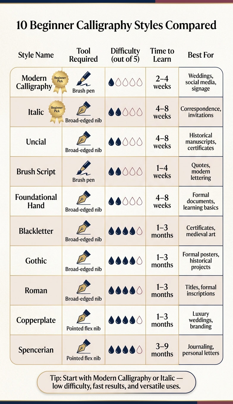
Calligraphy offers a rewarding way to create beautiful writing while improving focus and reducing stress. For beginners, starting with the right style and tools can make learning easier and more enjoyable. Here's a quick breakdown of 10 beginner-friendly calligraphy styles, each with its own tools, techniques, and learning curve:
- Copperplate: Elegant and precise; uses a pointed nib and requires pressure control. Difficulty: 4/5.
- Blackletter: Bold and structured; relies on a broad-edged nib and fixed angles. Difficulty: 4/5.
- Italic: Clean and readable; uses a broad-edged nib with moderate slant. Difficulty: 2/5.
- Uncial: Rounded and historical; broad-edged nib with minimal angle variation. Difficulty: 2/5.
- Roman: Geometric and formal; broad-edged nib with rigid proportions. Difficulty: 4/5.
- Spencerian: Flowing and delicate; pointed nib with soft shading. Difficulty: 4/5.
- Modern Calligraphy: Freeform and expressive; perfect for brush pens. Difficulty: 1/5.
- Brush Script: Fluid and forgiving; uses pressure-sensitive brush pens. Difficulty: 2/5.
- Gothic: Sharp and dramatic; broad-edged nib with strict angles. Difficulty: 4/5.
- Foundational Hand: Balanced and simple; ideal for beginners with broad-edged nibs. Difficulty: 2/5.
Quick Comparison
| Style | Tools | Difficulty | Key Feature |
|---|---|---|---|
| Copperplate | Pointed nib, ink | 4/5 | Elegant, flowing strokes |
| Blackletter | Broad-edged nib, ink | 4/5 | Bold, angular forms |
| Italic | Broad-edged nib, ink | 2/5 | Clean, readable slant |
| Uncial | Broad-edged nib, ink | 2/5 | Rounded, historical look |
| Roman | Broad-edged nib, ink | 4/5 | Geometric, formal letters |
| Spencerian | Pointed nib, ink | 4/5 | Flowing, soft contrast |
| Modern Calligraphy | Brush pen | 1/5 | Freeform, expressive style |
| Brush Script | Brush pen | 2/5 | Fluid, pressure-sensitive |
| Gothic | Broad-edged nib, ink | 4/5 | Sharp, architectural forms |
| Foundational Hand | Broad-edged nib, ink | 2/5 | Simple, balanced strokes |
Start with a style that matches your goals and tools. For beginners, Modern Calligraphy and Italic are great starting points due to their simplicity and versatility. Dedicate 15–30 minutes daily, and you'll see progress in weeks.
10 Beginner Calligraphy Styles Compared: Tools, Difficulty & Uses
Calligraphy for Absolute Beginners: The Only Video You Need!
sbb-itb-1dd4fe9
1. Copperplate Calligraphy
Copperplate is the style that often comes to mind when people think of calligraphy - those elegant, flowing letters you see on wedding invitations or certificates. Originally known as "English Round Hand" in the 17th century, it later became "Copperplate" because calligraphers aimed to mimic the precise lettering engraved on copper printing plates.
"The Copperplate script is undoubtedly one of the most popular calligraphy styles worldwide. Highly slanted, elegant, flowy, delicate, and precise strokes are just some elements that make Copperplate such an attractive style." - Max Juric, Founder, Lettering Daily
What makes Copperplate so distinctive is its dramatic contrast between thick and thin strokes. This effect comes entirely from pressure control using a flexible pointed nib. The downstrokes are bold, while the upstrokes are light and delicate, all while maintaining a consistent 52–55° slant and a 3:2:3 proportion.
If you're ready to dive in, here's what you'll need: a flexible pointed nib (like the Nikko G), an oblique dip pen holder, calligraphy ink, and smooth paper such as Rhodia Dot Pads or HP Premium 32lb Laser Paper. A basic starter kit costs about $20–$40. Learning Copperplate is a great starting point for mastering other calligraphy styles later on.
This style scores a 4/5 in difficulty. As one source explains, "Copperplate requires patience. You're making constant pen lifts, drawing the letters more than writing them... you're constructing architecture, not writing words." With consistent practice, you can expect to spend 1–3 months getting the hang of it. Start with the basics - downstrokes, upstrokes, and ovals - to develop control over the pressure.
Next, let’s take a look at another historic style with its own set of challenges and charm.
2. Blackletter Calligraphy
If Copperplate is all about grace and fluidity, Blackletter stands out with its bold, structured, and almost architectural character. This angular script is a hallmark of medieval manuscripts and has found its way into modern logos, thanks to its dramatic and commanding presence.
Blackletter carries a strong historical essence, blending precision with a unique charm.
"Blackletter calligraphy looks like something straight out of an ancient wizard's spellbook." - Christine Britton, Art Teacher
Unlike Copperplate, where pressure creates thick and thin lines, Blackletter relies on a broad-edged nib held at a fixed angle - usually between 30 and 45 degrees. The nib's geometry itself creates the contrast. Adjusting the angle slightly alters the thickness of the lines, but consistency is key for this style.
For beginners, using a Pilot Parallel Pen is a great choice. It ensures steady ink flow and simplifies the learning process. Letter sizes in Blackletter follow a nib-width system: lowercase letters are generally 5 nib widths tall, while uppercase letters and ascenders measure around 7 nib widths. To maintain the strict vertical alignment this style demands, grid paper or guidelines are essential tools.
Blackletter earns a difficulty rating of 4/5. Even a minor shift in pen angle can stand out, making precision critical. Most beginners spend 1–3 months mastering the foundational strokes before moving on to more complex forms.
"Think of Blackletter (gothic) calligraphy as a family of different scripts... they're dense, angular, and unforgiving." - Cursive Generation
To get started, focus on the basic vertical stroke, called the "minim." These strokes are the building blocks of many Blackletter letters. A good starting point is the Rotunda style, which is rounder and easier to read. Once you've gained confidence, you can move on to the sharper, more angular Textura style.
Next, we'll dive into another timeless calligraphy style that bridges historical influences with modern techniques.
3. Italic Calligraphy
Italic calligraphy, also known as Cancelleresca or Chancery script, emerged during the Renaissance in Italy, evolving from Humanist minuscule. Its clean and readable letterforms make it an excellent choice for beginners.
"Genuinely the best beginner-friendly calligraphy style if you want something that looks impressive quickly." - Cursive Generation
This style relies on a broad-edged nib to create its characteristic thick and thin contrasts. To achieve the correct stroke balance, maintain a consistent nib angle of 30–45° and a forward slant of 5–15°. Lowercase letters are generally 5 nib widths tall, while capitals measure 7 nib widths.
For tools, a Pilot Parallel Pen (2.4 mm or 3.8 mm) is a great option for smooth ink flow and precise strokes. Pair this with high-quality paper like the Rhodia Dot Pad (80 gsm) or HP Premium 32 lb Laser Paper to avoid issues like feathering. A basic starter kit for Italic calligraphy typically costs between $20 and $40. For budget-friendly and reliable supplies, you can also check out Fountain Pen Revolution.
Italic calligraphy is rated 2/5 in difficulty, making it less challenging than pointed pen styles like Copperplate. Calligrapher Ellie Shopova-Smith explains:
"Broad nib calligraphy may be easier for beginners than pointed pen calligraphy because it does not require pressure control." - Ellie Shopova-Smith
This script is versatile and often used for wedding invitations, certificates, poetry, personal letters, and luxury branding. Its clarity makes it ideal for longer texts, unlike denser scripts such as Blackletter. Now, let’s move on to another captivating calligraphy style.
4. Uncial Calligraphy
Uncial calligraphy, which emerged in the 3rd century for early Christian manuscripts in Europe, has stood the test of time as one of the most enduring scripts in Western history. Despite its ancient origins, calligraphy instructor Christopher Calderhead describes it as:
"Surprisingly modern for a 1,600-year-old script." - Christopher Calderhead, Calligraphy Instructor
This script is technically an all-capitals (majuscule) style, but it played a key role in shaping some of the first lowercase letterforms we use today. Like Italic, Uncial relies on a broad-edged nib to create natural contrasts between thick and thin strokes. However, this effect is achieved by maintaining a consistent nib angle - typically between 0° and 15° - rather than applying pressure. The fixed width of the nib determines the stroke thickness depending on the direction of the stroke. Most letters are about four nib widths tall, with some featuring extended strokes.
For beginners, tools like the Pilot Parallel Pen (1.5–3.8 mm) are excellent for creating crisp, clean lines. Affordable supplies, including beginner-friendly fountain pens, can also be found at Fountain Pen Revolution.
Uncial is rated a 2 out of 5 in difficulty. While it doesn’t require the pressure control needed for scripts like Copperplate, it does demand precision in forming consistent, rounded letterforms. Many of these letters are based on the shape of an "O". Beginners are encouraged to master Classic Uncial first before moving on to Artificial Uncial, which incorporates serifs and requires more advanced pen control. This timeless script continues to inspire modern design, serving as a gateway to exploring other calligraphy styles.
Today, Uncial is often used in Celtic-inspired designs, spiritual branding, book titles, certificates, and historical recreations. Its historical essence even made its mark in cinema, influencing a key font in the Lord of the Rings film trilogy.
5. Roman Calligraphy
Rooted in history and inspired by scripts like Uncial, Roman Calligraphy combines ancient elegance with geometric precision. Emerging in the 1st century, it laid the foundation for the Latin alphabet we use today. Roman Square Capitals, a hallmark of this style, have remained virtually unchanged for nearly 2,000 years - making it one of the most enduring and influential scripts.
Roman Calligraphy relies on broad-edged tools to create its signature contrast between thick and thin strokes. In Roman Square Capitals, letters like "O", "C", and "D" are carefully confined to perfect squares, with the angle of the nib determining the weight of each stroke. This strict attention to geometry is what sets Roman Calligraphy apart from other styles.
To master this script, start by sketching each letter's monoline skeleton with a pencil. This step helps you focus on the structure before introducing a broad-edged nib or fountain pen. Unlike the flowing lines of Copperplate or the rounded forms of Uncial, Roman Calligraphy demands precision in every stroke due to its rigid proportions. Once you’re confident with the basics, tools like the Pilot Parallel Pen make it easier to practice full letterforms on grid or guideline paper. If you're looking for budget-friendly tools, check out Fountain Pen Revolution.
When it comes to difficulty, Roman Calligraphy earns a 4 out of 5. Its formal nature requires patience, steady hand control, and a commitment to detail. If this level of precision feels overwhelming, you might want to explore Rustic Capitals first. This alternative retains the essence of Roman design but offers a more relaxed and quicker writing style. Roman Calligraphy is often used in certificates, formal invitations, luxury branding, architectural inscriptions, and book titles, showcasing its timeless appeal.
6. Spencerian Calligraphy
Spencerian script, created in the 1840s by Platt Rogers Spencer, was designed to bring speed and smoothness to everyday American business writing. By the mid-19th century, it became the go-to handwriting style in schools and offices, even serving as the official script for personal letters and U.S. government documents. One of its most famous uses? The iconic Coca-Cola logo, which is based on a modified version of Spencerian script.
If you want to try your hand at Spencerian, you’ll need a few tools: a flexible pointed nib (like the Nikko G), an oblique dip pen holder, and high-quality ink. The oblique holder is key - it helps you keep the script’s precise 52-degree slant without overworking your wrist. For paper, smooth and bleed-proof options like Rhodia Dot Pads or HP Premium 32-lb Laser Paper are ideal to avoid ink feathering. A great resource for supplies is Fountain Pen Revolution, which offers a variety of fountain pens, nibs, and inks.
Spencerian script stands out for its delicate contrast between thick and thin strokes, which is softer than the bold shading seen in Copperplate. As Robert Williams, an independent scholar, explains:
"Spencerian script is distinguished from round hand and copperplate scripts by the lack of emphasis on shaded downstrokes on most small letters and by the use of only one broad downstroke on capitals."
This subtler shading gives Spencerian an elegant, flowing look. Its oval-shaped letterforms connect seamlessly, requiring fewer pen lifts compared to Copperplate.
In terms of difficulty, Spencerian is rated a 4 out of 5. Most people need 3–9 months of consistent practice to master its strict 52-degree slant and rhythmic strokes. Experts suggest dedicating 6 to 12 months to building a solid foundation in calligraphy before tackling Spencerian. Today, it’s a popular choice for luxury wedding invitations, vintage-inspired branding, personal letters, journaling, and formal certificates. Up next, take a look at Modern Calligraphy for a more contemporary approach to traditional lettering techniques.
7. Modern Calligraphy
Modern calligraphy is one of the easiest styles to pick up, with a difficulty rating of just 1/5. Unlike traditional scripts like Spencerian or Copperplate, it doesn't come with a set of rigid historical guidelines. As Max Juric, Founder of Lettering Daily, explains:
"Modern calligraphy is more of a concept than a particular script."
With consistent daily practice, beginners can make noticeable progress in as little as 2–4 weeks.
The go-to tool for this style is a brush pen. A great option for beginners is the Tombow Fudenosuke, which features a firm tip that helps develop pressure control more quickly compared to softer brushes. Pair this with high-quality paper, such as Rhodia or HP Premium 32lb Laser Paper, to ensure smooth ink flow and avoid feathering. A calligraphy practice set typically costs less than $20, making this an accessible hobby to start.
Modern calligraphy is known for its striking contrast between thick and thin strokes. To achieve this, apply firm pressure on downstrokes for bold lines and use a lighter touch on upstrokes for delicate, fine lines. Another hallmark of this style is the "bouncy baseline", where letters sit at varying heights instead of aligning perfectly. This creates a playful, rhythmic appearance that sets Modern Calligraphy apart from more structured traditional styles.
"The best calligraphy style for beginners is Modern Calligraphy. It's approachable, expressive, and doesn't demand strict perfection." - Carla Schall, Luxury Calligrapher
This style is incredibly versatile, making it a popular choice for wedding invitations, event signage, social media graphics, branding, and personal projects like handmade cards or gifts. It also transitions seamlessly into the digital realm with tools like Procreate, offering even more creative possibilities.
Up next: Brush Script Calligraphy, another expressive and free-flowing style.
8. Brush Script Calligraphy
Brush Script Calligraphy is one of the easiest styles to get started with, earning a 2/5 difficulty rating. Most beginners see progress within just 1–4 weeks. If you're new to calligraphy, brush pens are a great choice - they're reliable, mess-free, and much easier to control compared to traditional tools. Popular options include the Tombow Dual Brush Pen for larger strokes and the Pentel Sign Pen for finer details. Plus, you can grab a basic starter kit for less than $20. This makes it an accessible way to dive into calligraphy while learning how to master its unique stroke techniques.
This style takes cues from Modern Calligraphy but adds a focus on stroke contrast using pressure sensitivity. Pressing down firmly on the pen creates thick, bold downstrokes, while a lighter touch results in thin, delicate upstrokes. Unlike the rigid precision required for styles like Copperplate, Brush Script is more forgiving, allowing for natural and fluid lines.
"Brush calligraphy rewards looseness and punishes overthinking." - Molly Suber Thorpe, Contemporary Calligrapher
Thanks to its flowing, organic appearance, Brush Script is a favorite for wedding invitations, social media content, branding, and personal creative projects. Its visually pleasing style has also made it a hit on Instagram.
9. Gothic Calligraphy
Gothic Calligraphy is a style that demands precision and control, offering a sharp contrast to the free-flowing nature of Brush Script. With a difficulty score of 4/5, this style is among the more challenging ones to learn. Its striking, architectural letterforms and rich historical background make it stand out. Be prepared to dedicate 1–3 months to practicing foundational strokes before your letters achieve a polished appearance.
To get started, consider using a Pilot Parallel Calligraphy Pen (2.4mm or 3.8mm) paired with smooth, bleed-proof paper. This setup typically costs around $20–$40, enabling you to create the crisp, clean edges that Gothic calligraphy is known for.
The hallmark of Gothic lettering lies in the contrast between thick and thin strokes, achieved by maintaining a steady pen angle rather than applying varying pressure. Keep the broad-edged nib at a consistent 30–45 degree angle to produce the bold downstrokes and delicate crossstrokes that define this style. This unwavering angle is key to creating Gothic's structured, dramatic look.
For beginners, start with Textura Quadrata, a highly structured sub-style distinguished by its tight, vertical strokes that resemble a picket fence. Mastering this will give you a solid foundation in Gothic letterforms. This style is often used for projects where a sense of history, authority, or drama is required, such as certificates, diplomas, medieval-themed wedding materials, beer labels, or even metal band logos.
Once you've grasped the basics of Gothic Calligraphy, you’ll be well-prepared to explore how Foundational Hand Calligraphy builds on these structured techniques.
10. Foundational Hand Calligraphy
After working with more detailed scripts, Foundational Hand offers a simpler way to grasp the basics of calligraphy. With a difficulty rating of just 2/5, this style is perfect for beginners. It was created by Edward Johnston, a 20th-century calligraphy pioneer, to help learners develop strong foundational skills.
"The Foundational Hand is the best script for beginners to start practicing calligraphy." - Edward Johnston, Calligrapher
The style relies on creating balanced thick and thin strokes by maintaining a consistent pen angle. By holding a broad-edged nib at a steady 30°, you can naturally achieve stroke weight variations. For diagonal strokes, adjust the angle to 45° to ensure balance. This fixed-angle technique makes Foundational Hand more approachable than pressure-sensitive styles like Copperplate or Spencerian.
To get started, use a broad-edged tool like a dip pen, Pilot Parallel Pen, or a chisel-tip marker. When practicing proportions, set the x-height to 4 nib widths, with 2 nib widths added for ascenders and descenders. Here's a helpful tip: Start each practice session with the letter "o". Its rounded, square form acts as a guide for the rest of the alphabet. This method not only simplifies practice but also prepares you for more advanced styles like Blackletter or Copperplate. By mastering the rounded forms of Foundational Hand, you'll build a solid base for tackling more complex calligraphy techniques.
Style Comparison Table
After exploring 10 calligraphy styles, here's a side-by-side comparison to help you decide where to begin. As Denis Brown wisely noted:
"The tool chooses the style as much as the scribe does."
The tools you use will play a big role in shaping your style. The table below breaks down essential details like tools, stroke contrast, difficulty levels, common uses, and suggested Fountain Pen Revolution (FPR) starter picks for each style.
| Style | Tools Required | Stroke Contrast | Difficulty (1–5) | Common Uses | FPR Starter Suggestion |
|---|---|---|---|---|---|
| Modern | Brush pen / Flex nib | Variable / High | 1 | Weddings, social media, signage | FPR Flex or Ultra Flex Nib |
| Italic | Broad-edged nib | Moderate | 2 | Correspondence, invitations | FPR 1.1mm Stub Nib |
| Foundational | Broad-edged nib | Moderate | 2 | Formal documents, learning basics | FPR 1.1mm Stub Nib |
| Uncial | Broad-edged nib | Low / Moderate | 2 | Historical manuscripts, certificates | FPR 1.1mm Stub Nib |
| Brush Script | Brush pen | High | 2 | Quotes, modern lettering | FPR Flex Nib |
| Blackletter | Broad-edged nib | High / Dense | 3 | Certificates, medieval art | FPR 1.5mm Stub Nib |
| Gothic | Broad-edged nib | High | 3 | Formal posters, historical projects | FPR 1.1mm / 1.5mm Stub |
| Roman | Broad-edged nib / Brush | High / Geometric | 4 | Titles, formal inscriptions | FPR 1.5mm Stub Nib |
| Copperplate | Pointed nib | High / Pressure-based | 5 | Luxury weddings, branding | FPR Ultra Flex Nib |
| Spencerian | Pointed nib | Subtle / Low | 5 | Journaling, personal letters | FPR Ultra Flex Nib |
This comparison highlights key differences. For beginners, broad-edged nibs are the go-to option because they rely on nib width and angle to create contrast, making them easier to manage. On the other hand, pointed flex nibs require pressure control to achieve contrast, which makes them better suited for advanced styles like Copperplate and Spencerian.
If you're just starting, FPR's Starter Sets (priced at $35 and up) offer a budget-friendly way to experiment with calligraphy tools without breaking the bank.
Conclusion
When it comes to mastering calligraphy, one principle stands out: simplicity and consistency are key. Whether you’re captivated by the flowing elegance of Modern Calligraphy or the precise structure of Roman Capitals, the secret to progress lies in short, regular practice sessions.
Edward Johnston’s recommendation to begin with Foundational Hand highlights an important truth: the best style is the one that keeps you motivated to write. Stick with one style for at least 2–3 months, and avoid the temptation to constantly switch. Research on skill-building supports this approach, showing that 20 minutes of daily practice is more effective than cramming in a 2-hour session once a week - even if the total time is the same.
As you develop these foundational skills, you’ll notice something fascinating: the techniques you learn in one style often carry over to others. For instance, the pen angle control honed in Italic can enhance your work in Blackletter, while the pressure sensitivity gained from Brush Script can prepare you for Copperplate. Over time, these skills combine and evolve, allowing your unique style to shine through.
The tools you choose also make a difference. Broad-edged nibs are ideal for structured scripts, while flex nibs are perfect for more expressive styles. If you’re just starting out, consider beginner-friendly options like FPR’s Starter Sets, which start at $35 and provide an affordable way to dive in.
FAQs
Which calligraphy style should I learn first?
Modern Calligraphy is a fantastic choice for beginners. Its relaxed and expressive nature makes it easier to learn, and it’s forgiving when mistakes happen. This style allows for plenty of creative freedom while helping you build essential pen control. Learning Modern Calligraphy first gives you a solid starting point before moving on to more formal styles like Italic or Copperplate.
Do I need a dip pen, or can I start with a fountain pen?
You don’t need a dip pen to dive into calligraphy - a fountain pen can be a great starting point, especially for styles like modern calligraphy.
Here’s how to begin:
- Pick a fountain pen that’s beginner-friendly, ideally one with a flexible or calligraphy-specific nib.
- Use high-quality ink to ensure your strokes are smooth and even.
- Start by practicing basic strokes and letter shapes, paying attention to control and steady movements.
Fountain pens make it easier for beginners to explore calligraphy without the mess or complexity of dip pens!
What paper is best to prevent feathering and bleed?
When it comes to avoiding feathering and ink bleed, smooth, high-quality paper is your best bet. Thicker, non-absorbent options like Bristol or Rhodia paper are perfect for tasks like calligraphy or using fountain pens. These papers excel at minimizing ink spread, helping you achieve crisp, clean lines every time you write.