

You can make clean, good-looking gift tags with a fountain pen if you get four things right: paper, nib size, layout, and dry time. In most cases, I’d use 80–110 lb cardstock or 140 lb watercolor paper, keep text clear with a fine or extra-fine nib, leave 3/8–1/2 in. below the hole, and test ink for 15–30 seconds before writing the final tag.
Here’s the short version:
- I pick well-sized paper to cut feathering and bleed-through.
- I use fine/extra-fine nibs for names and stub or italic nibs for one standout word.
- I mark light pencil guides for baselines, margins, and hole clearance.
- I choose dark inks for easy reading and switch to water-resistant ink if the tag will be handled a lot.
- I keep styles simple: italic, block capitals, or short script only.
- I write in order: practice, pencil, ink, dry, erase.
- I add only one small finish, like an underline, border, ribbon, or twine.
A few numbers matter here. Small tags around 3 x 1.75 in. fit one name well. Larger tags around 3.5–4 x 2–2.5 in. give room for full To/From lines. And line width changes how much you can fit: 0.3–0.5 mm fine nibs suit small text, while 1.1–1.5 mm stub or italic nibs need more space.
If I had to boil the whole process down to one point, it would be this: use paper that handles fountain pen ink well, keep the lettering style easy to read, and don’t crowd the tag.
Choose Your Tag Stock, Size, and Basic Prep
Best Paper and Tag Sizes for Fountain Pen Ink
With small tags, the big trouble spots are feathering and bleed-through. That’s why paper choice matters more than many people think.
Two common picks for gift tags are 80–110 lb cardstock and 140 lb cold-press watercolor paper. Heavy cardstock is easy to find. Watercolor paper gives you clean edges and a subtle handmade feel, and its sizing helps control how much ink sinks in. That last part matters a lot: paper weight by itself won’t stop feathering - sizing does.
Check the label for acid-free paper. Skip thin craft paper and rough recycled stock, since both can make fountain pen ink spread or soak through.
For size, a 3 in. x 1.75 in. tag works well for one name and a short phrase. A 3.5–4 in. x 2–2.5 in. tag gives you space for full “To/From” lines plus a small decorative detail. Shape matters too. Simple rectangles with one punched hole are the easiest to letter on. Shapes like stars or trees can make straight baselines a headache.
Before you make a whole batch, test a scrap from the same paper. Write a few strokes, wait 15–30 seconds, then flip it over and check for bleed-through. After that, lightly rub a clean finger over the ink to see if it smears. It takes less than a minute and can save a pile of ruined tags.
Once the paper is set, match the pen and ink to the tag size.
Mark Baselines, Margins, and Hole Clearance in Pencil
After you cut and punch the tags, add light pencil guides. Use a sharp HB or 2H pencil and a ruler. Keep the lines faint so you don’t press grooves into the paper.
On a 3 in. x 1.75 in. tag:
- Place the baseline ⅜–½ in. from the bottom
- Add a center line
- Mark a ½–¾ in. no-write zone around the hole
- Leave at least ¼ in. of margin on the left and right sides
- Leave about ⅜ in. at the top and bottom so the text doesn’t look cramped against the edges
Only erase after the ink is dry. Use a white vinyl eraser on smooth cardstock and a kneaded eraser on textured paper. If you’re working on dark tags, use a light pencil.
With the tag marked, the next step is choosing a nib and ink that fit the space.
sbb-itb-1dd4fe9
Pick the Right Pen, Nib, and Ink for Small Tags
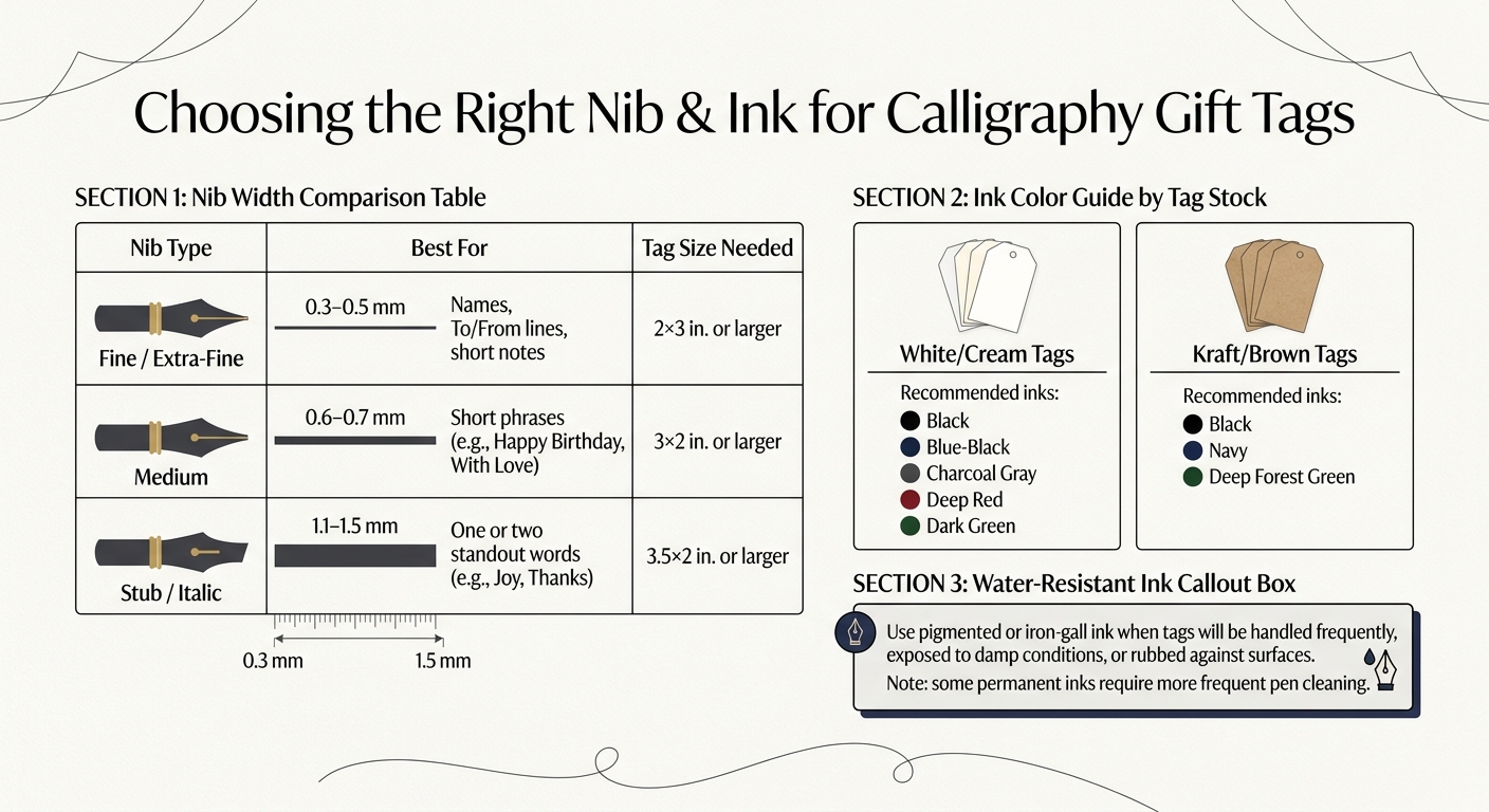
Fountain Pen Nib Guide for Gift Tags: Sizes, Uses & Ink Tips
Nib Widths for Names, Short Phrases, and Decorative Words
A fountain pen nib size calculator can help you decide how much writing you can fit on a small tag. For names, short notes, and To/From lines, a fine or extra-fine nib is usually the smartest pick. These tend to put down a line around 0.3–0.5 mm wide, which helps keep letters slim enough to fit several words on a 2 x 3 in. tag without making the space feel cramped.
A medium nib, usually around 0.6–0.7 mm, works well for short phrases like Happy Birthday or With Love. Stub and italic nibs, often 1.1–1.5 mm, need a bit more room. Letters written with these nibs have to be taller and spaced farther apart so they stay easy to read. In plain English: stub nibs are better for one or two standout words, like a first name or a decorative word such as Joy or Thanks. Since broader nibs put down more ink, they also do better when you leave extra space near the tag edges and around the hole reinforcement.
Ink Choices That Stay Readable on Tag Stock
On white or cream tags, dark ink shows up cleanly. Black, blue-black, and charcoal gray are easy to pair with many gift wrap styles, while deep red or dark green can look right at home on holiday paper. On kraft or brown stock, black, navy, or deep forest green are usually the safest picks.
If the tags will be handled a lot, stacked with other gifts, or carried around in winter weather, it makes sense to switch to a water-resistant or permanent ink. Pigmented and iron-gall inks can help cut down on smudging from damp hands, and they’re handy when tags may rub against other surfaces. One catch: some permanent inks call for more frequent pen cleaning, so it helps to plan for that. For day-to-day tags, a standard dye-based ink in a dark shade is still a solid choice.
Set Up and Test Your Pen Before Writing the Final Tag
Before you write on the finished tag, get the pen ready. If it has been sitting unused, flush the nib and feed with cool water, then let it dry all the way. Fill the pen at least halfway since a low ink level can lead to skipping in the middle of a name. Then wipe any extra ink from the nib and grip section with a soft cloth.
Next, test the pen on a scrap from the same tag paper. Write a name, a loop, and a short phrase. Then check if the ink stays crisp without feathering, bleed-through, or show-through. If you see smearing or feathering, switch to a faster-drying ink or a finer nib before you move to the finished tags. Once the pen is writing cleanly, you’re ready to move on to layout and spacing.
Plan the Layout and Write the Tag Step by Step
Choose a Lettering Style That Fits the Tag Size
Start with the tag size and the number of words. That’s the part that matters most.
For gift tags, readability matters more than ornament. On a 2 x 3 in. or 2 x 4 in. tag, simple italic and block capitals are the safest picks. Simple italic has a slight slant with clean thick-and-thin strokes, so it stays easy to read even when the tag is small. Block capitals are the easiest style to write and scan, especially on textured stock, which makes them a smart fit for To/From lines. Modern script looks best when you keep it short - one or two words, not a full line. If you are just starting out, using dedicated calligraphy sets can help you master these styles more quickly.
| Lettering style | Ease on small tags | Readability | Best use case |
|---|---|---|---|
| Simple italic | High | High | Names, short greetings, clean modern tags |
| Block capitals | High | Very high | Ultra-small tags, minimal designs, quick readability |
| Modern script | Advanced | Medium | Single names or decorative words only |
Once you’ve picked the style, the next job is simple: make the wording fit the open space without feeling squeezed.
Space Names and 'To/From' Lines Without Crowding
Use the pencil guides on the tag before you touch ink to paper. That small step saves a lot of frustration.
Leave at least 3/8–1/2 in. of space below the hole punch so the ribbon or twine knot doesn’t land on top of the lettering. If you’re centering a name, lightly mark the visual center in pencil. In most cases, placing it a bit above the exact geometric middle looks better to the eye.
If the front starts to feel cramped, don’t force it. Put the decorative name on the front, then move the practical details to the back in small block capitals. Keep one nib width between letters and two nib widths between words so the text has room to breathe.
Write in Order: Practice, Pencil Draft, Ink, Dry, Erase
Follow the steps in order. It keeps the process calm and cuts down on the usual mistakes.
- Practice on scrap paper. Write the exact name or phrase first, check the spacing, and make sure it fits. For classic italic forms, hold the pen at a steady 45-degree angle to the baseline.
- Sketch lightly in pencil. Use a 2H pencil to draw a baseline, a top line for your x-height or capitals, and the outer margins on the tag itself.
- Ink, dry, then erase. Write slowly. Let each word settle before moving to the next. When the ink is fully dry, erase the pencil with a soft white vinyl eraser, then brush the crumbs away in one direction so you don’t smear the ink.
After the ink dries, the tag is ready for ribbon and wrapping details.
Match the Tag to Your Gift Wrap and Add Finishing Details
Match Ink and Tag Style to the Wrap
Once the lettering is dry, match the tag to the wrap instead of piling on extra decoration that fights for attention.
A flex nib gives you flowing swashes and strong contrast, so it fits ornate or romantic wrap well. An italic or stub nib makes crisp thin lines with bold accents, which pairs nicely with clean, modern wrap. A round nib keeps the line width even and works best on simple tags paired with plain white or kraft paper that needs only one underline.
Here’s the simple match-up:
- Flex nib for ornate or romantic wrap
- Italic or stub nib for clean modern wrap
- Round nib for simple tags with one underline
From there, keep finishing marks light so the tag stays easy to read.
Add Twine, Ribbon, and Small Flourishes Without Overfilling the Tag
When you add decorative details, less is more. A simple underline or thin border can make the tag look polished without crowding the lettering. Use smooth, well-sized tag stock so the ink stays crisp. And if you add finishing details, use high-quality fountain pen ink to keep flourishes sharp.
Conclusion: Key Steps for Clean, Personalized Gift Tags
For the cleanest finish, match the nib, ink, and one restrained flourish to the wrap, then stop before the tag starts to feel crowded.
FAQs
What if my ink feathers on the tag?
If your ink feathers on a gift tag, the paper is probably soaking it up too fast. A better tag stock can help a lot. Go with something higher quality, coated, or a bit heavier - ideally 80 GSM or more - so your lines stay crisp.
A finer nib can also help, and so can a drier ink, since both tend to spread less on paper like this. Before you start, test your ink and tag on a scrap piece first. It’s a small step, but it can save you from a messy surprise.
Can I use one pen for all tag lettering?
Yes, you can use one fountain pen for all your gift tag lettering.
That said, many experienced letterers switch nib sizes to add more contrast and make the layout easier to scan at a glance.
Broad or stub nibs work well for bold names. Fine nibs are better for small details or delicate flourishes. A pen like the FPR Duet Fountain Pen lets you switch between two nib sizes without changing pens.
How do I fix a mistake on a gift tag?
If you make a mistake on a gift tag, the safest move is usually to grab a new tag and start again. Trying to erase ink often leads to smudges and can scuff or tear the paper surface.
Fountain pen ink is often permanent once it dries because it bonds with the paper fibers. Metallic inks need extra care. In many cases, they can take at least 24 hours to dry all the way before you handle the tag or try to fix anything.