

If you want the short answer: pick the maker by finish first, then by fit. In this list of 7 pen makers, urushi names like Tamenuri Studio, Hakase, and Bokumondoh focus on lacquer depth, texture, and aging. Resin-led names like Carolina Pen Company, Newton Pens, and Scriptorium Pens focus more on swirl, chatoyance, polish, and shape. Lotus Pens sits between both sides with ebonite, acrylic, wood, paint, and inlay work.
Here’s the core idea in plain English:
- Choose urushi if you want layered glow, surface depth, and a finish that can change over time.
- Choose resin if you want bold swirls, translucency, and pattern built into the material.
- Choose by grip and balance too, because a pen that looks good can still feel off after 10 minutes of writing.
- A useful comfort range is about 0.45 to 0.55 inches at the grip.
- Prices in the article run from about $40 on the low end to $600 for some custom models.
The 7 makers covered:
- Tamenuri Studio - urushi depth, layered lacquer, textured finishes
- Carolina Pen Company - hand-cast resin, Primary Manipulation swirls
- Newton Pens - resin blanks shaped for comfort and fit
- Scriptorium Pens - polished resin with story-led designs and metal details
- Lotus Pens - ebonite, acrylic, wood, painted and inlaid work
- Hakase Bespoke Fountain Pens - quiet urushi over wood with hand-fit sizing
- Bokumondoh - custom urushi work on existing pens with textured surfaces
Quick takeaway: if you care most about depth, start with urushi. If you care most about pattern, start with resin. If you care most about comfort, look hard at section size, weight, and whether you write posted or unposted.
Urushi DIY - tamenuri fountain pens
sbb-itb-1dd4fe9
Quick Comparison
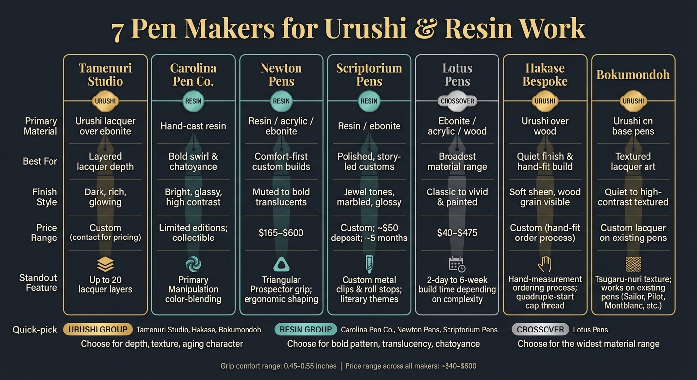
7 Pen Makers for Urushi & Resin: Side-by-Side Comparison
| Maker | Main Material | Best For | Look | Feel in Hand |
|---|---|---|---|---|
| Tamenuri Studio | Urushi | Layered lacquer depth | Dark, rich, glowing | Light, often front-balanced |
| Carolina Pen Company | Cast resin | Bold swirl and chatoyance | Bright, glassy, high contrast | Comfortable, moderate grip |
| Newton Pens | Resin/acrylic/ebonite | Fit-first custom use | Depends on blank choice | Strong focus on ergonomics |
| Scriptorium Pens | Resin/ebonite | Polished, story-led customs | Marbled, jewel-toned, glossy | Larger shapes, smooth sections |
| Lotus Pens | Ebonite/acrylic/wood | Material range | From plain to ornate | Varies by model |
| Hakase Bespoke | Urushi over wood | Quiet finish and hand-fit build | Soft sheen, wood grain | Built around your grip |
| Bokumondoh | Urushi on base pens | Textured lacquer art | From dark to high-contrast | Depends on base pen |
So if I were narrowing this list fast, I’d do it like this:
- For layered urushi: Tamenuri Studio
- For subtle urushi over wood: Hakase
- For textured urushi work: Bokumondoh
- For bold resin color: Carolina Pen Company
- For comfort-first customs: Newton Pens
- For polished resin with theme-driven styling: Scriptorium
- For the broadest material mix: Lotus Pens
That’s the article in a nutshell. The rest is about how each maker handles finish, color, shape, and long-term use. Understanding these factors is key to improving your handwriting with a custom tool.
What Sets Urushi and Resin Pens Apart
Urushi builds depth layer by layer. Resin, by contrast, holds its pattern inside the material from the start.
Urushi Depth, Layering, and Organic Luster
Urushi is a natural lacquer that goes on in many thin coats over a pen body, often made from ebonite or acrylic. In many classic urushi builds, makers apply a long series of thin coats - sometimes dozens - before the last polish. Each layer cures in controlled humidity, then gets sanded and polished before the next one goes on. That process gives urushi an inner glow instead of a plain top-level shine.
Because the finish builds slowly over time, urushi can also shift a bit as it ages and meets light. Edges and high points may reveal more of the color underneath, which means the pen picks up character as the years pass instead of looking visually flat. For collectors, that’s a big part of the draw. The pen can feel alive in the hand, not fixed or sterile.
Resin Swirl, Translucency, and Chatoyance
Cast resin works in a completely different way. Its visual effects - swirls, color ribbons, and pearly clouds - are set into the material at the moment it’s poured. Makers blend dyes, pigments, and pearlescent powders into liquid resin before it cures, so the pattern becomes part of the pen body itself. After the rod is turned and polished, those inner structures catch light from different angles.
Chatoyance is the shifting, cat’s-eye shimmer you see inside resin. It comes from pearlescent pigments or layered swirls. The surface of resin is usually polished hard and clear, which can look dramatic, but the visual effect sits below that surface rather than being built through the finish itself.
Key Finish Terms in Plain English
A few terms show up again and again when you're shopping for urushi or resin pens. It helps to know what they mean before you start judging product photos.
| Term | What It Means |
|---|---|
| Tamenuri | Dark urushi top coat over a brighter base |
| Kawari-nuri | Patterned or textured urushi |
| Raden | Mother-of-pearl inlay |
| Maki-e | Metallic powder design under lacquer |
| Chatoyance | A shifting, silky glow inside resin caused by pearlescent pigments or layered swirls |
How Shape and Grip Affect Daily Use
For day-to-day comfort, finish matters less than barrel shape. A moderately thick, gently tapered barrel - about 0.45 to 0.55 inches at the grip - spreads finger pressure and can cut down on fatigue. Large, straight barrels do a great job showing off a finish, but they can wear out smaller hands. Shape also changes how much of the finish you can actually see while writing.
Urushi pens made on ebonite bodies often feel lighter and more front-balanced, which can help keep your grip relaxed. Some solid resin pens, especially those with heavy metal hardware, can feel back-heavy. That may not matter much for a quick note, but it starts to stand out during longer writing sessions. If you like to post the cap, the balance shifts even more. That’s worth checking before you commit to a heavier pen. A pen can look stunning on a desk and still feel awkward after ten minutes in your hand.
Those differences affect how each maker approaches color, surface depth, and barrel shape. With finish and feel in mind, the makers below show how those choices play out in actual pens.
1. Tamenuri Studio by Michal Kulka
Among the makers in this guide, Tamenuri Studio stands out as the clearest urushi specialist. Michal Kulka’s work starts with urushi and builds from there, with a strong focus on layered lacquer, textured surfaces, and tight color control. One reviewed pen used 20 layers in total: four base layers, six middle layers, five pigmented top layers, and five translucent finish layers.
Finish Depth
That process gives the finish a sense of depth that feels built into the pen, not laid on top like a coating. In more complex pieces, textured underlayers paired with gold leaf and metallic pigments create highlights that seem to float inside the lacquer.
Color Philosophy
Kulka works across both quiet and bold color palettes. On one side, there are restrained blue, copper, and black-and-copper finishes. On the other, there are limited-edition flame and sakura designs that use kawari-nuri, gold leaf, metallic pigments, and shell inlay.
Surface Techniques
The surface work is just as varied. Kulka uses:
- ishime-ji for grip
- kawari-nuri for a sense of motion
- togidashi kawari-nuri with raden for depth beneath the lacquer
Body Shape and Ergonomics
Tamenuri Studio mainly works on ebonite bases, including Nikko-sourced Japanese ebonite. Its Esterbrook Estie collaborations also bring in a thicker, gently tapered section, which can feel better suited to longer writing sessions.
2. Carolina Pen Company by Jonathon Brooks
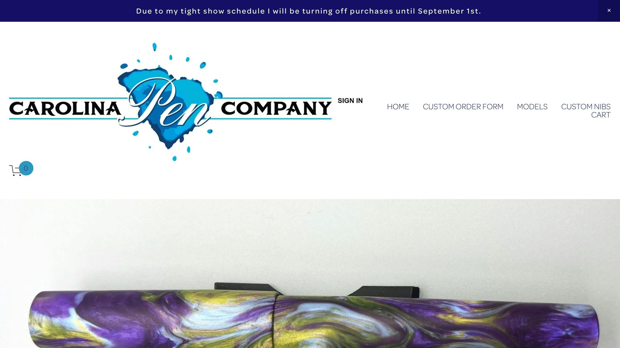
Jonathon Brooks is best known for Carolina Pen Company's hand-cast resin blanks, especially the Primary Manipulation line. If urushi gets its depth from many layers, Brooks gets his inside the pour itself. The effect feels almost suspended in the material, as if the color is moving under the surface.
Finish Depth
Brooks creates depth by controlling how dyes shift as the resin cures, which makes the color look layered within the blank. Instead of adding depth after the fact, he builds it into the resin from the start.
Color Use
"Primary Manipulation" reflects Brooks's way of handling color. Primary Manipulation creates green by blending translucent blue and yellow, not by adding green dye. That detail says a lot about the line: the color isn't just placed there, it's formed through interaction inside the resin.
Brooks has released multiple numbered Primary Manipulation editions, each with its own palette. For collectors, that means each version has its own mood and look rather than feeling like a small variation on the same idea.
Body Shape and Ergonomics
Carolina Pen Company pens like the Charleston and Charlotte are made for comfort and balance during long writing sessions. The Charlotte PM6 measures 5.39 inches capped, 5.04 inches uncapped, has a 0.49-inch grip, and weighs 0.9 oz capped and 0.4 oz uncapped.
Its pinched section, gentle body taper, flat ends, and minimal step from barrel to section help it feel secure in hand. In plain terms, it looks striking without giving up usability. That mix of color and comfort helps his pens stand out in a resin-first lineup.
Polish and Surface
Brooks machines and polishes cured resin rods, so the final appearance comes from the material itself. That's part of the appeal: the polish isn't hiding anything. It's showing off what happened inside the blank.
His releases are often small and collectible:
- The Charlotte PM6 launched with 23 pens.
- The Conklin 1898 in Primary Manipulation 5.0 was limited to 198 pieces.
- The Leonardo Momento Zero Grande 2.0 in Primary Manipulation 4 (2025) was limited to 55 pieces.
If a certain PM version catches your eye, it's smart to move fast when it shows up.
3. Newton Pens by Shawn Newton
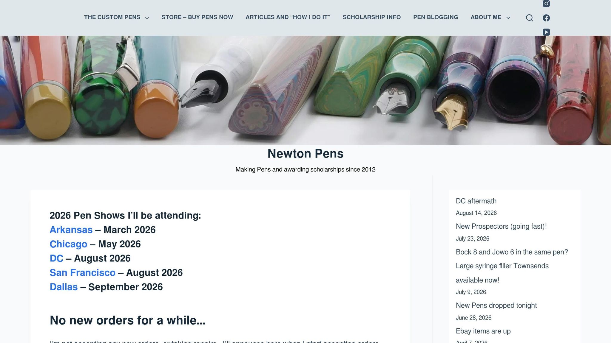
Carolina Pen Company makes the blank. Newton takes it from there and turns it into a pen that feels balanced in the hand, sits well for long writing sessions, and has a polished final look.
Shawn Newton, based in Hot Springs, Arkansas, has been making pens since 2011. He doesn't cast his own blanks. Instead, he works with hand-poured resins from artists such as Jonathon Brooks of Carolina Pen Company, Bob Dupras of Corrl Creations, and D-Squared Arts, then puts his attention on shaping, ergonomics, and final polish.
Finish Depth
Newton uses a multi-stage polishing process to remove micro-scratches and help swirls and translucency show more depth in everyday light.
Color Philosophy
Newton tends to pick blanks with strong swirl, contrast, or translucency, then uses shape and polish to show them off. His catalog runs from earthy tortoise patterns and autumn-inspired mixes to bright yellows, blues, and multi-color blends. He has also worked on themed pens, including a purple striped jellyfish colorway tied to specific ink collections.
Body Shape and Ergonomics
This is where Newton stands out most: ergonomic shaping. His lineup includes several core models in resin, acrylic, and ebonite, across a range of sizes, including the Hale, Orville, Prospector, Shinobi, and Townsend.
The Prospector is the clearest example of that approach. Its triangular-prism body helps keep the pen from rolling away and gives your fingers three flat grip surfaces. It's a small detail, but it changes how the pen feels in use. Sections and grip dimensions can also be customized to better fit long writing sessions.
Pricing and Surface
Base prices on commissioned models start at about $225 to $230 for pens like the Hale, Orville, and Townsend. From there, pricing goes up to $420 to $425 for the Prospector and as high as $600 for the Breaker.
Ready-made store inventory usually falls in the $165 to $400 range, depending on the model and material.
That mix of hand-picked resin and comfort-first shaping points to a different approach to surface work in the next maker.
4. Scriptorium Pens by Renée Meeks
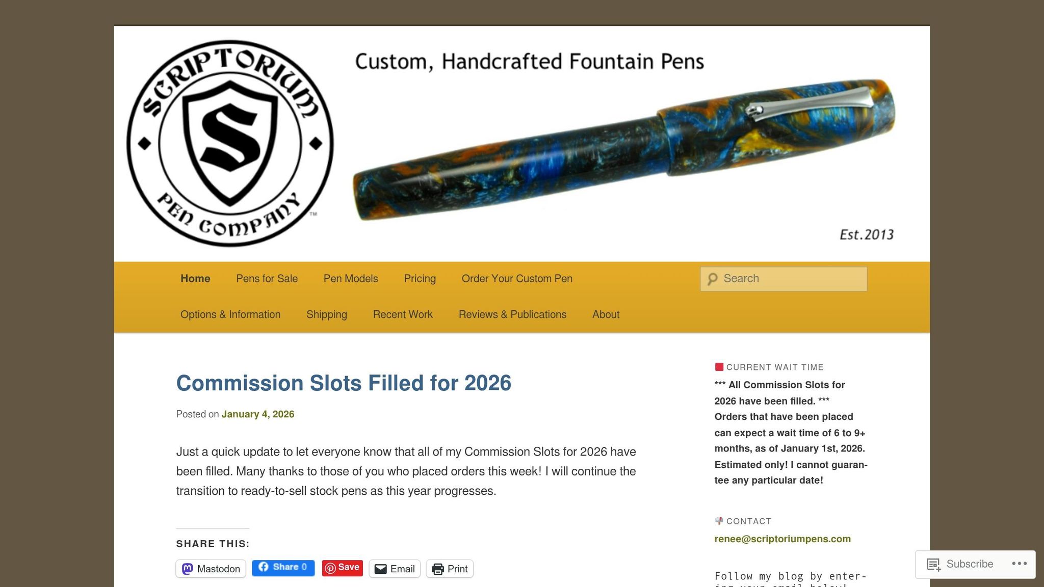
Where Newton puts comfort first, Scriptorium leans harder into narrative, resin drama, and metal detail. Renée Meeks runs Scriptorium Pens in Jackson, Mississippi, and gives the brand a literary identity through model names like Balladeer, Novelist, Idyll, and Epic.
Finish Depth
Meeks turns custom resin blanks to a high-gloss finish that brings out the depth and contrast in each material. Dartmoor, for instance, can look dark brown, green, and black at first glance. But once light hits it, veins and flecks of white, gold, and caramel start to show, shifting as you turn the pen in your hand. The surface stays smooth and glass-like, so you see all that movement without any textured feel.
Color Philosophy
For Meeks, color isn't just decoration. It's part of the pen's story. She draws inspiration from the endpapers of old books, then commissions custom blanks to match that mood and theme. The Dancing Crane, Rising Sun Idyll is a good example. It uses a white, red, and black acrylic meant to echo the plumage of the Japanese red-crowned crane, paired with a sterling silver crane roll stop. She also returns often to color contrast: a patterned body set against solid end caps or bands. Dartmoor with Urushi Red acrylic end caps shows how that works. Your eye gets motion from the body, then a clean point of focus from the trim.
Body Shape and Ergonomics
Most Scriptorium models come in small, medium, large, and oversize sizes, though even the medium usually runs bigger than mass-market pens. The shapes tend toward classic cigar forms or gentle tapers, with smooth transitions from barrel to section. Because the pens are usually made from acrylic or other light materials, even the larger sizes stay comfortable during long writing sessions. Meeks can also adjust dimensions and balance for posted or unposted use, along with grip diameter, depending on how you write.
Surface Techniques
That story-first approach carries over to the hardware. Meeks works with a metalworker to make custom clips and roll stops cast to order. The bronze book-shaped roll stop on Read Between the Lines Long Idyll and the Argentium sterling silver crane roll stop on Dancing Crane, Rising Sun both tie the metalwork back to the pen's theme. Cap bands are also offered in sterling silver, copper, jeweler's brass, and aluminum, with different thickness options. So buyers can decide whether they want just a touch of metal or something more noticeable against the resin.
Custom orders require a $50 nonrefundable deposit and can take about five months.
5. Lotus Pens by Arun Singhi
Arun Singhi started Lotus Pens in Mumbai after about four decades in the pen trade. The brand makes hand-turned ebonite and acrylic pens, with prices running from about $40 to $475. Lotus sits in an interesting middle ground: not just daily writers, not just display pieces. That makes its finish and surface work easier to line up against the resin-focused makers mentioned earlier.
Finish Depth
Lotus works with Japanese Nikko ebonite and Conway Stewart acrylics from the UK. The depth in these pens comes less from flashy coating and more from careful turning and polishing. On ebonite and acrylic, that matters. It keeps the surface clean, smooth, and lets the material’s own glow do the heavy lifting.
That same approach carries into dressier models too. Lotus also makes more decorative ebonite pens with Raden panels, including the Author with Raden inlays.
Color Philosophy
Singhi’s lineup splits pretty cleanly between practical pens and more ornate ones.
The daily-use side leans on classic ebonite and restrained acrylics that fit well in an office. The dressier side goes much further, with bold acrylics, hand-painted Indian motifs, carved barrels, and mother-of-pearl inlay. He has also developed a wood-finish ebonite meant to echo the look and warmth of wood while keeping the durability of ebonite.
Body Shape and Ergonomics
The Tanoshii sits on the slimmer side of the range. It measures 5.3 inches capped, 0.52 inches at the barrel, and about 0.4 inches at the section.
Surface Techniques
Carved and inlaid pens call for a bit more care, since knocks can chip the edges of the inlay. Hand-painted pieces are better treated more like art objects than rough daily carries, and they should be stored away from abrasive surfaces.
Build time also depends on how much surface work goes into the pen:
- Simple models take about two days
- Hand-painted or carved commissions can take four to six weeks
That blend of practical ebonite work and decorative inlay leads into a different kind of custom path with Hakase Bespoke Fountain Pens.
6. Hakase Bespoke Fountain Pens
Hakase comes from a workshop in Tottori with roots going back to the 1920s. The company has made custom pens since 1982, first under Harumi Tanaka and now under Masaaki Yamamoto. Its style is quiet and made-to-order, with a strong focus on fit. That puts Hakase in a different lane from the brighter, more decorative names on this list.
Finish Depth
Hakase uses urushi mostly to protect wood and keep its grain visible, not to create a bold, high-contrast look. Some limited urushi models - amboyna burl, snakewood, sandalwood, and black persimmon - use lacquer to steady porous or lower-density woods while still showing off the natural pattern. The finish tends to land between satin and soft gloss. It has warmth and depth, but not the glassy shine you see on some other pens.
Color Philosophy
Hakase lets the material lead. Its palette leans toward deep browns, blacks, muted greens, and the natural figuring of woods like old red sander, rosewood, and African ebony. Urushi is used to support the wood’s existing tone, not to add sharp color contrast.
Body Shape and Ergonomics
Hakase’s ordering process is unusually detailed. You measure your hand, film yourself writing from several angles, and send that information in so the maker can adjust the pen’s length, section shape, and weight balance to match your grip. It’s a bit like getting a suit tailored, except it’s for your handwriting.
Typical examples come in at about 5.6 inches capped and a little over 1 oz filled, which sits in a comfortable range for many U.S. writers. Inside the pen, Hakase uses ebonite for the threads, sections, and mechanisms, which helps the grip feel warm and lightly textured instead of slick. The company also uses a quadruple-start cap thread, so the cap opens faster.
Surface Techniques
At Hakase, urushi is as much a practical choice as a visual one. The workshop starts with air-dried woods selected for density and resistance to moisture, then applies urushi to help stop ink and moisture from soaking into the barrel over time. The nibs are 14k gold units from Pilot or Sailor, branded for Hakase and hand-tuned based on a diagnosis of the buyer’s writing habits. In other words, the lacquer here supports the pen’s structure and feel in the hand just as much as its look.
7. Bokumondoh
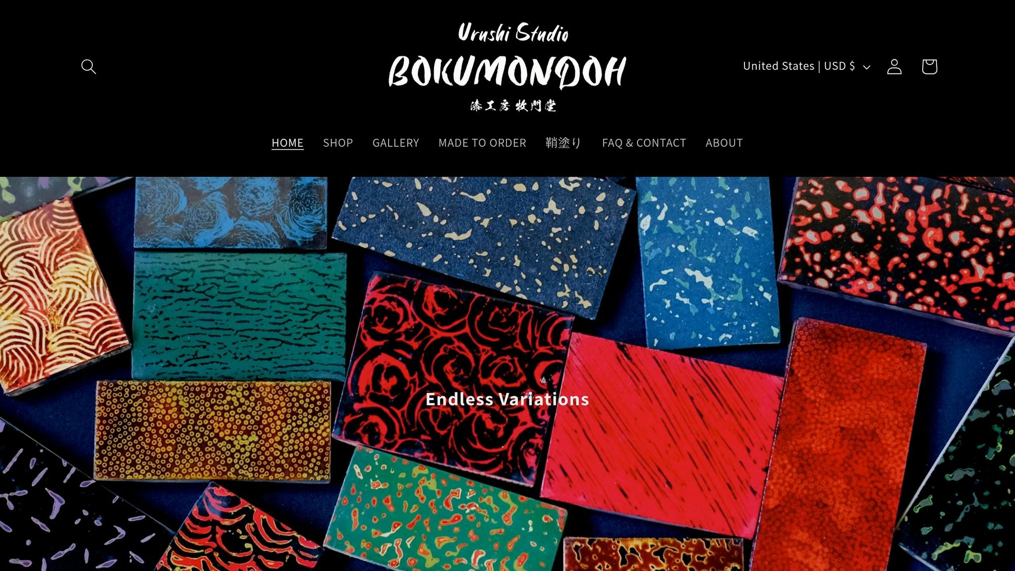
Bokumondoh takes urushi in a different direction. Instead of making pen bodies from the ground up, this Tokyo studio custom-lacquers pens that already exist. The studio is run by lacquer artist Hiroko Makino, who trained in Tsugaru-nuri, a northern Japanese style of kawari-nuri known for layered texture and contrast. Bokumondoh works on pens from makers like Sailor, Pilot, Montblanc, Pelikan, Nakaya, and others.
Finish Depth
Makino's Tsugaru-nuri training comes through clearly in her use of ishime-nuri, hineri-ishime, and shigurenuri - methods that give the surface texture you can both see and feel as the light moves across it. A Fine Writing International brass pen finished in hineri-ishime urushi shows this well: the dark surface doesn't look flat at all. It feels layered, textured, and full of small details.
Color Philosophy
Bokumondoh's palette runs from quiet, near-black finishes to much bolder, high-contrast work. Raden and kin-hirame bring in flashes of shimmer and iridescence. One example is a Sailor King of Pens body with raden stripes, which shows how Makino can move from restrained to eye-catching without losing control of the design. Those shifts in color come from the way she builds up texture, inlay, and lacquer layer by layer.
Body Shape and Ergonomics
Bokumondoh keeps the base pen's original shape and balance, so the writing feel depends on the model underneath. In other words, the lacquer changes the surface character, not the core form. Textured finishes like ishime and hineri-ishime can also make the pen feel more tactile in the hand.
Surface Techniques
Makino works with kawari-nuri textures, raden, eggshell inlay, kin-hirame, tamenuri, and ikkan-bari, among other surface treatments. That's a big part of what makes Bokumondoh stand out here: the same base pen can end up looking almost like a different object depending on the urushi method she uses. The finish depth, color, and surface feel all shift, while the pen's underlying shape stays the same.
How the 7 Makers Compare Side by Side
These seven makers fit into three camps: urushi-focused, resin-focused, and crossover.
Urushi-Focused Makers
Hakase, Tamenuri Studio, and Bokumondoh all work in urushi. They don't just use the same material in the same way, though. Hakase is the quietest of the three. Tamenuri Studio lands in the middle, with a strong sense of balance. Bokumondoh is the most expressive.
The best way to compare them is to look at how much visual weight the finish carries. In plain English: how much the surface speaks before you even pick the pen up. Each maker uses layering, texture, and depth in a different way.
Resin-Focused Makers
Carolina Pen Company and Scriptorium Pens put resin front and center. Newton Pens sits a bit apart here because its main draw isn't only the surface look. It's also about ergonomics and customization.
Carolina Pen Company is the boldest of the group, with bright resin patterns and a glassy, chatoyant finish. Scriptorium Pens is just as polished, but the mood shifts toward jewel tones and elegant marbled mixes. Newton Pens makes the most sense when fit and writing comfort come first.
Crossover Approach
Lotus Pens works across Japanese Nikko ebonite, acrylic, wood, and hand-painted finishes. Here, the material is only part of the story. Turning, painting, and engraving matter just as much, which makes Lotus Pens the broadest option for buyers who want range.
That range shows up most when you're choosing finishes, nibs, and care. If you like having more than one path in front of you, Lotus Pens gives you a lot to work with.
Finish, Color, and Shape Differences
At a glance, the differences look like this:
| Maker | Primary Medium | Finish Depth | Color Style | Body Shape | Surface Technique |
|---|---|---|---|---|---|
| Tamenuri Studio | Urushi | Deep, layered glow | Rich, controlled tones | Classic cigar | Tamenuri, raden, rankaku, metallic pigments |
| Hakase Bespoke | Urushi over wood/ebonite | Subtle, traditional sheen | Natural, understated tones | Classic Japanese taper | Traditional urushi, hand-finishing |
| Bokumondoh | Urushi | High-relief, textured depth | Quiet to bold, high-contrast | Varies by base model | Tsugaru-nuri, kawari-nuri, raden, eggshell, kin-hirame |
| Carolina Pen Co. | Cast resin | High-contrast, glassy depth | Bright resin patterns | Classic cigar | In-house cast resin swirls, high-gloss polishing |
| Newton Pens | Acrylic/ebonite | Cleanly polished | From muted solids to bold translucents | Highly customizable, ergonomic focus | Precision turning and polish; buyer-specified blanks |
| Scriptorium Pens | Resin/ebonite | Mirror-polished resin depth | Jewel tones, marbled mixes | Graceful tapers | Premium resin turning, meticulous high-gloss polish |
| Lotus Pens | Ebonite, acrylic, wood | Warm ebonite to multi-layer painted depth | Classic ebonite to vivid acrylic and hand-painted motifs | Classic straight to sculpted, balanced forms | Turned ebonite, acrylic, and wood; hand-painted and engraved finishes |
If you want a simple shortcut, here it is:
- Choose Hakase for subtle urushi
- Choose Tamenuri Studio for layered depth
- Choose Bokumondoh for textured urushi
- Choose Carolina Pen Company for bold resin
- Choose Scriptorium Pens for polished, refined resin
- Choose Newton Pens for fit-first custom builds
- Choose Lotus Pens for the broadest material range
With the finishes compared, the next step is figuring out how to protect them and pair them well.
Pairing These Pens With Nibs, Inks, and Storage
Once you pick a finish, it helps to pair it with the right storage, ink, and nib care. That way, the pen doesn’t just look good on day one - it stays in good shape with regular use.
Protecting Urushi and Polished Resin Finishes
The finish is a big part of what gives these pens their appeal and price. That’s why you shouldn’t post urushi pens or heavily finished resin pens. Over time, posting can scuff the surface or leave compression marks.
For storage, keep things simple: a soft leather case or pen pouch can stop pens from bumping into each other and lower the risk of scratches during travel or daily carry. It’s a small habit, but it goes a long way. Once storage is handled, ink is the next place to make a smart match.
Matching Ink Color to Pen Material
With translucent or swirled resin, inks can either play along with the pattern or stand apart from it. Fountain Pen Revolution offers Neptune Blue, Classic Blue-Black, and Diamine Oxford Blue, and all three are practical picks for this kind of pen.
Urushi pens usually look best with quieter ink colors, like blue-black, dark blue, or black. That keeps the lacquer front and center instead of competing with it.
Affordable Accessories From Fountain Pen Revolution
Fountain Pen Revolution also sells lower-cost accessories that make pen care easier, including inks, nib-smoothing tools, leather cases, and pen pouches. A few prices stand out:
- Classic Blue-Black starts at $1.00
- Diamine Oxford Blue starts at $1.50
- Neptune Blue costs about $8.50
- Free U.S. shipping applies to orders over $65
For nib maintenance, FPR Micro-Mesh Nib Smoothing Sheets (12,000 grit) cost $5.00, and Brass Flossing Sheets cost $3.25. If a nib feels a little rough or tight, those tools can help without costing much.
Conclusion
After looking at finish, shape, and surface work, the easiest way to narrow the field is to focus on what matters most to you. If urushi depth is the main draw, look at Tamenuri Studio or Bokumondoh. If you want bold resin color and movement, Carolina Pen Company or Scriptorium Pens make more sense. If comfort comes first, Newton Pens or Lotus Pens stand out. And if surface artistry is the big thing, Hakase deserves a close look.
Those preferences show up in the numbers too. Specs matter just as much as photos. Length, grip diameter, and weight can change how a pen feels in your hand as much as the finish changes how it looks.
Color plays a part as well. Darker urushi tends to fit a restrained office look. Saturated resin, on the other hand, feels more expressive on a desk or in a journal.
Before buying a high-end custom pen, get clear on your preferred nib size and feel and balance. It helps to start with lower-cost pens and accessories first.
Once you know whether finish, color, or comfort matters most, you can use that to cut down the final list.
FAQs
How do I choose between urushi and resin?
Choose plain urushi if you want the smoothest, most forgiving lacquer-only feel. It’s usually easier to repair and often makes more sense for frequent daily writing. The look comes from the depth of the lacquer and the final polish.
Choose urushi-based resin only if you want a resin or acrylic body with urushi-style decorative surfaces. If day-to-day use matters most, start with plain urushi. If you want decorative shimmer, go with maki-e.
Which maker is best for comfort?
For frequent daily writing, plain urushi is the most comfortable choice. It has the smoothest, most even texture, and it needs the least upkeep.
If you want decoration, Togidashi Maki-e also works well for everyday use. Its design sits under layers of lacquer, which creates a sleek, polished, flat surface. That surface tends to handle regular use better than raised finishes like Taka Maki-e.
Are urushi and resin pens hard to maintain?
It depends on the finish. Plain urushi is usually the best pick for daily writing because it holds up well and asks for less fuss. Maki-e and raden are more delicate, so they need a gentler touch to keep their fine surface work in good shape.
Resin pens can look elegant, but they don't love heat or long hours in the sun. It's best to keep them in a soft-lined case and away from direct sunlight, extreme temperatures, and moisture. For cleaning, use a soft, dry cloth. Skip harsh chemicals like alcohol or acetone, since they can damage the surface.