

If you’re choosing a Nakaya, the finish changes more than the color. It affects grip, gloss, depth, wear, and how the pen looks after years of use. In short: if you want edge glow, pick tamenuri; if you want a mirror-like look, pick solid polished urushi; if you want more grip, look at nuritate or ishime; if looks come first, focus on decorative or translucent styles.
Here’s the full picture in one pass:
- Tamenuri: layered color, darker center, lighter edges, changes with use
- Solid polished urushi: even color, high gloss, formal look
- Nuritate: satin to semi-matte, softer feel, a bit more traction
- Ishime: stone-like texture, dry feel, more grip
- Urushi art techniques: maki-e, chinkin, raden, nashiji, and byakudan-nuri
- Special variants: translucent effects like tame-sukashi-nuri, akebono-nuri, and fuki-urushi
A few facts matter here. Nakaya builds urushi by hand in thin layers, and some finishes can take months, with more involved work reaching close to a year. Polished urushi often uses 6 to 8 coats. And raden inlay may use shell pieces around 0.1 to 2 mm thick. So when prices move into the luxury range, the finish is a big part of what you’re paying for.
The short version: there isn’t one best finish. There’s only the one that fits how you write, carry, and store the pen.
Nakaya fountain pens, comparison of 3 models
sbb-itb-1dd4fe9
Quick Comparison
| Finish family | Look | Feel | How it ages | Best fit |
|---|---|---|---|---|
| Tamenuri | Layered, glowing edges | Smooth, warm | More base color shows over time | Daily use + collecting |
| Solid polished urushi | Deep, even, glossy | Slick, smooth | Gloss softens at touch points | Desk use, formal settings |
| Nuritate | Satin, low-shine | Soft with a bit more hold | Contact spots grow shinier | Long writing sessions |
| Ishime | Matte, textured | Dry, grippy | Texture hides light wear well | Frequent writers |
| Decorative | Pattern, metal, shell, shimmer | Varies by technique | Some styles need lighter handling | Display or careful use |
| Special variants | Translucent, layered effects | Smooth | Depth often grows with age | Collectors and rotation pieces |
If I were choosing by use case alone, I’d keep it simple: tamenuri for depth, polished urushi for gloss, nuritate or ishime for grip, and decorative work for show.
What Sets Nakaya Urushi Finishes Apart
Nakaya uses ebonite, a warm, lightweight, durable hard rubber that gives urushi a strong base. Urushi bonds well to ebonite, which helps support layered lacquer finishes without the slick feel you often get from acrylic or injection-molded resin.
Each finish is built by hand, one coat at a time. Every thin layer cures in a humid chamber before the next one goes on. More involved finishes can take months, and sometimes up to a year. That core method stays the same, but the final look can change a lot based on layering, polishing, and surface texture.
That’s where the visual depth comes from. Light passes through the top layers and reflects back from underneath, which gives the color a subtle three-dimensional look. The same pen can seem softer in one setting and deeper in another, just from a shift in light. In layered finishes like tamenuri, that effect stands out even more.
Urushi on ebonite also changes the feel of the pen in your hand. It’s smooth, silky, and warm. Over time, Nakaya urushi finishes can develop patina too: polished surfaces may lose a bit of shine, while layered colors can grow more transparent around the edges and high points. Those changes are easiest to spot in the six finish families below.
1. Tamenuri Layered Finishes
Among Nakaya's layered finishes, tamenuri is the clearest example of depth and edge glow. The effect is simple to describe but hard to forget: a darker center, lighter edges, and a surface that changes as light moves across it. In practice, that means the same pen can look deep and shadowed from one angle, then warm and bright from another.
Where the top layer is thinnest, the color underneath comes through more strongly. That’s what creates the shift from a darker middle to the warmer, more luminous seams and raised areas.
Nakaya's classic tamenuri palette includes:
| Finish | Base Color | Edge Effect |
|---|---|---|
| Aka-tamenuri | Deep red / mahogany | Bright red-orange halo |
| Kuro-tamenuri | Red or brown | Burgundy at edges |
| Heki-tamenuri | Blue-green / teal | Mossy highlights |
| Midori-tamenuri | Forest green | Vivid green glow |
| Toki-tamenuri | Pinkish / soft brown | Blush at transitions |
With regular handling, the top layers slowly become more transparent. The change tends to show up first in high-contact spots, like the grip section and the cap lip. So over time, each pen starts to look a little more personal, both when you’re using it and when you line it up with others in a collection.
Tamenuri is the most visually dimensional finish family; the finishes that follow lean more toward opacity, texture, or pattern.
2. Solid Polished Urushi Colors
Where tamenuri pulls you in with depth and that glow along the edges, solid polished urushi makes its point in a different way. It’s about even color and high gloss. You get a mirror-like surface, with no layered reveal and no edge glow. Nakaya’s best-known finishes in this group make that difference easy to see.
The two finishes most people know here are kuro-roiro and shu. Kuro-roiro is Nakaya’s classic black urushi: a deep, wet-like black with a glossy, formal look. Shu is a vivid vermilion red, a little warm and slightly yellow in tone, made with cinnabar pigment and valued for its bright, classic red. Both are polished to the same high-gloss standard, but they feel quite different in person. Kuro-roiro comes across as restrained and formal. Shu feels warmer and more expressive. If you want a pen with a clear color identity and little visual variation, these finishes fit that brief.
Getting this kind of solid polished urushi finish takes time. The maker builds up six to eight passes of transparent urushi over a finely ground surface, then polishes it again and again with oil and fine powders. The full process usually takes three months or more. In the hand, the surface feels slick rather than grippy, which gives it a luxurious feel. There’s a tradeoff, though. That same polished surface tends to show fingerprints, smudges, and fine marks more easily than matte or textured finishes, especially in darker colors like black. Strong light over long periods can also dull urushi with time.
As the pen is used, the gloss usually softens a bit at the places your fingers touch most. The color itself stays stable. So the finish keeps its formal, even look, even as regular handling takes a little of the sharp shine off. That makes sense for writers who want a display-ready pen with steady color and a high-gloss surface.
3. Unpolished Urushi (Nuritate)
If polished urushi is all about shine, nuritate goes in the other direction. It leaves the surface unburnished after curing, so the finish feels softer to the touch and a bit more tactile. Visually, it sits in the satin-to-semi-matte range: less reflective, more restrained, and quieter than polished urushi.
Nakaya's Shu Unpolished is a good example. Other makers also offer urushi art fountain pens that showcase similar traditional techniques. It has a matte red finish with clear color and very little shine. That softer surface can also add a touch of grip, which helps the pen feel steadier in longer writing sessions.
Over time, spots that get the most contact can start to gloss up from use, especially on the barrel, cap edge, and grip. That gentle patina is part of the charm. It shows the kind of beauty that comes from handling and time.
Care for nuritate the same way you would any urushi finish: keep it away from direct sun, sharp temperature swings, and rough handling. From here, Nakaya shifts from soft sheen toward finishes shaped more by texture.
4. Ishime Stone Texture Finishes
Moving from satin-like surfaces into texture, Ishime is Nakaya's most tactile urushi family. Artisans build Ishime by applying urushi, adding lacquer powder, and letting it clump into an irregular surface as it cures. The result is simple to spot: no two Ishime pens look exactly alike.
Visually, Ishime sits somewhere between matte and semi-matte. The raised points pick up light, while the lower areas stay dark, which gives the finish a lot of depth. Nakaya offers a few colorways, including Kuro Ishime, a jet-black version that looks like obsidian; Midori Ishime, a blue-green tone; and Heki-tame Ishime, a special blue tone. And this isn’t just a finish you look at from across the room. The texture changes the whole feel of the pen in use.
In the hand, Ishime feels dry, lightly rough, and more secure than polished urushi. It also feels warm instead of cold, which adds to that easy, tactile feel.
It’s also forgiving in day-to-day use. Small scuffs tend to blend into the uneven surface, and high-contact spots can pick up a slight sheen over time without losing that stone-like look. For care, wipe it with a soft, lint-free cloth, skip abrasive polishes, and keep it out of long periods of direct sunlight. Ishime sits in a nice middle ground between a decorative finish and something you can carry and use often.
5. Decorative and Patterned Urushi Techniques
Where Ishime changes the feel of the surface, these finishes change how the surface looks. Nakaya's decorative urushi techniques - maki-e, chinkin, raden, nashiji, and byakudan-nuri - focus on pattern, inlay, and depth instead of plain color. Each one lands a little differently on the scale between visual drama and daily use.
Maki-e is the best-known decorative method. The artist paints a design into wet urushi, then builds it up with metallic powders, most often gold or silver, to create pictorial motifs on the pen body. The surface ends up slightly raised. That means it's better treated as a pen for careful use, not the kind of daily pocket carry you'd toss in and out without thinking.
Chinkin works in almost the opposite way. Instead of building the design above the surface, the artisan cuts fine lines or dots into hardened lacquer and fills them with gold powder, gold leaf, or other metallic inlay. Nakaya notes that this kind of engraving is especially difficult on a fountain pen's curved surface. Since the decoration sits in recessed grooves, chinkin is usually easier to live with than raised work.
Raden uses thin pieces of abalone or mother-of-pearl, usually cut from about 0.1 to 2 mm thick, which are inlaid into the pen, then coated with lacquer and burnished smooth. The result is an iridescent shimmer that shifts as the light moves. Nakaya also notes that raden needs thick urushi and can look muted at first, with the effect growing deeper as layers build.
Nashiji means "pear skin", and the finish spreads very fine metal flakes through the lacquer to create a soft, even sparkle. It's the most understated option here: luminous, but not pictorial. Because the shimmer is spread across the whole surface and the finish stays flat, nashiji is one of the easiest decorative styles to use day to day.
Byakudan-nuri layers translucent lacquer over a silver-colored base, so that metallic base adds to the finish's depth. It gives the pen a soft glow that shifts with the light. Like nashiji, it leans understated, which makes it easier to fit into a daily rotation.
If daily carry is the goal, nashiji and restrained chinkin make the most sense. Maki-e and raden lean more toward display pieces.
Taken together, these techniques cover the broadest visual range in Nakaya's lineup, from quiet shimmer to full ornament.
6. Special Translucent and Variant Techniques
Unlike the ornament-led finishes above, these variants sit outside the main finish families. Their main effect comes from translucency, which lets the layer underneath show through.
Tame-sukashi-nuri pairs translucent layers with a decorated base, so the pattern stays partly visible through the finish. On pens like the Neo Standard, a bamboo motif sits under clear urushi, which means the design remains visible beneath the surface.
Akebono-nuri begins with a vermilion base, then black urushi is polished back until the red comes through. The result is a dark-to-red gradient that shifts with angle and light, giving off a light-from-dark look.
Fuki-urushi goes in the other direction. Rather than building a thick layered surface, thin transparent urushi is applied and wiped off again and again, so the base material stays visible. The finish has a soft sheen that feels quiet, but still rich.
These finishes reward a closer look and often change in small ways as they age. That also makes them easier to compare with the more opaque finish families in the next section.
Side-by-Side Look at the 6 Finish Families
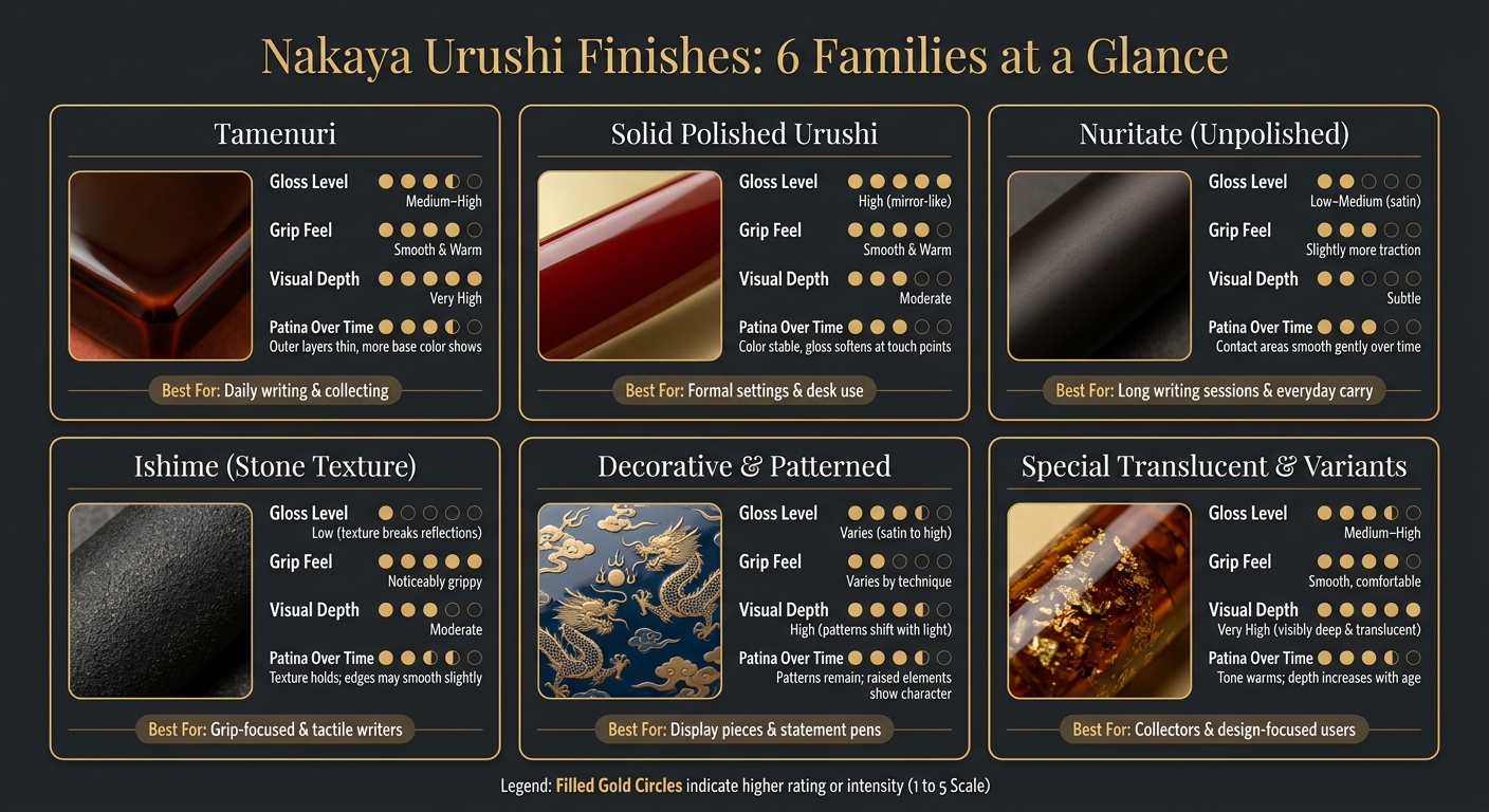
Nakaya Urushi Finishes Compared: Gloss, Grip, Depth & Best Use
Here’s a concise comparison of how each finish looks, feels, and wears.
The table below narrows the six finish families down to the details that matter most when the pen is in your hand and in daily use.
| Finish Family | Gloss Level | Grip Feel | Visual Depth | Patina Over Time | Best Use Case |
|---|---|---|---|---|---|
| Tamenuri (layered, translucent top over colored base) | Medium–high gloss; soft glow rather than hard shine | Smooth and warm | Very high; color glows from within, edges lighten | Outer layers thin over time, revealing more base color | Daily writing and collecting; ideal if you enjoy a finish that evolves |
| Solid Polished Urushi (single-color mirror finish) | High gloss; mirror-like | Smooth and warm | Moderate; rich single-color depth | Color stays stable; fine marks soften the gloss over time | Formal settings, desk pens, or anyone who prefers a clean classic look |
| Nuritate (unpolished urushi) | Low–medium gloss; satin, low-glare finish | Smooth with slightly more traction than polished | Subtle; restrained and quiet | High-contact areas smooth gently over time | Long writing sessions, journaling, everyday carry |
| Ishime (stone texture finish) | Low gloss; texture breaks up reflections | Noticeably grippy | Moderate; texture creates shadow and highlight variation | Texture holds up well; edges may smooth slightly over years | Writers who prioritize grip or prefer a tactile, rugged aesthetic |
| Decorative & Patterned (decorative techniques) | Varies from satin to high gloss | Varies; smooth for embedded work, raised for relief decoration | High; patterns and inlays shift with light and angle | Patterns remain visible; raised elements may show character marks with heavy use | Display pieces and statement pens; embedded decoration suits regular use, raised decoration suits lighter handling |
| Special Translucent & Variant Techniques | Medium–high gloss; surface enhances depth | Smooth, comfortable for careful daily use | Very high; layers stay visibly deep and translucent | Tone may warm slightly; depth often increases as lacquer ages | Collectors and design-focused users; fits display and thoughtful daily rotation |
With the finish families compared, the next step is matching them to how you write and carry your pen.
How to Pick the Right Nakaya Finish for Your Writing Habits
Now that the main finish families are clear, the next step is simple: match the finish to the way you actually use the pen. Don’t pick a Nakaya finish on looks alone. Think about how often you carry it, where you write, how firmly you grip the pen, and how much care you want to put into it. The same traits covered above - gloss, grip, depth, and patina - show up in everyday use.
For daily carry writers - people who bring a pen to work, school, or meetings - solid polished urushi or a simple tamenuri finish usually make the most sense. Go with solid polished urushi if you want a clean, crisp look. Pick tamenuri if you want more visible depth and color change over time. If you grip the pen hard or often write in warm or humid conditions, nuritate (unpolished) or ishime can feel better in the hand because they offer more surface traction.
For home journalers and desk writers, the choice opens up a bit. Since the pen usually stays in a controlled space, durability matters a little less and mood matters more. That means you can comfortably choose tamenuri for its changing color depth, a special translucent or variant technique for layered visual effect, or a decorative patterned finish if you want something that feels just as good to look at as it does to use. These finishes work best with careful handling. Keep them away from direct sun and heat.
For collectors and display-focused buyers, pattern and depth may matter more than day-to-day wear. In that case, it makes sense to focus on craftsmanship and visual complexity. Decorative and patterned urushi techniques, along with special translucent finishes, offer the highest visual interest.
Conclusion
Put it all together, and one point stands out: the best finish depends on how you’ll use the pen, not just what looks good at first glance. Tamenuri, solid polished urushi, nuritate, ishime, decorative and patterned techniques, and special translucent variants all handle gloss, grip, depth, and aging in their own way.
Urushi is a living finish. Part of the draw is that it changes as you use it. And if you want to round out a practical writing kit around a Nakaya, Fountain Pen Revolution also offers affordable pens, nibs, inks, stands, and cases. The right Nakaya finish is the one that fits how you write today and how you want the pen to look years from now.
FAQs
Which Nakaya finish is best for daily writing?
For daily writing, plain urushi is the best pick. It gives you the smoothest, most even feel in the hand, and it’s the easiest finish to repair and care for over time. Just as important, it’s made to be used often, handled often, and carried without much fuss.
Decorated finishes like maki-e or raden can be stunning, but they usually do better with a lighter touch. Plain urushi, by contrast, is the practical grab-and-go choice. You still get that rich, warm gloss, and with age, that surface can develop even more depth.
Which finish changes the most over time?
Maki-e finishes, including Togidashi and Taka Maki-e, usually show the clearest change over time. As the lacquer ages and settles, the metal powders reflect light in a different way.
That can make the design look brighter and more lively from one angle to the next than plain urushi or solid-color finishes.
How much care do decorative urushi finishes need?
Urushi finishes are durable, but they still need the right care to keep their look over time. Keep the pen out of direct sunlight and away from UV lamps. It’s also best to avoid very dry conditions, extreme heat or cold, and sudden temperature swings.
For cleaning, use only a soft, dry cloth. If ink spills on the pen, wipe it gently with a slightly damp cloth, then dry it at once. Stay away from abrasive cleaners, household chemicals, alcohol, and oils.