
The holiday season is a great time to send handwritten cards, and choosing the right fountain pen ink can make your greetings more special. Festive inks like reds, greens, and metallics add charm, while shimmering and sheening inks bring extra sparkle to your messages. Brands like Robert Oster, Jacques Herbin, and Diamine offer seasonal options that work across various nib sizes and card designs. Whether you prefer vibrant colors or elegant finishes, these inks can transform your holiday cards into memorable keepsakes. Here’s a quick guide to some standout inks:
- Robert Oster Peppermint: A bold minty green with shading for playful, modern cards.
- Jacques Herbin Emerald of Chivor: A deep green with gold shimmer for a polished look.
- Sailor Shikiori Yozakura: A soft pink for understated elegance.
- Colorverse Golden Record: A warm golden hue with shading for festive charm.
- Fountain Pen Revolution Green Leaf: A classic green for simple, clear writing.
- Diamine Inkvent Calendar 2025: A set of 25 inks with varied effects for creative designs.
Each ink offers unique qualities, from vibrant tones to special effects like shimmer and sheen. For variety, the Diamine Inkvent Calendar provides an excellent way to experiment with different colors and styles throughout the season. Choose the ink that best fits your cards and recipients for a personal touch this holiday.
1. Diamine Red Dragon
Removed
This ink is no longer part of our recommendations as there isn't enough reliable evidence to confirm its existence.
Feel free to check out other festive ink options!
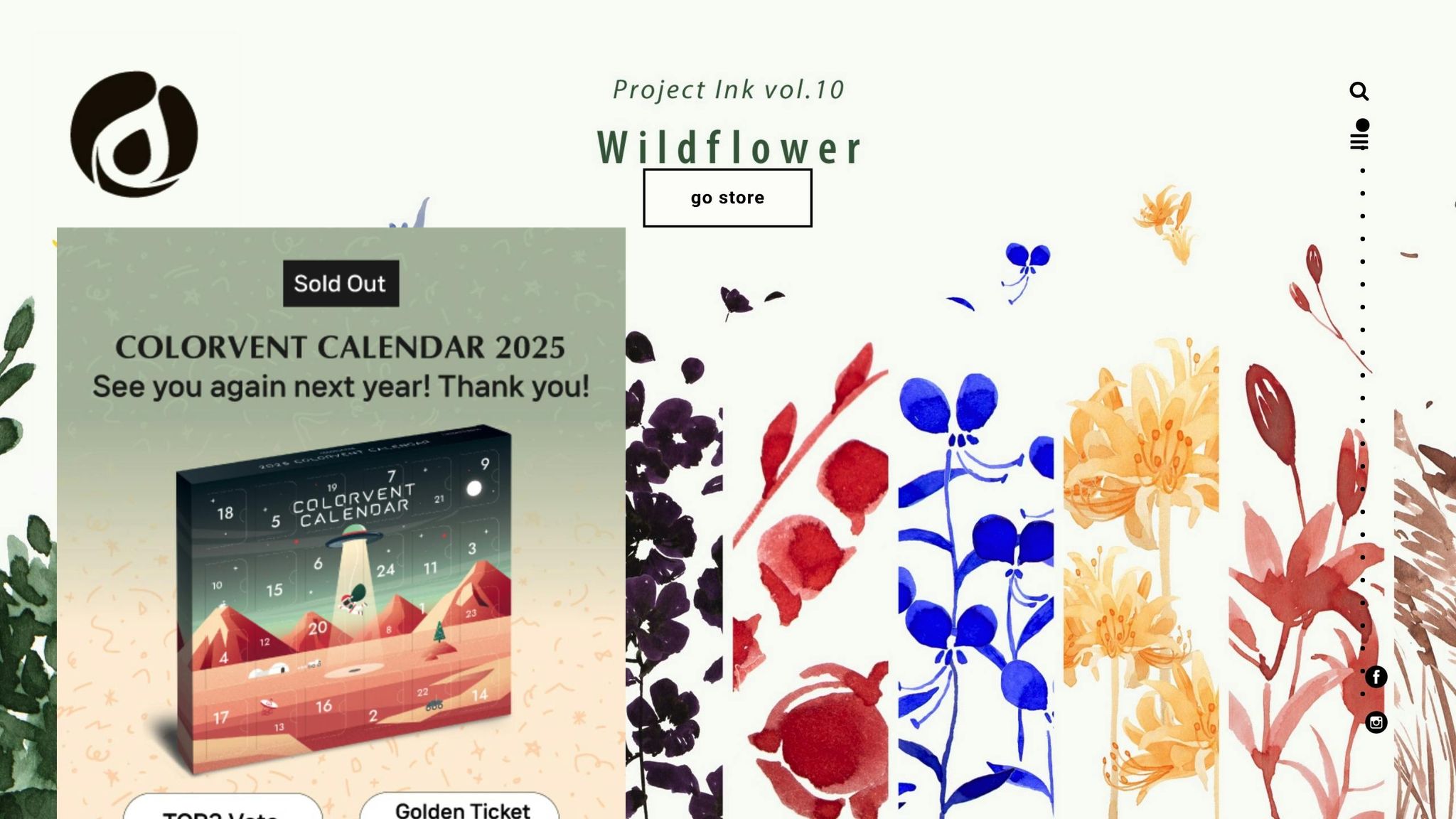
A preview of the Diamine Inkvent 2024 and Fountain pen friendly Christmas Cards!
2. Robert Oster Peppermint
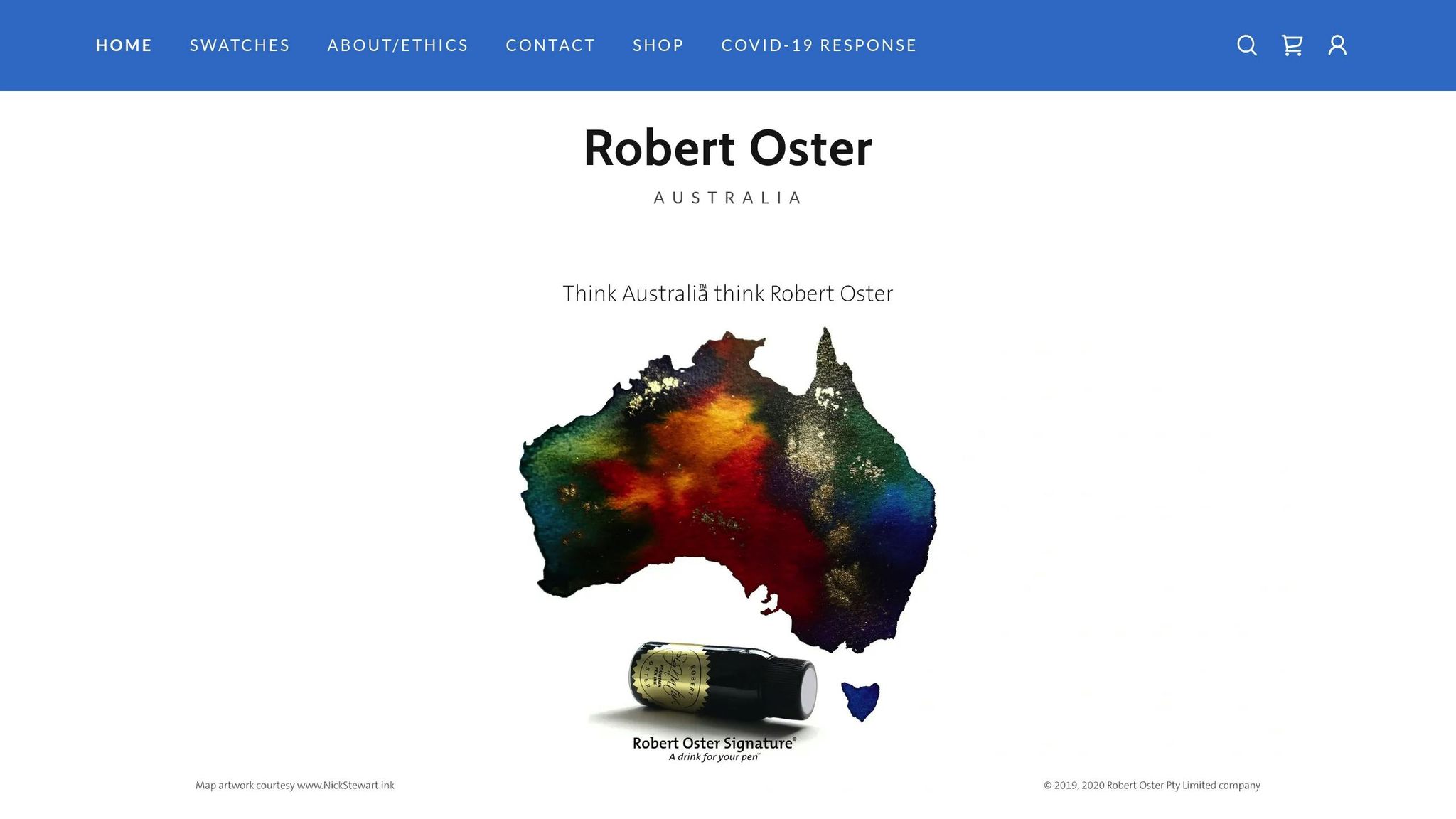
Robert Oster Peppermint brings a crisp, minty tone to your holiday stationery, offering a fresh twist on the classic reds and greens we associate with the season. Made in Australia, this ink evokes the charm of peppermint candy canes and the cozy traditions of winter, making it a standout choice for those who love themed stationery. Let’s dive into its color, performance, and versatility.
Festive Color and Visual Appeal
This ink delivers a bold, saturated color that stands out beautifully on both bright white and cream-colored paper. Its vibrancy ensures your holiday messages are not only eye-catching but also easy to read. Whether you're writing festive notes or decorating cards, this minty hue adds a playful, modern vibe to your correspondence.
Unlike the deeper, more traditional holiday tones, Peppermint has a whimsical quality that resonates with younger recipients, creative professionals, or anyone drawn to contemporary holiday designs. Its peppermint-inspired shade feels thoughtful and intentional, making your cards feel a bit more personal.
Shading and Artistic Depth
One of Peppermint’s standout features is its ability to create dynamic shading. Depending on your nib size and writing pressure, the ink naturally shifts between lighter and darker tones, adding depth and texture to your writing. This subtle variation elevates your holiday cards, giving them a polished and artistic touch that feels far more special than standard pen ink.
Performance Across Nib Sizes
Whether you prefer fine, medium, or broad nibs, Robert Oster Peppermint performs consistently across the board.
- Fine and medium nibs are ideal for clean, elegant text, especially when space is limited on holiday cards.
- Broad nibs shine when used for decorative elements, bold signatures, or artistic flourishes.
The ink flows smoothly, even during long writing sessions, so you won’t have to worry about interruptions while tackling your holiday card list.
Perfect Pairing with Holiday Cards
Peppermint ink complements a wide range of holiday card designs. It pairs beautifully with winter themes like snowflakes, frosted landscapes, or peppermint candy patterns. It also works well with minimalist designs where its vibrant color can serve as a standout accent. For cards featuring traditional Christmas motifs - like evergreen branches or winter wildlife - the minty hue adds a fresh, modern twist.
For the best results, use bright white cardstock to make the color pop, or opt for cream or off-white paper for a softer, more sophisticated look. Pairing Peppermint with metallic inks or deeper greens can also elevate your designs, adding layers of visual interest and making your cards truly memorable.
Robert Oster is widely regarded as one of the top fountain pen ink brands, with its products consistently praised by both customers and retailers. At $21.00 to $28.00 for a 50ml bottle, Peppermint sits in the mid-to-premium price range, offering a high-quality option for those looking to make a statement this holiday season.
3. Jacques Herbin Emerald of Chivor
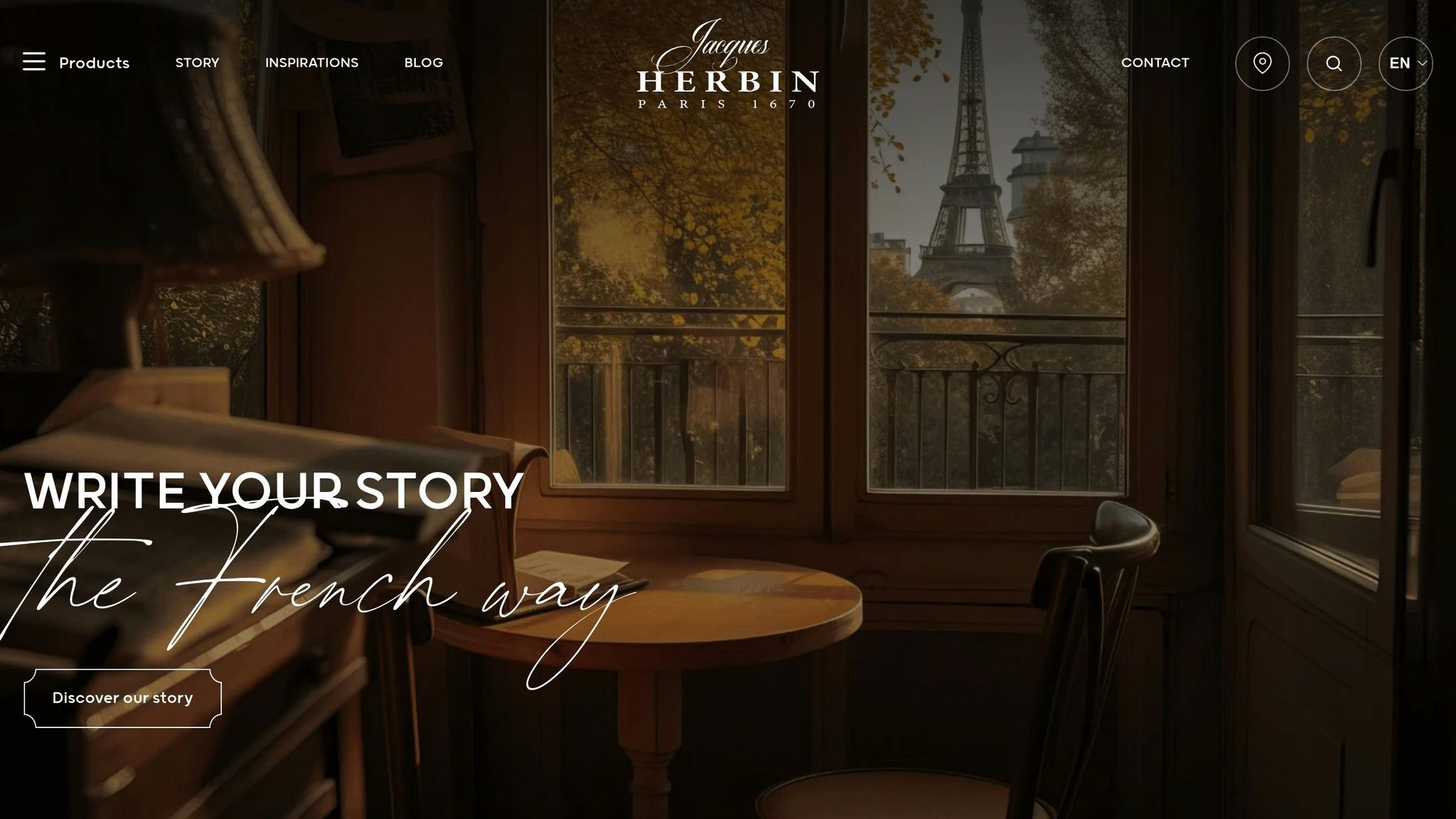
Jacques Herbin Emerald of Chivor stands out with its deep emerald green tone, radiating a sense of festive elegance. Its luxurious color adds a polished touch to holiday cards, making it a great choice for both personal and professional greetings.
The rich green shade pairs beautifully with holiday themes like evergreens, holly, and other winter botanicals. It also complements gold and copper accents, creating a visually harmonious and intentional design.
Shading, Sheen, or Shimmer Properties
This ink isn’t just about color - it’s about performance. Emerald of Chivor offers dynamic shading, with subtle variations that shift from lighter to darker tones, adding depth to your writing. A delicate sheen further enhances its appeal, giving handwritten messages a refined finish. When used on high-quality cardstock or specialty paper, these features become even more pronounced, turning simple notes into artistic expressions.
Compatibility with Different Nib Sizes
Emerald of Chivor works seamlessly with all standard fountain pen nib sizes, offering smooth ink flow from extra-fine to broad nibs. For holiday cards, medium to broad nibs (0.6mm to 1.5mm) are particularly effective, showcasing the ink’s full depth and shading properties for bold, eye-catching handwriting. Even with fine nibs, the ink retains its rich emerald tone, making it versatile enough for addressing envelopes or writing personal notes.
Perfect for Holiday Cards
This ink’s elegant color and performance make it an excellent choice for enhancing holiday card designs. Whether your cards feature modern minimalist patterns or traditional holiday motifs, Emerald of Chivor adds a touch of sophistication. It shines especially on cards with metallic details like foil stamping or embossing, where its vibrant green contrasts beautifully with gold and silver accents. For the best results, pair the ink with cream or off-white cardstock, which highlights its shading and sheen, ensuring your holiday greetings leave a lasting impression.
4. Sailor Shikiori Yozakura
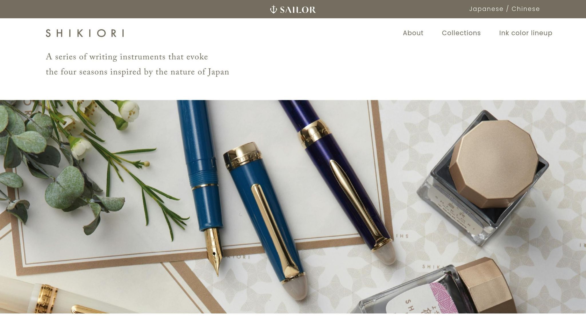
Sailor Shikiori Yozakura is a soft pink ink inspired by the beauty of "night cherry blossoms." It’s a refreshing twist on the usual holiday palette of reds and greens, bringing a delicate and understated charm to seasonal designs.
This gentle pink works beautifully in a variety of creative projects. Whether used as a subtle accent or the main focus, it adds an elegant touch to holiday cards and decorations. Its light tone provides a lovely contrast to the bold reds and greens often associated with festive themes.
Sailor Shikiori Yozakura brings a fresh and enchanting option for celebrating the season.
sbb-itb-1dd4fe9
5. Colorverse Golden Record
Colorverse Golden Record brings a luxurious golden hue to your holiday cards, blending festive charm with excellent readability. Whether you're sending formal greetings or personal notes, this rich tone adds a touch of warmth and personality without sacrificing professionalism. Let’s dive into what makes this ink a standout choice for the season.
Festive Color Vibrancy and Appeal
The golden shade of this ink perfectly captures the holiday spirit, radiating warmth and joy. It pairs effortlessly with classic holiday themes like snowy landscapes, sparkling ornaments, and elegant typography. Its refined tone is especially striking on minimalist card designs, where the ink’s natural glow can take center stage.
This golden hue also works beautifully with gold foil accents or metallic embellishments, creating a polished and cohesive look. Whether you're crafting corporate holiday messages or heartfelt personal notes, the celebratory feel of this ink ensures your cards stand out far beyond the usual black or blue.
Shading, Sheen, or Shimmer Properties
Colorverse Golden Record offers remarkable shading that brings depth and texture to your writing. Its subtle sheen catches the light, giving your words a soft metallic glow that enhances the festive vibe of your cards.
These optical effects are particularly noticeable on high-quality cardstock. The interplay between shaded areas and luminous highlights creates a captivating visual effect, elevating your holiday messages from simple to stunning.
Compatibility with Different Nib Sizes
This ink performs beautifully across a range of nib sizes, making it versatile for various writing styles. Medium to broad nibs (0.6mm to 1.5mm) showcase its shading and sheen most dramatically, creating bold, eye-catching results perfect for holiday cards.
Even with fine and extra-fine nibs (0.4mm to 0.6mm), the ink retains its golden warmth and offers crisp line definition. While the shading effects may be subtler with smaller nibs, the overall look remains elegant. Testing the ink on sample paper before committing to a full card design can help you achieve the perfect effect for your project.
Suitability for Holiday-Themed Card Designs
This ink truly shines on high-quality, smooth cardstock, where its shading and sheen can fully develop. Bright white or cream-colored paper provides the best backdrop for its golden warmth, while premium papers with satin or slightly glossy finishes enhance its luminous qualities. Just remember to allow extra drying time on coated or glossy surfaces.
Writing speed and pen angle also influence the final look. Slower strokes allow more ink to saturate the paper, deepening the color and enhancing its vibrancy. Flowing cursive scripts or italic nibs can further highlight the ink's depth and sheen, adding a dynamic element to your cards.
Colorverse Golden Record is also a great choice for keepsake holiday cards. Its rich golden tone is resistant to fading when stored away from direct sunlight, ensuring your heartfelt messages remain vivid and beautiful for years to come.
6. Fountain Pen Revolution Green Leaf
Fountain Pen Revolution Green Leaf brings a lively green hue to your holiday cards. Like other seasonal inks in the lineup, it enhances the festive spirit with its distinctive tone. Balancing quality with affordability, this ink is an excellent choice for writers looking to add a touch of nature-inspired elegance to their seasonal correspondence.
A Festive Green with Seasonal Charm
This green shade calls to mind images of pine branches, holly leaves, and winter wreaths - perfect for holiday greetings. It pairs beautifully with metallic accents and complements traditional holiday palettes, especially when combined with red. Whether you're creating formal business cards, personal holiday notes, or nature-inspired New Year's messages, this ink offers a blend of sophistication and versatility.
A Focus on Simplicity and Clarity
Green Leaf provides a consistent and straightforward writing experience, allowing your words to take center stage. Without distracting effects like sheen or shimmer, this ink ensures your handwriting remains clear and polished.
Works Well with Any Nib Size
Whether you’re using a fine nib for intricate calligraphy or a broad nib for bold, expressive strokes, Green Leaf delivers reliable and consistent ink flow. This adaptability ensures that your holiday cards maintain a refined and professional appearance, no matter your style.
Ideal for Holiday Card Designs
For the best results, pair Green Leaf with bright white or cream-colored paper to make its vibrant tone pop. Its steady performance ensures your cards look polished and cohesive, no matter how many you write.
Fountain Pen Revolution Green Leaf is a dependable and versatile option for adding a festive yet understated touch to your holiday cards.
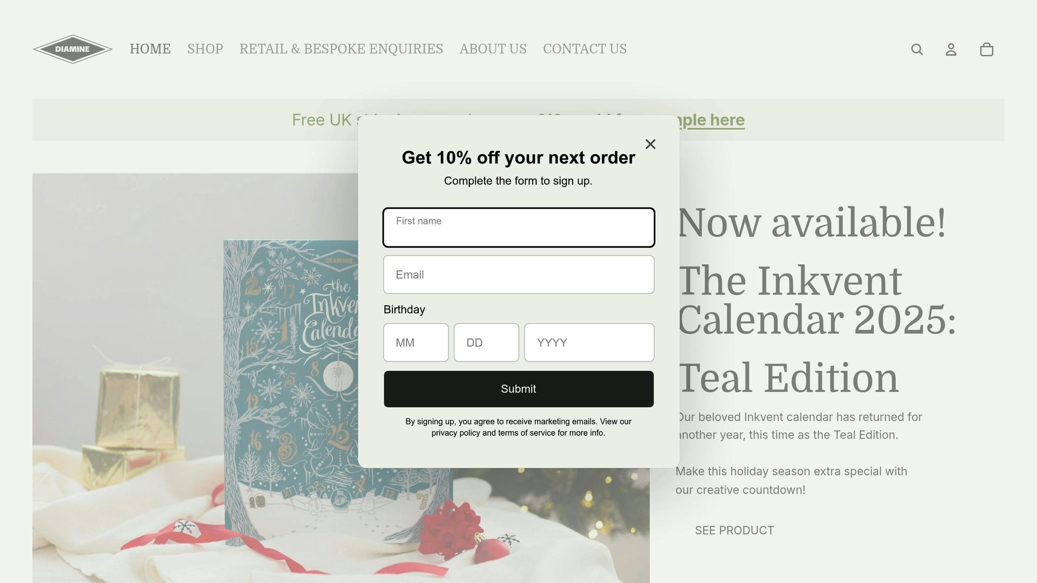
7. Diamine Inkvent Calendar 2025
The Diamine Inkvent Calendar 2025 is here to brighten your holiday season with 25 unique ink colors, all for $120.00. This year’s limited-edition Teal Edition replaces last year’s Black Edition, offering a daily surprise of both classic and seasonal hues. It’s the perfect way for fountain pen enthusiasts to enjoy a touch of holiday magic every day. Instead of committing to full bottles, you can sample a curated selection of inks - a thoughtful approach that pairs well with other festive ink choices.
Festive Color Variety
This collection includes an array of warm reds, rich greens, deep burgundies, and metallics, all showcasing the vibrant saturation that Diamine inks are known for. The daily unveiling of each color adds an element of fun and creativity to your holiday card writing, letting you match specific inks to your card designs.
Whether you’re going for sophisticated, deeper tones for formal cards or bright, cheerful shades for personal notes, this set ensures that every piece of correspondence feels distinct and special.
Shading, Sheen, and Shimmer
Some of the inks in this calendar come with extra flair - shimmer, sheen, or subtle gradients that elevate your handwritten messages. These effects are perfect for adding decorative touches to envelopes or cards, catching the light beautifully to make your writing stand out.
Works Across All Nib Sizes
Diamine’s ink formulas are designed to perform reliably across a range of nib sizes. Whether you’re using a fine nib for detailed calligraphy or a broader nib for bold lettering, these inks deliver clear, polished results. Fine nibs emphasize delicate shading, while broader nibs bring out the full vibrancy of each color.
Perfect for Holiday Card Designs
The Inkvent Calendar is tailor-made for holiday card writing. Its colors pair beautifully with traditional festive themes and look stunning on both bright white and cream-colored cardstock. The inks maintain excellent saturation and readability, even on thicker card-weight papers.
The daily format encourages creative designs - coordinating deeper tones for elegant cards and brighter shades for playful greetings. This curated selection eliminates the hassle of choosing individual inks, ensuring you always have the right color for every occasion.
Considering that individual 50ml Diamine ink bottles typically cost $20.00–$24.00 and 30ml bottles are priced at $9.00, the Inkvent Calendar offers a cost-effective way to explore an entire palette of colors for the holiday season.
Ink Comparison Table
Here's a quick overview of some standout festive inks to help you pick the perfect match for your holiday projects:
| Ink Name | Color Intensity | Special Effects |
|---|---|---|
| Robert Oster Peppermint | Vibrant fresh green | Subtle shading |
| Jacques Herbin Emerald of Chivor | Rich teal-blue-green | Gold shimmer |
| Sailor Shikiori Yozakura | Soft pink with depth | Moderate sheen |
| Colorverse Golden Record | Rich golden yellow | Exceptional shading |
| Fountain Pen Revolution Green Leaf | Traditional Christmas green | None (traditional ink) |
| Diamine Inkvent Calendar 2025 | Varies (25 colors) | Varied effects: shimmer, sheen, and solid |
When choosing an ink, think about the tone you want to set. Bold, vibrant hues like Robert Oster Peppermint or Jacques Herbin Emerald of Chivor are perfect for classic, festive cards. On the other hand, softer shades like Sailor Shikiori Yozakura bring a touch of elegance to more understated designs. If you’re aiming to add a bit of sparkle, shimmer inks like Jacques Herbin Emerald of Chivor or the varied effects from the Diamine Inkvent Calendar 2025 can make your holiday messages stand out.
Speaking of the Diamine Inkvent Calendar 2025, it’s a great option for those who love variety. Priced at $120.00, it includes 25 unique colors with different effects, offering a chance to experiment without committing to full-sized bottles. Considering that individual 50ml Diamine bottles usually cost $20.00 to $24.00 each, the calendar provides a budget-friendly way to explore an entire festive ink collection.
Use the table above as a quick guide, and feel free to revisit detailed sections for a closer look at each ink’s personality.
Conclusion
Picking the perfect fountain pen ink for your holiday cards can transform a simple greeting into something truly special. Whether it’s a festive red or a shimmering green, the ink you choose reflects thoughtfulness and care, turning an ordinary card into a keepsake that recipients will treasure.
The color and finish of your ink can evoke different moods and emotions. Classic holiday hues like rich greens and warm reds instantly capture the festive spirit, while specialty finishes - like shimmer or subtle shading - add a touch of magic. Imagine a card written in gold-flecked ink or one with delicate color variations. It’s not just a message; it’s a little piece of art that stands out among the usual stack of printed cards.
Trying out festive inks doesn’t have to break the bank, either. For example, the Diamine Inkvent Calendar 2025, priced at $120.00, offers 25 unique colors to explore throughout December. This gives you the chance to match inks to your recipients’ personalities. Bright, playful shades might suit close friends, while elegant metallics could be reserved for more formal greetings. This kind of customization adds an extra layer of meaning to each card.
Of course, practicality matters too. High-quality inks from trusted brands ensure smooth writing, reliable drying, and long-lasting color. Always test your ink on the card stock you’re using to make sure it looks just right. Pair the ink with the appropriate nib size to achieve the best effect, whether you’re aiming for bold strokes or fine details.
The right ink can elevate your holiday cards into something memorable and heartfelt. Whether you stick with a single festive color or experiment with a variety of inks, your thoughtful choice will make your cards stand out, turning them into cherished gestures of the season.
FAQs
Why should I use shimmering or sheening inks for holiday cards?
Shimmering and sheening inks bring an elegant, festive flair to your holiday cards, ensuring they grab attention and leave a lasting impression. These inks play with light in stunning ways, creating a dynamic sparkle that elevates your card's design. Whether you're penning a heartfelt message or adding decorative accents, they can make your cards feel truly unforgettable.
For a holiday vibe, try metallic tones or rich, glimmering shades like sparkling reds and greens to perfectly capture the season's spirit!
What are the best fountain pen ink colors for creating festive holiday cards?
Choosing the right fountain pen ink for your holiday cards can add that extra layer of charm and personality. For a classic holiday vibe, you can’t go wrong with deep reds or lively greens. Want to take it up a notch? Try incorporating metallic inks like gold or silver for a touch of shimmer that makes your cards truly stand out.
As you pick your ink, think about how it pairs with your card's design and the type of paper you're using. Smooth paper tends to make colors appear more vivid, while textured paper can give a softer, more nuanced look. To get it just right, test a few swatches beforehand and see how the colors interact with your chosen materials - it’s a simple step that ensures your cards look as stunning as you imagined.
How can I get the best results when using festive fountain pen inks with different nib sizes?
To get the most out of your festive fountain pen inks, try these simple yet effective tips:
- Choose the right nib size: Broader nibs bring out the sparkle and richness of metallic or saturated inks, while finer nibs are perfect for classic holiday hues like red and green.
- Invest in quality paper: Use fountain pen-friendly paper to avoid issues like feathering or bleeding. This ensures your holiday cards have a clean, polished appearance.
- Gently shake shimmer inks: For metallic or shimmer inks, give the bottle a soft shake before filling your pen. This helps evenly distribute the shimmering particles for a consistent effect.
These small tweaks can elevate the look and feel of your holiday cards, making them truly stand out!