
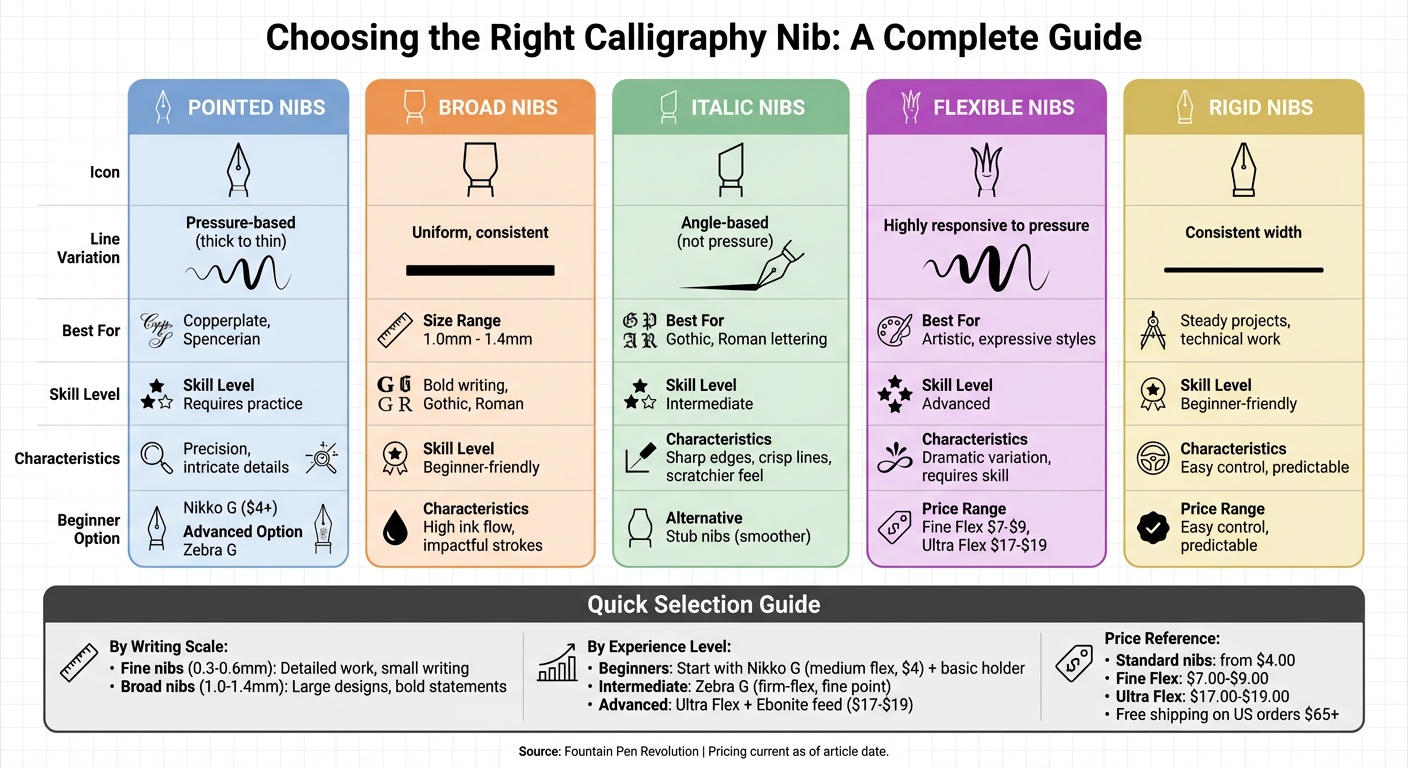
Choosing the right nib shape is essential for achieving your desired calligraphy style and ensuring a smooth writing experience. Here's what you need to know:
- Pointed Nibs: Best for scripts like Copperplate and Spencerian, these nibs create line variations based on pressure. They require practice but offer great precision.
- Broad and Italic Nibs: Designed for bold, consistent strokes. Great for Gothic or Roman styles, with stub nibs offering a smoother alternative.
- Flexible Nibs: Respond to pressure for expressive strokes but need skill to handle. Ideal for artistic styles.
- Rigid Nibs: Easier to control, with consistent line widths. Perfect for beginners or steady projects.
- Nib Sizes: Match the nib size to your writing scale. Fine nibs suit detailed work, while broad nibs are better for large, bold designs.
For beginners, start with options like the Nikko G nib for ease of use. Advanced users may prefer the Zebra G for its balance of control and flexibility. Always consider your calligraphy style, ink flow needs, and the scale of your writing when selecting a nib.
For affordable nibs, check out Fountain Pen Revolution, where prices start at $4.00. Orders over $65 in the U.S. qualify for free shipping.
Calligraphy Nib Types Comparison Guide: Shapes, Uses, and Best Styles
3 Differences Between Pointed and Broad Edge Calligraphy Nibs
sbb-itb-1dd4fe9
Different Nib Types and What They Do
Getting familiar with various nib categories can help you choose the right tool for your calligraphy needs. Each type produces unique line styles and reacts differently to how you move your hand.
Pointed Nibs: Precision and Line Variation
Pointed nibs have a sharp tip that allows for line variation based on pressure. When you press down, the tines spread to create thicker strokes, while lighter pressure results in thin lines. This makes them ideal for styles like Copperplate and Spencerian calligraphy, which rely on the striking contrast between thick and thin strokes.
However, these nibs come with a learning curve. As EndlessPens highlights, their flexibility under pressure demands practice to achieve the best results. But once mastered, they’re perfect for intricate illustrations and detailed work where precision is key. By contrast, broad and italic nibs focus more on consistent, bold lines rather than pressure-based variation.
Broad and Italic Nibs: Bold and Consistent Lines
If pointed nibs are about expressive variation, broad and italic nibs are all about delivering steady, impactful strokes.
Broad nibs create wide, uniform lines, typically ranging from 1.0mm to 1.4mm in size for specialized calligraphy. They deposit more ink than fine or medium nibs, making them great for bold, attention-grabbing writing. David Cooper from Conway Stewart describes them as:
perfect for those who are more leisurely in their writing or like to create an impact with bold, broad writing strokes.
Italic nibs, on the other hand, have a rectangular shape with sharp edges. Instead of relying on pressure, they create line variation through writing angles - broad downstrokes and thin cross strokes happen naturally due to their design. These nibs are ideal for formal styles like Gothic and Roman lettering. However:
the sharp edge makes the [italic] nib stiffer and scratchier to write with compared to regular nibs.
For a smoother option, stub nibs offer a compromise. With rounded edges instead of sharp corners, they provide line variation similar to italic nibs but with a more fluid writing experience that doesn’t require advanced techniques. Their broader strokes also highlight ink effects like shading, sheen, and shimmer better than finer nibs.
Flexible vs. Rigid Nibs: How They Respond to Pressure
A nib’s flexibility determines how much control you have over line width. Flexible nibs are highly responsive to pressure, making them perfect for creating expressive, artistic strokes. They’re essential for scripts with dramatic line variation but demand skill to handle and require a feed system that can manage heavy ink flow.
Rigid nibs, which include most broad and italic types, offer more resistance and consistent line widths. They don’t react to pressure, making them easier to control and ideal for beginners or projects that need steady, predictable strokes. Whether you choose flexibility or rigidity depends on whether you value expressive variation or reliable consistency in your calligraphy work.
What to Consider When Selecting a Nib Shape
Choosing the right nib depends on your calligraphy style, the ink you plan to use, and the scale of your writing.
Your Calligraphy Style and Project Goals
The type of calligraphy you practice plays a big role in determining the best nib shape. For pressure-sensitive styles like Copperplate or modern calligraphy, flex nibs are a great choice. They allow the tines to spread under pressure, creating striking line variations. On the other hand, angular styles such as Gothic or formal Italic work better with italic or stub nibs, which naturally produce bold downstrokes and fine cross strokes based on the writing angle.
If you're working on brush-like Asian calligraphy, Fude nibs are ideal. For technical drawings, Architect nibs provide the precision you need. Music nibs, with their dual ink channels and three tines, are perfect for musical notation. Meanwhile, extra-fine or needlepoint nibs are excellent for intricate details or very small handwriting.
Ink Flow and Nib Sharpness
A nib’s performance on paper is just as important as its style. Sharp-edged nibs, commonly found in italic styles, create crisp and precise lines but may feel scratchier and less forgiving. If you’re looking for smoother performance without sacrificing line variation, stub nibs are a great alternative. Their rounded edges make them beginner-friendly and less prone to catching on paper.
Ink flow is another critical factor. Nibs that produce broader strokes or dramatic line variation - like flex, music, or broad italic nibs - require a wet feed to ensure a consistent ink supply and avoid skipping. This generous ink flow also highlights specialty ink features like shading, sheen, or shimmer, making these nibs a favorite for showcasing complex colors.
Lastly, consider the nib size to match the scale of your calligraphy or writing.
Matching Nib Size to Your Writing Scale
The size of the nib should correspond to the scale of your work. Fine nibs, which generally produce lines between 0.3 mm and 0.6 mm, are perfect for detailed, everyday writing. Broad nibs, ranging from 1.0 mm to 1.4 mm, create bold strokes that stand out in larger designs. For highly detailed work, extra-fine nibs are best, while broader nibs excel in creating dramatic, sweeping lines for larger projects.
Keep in mind that Western nibs tend to produce thicker lines than Japanese nibs, so you may need to adjust by one size when switching between the two. If you’re left-handed, consider reverse oblique nibs, which are designed for a push motion. Right-handed writers, on the other hand, typically benefit from standard oblique nibs, which are cut at a 15-degree angle.
Common Nib Options for Beginners and Advanced Users
When it comes to nibs, choosing the right one can make all the difference. Here are two popular options that cater to different skill levels in calligraphy.
Nikko G: A Beginner-Friendly Choice
The Nikko G is a great starting point for those new to calligraphy. It has a medium level of flexibility and a moderately sharp point, which helps beginners create smooth, consistent lines. The ink flow is reliable, and its sturdy build can handle uneven pressure. This means you can focus on improving your technique without worrying about damaging the nib.
Zebra G: Versatility for Intermediate Calligraphers
For those with a bit more experience, the Zebra G offers a balance of control and flexibility. Its firm-flex design allows for precise strokes and varied line thickness, making it ideal for detailed work. The fine point is perfect for intricate designs, and you can choose between chrome or titanium finishes depending on your durability needs and budget.
Where to Find Quality Nibs and Calligraphy Supplies
Once you've pinpointed the nib that suits your style, it's time to round out your calligraphy toolkit with high-quality supplies.
Fountain Pen Revolution: Affordable and Versatile Options
If you're looking for quality nibs that won't break the bank, Fountain Pen Revolution is a fantastic place to start. They offer a wide variety of calligraphy-ready nibs and accessories at budget-friendly prices. For instance:
- Standard nibs start at just $4.00.
- Fine Flex nibs are priced at $7.00 for #5.5 size and $9.00 for #6 size.
- For advanced line variation, Ultra Flex nibs range from $17.00 to $19.00, depending on the size.
They also provide a variety of nib shapes, including Extra Fine, Fine, Medium, Broad, and 1mm Stub, along with flexible options. To ensure smooth ink flow, you can pair these nibs with Ebonite flex feeds, available in 4.7mm, 5.1mm, and 6.3mm diameters. For added convenience, nibs are sold individually or as "Nib and Feed" combos, starting at $8.00.
Another perk? Orders within the US that total over $65 qualify for free shipping, making it easier to stock up on everything you need. Plus, their website features a Nib Size Calculator to help you choose the perfect nib based on your writing pressure and project requirements.
With such a wide range of options, you can customize your purchases to suit your specific calligraphy goals.
How to Choose the Right Set for Your Needs
Your skill level and creative goals play a big role in deciding what to buy.
- For beginners: Start with a basic set that includes a Fine or Medium nib, ink, and a simple pen holder. This setup keeps costs under $20 and allows you to focus on mastering the basics. If you're eager to explore line variation early on, consider adding a Fine Flex nib to your kit.
- For advanced calligraphers: It's worth investing in individual nibs tailored to specific projects. Be sure to match the nib size (#5.5 or #6) to your pen model. Pairing an Ultra Flex nib with an Ebonite feed is ideal for more intensive work. Keep in mind that your hand pressure matters - a lighter touch works best with finer nibs, while broader or more flexible nibs handle heavier pressure better. Testing a few different sizes can help you find the perfect fit before making larger purchases.
Conclusion
Choosing the right nib comes down to your style, project goals, and personal preferences. Pointed nibs are perfect for creating precise, varied lines, making them great for scripts like Copperplate. On the other hand, broad and italic nibs deliver bold, consistent strokes, ideal for Blackletter and signage work. Pressure sensitivity also matters - flexible nibs respond to lighter touches, while rigid ones offer steady control.
If you're just starting out, try options like the Nikko G or Zebra G nibs. For more intricate work, the Gillott 303 is a fantastic choice. Also, consider the scale of your writing - smaller nibs are better for detailed tasks like envelope addressing, while larger nibs excel in larger formats like posters. Keep a record of your experiments to fine-tune your preferences.
For affordable, high-quality nibs, check out Fountain Pen Revolution, where prices start at just $4.00. Plus, U.S. orders over $65 qualify for free shipping. Testing different nibs can help you discover which ones truly elevate your calligraphy.
FAQs
Which nib shape matches my calligraphy style?
The nib shape you choose should align with your writing style and goals. If you're aiming for fine, intricate scripts like Copperplate, an Extra Fine nib is ideal. For bold, dramatic styles such as Gothic, a Broad nib works best. Formal scripts often look their best with a Stub or Italic nib, while a Flex nib is perfect for creating dynamic, expressive strokes. Experimenting with different nibs is a great way to discover the one that suits you best.
How do I stop a flex nib from skipping or railroading?
To avoid issues like skipping or railroading when using a flex nib, focus on applying gentle and steady pressure. Pressing too hard can cause the tines to stick together, disrupting the ink flow. Pair your pen with high-quality paper to reduce friction and create a smoother writing experience. Additionally, make it a habit to clean the nib regularly and check its alignment. This helps maintain consistent ink flow and prevents common problems.
What nib size should I use for my letter height?
The best nib size for you depends on how big your letters are and your personal writing style. If you prefer smaller letters or intricate details, go for a finer nib like Extra Fine (EF) or Fine (F) - these give you thin, precise lines. On the other hand, if you like larger letters or want bold, striking strokes, a Medium (M) or Broad (B) nib will give you thicker, more dramatic lines. Trying out different nibs is a great way to discover the one that feels just right.