
When it comes to fountain pens, the right ink can transform your writing experience. Smooth-flowing inks reduce friction, enhance shading, and deliver consistent results. This guide highlights eight top-performing inks, each offering unique characteristics like lubrication, shading, and paper compatibility. Whether you prefer wet or dry inks, vibrant colors, or quick-drying options, there's something here for every writer.
Key Inks to Consider:
- Pilot Iroshizuku Yama-Budo: Wet ink with excellent lubrication, vibrant pinkish-fuchsia tones, and strong shading. Works well on all paper types.
- Monteverde California Teal: Lubricated teal ink with balanced flow, shading, and sheen. Suitable for various pens and papers.
- Sailor Shikiori Kin Mokusei: Yellow-orange ink with smooth flow and moderate shading. Performs reliably across most paper types.
- Sailor Manyo Fuji Sugata: Violet ink with dual-shading properties and balanced lubrication. Great for artistic effects and everyday use.
- Diamine Chocolate Brown: Affordable brown ink with rich shading and smooth flow. Compatible with all paper types.
- J. Herbin Emerald of Chivor: Green-blue ink with red sheen and gold shimmer. Best on premium paper for maximum visual appeal.
- Robert Oster Fire and Ice: Vibrant blue ink with shimmer and smooth flow. Performs well across various papers.
- Wearingeul Inks (Path, For Whom the Bell Tolls): Smooth-flowing inks with unique shimmer and sheen effects. Designed for consistent performance.
Quick Comparison:
| Ink | Flow Type | Lubrication | Shading/Sheen | Dry Time | Paper Compatibility | Price Range | Sizes |
|---|---|---|---|---|---|---|---|
| Pilot Iroshizuku Yama-Budo | Wet | Excellent | Strong shading | Moderate (30-60s) | All paper types | $20–$30 | 50ml, 2ml samples |
| Monteverde California Teal | Wet | Enhanced | Sheen & shading | Moderate (30-60s) | All paper types | $12–$18 | 90ml, 30ml, 2ml, cartridges |
| Sailor Shikiori Kin Mokusei | Wet | Excellent | Moderate shading | Moderate (30-60s) | Most paper types | $18–$25 | Standard bottles |
| Sailor Manyo Fuji Sugata | Wet | Excellent | Dual-shading | Moderate (30-60s) | Most paper types | $18–$25 | Standard bottles |
| Diamine Chocolate Brown | Wet | High | Rich shading | Moderate (30-60s) | All paper types | $8–$15 | Various sizes |
| J. Herbin Emerald of Chivor | Dry | Moderate | Red sheen, gold shimmer | Quick (under 30s) | Premium paper recommended | $20–$30 | 30ml, 2ml samples |
| Robert Oster Fire and Ice | Wet | Good | Shimmer | Quick (under 30s) | All paper types | $12–$18 | Standard bottles |
| Wearingeul Inks | Wet | Excellent | Shimmer & sheen | Moderate (30-60s) | All paper types | $12–$18 | Various sizes |
Tips for Choosing the Right Ink:
- Wet vs. Dry Ink: Wet inks like Pilot Iroshizuku are ideal for smooth, saturated writing, while dry inks like J. Herbin reduce smudging.
- Shading and Sheen: For artistic effects, choose inks like Sailor Manyo or J. Herbin Emerald of Chivor.
- Paper Matters: Premium papers enhance shading and sheen, but many inks perform well on standard paper too.
- Test First: Try 2ml samples to see how an ink performs with your pen and paper.
The right ink can elevate your writing, whether you're journaling, note-taking, or working on creative projects. Experimenting with different formulations and colors is part of the joy of using fountain pens.
Top 10 Fountain Pen Inks of 2️⃣0️⃣2️⃣4️⃣ 🎉
1. Pilot Iroshizuku Yama-Budo
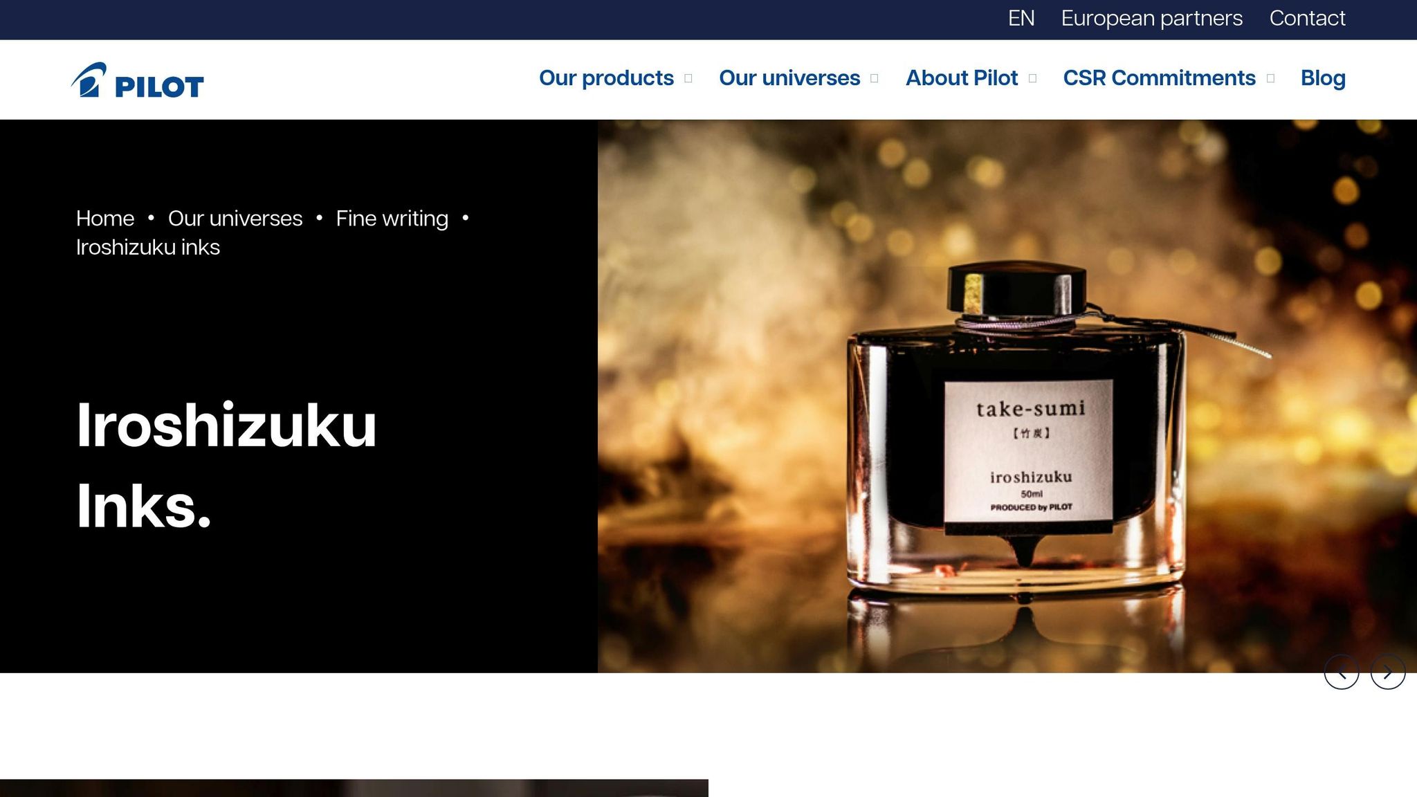
Pilot Iroshizuku Yama-Budo is a wet ink that delivers outstanding performance across a variety of fountain pens. Its name, "Yama-Budo", translates to "mountain grape" in Japanese, and the ink’s pinkish-fuchsia tone reflects that inspiration with a color that’s both striking and elegant.
One of Yama-Budo's most appealing qualities is how it wins over even those who typically shy away from pink inks. It strikes a perfect balance - vivid enough to grab attention but subtle enough for everyday use. This makes it a versatile choice for adding a touch of personality to your writing without stepping outside the bounds of professionalism.
Smooth Flow with Excellent Lubrication
Yama-Budo’s lubrication properties are a highlight, ensuring the ink flows smoothly and effortlessly across the page. Even fine nibs, which can sometimes feel scratchy with drier inks, glide easily with Yama-Budo. Medium and broad nibs, on the other hand, showcase its vibrant color and consistent saturation beautifully, delivering an even and enjoyable writing experience.
The wet flow of this ink makes it a reliable option, even for pens that tend to struggle with drier formulations. Beyond its smooth operation, the ink’s visual appeal adds an extra layer of enjoyment to the writing process.
Shading and Sheen: Adding Depth to Your Writing
Yama-Budo doesn’t just flow well - it also creates a visually dynamic writing experience. The ink offers natural shading, with darker tones appearing in areas where ink pools and lighter tones where the nib moves quickly. This variation gives your handwriting an artistic depth, making even simple notes more engaging to look at.
What sets Yama-Budo apart from many other wet inks is its ability to maintain both flow and character. While some wet inks prioritize smoothness at the cost of visual interest, Yama-Budo achieves both. Its saturated color pops on the page, while the shading effects add a touch of sophistication that fountain pen enthusiasts will appreciate.
Reliable on a Variety of Papers
Yama-Budo’s performance is consistent across different types of paper. Like other Pilot Iroshizuku inks, it behaves exceptionally well on everything from premium fountain pen paper to standard notebook stock. Feathering and bleed-through are minimal, making it a practical choice for everyday writing without needing specialty paper.
The ink also features a balanced dry time. It dries quickly enough to reduce smudging, which is particularly helpful for left-handed writers, but not so fast that it compromises the smooth, wet writing experience that defines the Iroshizuku line.
Bottle Sizes and Pricing
Yama-Budo is available in 50ml bottles and 2ml samples. The 50ml bottle provides plenty of ink for regular use, while the smaller sample size is perfect for those who want to try it out before committing.
As a premium ink in the Pilot Iroshizuku line, Yama-Budo comes with a higher price tag compared to budget options. However, its top-tier quality, reliable performance, and reputation as one of the finest fountain pen inks make it a worthwhile investment for those who value a smooth and enjoyable writing experience.
2. Monteverde California Teal

Monteverde California Teal is a lubricated fountain pen ink that delivers smooth, effortless writing. Its elegant teal shade might seem understated at first, but as you write, it reveals a rich depth of color. This balance of professionalism and artistic flair makes it a versatile choice for both business correspondence and personal journaling.
Here’s a closer look at what makes this ink stand out.
Smooth Flow, Thanks to Lubrication
One of the key features of Monteverde California Teal is its lubrication. Unlike drier inks that can feel restrictive, this ink ensures a steady, effortless flow through your pen, requiring minimal pressure while writing.
The ink’s formulation strikes the perfect middle ground - it flows smoothly without being overly wet. This makes it practical for a wide range of pens and writing styles. Whether you're jotting down quick notes or writing a lengthy journal entry, California Teal performs consistently. It's especially effective with fine nibs, which can sometimes feel scratchy with less lubricated inks, and it works seamlessly with flex pens, too.
Shading and Sheen for Visual Appeal
Monteverde California Teal offers more than just a solid teal color. It features impressive shading and subtle sheen, giving your writing a visually dynamic quality. As you write, you’ll notice color variations - darker tones where the ink pools and lighter tones where the nib moves faster. This natural shading adds depth and texture to your writing without requiring any special techniques.
Under certain conditions, the ink’s sheen becomes more apparent, adding an extra layer of interest. These properties make California Teal a great option for those who enjoy inks that bring a bit of personality to the page. Whether you're journaling, taking notes, or sending letters, this ink ensures your writing is both functional and eye-catching.
Reliable Performance on Different Papers
California Teal is designed to perform well on a variety of paper types. From premium fountain pen papers like Tomoe River and Clairefontaine to standard notebook stock, the ink maintains its consistent flow across the board.
This versatility means you won’t have to worry about switching papers or pens. It’s a dependable choice for everyday use, whether you’re writing on high-quality paper or something more basic like copy paper. Additionally, the ink is generally safe for most fountain pens and doesn’t cause staining, even in pens with delicate materials. This makes it a trustworthy option for writers with multiple pens in their collection.
Bottle Sizes and Pricing Options
Monteverde California Teal is available in several sizes to suit different needs: 90ml bottles, 30ml bottles, 2ml samples, and a 12-pack of cartridges.
For those trying the ink for the first time, the 2ml sample is a great way to experience its smooth flow and vibrant color without committing to a larger size. Regular users will find the larger bottles offer better value, while the cartridges are ideal for travel or quick refills on the go. With these options, California Teal caters to both beginners and seasoned fountain pen enthusiasts.
3. Sailor Shikiori Kin Mokusei
Sailor Shikiori Kin Mokusei stands out with its vibrant yellow-orange hue and balanced ink flow, making it a fantastic option for both daily writing and creative projects. It offers a refreshing alternative to traditional blue or black inks, combining eye-catching color with dependable performance.
Smooth Writing Experience
Kin Mokusei strikes a perfect balance in lubrication. While slightly less wet than inks like Pilot Iroshizuku, it still glides easily across the page. This makes it suitable for extended writing sessions without feeling overly dry or sluggish. Its formula ensures a steady flow in a variety of fountain pens, enhancing both comfort and consistency. Plus, this balanced flow helps bring out the ink's natural color variations.
Shading and Color Dynamics
One of the highlights of the Sailor Shikiori line is its ability to produce beautiful shading effects, and Kin Mokusei is no exception. Its yellow-orange tone reveals subtle shifts in color as you write - darker areas appear where the ink pools, while quicker strokes leave behind lighter hues. This dynamic interplay creates a visually engaging writing experience, perfect for journaling or adding a personal touch to letters.
Versatile Performance on Paper
Thanks to its well-crafted formula, Kin Mokusei performs reliably on a wide range of paper types. Whether you're using premium fountain pen paper, a standard notebook, or even basic copy paper, the ink resists common issues like feathering and bleed-through. This versatility ensures smooth writing and vibrant color, no matter where your ideas take you.
4. Sailor Manyo Fuji Sugata
Sailor Manyo Fuji Sugata offers a vibrant violet hue with a smooth and consistent flow, making it a standout in the Manyo ink collection. What sets it apart is its dual-shading quality, which adds depth and character to your writing. The name "Fuji" is inspired by wisteria flowers, a nod to the soft, elegant purple tones this ink brings to the page. Its refined formulation ensures a seamless writing experience, perfect for both everyday use and creative projects.
Smooth Writing with Balanced Lubrication
Thanks to Sailor's advanced lubrication formula, Fuji Sugata delivers an impressively smooth writing experience. While the Manyo inks are slightly drier compared to Pilot Iroshizuku, they still maintain enough wetness to flow effortlessly in a variety of pens. This balance makes the ink versatile, adapting well to both fine and broad nibs. Whether you're jotting down notes or indulging in long writing sessions, Fuji Sugata ensures a consistent, enjoyable glide across the page.
Dual-Shading for Added Dimension
One of Fuji Sugata's standout features is its dual-shading capability. The ink showcases darker tones where it pools and lighter shades in quicker strokes, creating a layered, dynamic effect. This interplay of tones not only enhances the visual appeal of your writing but also keeps it clear and legible. Whether you're journaling, penning a letter, or working on a creative piece, this ink brings a touch of artistic flair to your words.
Reliable Performance Across Paper Types
Fuji Sugata performs consistently on a variety of paper types, from standard office sheets to premium fountain pen paper. Its balanced viscosity helps minimize common issues like feathering and bleed-through, ensuring clean, sharp lines. For the best results, especially to highlight its dual-shading properties, consider using fountain pen-friendly papers like Rhodia or Clairefontaine. However, even on more affordable paper, this ink remains dependable and visually striking.
Pricing and Availability
Sailor Manyo inks fall within the mid-to-premium price range, with standard bottles (20–50 ml) typically priced between $8 and $15 USD. For those who prefer to sample before committing, many specialty shops offer 2 ml sample sizes. This flexibility makes Fuji Sugata an appealing choice for both newcomers exploring colored inks and seasoned collectors looking to expand their palette. Stay tuned for the next ink recommendation to elevate your writing experience.
5. Diamine Chocolate Brown
Diamine Chocolate Brown is a standout option for those seeking a smooth, reliable ink with a rich, warm tone - all without breaking the bank.
This ink delivers a luscious chocolate hue with a silky flow that glides effortlessly across the page. Its deep, inviting color offers a sophisticated twist on traditional black ink, making it perfect for both professional settings and personal correspondence. Whether you're jotting down notes or crafting a heartfelt letter, this ink's readability and charm make it a versatile choice.
Smooth Writing Experience
Diamine Chocolate Brown is known for its wet formulation, which ensures a consistently smooth flow from nib to paper. This free-flowing quality enhances the writing experience, whether you're using a fine nib for precise lines or a broad nib for bolder strokes. Its dependable performance makes it a favorite among both beginners and seasoned fountain pen enthusiasts.
Rich Shading, Minimal Sheen
One of the ink's most appealing features is its shading. It naturally transitions between lighter and darker tones, adding depth and character to your writing without sacrificing clarity. While it doesn't produce a noticeable sheen, the saturated color ensures even the lighter areas hold their own on the page. For best results, pair it with fountain pen–friendly paper to let its shading truly shine.
Works Across Paper Types
Another reason to love Diamine Chocolate Brown is its adaptability. It performs well on a variety of paper types, from everyday copy paper to premium fountain pen paper. While it dries a bit slower on smoother surfaces, allowing a moment for drying can help avoid smudges. Its versatility makes it a reliable choice for daily use.
Affordable and Accessible
Diamine is celebrated for offering high-quality inks at budget-friendly prices, and Chocolate Brown is no exception. It provides exceptional performance without the hefty price tag of luxury brands, making it an ideal pick for those exploring brown tones or building their ink collection. Plus, with Diamine's extensive range of colors, you can enjoy a variety of options while maintaining consistent quality across the board.
In short, Diamine Chocolate Brown combines affordability, performance, and elegance, proving that great ink doesn't have to come with a premium price. Whether you're a beginner or an experienced writer, this ink offers a little something for everyone.
sbb-itb-1dd4fe9
6. J. Herbin Emerald of Chivor

J. Herbin Emerald of Chivor stands out with its stunning green-blue base, enhanced by a striking red sheen and a touch of gold shimmer. This unique combination of colors makes it a favorite for both everyday notes and creative journaling. Beyond its beauty, the ink’s flow is carefully designed to provide a smooth and enjoyable writing experience.
Smooth Flow with Quick-Drying Formula
The ink’s slightly drier formulation ensures it doesn’t oversaturate the page and dries quickly, making it a great choice for left-handed writers or anyone who needs to jot down notes in a hurry.
Shading, Sheen, and Shimmer
The red sheen beautifully contrasts the cool green-blue base, while the gold shimmer adds just the right amount of sparkle. Its natural shading creates seamless transitions between lighter and darker tones, giving your writing a polished and dynamic look.
Performance Across Different Papers
Emerald of Chivor shines brightest on premium papers like Tomoe River and Clairefontaine, where its sheen and shimmer are most pronounced. On lower-quality paper, you might notice some feathering or bleedthrough, but the ink’s drier consistency helps reduce spreading.
Pricing and Availability
This ink falls into the mid-range price category, offering an attractive mix of visual appeal and dependable performance. While it’s more expensive than standard inks, its unique features make it worth the investment. It’s available in standard bottle sizes, so check with trusted retailers for the latest U.S. pricing.
7. Robert Oster Fire and Ice
If you're looking for an ink that combines smooth writing with a touch of visual drama, Robert Oster Fire and Ice is a standout choice. Its vibrant blue hue is anything but ordinary, making it perfect for everything from casual note-taking to more intricate writing projects. Known for crafting high-quality yet affordable inks, Robert Oster has created a gem with Fire and Ice, offering bold color and excellent saturation that truly makes your words leap off the page.
Let’s take a closer look at what makes this ink so special.
Smooth Flow for Effortless Writing
Fire and Ice is formulated to provide a consistent and smooth flow, no matter what pen or nib size you prefer. Whether you're using a fine nib for precision or a broad nib for flair, this ink glides effortlessly across the paper. Its balanced lubrication ensures you won't have to worry about clogging or skipping, making it a reliable option for daily use or long writing sessions.
Shading and Shimmer That Catch the Eye
One of the most striking features of Fire and Ice is its ability to combine bold color with a subtle shimmer. Part of Robert Oster’s Shake 'n' Shimmy line, this ink includes shimmering particles that reflect light beautifully, adding a bit of sparkle to your writing. The vibrant blue base is already stunning, but the shimmer takes it to another level, making it a great choice for adding personality to everyday notes or for special occasions where you want your writing to stand out.
Works Wonderfully on Different Papers
Fire and Ice performs well across a variety of paper types, but its true potential shines on premium papers like Tomoe River or Clairefontaine. These smoother surfaces allow the shimmer and vibrant color to come through vividly, giving your writing a polished look. On standard copy paper, the ink still holds up well, though the shimmer may be less pronounced. Its moderate dry time makes it versatile for most users, but left-handed writers may want to test it with their preferred pen and paper combination to ensure smudge-free results. Broad nibs are particularly effective at showcasing the shimmer, while finer nibs emphasize the rich blue color and quicker drying.
Affordable and Available in Multiple Sizes
Robert Oster inks are known for their budget-friendly pricing, and Fire and Ice is no exception. It comes in a standard 50ml bottle, with 2ml sample sizes also available for those who want to try it out before committing. This affordability makes it easy to expand your ink collection without breaking the bank, all while enjoying the vibrant color, smooth performance, and shimmering effects that make Fire and Ice such a popular choice.
8. Wearingeul Inks
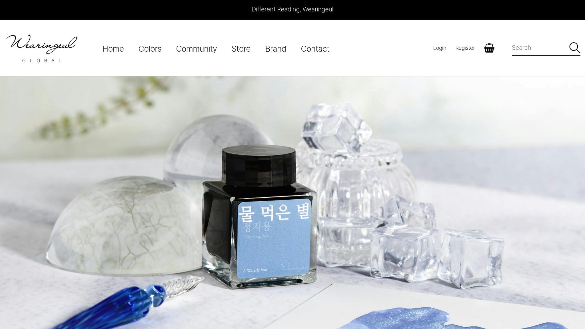
Wearingeul has quickly made a name for itself in the world of fountain pen inks, thanks to its smooth flow and vibrant, eye-catching colors. These inks stand out for their well-balanced shimmer and sheen effects, which enhance their base colors without sacrificing performance. The result? Inks that are as reliable as they are visually stunning.
Two popular options from the brand, Path and For Whom the Bell Tolls, showcase Wearingeul's focus on creating inks that not only write smoothly but also have a unique personality. Let’s dive into what makes these inks worth considering.
Smooth Flow and Lubrication
Wearingeul inks are designed to glide effortlessly across the page, regardless of the pen or nib size you’re using. Their formulation ensures consistent ink flow, even after periods of inactivity. This means fewer interruptions like hard starts or uneven ink delivery, making them a dependable choice for both casual and frequent writers.
Shading and Sheen: A Visual Treat
One of the standout features of Wearingeul inks is their ability to blend shimmer and sheen into the base colors seamlessly. These effects add depth and character without overpowering the ink’s natural tone. Whether you’re jotting down notes or working on artistic projects, Wearingeul inks strike the perfect balance between functionality and flair.
Pricing and Bottle Options
Wearingeul inks offer excellent value for their quality. While prices and bottle sizes may vary, they remain competitively priced, making them an appealing choice for fountain pen enthusiasts. As the brand continues to grow in popularity, its inks are becoming an exciting addition to any collection.
Ink Comparison Table
Choose the perfect ink by weighing factors like flow, lubrication, shading, dry time, paper compatibility, price, and size options. This table summarizes key performance details for easy reference.
| Ink | Flow Type | Lubrication | Shading/Sheen | Dry Time | Paper Compatibility | Price Range | Available Sizes |
|---|---|---|---|---|---|---|---|
| Pilot Iroshizuku Yama-Budo | Wet | Excellent | Strong shading | Moderate (30-60 sec) | All paper types | $20-30 USD | 50ml bottles, 2ml samples |
| Monteverde California Teal | Wet | Enhanced | Sheen & shading | Moderate (30-60 sec) | All paper types | $12-18 USD | 90ml bottles, 30ml bottles, 2ml samples, cartridges |
| Sailor Shikiori Kin Mokusei | Wet | Excellent | Moderate shading | Moderate (30-60 sec) | Most paper types | $18-25 USD | Standard bottles |
| Sailor Manyo Fuji Sugata | Wet | Excellent | Dual-shading | Moderate (30-60 sec) | Most paper types | $18-25 USD | Standard bottles |
| Diamine Chocolate Brown | Wet | High | Rich shading | Moderate (30-60 sec) | All paper types | $8-15 USD | Various sizes |
| J. Herbin Emerald of Chivor | Dry | Moderate | Red sheen, gold shimmer | Quick (under 30 sec) | Premium paper recommended | $20-30 USD | 30ml bottles, 2ml samples |
| Robert Oster Fire and Ice | Wet | Good | Shimmer | Quick (under 30 sec) | All paper types | $12-18 USD | Standard bottles |
| Wearingeul (Path, For Whom the Bell Tolls) | Wet | Excellent | Shimmer & sheen | Moderate (30-60 sec) | All paper types | $12-18 USD | Various sizes |
Understanding the Categories
Here’s a closer look at the factors that can guide your ink selection:
Flow Type: This determines how ink moves from the nib to the paper. Wet inks, like Pilot Iroshizuku and Monteverde California Teal, flow generously, creating smooth, saturated lines with excellent shading. On the other hand, dry inks, such as J. Herbin Emerald of Chivor, offer controlled flow, reducing bleed-through and drying faster - ideal for quick note-taking.
Lubrication: This affects how smoothly the pen glides on paper. Sailor inks are well-known for their silky writing experience, with their carbon black ink often described as feeling like writing on oil.
Shading and Sheen: These qualities add visual appeal. Shading creates variations in color intensity, while sheen reflects light for a unique effect. For instance, Sailor Manyo inks are prized for their dual-shading properties, producing striking results on paper.
Dry Time: If you need ink that dries quickly, J. Herbin and Robert Oster are great options, especially for left-handed writers or those who frequently flip through pages. In contrast, wetter inks with moderate dry times, like Sailor or Diamine, are better suited for artistic use.
Paper Compatibility: Some inks work beautifully on a wide range of papers. Pilot Iroshizuku performs well on everything from premium Tomoe River to standard office paper. However, shimmer inks like J. Herbin Emerald of Chivor show their best results on high-quality, fountain pen-friendly paper.
Price Range: Ink costs vary depending on brand and quality. Robert Oster offers vibrant colors at a mid-range price, while Diamine provides affordable options with excellent performance. Premium inks like Pilot Iroshizuku and J. Herbin are more expensive but deliver standout results.
Bottle Sizes: Flexibility in size can help you test or stock up on your favorites. For example, Monteverde California Teal is available in multiple formats, from 2ml samples to 90ml bottles, so you can try before committing to a larger purchase.
Matching Inks to Your Needs
Your choice of ink depends on how you plan to use it. For daily writing on standard paper, wet inks with smooth lubrication - like Monteverde or Sailor - offer an enjoyable experience without excessive bleeding. For creative projects or journaling, inks with rich shading and sheen, such as J. Herbin Emerald of Chivor or Wearingeul, bring depth and character to your work. And if smudge-free writing is a priority, quick-drying options from Robert Oster or J. Herbin are practical and reliable.
Conclusion
Using smooth-flowing inks can turn fountain pen writing from a routine activity into an enjoyable experience. The right ink minimizes friction between the nib and the paper, creating that effortless glide that makes writing for long periods feel less like a chore and more like a pleasure. It’s this smooth interaction that can make all the difference during extended writing sessions.
The inks highlighted in this guide each bring their own characteristics - ranging from flow and shading to compatibility with different types of paper. Finding the perfect ink depends on your writing habits, the pens in your collection, and what you value most in your everyday writing.
To truly discover what works best for you, it’s worth experimenting with inks on your own pens and paper. What feels smooth and fluid with a broad nib may behave differently with an extra-fine one. These subtle interactions between ink, pen, and paper make testing an essential part of the process.
Many fountain pen enthusiasts build versatile ink collections to suit various writing needs. Starting with one or two inks that meet your primary preferences is a great way to begin. Over time, as you experiment and learn, you can expand your collection to include inks that bring you the most joy.
Every new ink you try reveals more about your personal preferences and your pens’ unique qualities. Whether you prioritize smoothness, quick drying, or water resistance, there’s an ink out there to complement your style. Finding that perfect match not only enhances your writing but also deepens your appreciation for the fountain pen experience.
FAQs
What should I consider when choosing between wet and dry fountain pen inks?
When choosing between wet and dry fountain pen inks, think about your writing habits, the paper you use, and your pen’s nib size. Wet inks tend to flow more easily, giving you a smoother glide and deeper, more vibrant colors. However, they take longer to dry and might bleed through thinner paper. Dry inks, in contrast, provide better control, dry faster, and work well with finer nibs or less absorbent paper.
If you’re not sure which type suits you best, try experimenting with a few inks to see how they perform with your favorite pen and paper. Striking the right balance can make your writing feel effortless and perfectly suited to your style.
What are shading and sheen in fountain pen inks, and which ones are best for achieving these effects?
Shading and sheen are two features that can add a touch of flair to your handwriting. Shading happens when there’s a shift in color intensity within a single stroke, creating a beautiful gradient effect. Sheen, on the other hand, is that eye-catching, metallic-like shine that appears when ink pools slightly and catches the light at certain angles.
For inks with striking shading, try Robert Oster Fire & Ice or Diamine Autumn Oak. If it’s sheen you’re after, J. Herbin Emerald of Chivor or Diamine Majestic Blue are standout choices. To maximize these effects, use high-quality fountain pens and smooth paper - this combination can truly elevate your writing.
What type of paper works best with premium fountain pen inks like J. Herbin Emerald of Chivor for smooth writing and vibrant results?
If you want to experience top-notch performance and breathtaking visual effects with premium inks like J. Herbin Emerald of Chivor, choosing the right paper is key. Go for smooth, thick paper (ideally 80-100 gsm or higher) that resists feathering and bleed-through. Brands like Clairefontaine, Rhodia, and Tomoe River are favorites among fountain pen enthusiasts because they bring out the ink's sheen and shading beautifully. Steer clear of rough or overly absorbent paper, as it can dull the ink's vibrancy and affect its smooth flow.