
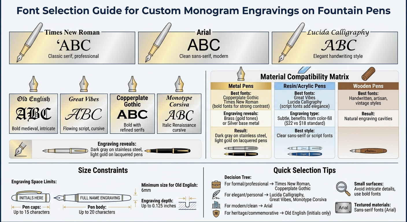
When engraving monograms on fountain pens, font choice is everything. The limited space and curved surfaces demand fonts that are both clear and visually appealing. Here’s what you need to know:
- Times New Roman: A classic serif font offering sharp readability and a professional look, even on small surfaces.
- Arial: A clean, sans-serif font known for its simplicity and modern appeal, perfect for textured materials.
- Lucida Calligraphy: Mimics elegant handwriting, ideal for adding a personal touch to pens.
- Old English: A bold, medieval-inspired font that works best for initials or monograms due to its intricate design.
- Great Vibes: A script font with flowing, cursive strokes that resemble traditional penmanship.
- Copperplate Gothic: Combines boldness with refined serifs, maintaining clarity even at reduced sizes.
- Monotype Corsiva: A stylish italic font inspired by Renaissance cursive, great for formal occasions.
Quick Tips:
- For metal pens, bold fonts like Copperplate Gothic or Times New Roman create strong contrasts.
- On resin or acrylic pens, script fonts like Great Vibes or Lucida Calligraphy add elegance.
- Always preview your design on a material similar to the pen to ensure clarity and alignment.
The right font transforms a pen into a personalized keepsake. Choose wisely based on the pen’s material, engraving space, and the message you want to convey.
Font Selection Guide for Pen Engraving by Material and Style
1. Times New Roman
Legibility at Small Scales
Times New Roman is a serif font that’s well-suited for engraving, especially when space is tight. Its consistent strokes and clean lines ensure readability even on small surfaces like fountain pens. Unlike decorative fonts with intricate designs, Times New Roman maintains a clear, professional appearance at smaller sizes. The serif details - those small finishing touches at the ends of each letter - help define characters sharply, making them stand out when etched into materials like metal or acrylic.
"A standard serif font for print, inscriptions in this font are easy to read. A popular choice for formal occasions." - CorelDRAW
When engraving smaller items, such as pens, adjusting the kerning (or spacing between letters) can further enhance clarity. Previewing the text on a material that matches the pen’s surface is a smart step to ensure the final result meets expectations. This attention to detail not only improves readability but also complements the refined design of Urushi art fountain pens.
Aesthetic Compatibility with Fountain Pens
The timeless and professional appearance of Times New Roman pairs beautifully with the classic style of fountain pens. For instance, Executive Pens Direct showcased a Blue Parker IM fountain pen engraved with a short name in this font. The laser engraving cut through the blue lacquer, revealing the brass barrel underneath to create elegant light gold lettering - an ideal look for corporate gifts or professional settings.
"This particular Blue Parker IM has been engraved with a short name in the Times New Roman font style which is a clear serif typeface and a great choice for any professionals or companies." - Executive Pens Direct
Suitability for Engraving Techniques
Beyond its aesthetic appeal, Times New Roman is also highly compatible with precise engraving techniques. It performs well with both rotary and laser engraving methods. Its structured design allows for clean, defined grooves on metal surfaces such as gold, sterling silver, or stainless steel. On lacquered pens, the engraving process exposes the brass underneath, creating a striking gold effect. Meanwhile, on stainless steel pens, laser marking produces a dark gray finish that contrasts beautifully with polished surfaces.
sbb-itb-1dd4fe9
2. Arial
Legibility at Small Scales
Arial's consistent stroke width ensures that every part of each letter remains visible during engraving, even on materials with textured surfaces. Its clean, sans-serif design - free of decorative serifs - provides a modern look that stays sharp when scaled down for narrow spaces like pen barrels.
"Arial might seem too basic at first glance, but that's actually one of its biggest strengths. Its straightforward, no-frills design translates well across various materials, from wood to glass to coated metal."
– Jeff Butts, XDA Developers
This font's geometry is highly adaptable, making it suitable for engraving on diverse materials like wood, glass, and coated metals. To ensure clarity on small surfaces, fine-tuning the kerning can help, although Arial's structure typically requires fewer adjustments compared to ornate fonts. Before finalizing, preview the design on a background color similar to your pen's surface. What looks sharp on a screen may appear less defined on textured or dark finishes. Arial's simplicity ensures legibility while maintaining a polished and modern appearance.
Balance of Elegance and Readability
Arial combines clarity with a contemporary style that works well for both casual and professional engraving projects. While script fonts may seem appealing for their romantic flair, their intricate details often blur at smaller sizes, making them harder to read. Arial, on the other hand, provides a professional yet approachable alternative with its block-letter design. Its softer lines, compared to traditional serif fonts, make it a versatile choice for various engraving needs.
For a creative touch, consider pairing Arial with a script font in layered designs. Use Arial for essential details like names or dates, while reserving the script font for decorative initials. Professional engraving services, often utilizing precision laser technology, ensure that Arial maintains its crisp and balanced appearance on fountain pens. Keep in mind that this process typically takes about 48 hours after proof approval.
3. Lucida Calligraphy
Aesthetic Compatibility with Fountain Pens
Lucida Calligraphy pairs beautifully with fountain pens, capturing the essence of elegant handwriting. Its alternating thick and thin strokes mimic the natural flow of a nib on paper, creating a seamless connection between the engraved text and the pen itself. This makes the font feel less like an added embellishment and more like an integral part of the pen's design.
"These stylish, classy fonts are designed to resemble graceful handwriting. They look as if they were drawn by hand with a flat-tipped pen or brush and typically include ornamental flourishes and swashes to add character and sophistication." – DesignBombs
When engraved with precision, the font's delicate curves and ornate details are preserved on metal surfaces, enhancing the overall aesthetic of the pen. This visual cohesion ensures that even small-scale engravings maintain their charm and distinctiveness.
Balance of Elegance and Readability
Lucida Calligraphy strikes the perfect balance between refined design and readability, even when used in smaller sizes. This is achieved through thoughtful letter spacing, which prevents characters from merging into one another during the engraving process.
To ensure clarity in engraving, it's important to focus on well-defined terminals and balanced spacing. This keeps each letter distinct and avoids the cluttered look that can result from overly condensed or highly decorative scripts. Additionally, the engraving team carefully considers the material and finish of the pen to maintain the font's crisp, polished appearance. By avoiding overly intricate designs, Lucida Calligraphy remains both elegant and practical for engraving on narrow surfaces.
4. Old English
Aesthetic Compatibility with Fountain Pens
Old English fonts carry the charm of blackletter styles, reminiscent of medieval manuscripts created with quills. Their bold, heavy strokes combined with fine, delicate lines mimic the natural variations produced by a flexible fountain pen nib. This creates a striking visual connection between the font and the pen. The style exudes a sense of tradition and sophistication, making it a popular choice for luxury pens, especially those tied to heritage themes or commemorative events. The decorative swashes and flourishes elevate a fountain pen into a meaningful keepsake, often chosen to mark milestones or formal occasions . However, the intricate design of Old English fonts requires careful attention to ensure readability, particularly on smaller surfaces.
Legibility at Small Scales
The detailed and ornate design of Old English fonts can pose challenges when used on small-scale engravings. Preston Lee highlights this by saying, "Avoid small text sizes - those beautiful details become muddy quickly". The angular strokes and pronounced contrast in weight can blur when reduced in size, especially on the compact surface of a fountain pen. To maintain clarity, Old English is often reserved for monograms or initials, with experts recommending a minimum size of 6mm . Adí Aviram from Linearity adds:
"With the heavily stylized nature of Old English, you sacrifice a bit of legibility".
Suitability for Engraving Techniques
To address the legibility challenges of Old English, advanced laser engraving is typically the go-to method. While the font offers a formal, hand-crafted appearance, its intricate details require precise engraving to retain their sharpness and balance on metal surfaces. The broken curves and bold strokes of Old English demand a high level of precision to preserve their unique character. Before engraving, it’s essential to consider the material and finish of the pen, as contrast can vary depending on these factors . Viewing a preview of the design on a background color similar to the pen’s material can help ensure the fine details remain clear and well-defined .
Hand Engraving Letter A, B and C in Script
5. Great Vibes
Great Vibes is a script-style font that captures the flowing elegance of fountain pen strokes, making it a standout choice for personalized engravings.
Aesthetic Compatibility with Fountain Pens
Created by Robert Leuschke, Great Vibes mimics the fluid motion of fountain pen writing. Its varying line thickness reflects the depth achieved by a flexible nib, while its looping ascenders and descenders add a sophisticated touch. The font pairs casual uppercase letters with more formal lowercase ones, striking a balance that feels both artistic and structured. This polished, handwritten look makes it a fantastic option for monogram engravings on pens.
Balance of Elegance and Readability
Great Vibes blends formality with a relaxed charm, thanks to its smooth, connecting ligatures that replicate traditional cursive handwriting. With over 400 glyphs and alternate characters, the font offers flexibility for customization, making it a perfect fit for curved pen surfaces. This adaptability ensures engravers can maintain a visually appealing design without compromising its refined appearance.
Legibility at Small Scales
The font’s regular x-height and moderate contrast ensure it remains clear even when reduced for engraving purposes. However, designers should test the font at the specific size intended for engraving, as intricate loops might blur on certain materials or with tools that leave a wider burr. Great Vibes works best for short texts like names or initials, as longer phrases may lose clarity.
Suitability for Engraving Techniques
Modern laser engraving technology brings out the smooth, continuous strokes of Great Vibes with precision. The font’s clean loops and defined lines translate seamlessly into engravings, though the final result depends on the material and finish of the pen. For example, Fountain Pen Revolution uses laser engraving to highlight the font's intricate details, delivering professional results within 48 hours of proof approval. The precision and elegance of Great Vibes make it a reliable choice for engraving projects that demand both style and clarity.
6. Copperplate Gothic
Copperplate Gothic combines a refined aesthetic with excellent readability, making it a top choice for custom monogram engravings. Created by Frederic W. Goudy in 1901 for American Type Founders, this typeface was designed to mimic the sharp, engraved look of traditional copperplate work. It’s no wonder it pairs so well with personalized fountain pens.
Aesthetic Compatibility with Fountain Pens
This font’s roots are deeply tied to the art of luxury craftsmanship. Its design draws inspiration from copperplate engraving techniques popularized in the 16th century. These same techniques influenced the creation of flexible-nib fountain pens, which are prized for their ability to replicate classic calligraphy. The tiny wedge serifs of Copperplate Gothic add a touch of sophistication, while its clean, polished appearance has made it a favorite for professional stationery - especially in law offices and banks - for over a century.
Balance of Elegance and Readability
Despite the term "Gothic" suggesting a sans-serif style, Copperplate Gothic is actually a wedge-serif typeface. Microsoft Typography describes it best:
"the design captures both the sturdiness of a sans serif, as well as the elegance of typefaces with serifs".
Its all-capital format ensures both boldness and refinement, making it ideal for engraving on smaller surfaces without sacrificing clarity.
Legibility at Small Scales
One of Copperplate Gothic's standout features is its ability to maintain legibility on small-scale applications. Its monolinear structure - meaning uniform stroke widths - ensures clarity during engraving. The font’s small capitals, scaled to about 70–80% of the full capital height, enhance its readability. Wide letter spacing and ample counterforms (the negative space inside letters like "O" or "E") further reduce crowding, even on narrow surfaces. Microsoft Typography highlights its effectiveness, noting:
"all-capital text typically set in small print...very popular for use on business cards".
This precise attention to detail makes it a perfect match for modern engraving needs.
Suitability for Engraving Techniques
Copperplate Gothic’s sturdy design, originally intended to prevent distortion in letterpress printing, adapts seamlessly to modern engraving methods. Its triangular serifs produce sharp, clean impressions, whether engraved on metal or resin fountain pens. Laser engraving - used by brands like Fountain Pen Revolution - captures these intricate details beautifully, ensuring the finished product retains the crisp lines and professional look that define this timeless typeface.
7. Monotype Corsiva
Aesthetic Compatibility with Fountain Pens
Monotype Corsiva brings to mind the elegance of 16th-century Italian cursive handwriting, seamlessly aligning with the timeless charm of fountain pens. Created by Patricia Saunders at the Monotype Type Drawing Office, this italic typeface takes inspiration from the work of Ludovico degli Arrighi, a renowned writing master of the Renaissance period. The font’s swash capitals, crafted for ornamental initials, make it a striking choice for monogram engravings, often used to commemorate special occasions or mark professional achievements. According to Microsoft Typography, Corsiva "is best used to add sparkle to invitations, greeting cards and menus, and to give a sense of occasion to certificates and awards". Its refined design strikes a delicate balance between sophistication and readability, even on the small surfaces typical of engraved items.
Balance of Elegance and Readability
While script fonts can sometimes pose readability challenges on compact surfaces, Monotype Corsiva performs exceptionally well for monogram engravings. CorelDRAW’s engraving guidelines highlight this point:
"If you would like to use capital letters with a script font, consider using a monogram for legibility if the object you are engraving is small".
The italicized structure of Corsiva lends it a polished, formal quality that works beautifully in professional contexts, while its flowing curves add a touch of romance and personality.
Suitability for Engraving Techniques
The precision of modern laser engraving, such as that offered by Fountain Pen Revolution, captures the delicate flourishes and varied line weights of Monotype Corsiva with remarkable clarity. For best results, preview your monogram design on a background that matches the finish of your pen. If the intricate details of the font appear too fine on certain materials, consider requesting a thicker weight to ensure the engraving remains sharp and legible.
How to Choose the Right Font
When selecting a font for engraving, it's essential to consider the pen's material, the engraving area's size, and your personal style preferences. Each material interacts differently with engraving, so tailoring your font choice can make a big difference.
For metal pens, engraving reveals the base metal - often brass or silver. To create strong contrast, opt for fonts with heavy strokes or bold serifs. If you're working with precious metals like gold, elegant script fonts add a refined touch, while industrial metals such as stainless steel look better with bold, solid typefaces.
Resin and acrylic pens often result in subtle engraving. To enhance visibility, consider color-filled engraving, which costs around $22.00 compared to $18.00 for standard engraving. Clear sans-serif or script fonts are the most effective for these surfaces. On the other hand, wooden pens naturally form engraving cavities, making them perfect for handwritten, artisan, or vintage-style fonts that complement the material's organic texture.
The size of the engraving area also matters. Pen caps typically hold up to 15 characters, while the pen body can accommodate about 20. For smaller spaces, choose fonts with ball terminals and long tails to keep the characters well-defined and legible.
Before finalizing your design, preview the font on a background that matches the pen's material. For example, Fountain Pen Revolution’s laser engraving can reach depths of up to 0.125 inches on materials like wood, acrylic, and coated metals. Using slightly thicker font weights ensures sharper, more precise results.
Conclusion
Selecting the right font for your custom monogram engraving involves considering the pen's material, available engraving space, and overall style. The base metal of the pen plays a big role in the final appearance - engraving brass often reveals gold tones, while stainless steel produces a dark gray mark. Keeping these details in mind ensures your chosen font complements the pen’s design beautifully.
These elements influence both the visual appeal and the technical aspects of the engraving. Fonts that remain legible at small sizes are key. For tighter engraving spaces, all-caps options like Copperplate Gothic work well, while serif fonts such as Times New Roman are ideal for longer text.
Using digital previews to test fonts is a practical way to see how different styles interact with the pen’s material and finish. For instance, script fonts can add a touch of elegance to gold surfaces, while bold sans-serif fonts often create better contrast on metallic finishes. Matching the font weight to the pen’s design and engraving method is just as important. The fonts mentioned here were chosen for their balance of style and readability, making them excellent choices for fountain pen engravings.
"The nature of engraving means that every pen will engrave slightly differently depending upon factors such as material, colour and base metal." - Executive Pens Direct
Keep in mind that what looks great on a screen may not always translate perfectly to engraving. Experimentation is essential to find the right balance between clarity and aesthetic appeal.
For more ideas and customizable fountain pens, check out Fountain Pen Revolution at https://fprevolutionusa.com.
FAQs
Which font is easiest to read on a small pen cap?
Simple and clean typefaces, such as monogram fonts with clear and well-defined letterforms, work best for small pen caps. These fonts are crafted to ensure clarity and readability, making them perfect for engraving in tight spaces.
How do I pick a font that matches my pen’s material and finish?
When picking a font for your pen engraving, think about how it pairs with the pen's material and finish. For pens with polished or brushed metal surfaces, clean and bold fonts tend to work beautifully. If your pen has a vintage or textured look, classic or decorative fonts can add a touch of charm.
However, steer clear of fonts that are overly thin or intricate - they can be tricky to engrave and may not hold up well over time. Instead, focus on fonts that are bold, easy to read, and sturdy, ensuring your engraving not only looks great but also lasts.
Will my engraved monogram look the same as the on-screen preview?
Your engraved monogram could look slightly different from the on-screen preview. This is due to factors like font rendering, engraving methods, and the material used. That said, a high-quality preview tool can give you a pretty good sense of how the final design will turn out.